Here’s Harriet’s entry for Power BI Challenge 18. @hastewar22, would you like to share how you built this dashboard and what your inspiration is in building it?
To learn about the real-life scenario presented for the challenge, be sure to click on the image below.
1 Like
This was my first Challenge entry and I really enjoyed putting it together.
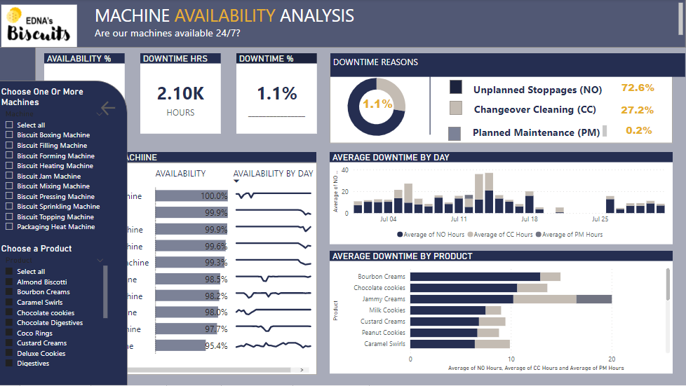
The data was my biggest issue and I spent too much time trying to sort it out. I finally decided to break the stoppages into distinct periods contained within each day. So, if a stoppage extended beyond midnight, I made a different record for the extended period.
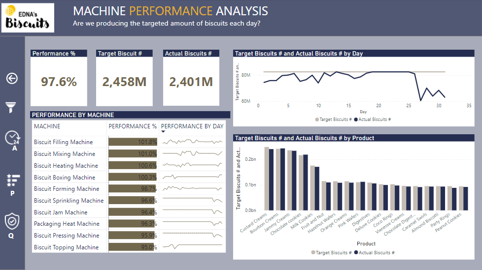
I also decided to simply take the average of the Total Biscuits and Good biscuits number for any one stoppage and apply that only to the first record in the stoppage series.
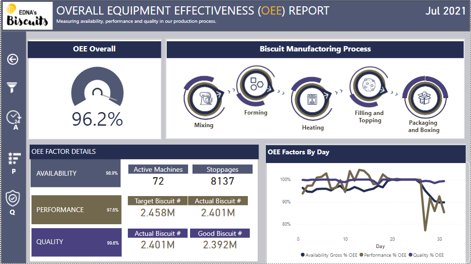
I chose to focus the entire entry on OEE and its components, thus providing a page for the Overall OEE and then one page for each of its components.
I figured that the type of machine was added for a reason, so I built the manufacturing process graphic based on that information for machines in each of those categories, deciding on an order that I hoped was right. I got the idea for the graphics from some generic Powerpoint templates I’d seen and then created the graphics using the chosen color scheme.
The idea behind the process graphic was that the user could click on any of the icons and see the page change to reflect just those machines represented by the icon. Unfortunately, I ran out of time and was not able to do that.
If I’d had another day, I would also have fixed all the formatting issues. I’m working on an updated version for my records… just because it is annoying me so much!
4 Likes