Power BI Challenge 17 - Environmental Data Reporting

@FPastor ,

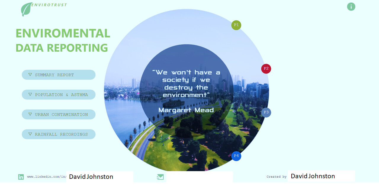
Bravo! This is a fantastic combination of style and substance. First off, it just looks beautiful – the navigation page is striking, the use of color is perfectly suited to the subject matter and very effectively conveys the key elements in each analysis. You really need to view this report in the Service to fully appreciate all the fine touches you’ve added to give this such a polished user experience – the “hover and bounce” effect of the menus, the overall navigation structure, the bookmark information pop-up, etc.

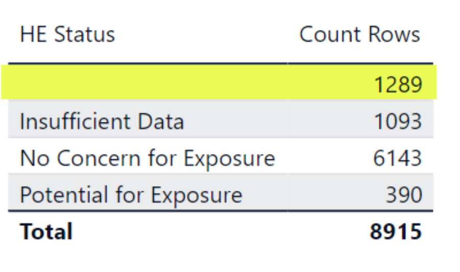
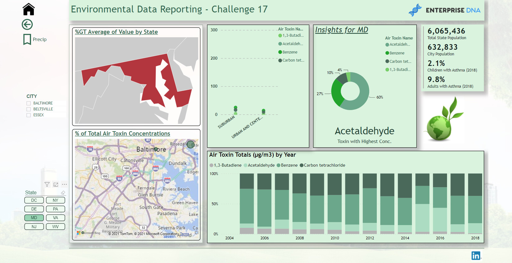
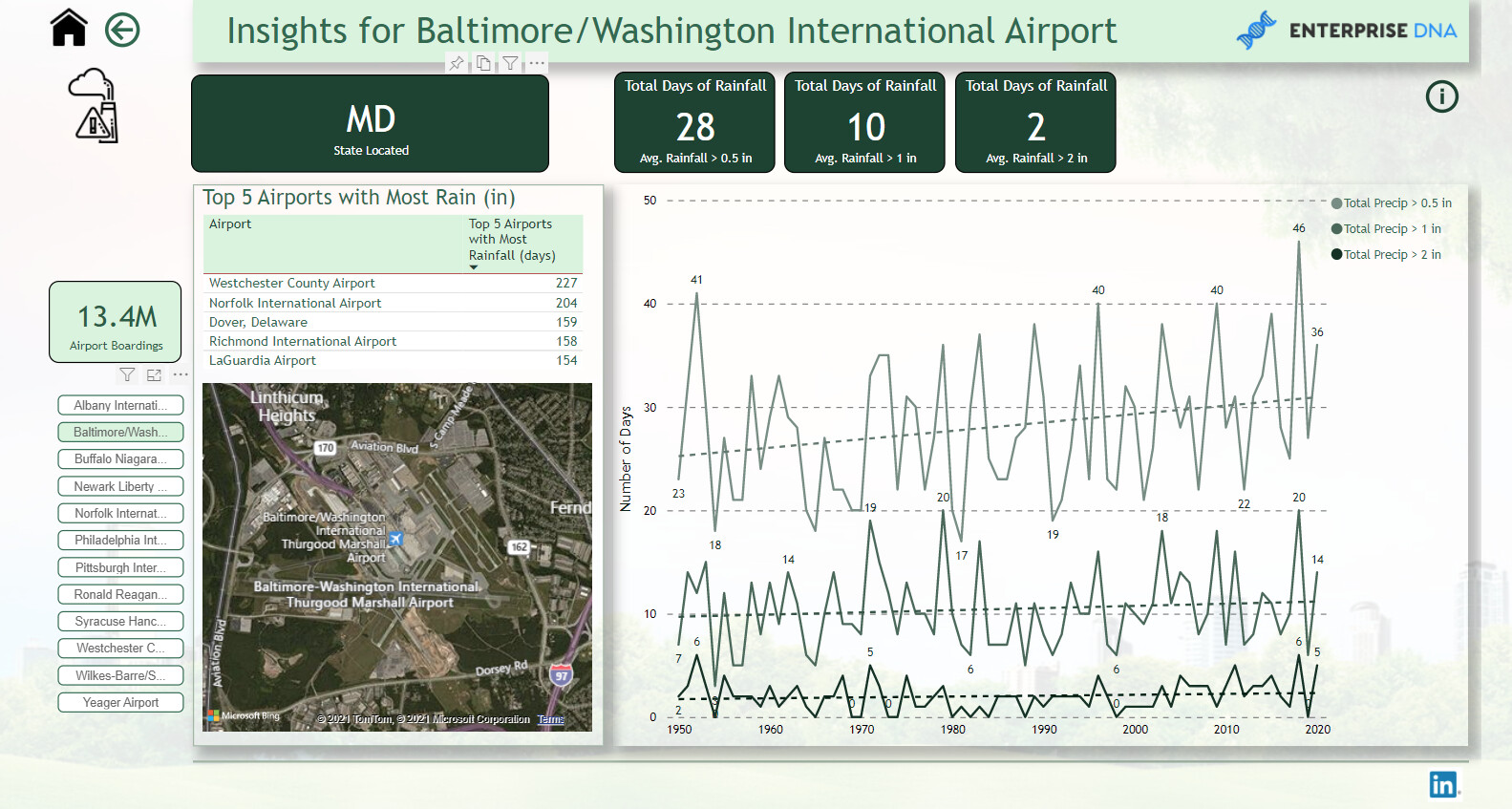
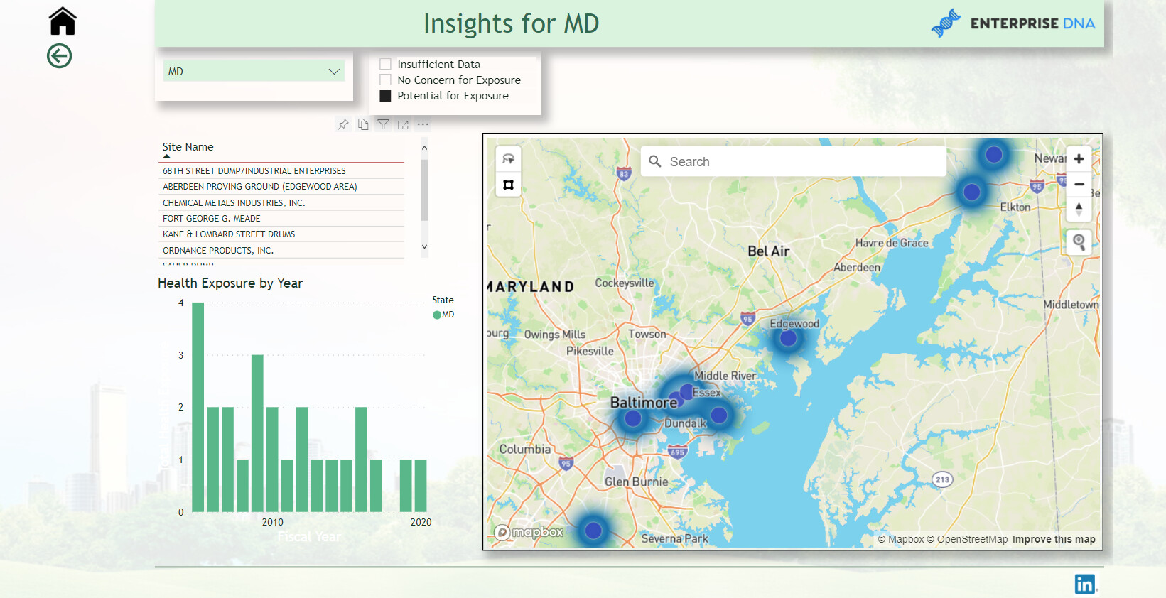
Substantively, I think you have done a wonderful job in synthesizing a huge amount of information in a concise and meaningful way. The executive summary nicely pulls everything together with key trends clearly summarized. And the next time I hear someone complain about how limited the native Power BI visuals are, I’m going to show them this report as evidence to the contrary.

The only tiny area for improvement I can see is with regard to readability of some of the light colored text on some of the lighter colors in the theme.

Overall, I think this is a beautifully done report that really showcases Power BI’s versatility as a visualization tool, and the way in which a skillful developer can use the different elements to create a great user experience.

Between you and @DianaWill , this challenge is off to an incredible start. Thank you for the obvious intensive work you put into this fantastic entry. :clap: :clap:

2 Likes

@BrianJ

Thank you, grateful for your comments. Improvement suggestion duly noted.

F Pastor

1 Like

This is great @FPastor …it looks really similar to my report :rofl: :rofl:

6 Likes

@DavieJoe
Great minds think alike, I like your marine algae theme :rofl: :joy:

2 Likes

Yes, marine algae/sewage theme

1 Like

Challenge Participants,

I spoke with the submitter about a couple of recent questions that have come up regarding the data, and here was their response:

  1. In the human exposure data , under the status field there are a lot of blank values. I asked what the interpretation of those blank values was, and they said it’s fine to treat the blank values as “Insufficient Data”

  1. I’ve gotten a number of questions from folks about threshold values for the air toxics data. The submitter discouraged going down that road - letting me know that standards vary by state and over time, making above/below threshold comparisons quite difficult and time-consuming. They encouraged focusing instead on analyzing and visualizing trends in concentrations without regard to thresholds.
  • Brian
2 Likes

Hey guys
Newbie challenge contestant here. Looking at what’s already been posted you guys are just awesome. So no tittering when I post my inaugural challenge next week.

Couple of questions though.
I’m struggling to get the population data by state and maybe racial ethnicity too. I have followed @BrianJ 's link but being a numpty and not finding what I want.

Also not sure what buttons to push to arrive at Publish to Web URL. So any help here would be cool. Then when I get that far next week all will be good.

@DavieJoe - madness going to Scotland last week in all that snow. You weren’t overnighting in that cut off pub in Yorkshire, were you :cold_face:

Pete

4 Likes

Haha, don’t worry Pete I went to Scotland the weekend before the snow fell/storms. If I was locked in a pub for 4 days I’m not sure I’d come out alive :rofl:

3 Likes

Pete,

This is either incredibly simple or fiendishly difficult. I suspect since you are now an independent consultant and probably not under someone else’s tenant, it will be the latter. Try the simple first. Just click the Publish button, and select the Workspace you want to publish to. Go into the published report on the service, and then click on the following:

It will now give you a warning about the lack of security in PTW, and then give you a shareable link to your report.

If it gives you a message saying you don’t have rights to Publish to Web and that you should contact your System Administrator, I can point you to some resources to help you configure your tenant to gain access to PTW rights.

Gotta run and finish the Accelerator lecture for this evening, but will be back later to help with your data question as well.

Hope this is helpful.

  • Brian

P.S. Note that if you don’t want to mess with all this now, you or anyone else can just email me your Challenge entry at brian.julius@enterprisedna.co, and I will be happy to publish it to the eDNA tenat and send you the link.

3 Likes

Everyone - if you have enabled the preview feature on the new updated format pane (November release) - just a warning that it looks like Microsoft has apparently forgotten to include the “action” section for buttons (i.e. to navigate through pages, bookmarks, etc.). I just spent the last 30 minutes pulling my hair out trying to figure out where it went only to have discovered a posting on Microsoft’s site about this. The only fix seems to disable this feature and revert back to the original format.

2 Likes

Yes, it is a bit of an annoying “oversight” on their part.

@tweinzapfel ,

Absolutely right. I came across the same issue last week when I did the Bookmark Navigator and Page Navigator review videos of the November 2021 update. Microsoft did note it in the “known issues” documentation accompanying that update, but I think given the importance of that omission it was shockingly bad judgment to proceed with releasing the update without that functionality enabled.

– Brian

2 Likes

Hi @BrianJ
FYI
I’m not sure if they have fixed that issue in the latest update on December 1. There was update to Microsoft Power Bi on the Microsoft Store.

thanks
Keith

2 Likes

Okay. My first time doing a challenge. I have a free MS developer license. But I can’t publish to the web only share link. Any hints on how to make my report available?

@Paul.Gerber ,

In the very first post in this thread, there are specific instructions that answer your question. Please email @BrianJ , and he will do the publish to web for you.

Thanks
Jarrett

2 Likes

Hello eDNA community. I am a first time Power BI challenger but a Power BI user for almost one year. @Brian asked me to start doing these challenges so this is my first go.

When I first looked at the data and what the indicators were coupled with my target audience, my first thought was to find correlations in between the datasets. As an engineer, this is just out of habit. I think I was making this harder than what I needed it be.

My approach at first was to see what toxins were related to number of asthma cases. Asthma in adults were higher than in children. But formaldehyde was a top toxin that was present in the majority of the states.

I tried to do a very simplistic approach. But doing this challenge I found that overall throughout the Mid-Atlantic states, children with asthma is slightly more than asthma in adults.

Also what was interesting, in all states over the course of years, formaldehyde was the highest contributor of air toxins.

What it Causes
Formaldehyde exposure is ubiquitous and occurs in homes, communities, and workplaces. Formaldehyde is a high-volume production chemical with numerous industrial and commercial uses as a solution, disinfectant, preservative or to produce industrial resins used to manufacture adhesives and binders in wood, paper, and other products. It is present in many household products, such as foam insulation, cleaning and personal care products, pressed wood products such as particleboard and plywood, and as a result is a common indoor air pollutant found in virtually all homes and buildings [1–9]. Homes are impacted by off-gassing of formaldehyde from new housing materials, with availability and rates of ventilation having minimal impact on exposure levels [10].

Rainfall totals were interesting. Westchester Airport had the highest amount of days out of year for rainfall. Rain and humidity can attribute to mold and mildew; problematic for asthma people. Westchester is NE of NYC. So my assumption would be that NYC would get a great deal of rain as well.

I treated human exposure with just a map with “heat map” selected in the visual. Then using a slicer to show which sites had the “potential for exposure”.

Throughout the report I used the basic DAX measures then expanded on those measures. I used TREATAS quite a bit to “bang” two data tables together virtually which helped a lot. I also used Dynamic Text Measures too for my graphs and titles. I feel it helps the user to know what value they selected to view in the Dashboard and to label the graphs.

Thank you for taking the time to read and to view my dashboard. I appreciate all feedback and thoughts.

Paul


6 Likes

Thank you. I emailed Brian.

Paul

1 Like

Nice entry Paul :+1:

1 Like

@DavieJoe thank you, sir! Was a little nervous about my first entry.

1 Like

Beautiful presentation!

1 Like