Power BI Challenge 17 - Environmental Data Reporting

@FPastor ,

Assume the submitter is a government agency. There’s no specific direction with regard to aesthetics (e.g., theme, font, color palette) except to make it accessible - for example, readable by people with color blindness.

Here are some links that may be helpful:

  • Brian
2 Likes

@tweinzapfel ,

Great to hear you’re back in the Challenge game – you were on a hell of a roll before your recent hiatus. Yes, we definitely wanted to give some extra time on this one to maximize participation.

The Lions losing on Thanksgiving is basically a given, unless the Jets are involved. And I agree the world would be a better place if all family Thanksgiving arguments were focused on things like whether virtual tables should be constructed with ADDCOLUMNS/SUMMARIZE or GENERATE/ROW… :grinning_face_with_smiling_eyes:

  • Brian
4 Likes

Finally, challenge 17 is here.

Let the work begin

5 Likes

@davidcenna ,

Yup, sorry for the delay. This one took a bit longer than usual to put together due to detailed discussions on which indicators to use, and how to make the data as easy to understand as possible for people not accustomed to working with environmental data. In addition, I think the submitter did a phenomenal job cleaning the data - there should be little or no additional cleaning required.

  • Brian
3 Likes

So excited about this one.

I really hope we get a huge turnout and can produce some amazing work for the sponsor!

4 Likes

Challenge Participants,

Some of you have asked for some additional background on air toxics monitoring. I spoke to the sponsor about this request, and here’s an excerpt from their response - two excellent resources for you to review if interested.

PA DEP has a pretty non-technical summary on their website here: https://www.dep.pa.gov/Business/Air/BAQ/MonitoringTopics/ToxicPollutants/Pages/default.aspx

NJ also has a pretty robust resource on it but it is a little more technical: https://www.nj.gov/dep/airtoxics/Monitor.htm This might help some of the participants though because it discusses the same specific toxics that are reported in the indicators.

  • Brian
2 Likes

Challenge Participants,

Here’s a tip you may find helpful in cleaning/modeling your data. Some of the tables have state listed by name, others by abbreviation. If you want to normalize this across tables, the following complete listing of state names (including District Of Columbia) and abbreviations is well-formatted, and pulls in perfectly using the simple Power BI Web Connector:

  • Brian
1 Like

Challenge Participants,

One other thing i put together you might find helpful in cleaning/modeling your data is a correspondence table between data collection sites in the Precipitation table and state abbreviations:

– Brian

Data Collection Site Locations.xlsx (9.3 KB)

2 Likes

Challenge Participants,

I got another question about the Precipitation data and wanted to share my response with you all. The questioner asked why the categories for a given site and year did not add up to 365 (or 366 for leap years)?

I spoke with the submitter about this, and here’s the answer: there are two possibilities. The most likely is that the observations that would total to 365 or 366 fall into the 0 < x < 0.5 range, but could also be that there are some missing observations.

  • Brian
2 Likes

All,

Here are the Airport codes for those who are intersted.

image

Thanks
Jarrett

2 Likes

This was exactly my question as well

Considering that if they had the data which was between 0 and 0.5 inches, it would be highly unlikely to be omitted from the dataset on purpose.
I was making an assumption that the data would be missing for these days. Or was not collected.

1 Like

Hi! Am I the only data head spending Thanksgiving weekend on the challenge? I am wondering how others are approaching the data?

The states in the US Mid-Atlantic region are very close together, almost overlapping. So, the air or water quality is closer to shared than unique metrics as recorded by monitoring sites. For example, I live in New Jersey but can be in Delaware or Pennsylvania in less than 20 minutes. Their water and air are my water and air.

I am finding aggregate trends or patterns provide more insight than map visuals. How are others approaching this?

3 Likes

This is really a unique challenge. I found the data modeling to be pretty straightforward, my DAX is almost nonexistent, but the visualization element has so many potential paths to go down for each dataset that you could spend days on each one…

Very interested to hear how you and others are approaching this.

– Brian

3 Likes

@BrianJ & @DianaWill - I am in my final stages but my approach is rather simpler. My reports is intended for the passing by user being able to read and easily grasp what the numbers/charts are about it. 100% no designed for the well numerically educated user which of course would neither has any issue in understanding it.

Am I making sense!!!

Regards,

F Pastor

2 Likes

I am taking a similar approach to F Pastor, rather than a deep data dive. There are eight states in the region but I am mostly approaching it from a regional or aggregate perspective rather than specific locations, due to the subject. I was wondering how others were approaching.

3 Likes

@DianaWill ,

I am certain that there is not a right or wrong approach here. I think a mix of entries that take a regional approach, like you and @FPastor are doing, and a more granular approach like I am taking will provide the client with a really valuable range of approaches and ideas.

  • Brian
3 Likes

Someone has to be first…

I got a cognitive overload analyzing the data. So, I focused on one metric in each subject area that impacts the quality of life. In other words, the social impact. The Dashboard page sets the context with the subject area pages providing focused detail. Overall, the report is not a data deep dive but rather a status report on conditions. Honestly, you could spend a month, full time, analyzing this data.

The learning opportunity was to be mindful of accessibility issues. Also, this is my first opportunity to try the new page navigation released in November 2021. I think a vertical bar may look better but a lateral bar leans more towards accessibility.

I’d appreciate your feedback-
Diana

9 Likes

@DianaWill ,

Wow! Terrific entry - beautifully organized, very clear summary of key findings supported by detailed analyses in corresponding pages, attractive design mindful of accessibility issues, smart choices on visualizations, nice application of the new Page Navigator, and much more. Just really well done all around on quite a difficult challenge.

I do agree with you about the biggest challenge being cognitive overload. You literally could spend a month working on any one of the five datsets, so I think your strategy of focusing on a limited number of impactful metrics makes a lot of sense.

Thanks for participating, and for breaking the ice and going first. Very impressive start out of the gate…

  • Brian
2 Likes

@DianaWill - Excellent work!!!

2 Likes

Here it is my take on Challenge 17 “Environmental Data Report”.

Report Commentary

I am terrible at writing reports commentary so I hope this will be OK with you.

Theme and Colour Palette

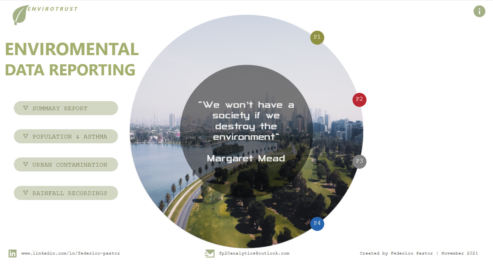
I went through 3 different layouts and colour palettes finally setting for the one hereby presented. The circle in the intro page try to represent Earth with the photo representing the environment.

While picking the theme and palette seemed an easy task, considering the data in analysis, it presented a number of challenges i.e. happy green “all is OK” or polluted greyish “we must do something about it”. I went for a mixture of the two represented by the photo in Intro page displaying a park in first line and the city with polluted sky in the background. The photo took well over 2 hrs to be picked between another 20/25 photos.

Approach

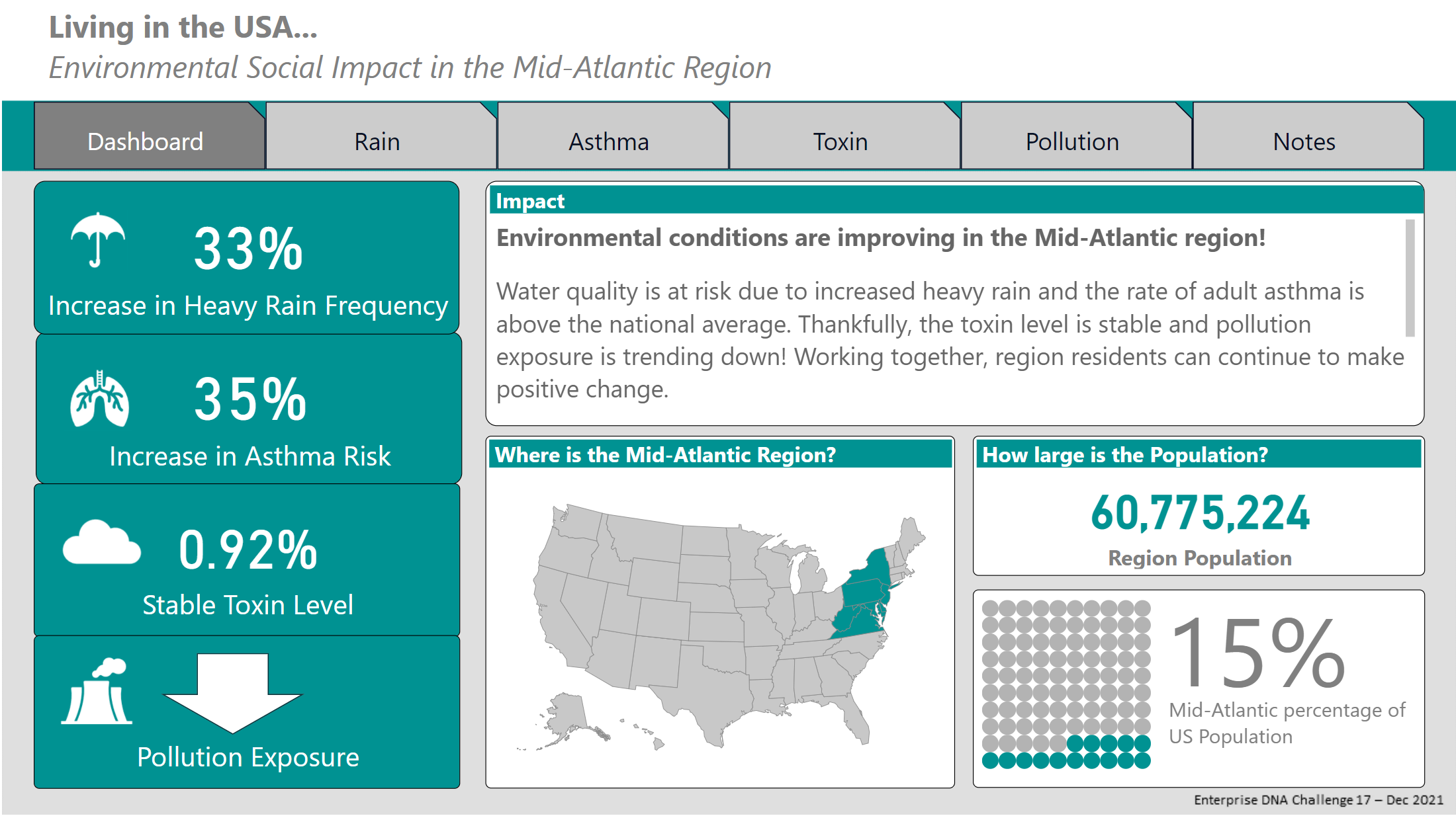
I decided to go for a “all end-users” must understand the numbers with the idea of normal passing by users to know what the report is about it. I am no sure I do achieve this but with the use of simple charts and KPI/s the report presents a clear and informative storytelling of the data analysed.

Data Analysis

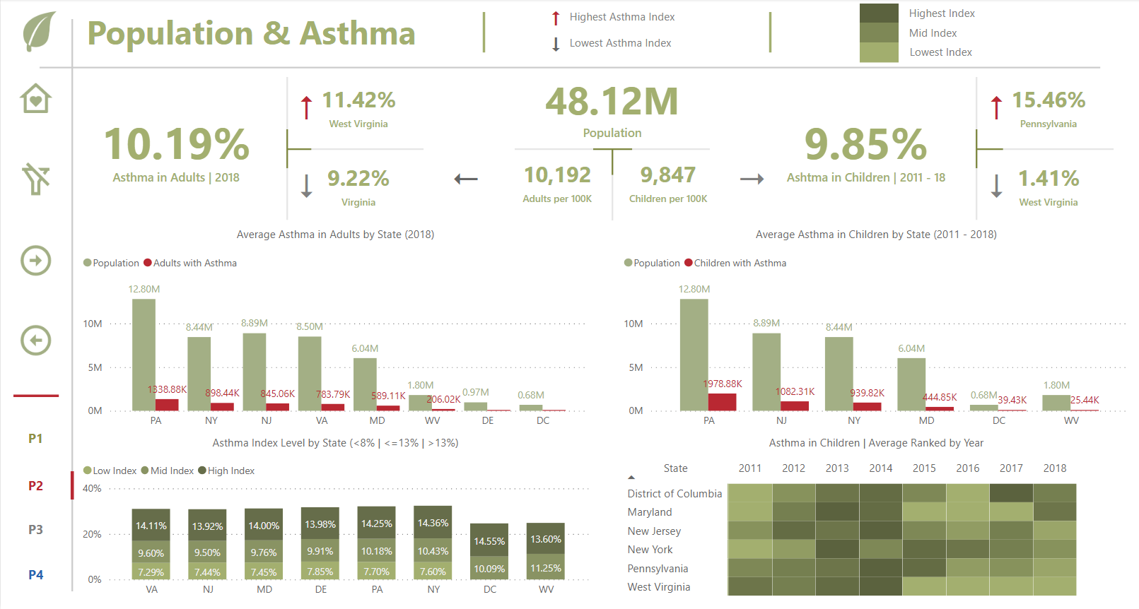
Presented with 5 different or interrelated tables, the first hurdle was how to set up a model. I decided to go with 3 mini-models with their own dimensions’ tables i.e. Asthma (Adult & Children) as fact tables and Year and State as dimensions table. In hindsight I could have done better but this is also part of the learning, discovering better processes or quicker ways.

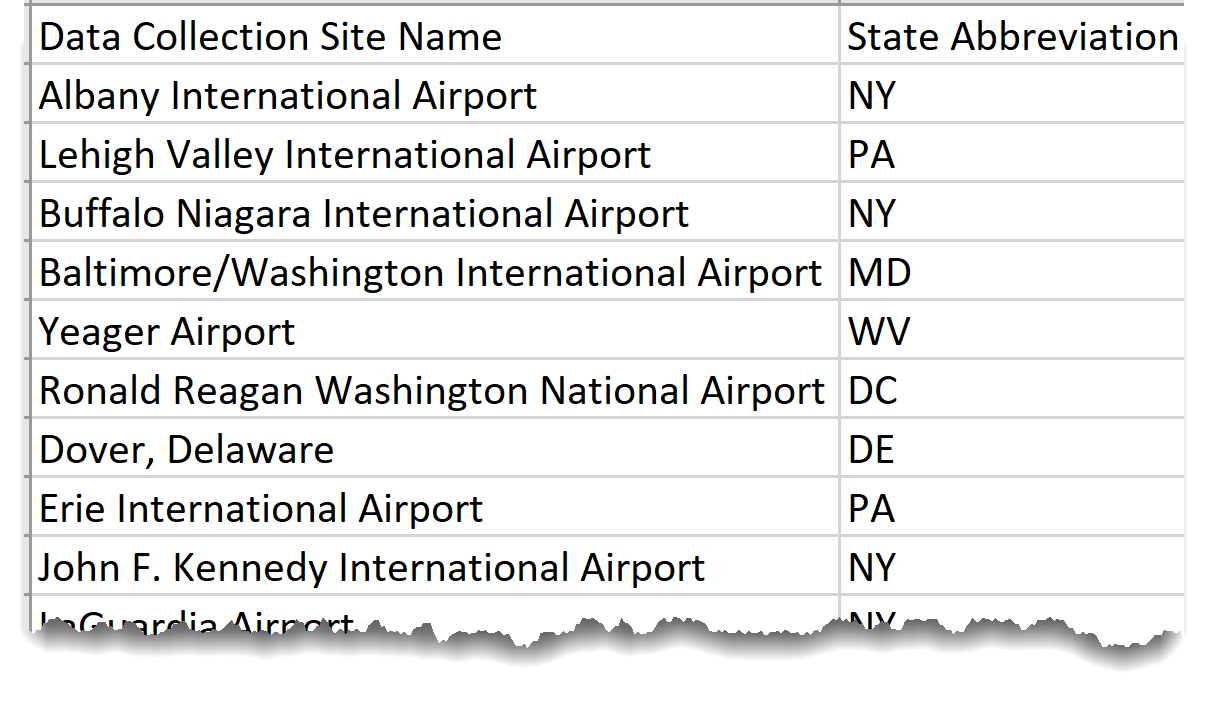
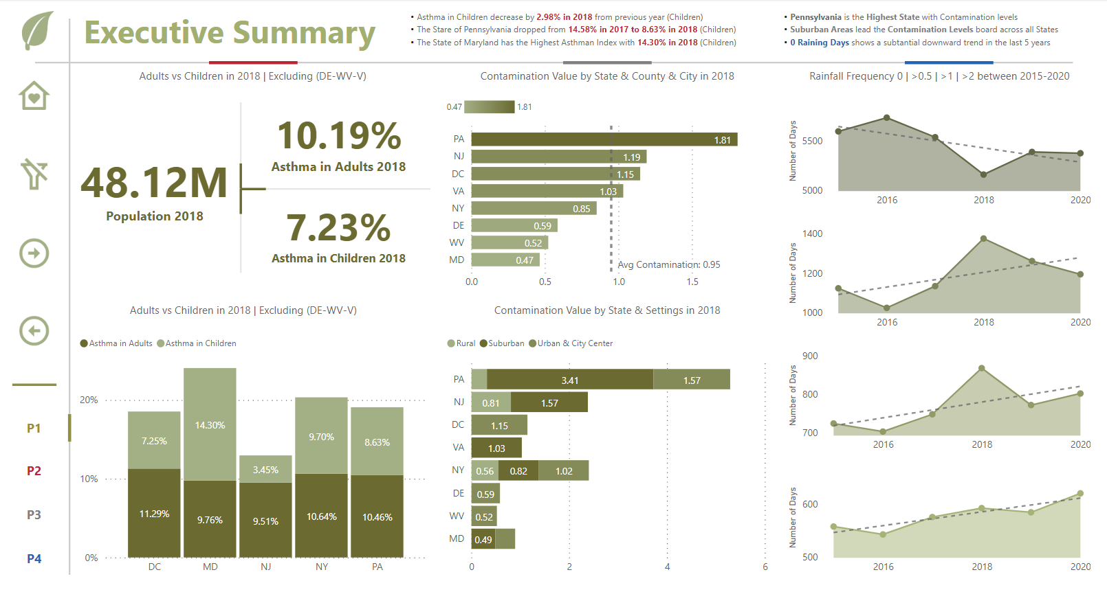
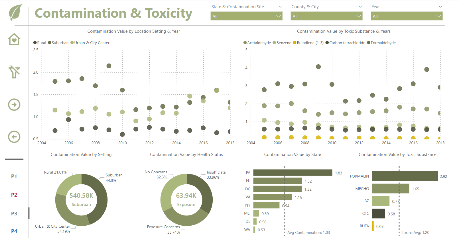
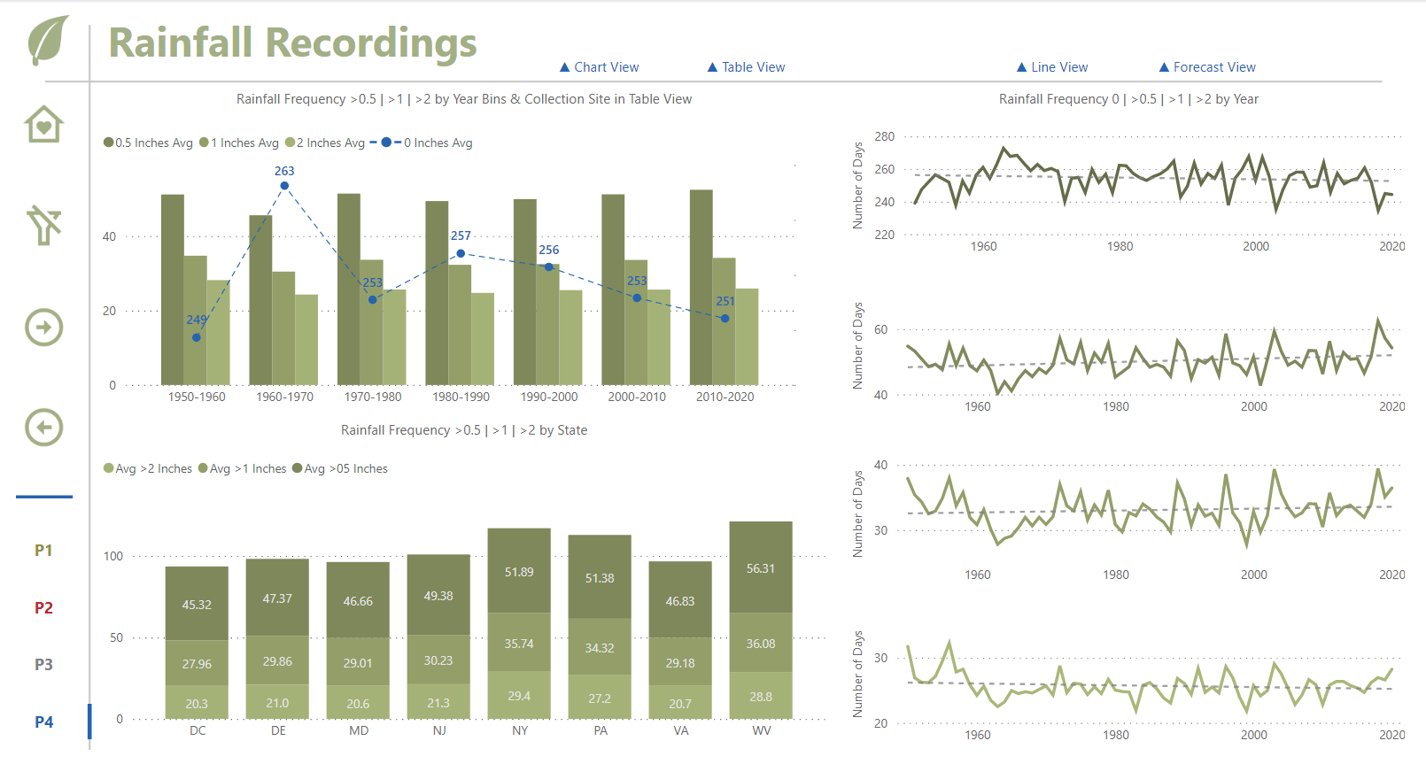
There are 4 pages of data analysis in my report, the summary, Asthma (Adult & Children), Contamination & Toxicity and Rainfall Recordings. I use normally a 1400-750 pixels page size packing enough room for a few viz.

I have added the population in the presented States for 2018 and for the rainfall recordings, where days were not summing up to 365 days a year, I found out the number of missing days and share them equally between the 4 different frequencies.

DAX is uncomplicated, averages and a couple of calculates and filters measures with the addition of some extra additional columns enhancing the report analysis.

Well, I hope you like it.

F Pastor

Link to report.

14 Likes