@DianaWill thank you very much.
Hi together,
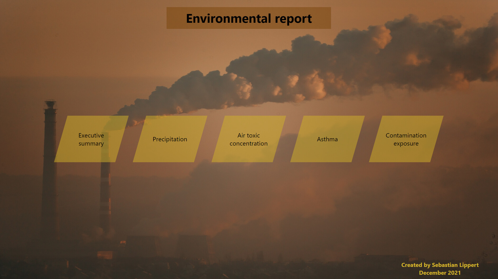
below my entry to the challenge, it’s my first time participating so don’t be too harsh 
Colour theme:
I had the idea for the theme before I read about the requirement for the colourblind friendliness,
I checked and got a supposely suitable colour theme which I used for the visualisation,
while maintaining my initial idea in the background theme & navigation.
Approach:
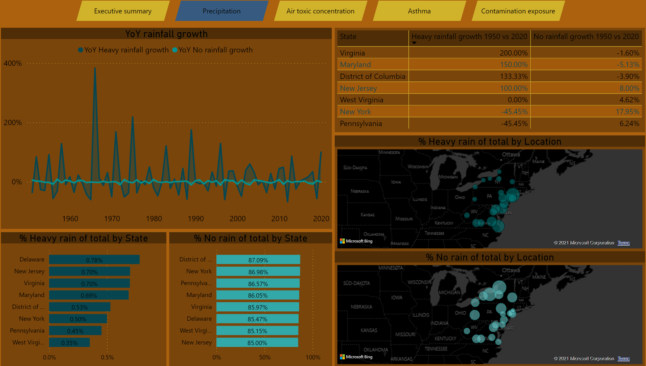
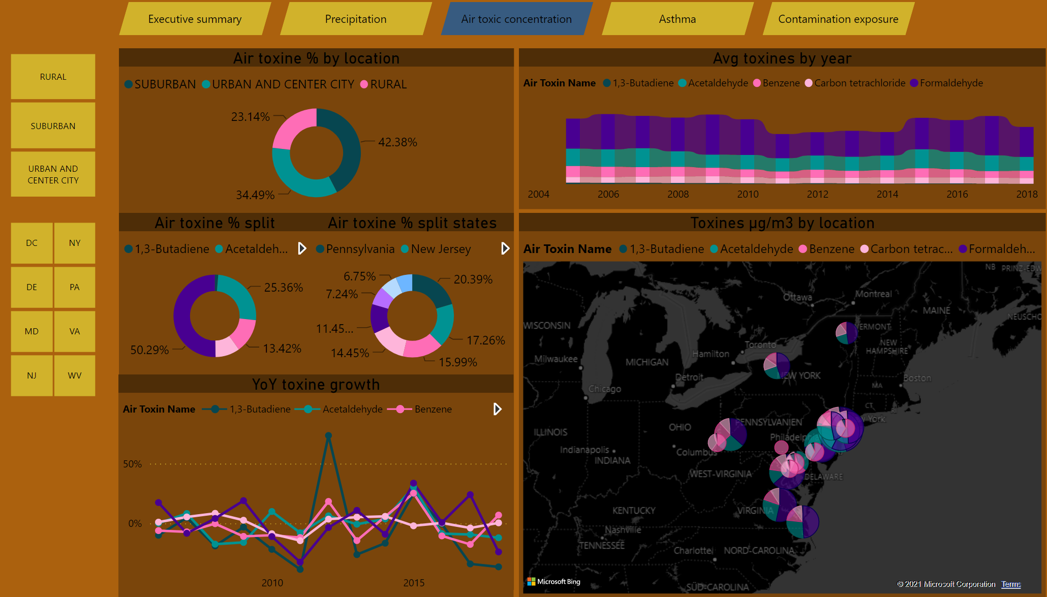
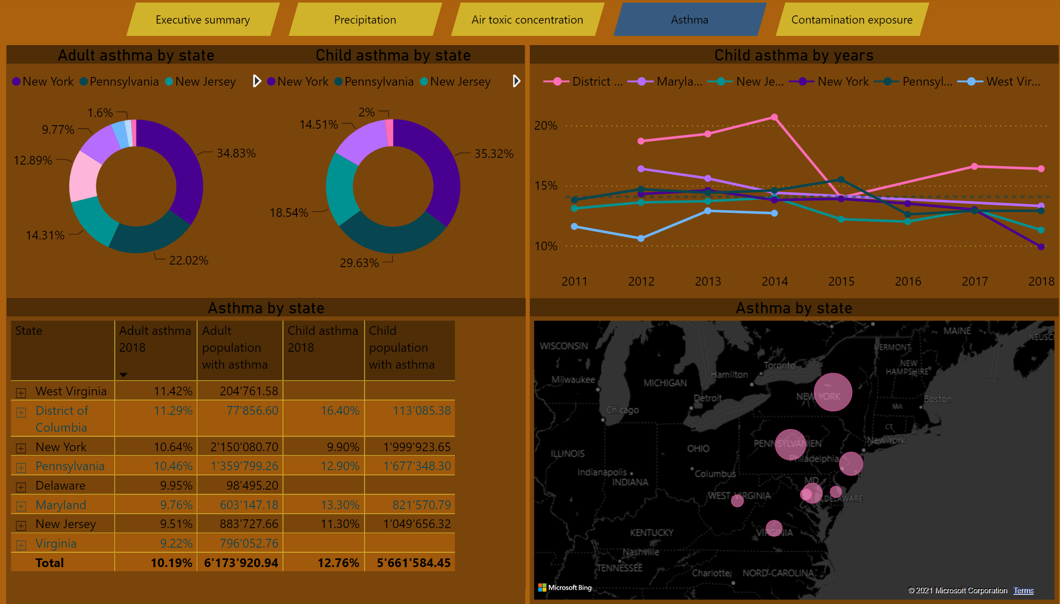
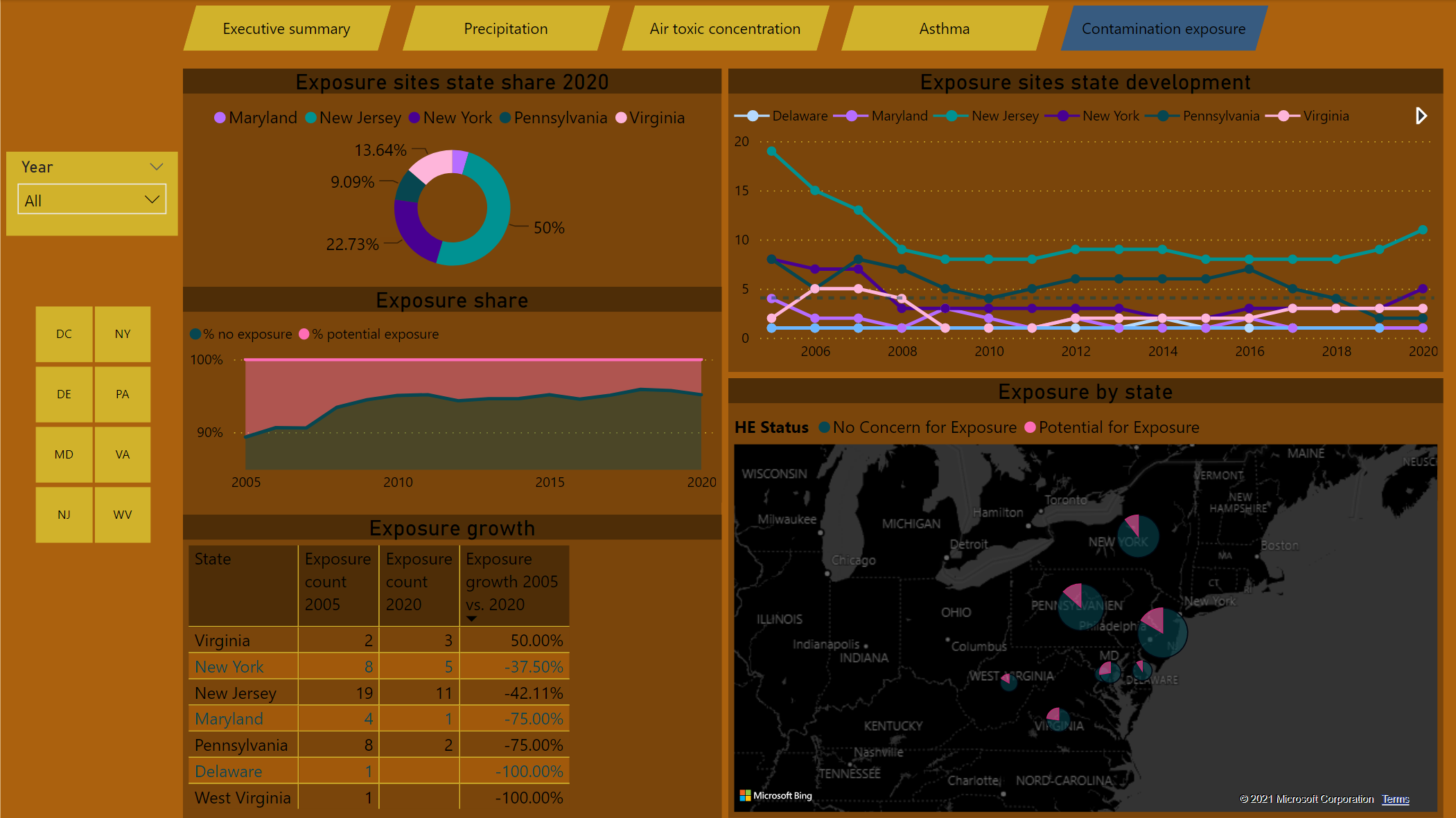
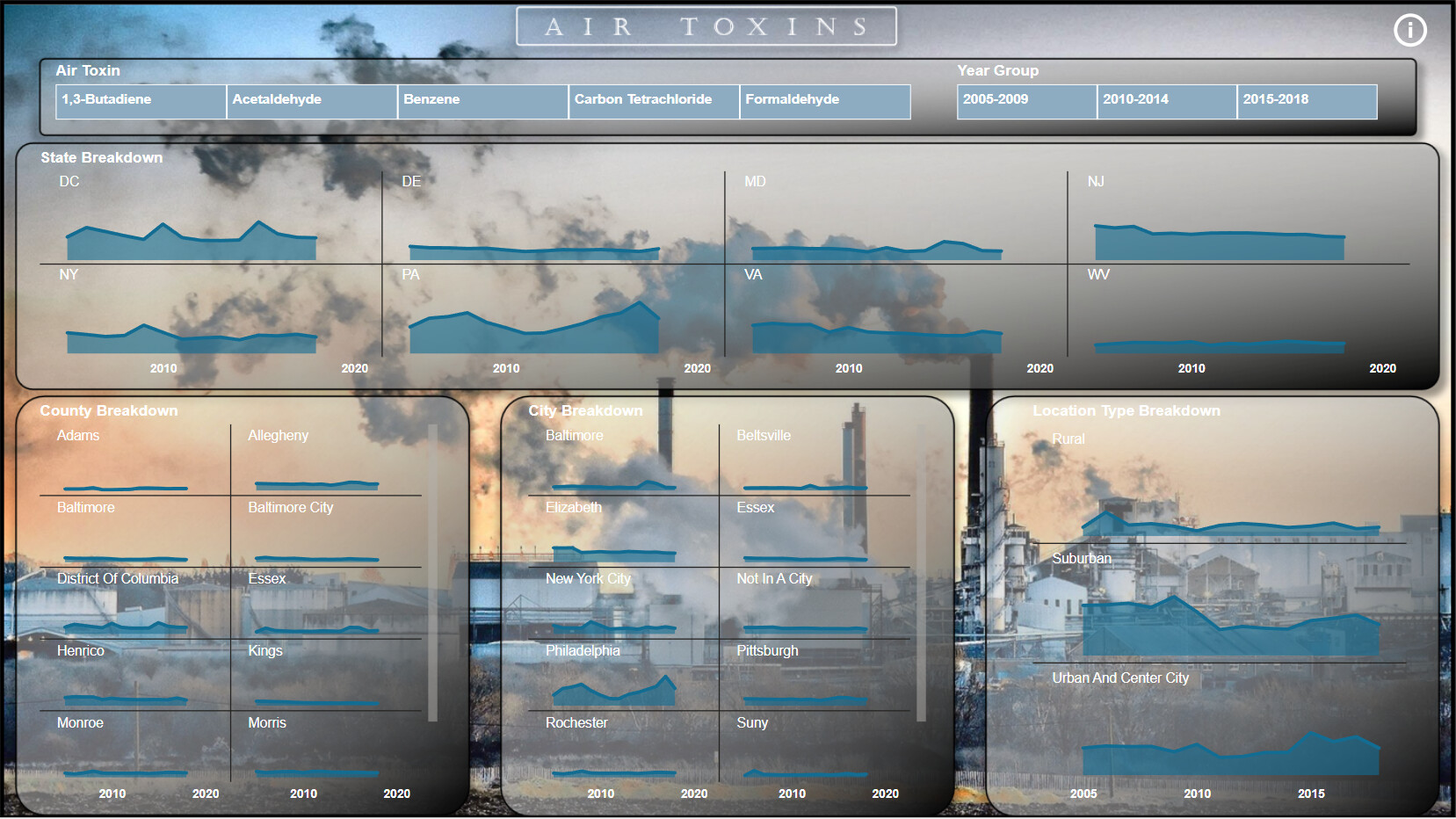
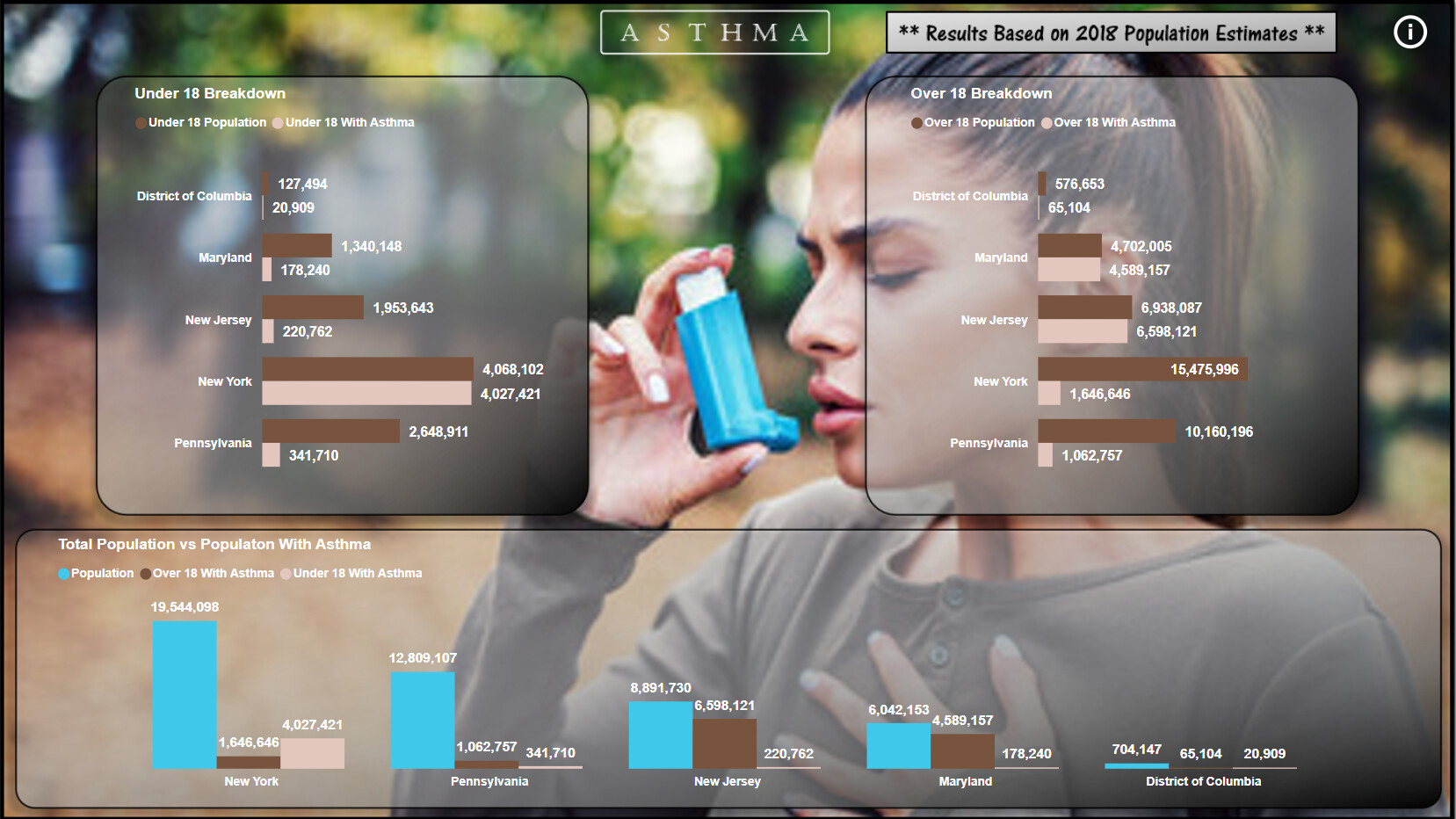
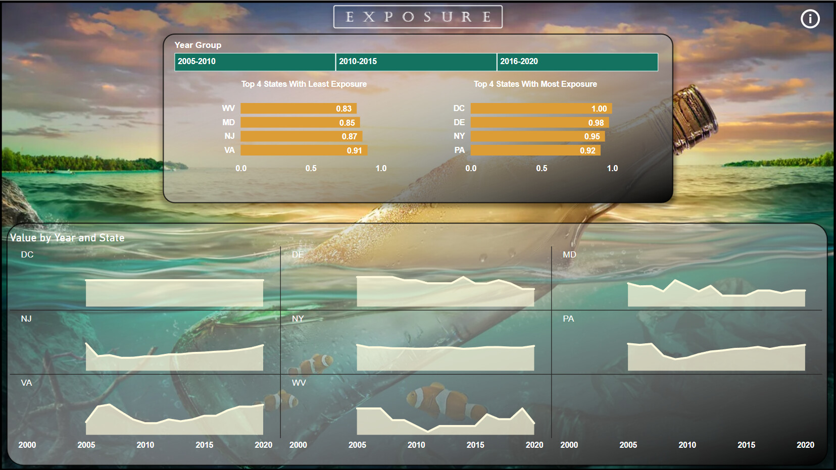
Looking at the data and the topic I knew I wanted to incorporate the geographical aspect so I decided to add a map to each page, I decided to show state values over location for contamination and asthma, and kept the location level for rainfall and air toxines.
Then I look into other angles and filter which could be useful to apply and tried to incorporate this to each page. For rainfall I struggled with the days analysis/harmonization so I decided to leave this out and just went with %. For asthma I left out the race component in the analysis.
I added some filter buttons on the side where I believe it may be useful.
Other than that I just went with the flow, added some growth rates, distribution charts etc. what seemed insightful. For some results I defer from other entries, so my DAX maybe a bit off in some cases.
Hope you like it, appreciate feedback and suggestions how to improve.
I sent the report to Brian for uploading.
Cheers,
Seb
6 Likes
@Slipper ,
Like some of the analytics that you have incorporated, but the color theme needs some work. Too many different colors that do not match. I would also use White as the overall text color, since you have a dark background on the reports. Something you may want to try is do a google search for a picture that you feel the colors are appealing, and then use the following website to pick the colors as your theme. https://imagecolorpicker.com/
I did a course on report development from start to finish. I would definitely suggest going through the course if you have not already done so. Keep up the good work. I look forward to your future entries!
Here is the link to the course I mentioned:
Thanks
Jarrett
4 Likes
Here’s the entry from one of our non-member participants, Gliceria.
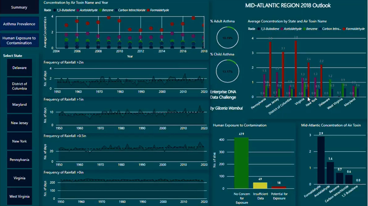
Here’s how Gliceria described it:
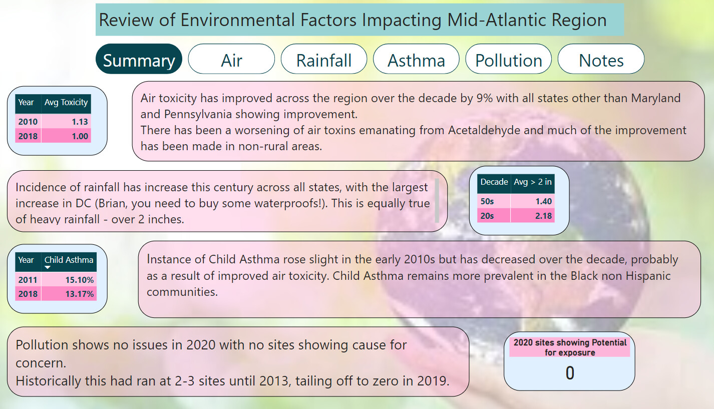
I accepted the Enterprise DNA Ltd challenge for the first time. I enjoyed working on the environmental data with the aim of showing the growth patterns in key indicators: heavy precipitation, ambient air toxins, asthma prevalence and human exposure to contamination in the Mid-Atlantic region.
4 Likes
Thanks @JarrettM ,
I have not done any course on report development yet but surely will.
Thanks a lot for the tip with the pic and website!
BR
Seb
2 Likes
Here’s the entry from one of our non-member participants, Chandra.
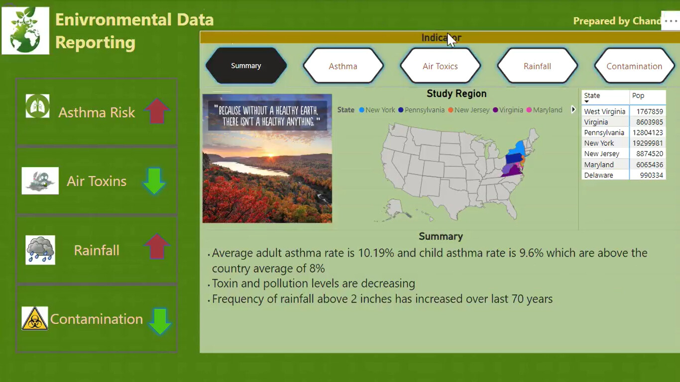
Here’s how Chandra described it:
Power BI Challenge 17 – Environmental Data Reporting
Enterprise DNA Ltd, I accepted the #EnterpriseDNAPowerBIChallenge.
Thankyou for giving the great opportunity to work with environmental data.
Any feedback would be greatly appreciated. Thankyou.
Data: United States Mid-Atlantic Region Environmental Data
Tools Used: Power BI
4 Likes
You had no need to be, but I can understand that feeling. Well done again for joining in the fun!
2 Likes
@Paul.Gerber - This is a super entry! Fantastic work here 
3 Likes
Excellent work Chandra, I know you for a while now in LinkedIn and your improvement is noticeable, meaning you’re doing your homework and putting the hours  Well done
1 Like
Another of my LinkedIn connections working hard and improving by the day, excellent entry Gliceria
1 Like
Thank you so much @FPastor
2 Likes
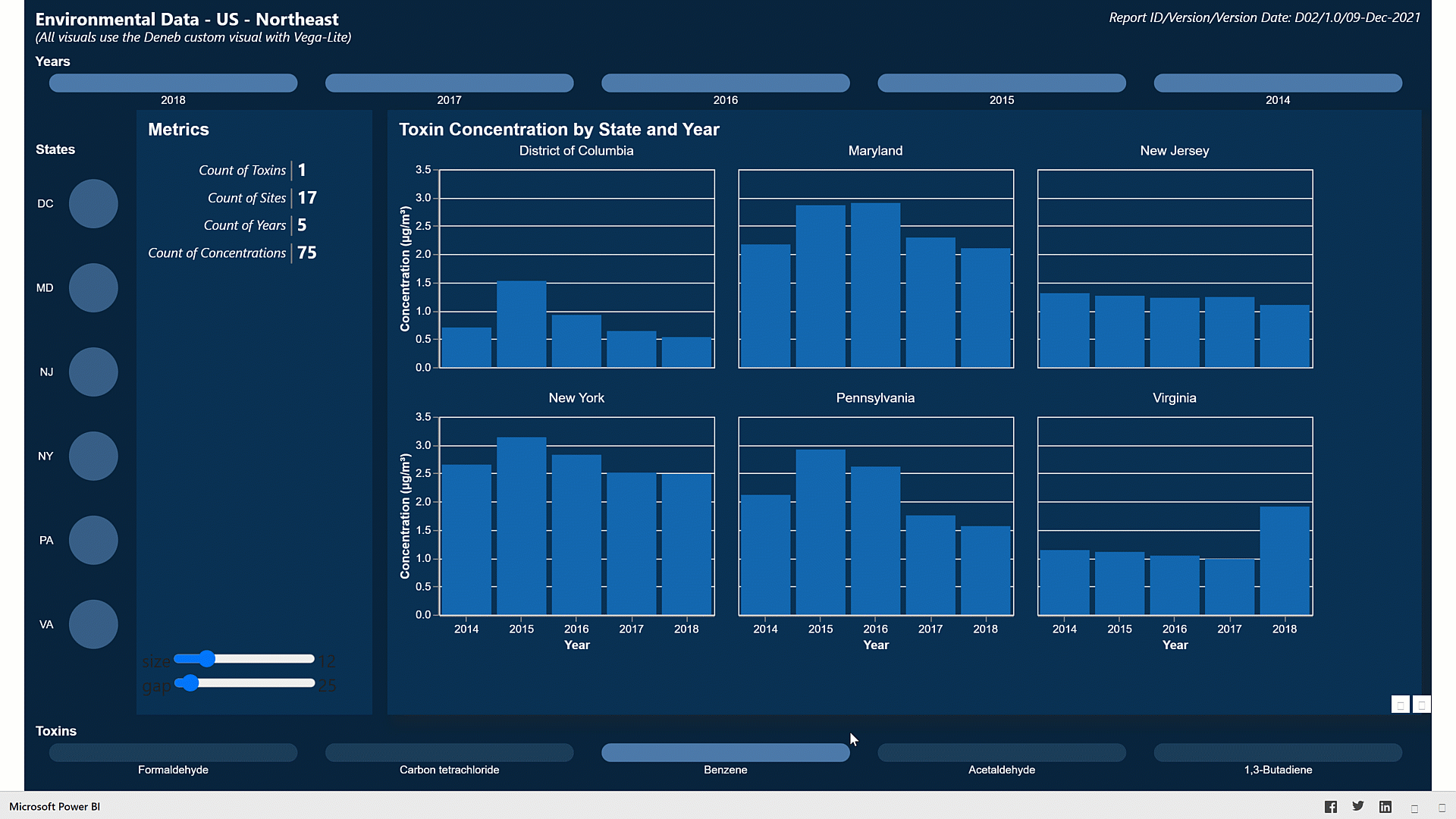
Here’s my partial submission (air toxins only) using only Deneb visuals (no Power BI visuals) for Data Challenge 17, Environmental Data Reporting.
Here are the notes I kept during development:
Goals:
- to gain experience with the Deneb custom visual and the Vega-Lite language
- to maximize the time available to learn the Deneb custom visual and the Vega-Lite language,
- minimize the data analysis by restricting the dataset to a single parameter (air toxins), making this only a partial solution
- minimize the “normal” Power BI work (data loading and transformations, data modelling, DAX calculations)
- to create all visualizations using the Deneb custom visual and the Vega-Lite language
What needs more work:
- I was able to use Deneb/Vega-Lite bar and column charts as slicers with either overlapping labels or reduced opacity for unselected items, but the Vega-Lite syntax to enable both proved elusive; I chose to implement the reduced opacity and defer the overlapping levels
- my basic implementation of the 3 Deneb/Vega-Lite bar and column charts (years, states, toxins) with the intent of them being completely separate slicers was unsatisfactory, and each selection in one slicer overrode the selections in the other two slicers, so I had to resort to using the filter pane to restrict the years and states available
- I was unable to find the correct Vega-Lite syntax to set the text colour of the input widgets in the “multi-row card” (metrics) for font size and vertical gap; I had hoped to show white text on a dark background instead of the default dark grey, which led to poor visibility
Deneb/Vega-Lite:
- composed standard Power BI measures for report title, report subtitle, and report info
- used report title and report sub title in a left-aligned text visual at top left
- used report info in a right-aligned text visual at top right
- used a bar chart with bar marks for [Years] as a slicer; used dedicated hard-coded measure to set bar size to 1; exchanged X and Y to turn bar chart into a column chart
- turned off tooltips
- turned off chart border by adding [“style”: { “cell”: {“stroke”: “transparent”} }] block to [Config] section of visual
- used a bar chart with circle marks for [States] as a slicer
- turned off tooltips
- turned off chart border by adding [“style”: { “cell”: {“stroke”: “transparent”} }] block to [Config] section of visual
- used a bar chart for [Toxins] as a slicer; used dedicated hard-coded measure to set bar size to 1; exchanged X and Y to turn bar chart into a column chart
- turned off tooltips
- turned off chart border by adding [“style”: { “cell”: {“stroke”: “transparent”} }] block to [Config] section of visual
- used text visual with 12 layers of text marks to simulate a multi-row card
- used parameters for text colour of category, separator, and data to ensure each “card” was coloured consistently (the use of “grey” as separator colour did not contribute to the usefulness of the visual but rather was an exploration of one of the available customization features of the Vega-Lite language)
- used standard Vega-Lite input widgets for font size and vertical gap and bound those widgets to the visual (this did not contribute to the usefulness of the visual but rather was an exploration of one of the available interactive features of the Vega-Lite language)
- used a bar chart faceted by state to show toxin concentration by state and year
- used a parameter for text colour to ensure all titles and labels were coloured consistently
- used a custom tooltip to show state, year, toxin and concentration [with title of “C (µg/m³)”]; set concentration tooltip to show only 2 decimal places
- used ALT codes for special characters for micro symbol (µ) [ALT+230] and cube symbol (³) [ALT+0179] to set the concentration units
Setup:
- disabled “Auto date/time” option
- disabled “Auto detect relationships” option (both “Import relationships from data sources on first load” and “Autodetect new relationships after data is loaded”)
- enabled “Change default visual interaction from cross highlighting to cross filtering”
General:
- there were duplicate data entries for site 240053001 (Baltimore/Essex), so deleted the 2nd one
Data Loading:
- loaded [Air Toxin Concentrations] Excel sheet; moved to [Staging Queries] group; disabled load
- create reference of [Air Toxin Concentrations] as [Toxins]
- kept only [Toxin] column, removed other columns, removed duplicates, added index from 1 as [Toxin Key]
- create reference of [Air Toxin Concentrations] as [Sites]
- kept all “site” columns (removed other columns - Toxin, Concentration in Year), removed duplicates, renamed [Site Code] to [Site Key]
- set data category of city, county, state, latitude, longitude columns
- create reference of [Air Toxin Concentrations] as [Years]
- kept only [Site Code] and […Year] columns, selected [Site Code] column, un-pivoted other columns, removed [Site Code] and [Value] columns, renamed [Attribute] to [Year], removed duplicates, sorted by [Year], changed type to [Whole Number]
- create reference of [Air Toxin Concentrations] as [Concentrations]
- merged with [Toxins}, kept only [Toxin Key], removed [Air Toxin Name]
- removed “site…” columns (e.g., city, county, state, latitude, longitude, type)
- selected [Site Key] and [Toxin Key] and un-pivoted other columns;
- renamed [Attribute] to [Year], set type to “whole number”
- renamed [Value] to [Concentration]
Data Modelling:
- used “Advanced” section of “Properties” pane to set “Summarize by” value for all fields to “None”
- used [… Key] columns to link [Concentrations] and [Toxins]
- used [… Key] columns to link [Concentrations] and [Sites] (unsure why Power BI insisted on a relationship with cardinality = many-to-many, direction = both; will certainly give suspect/wrong numbers, but as the goal is to learn Deneb/Vega-Lite coding, errors in the data model are not important for this exercise)
- used [Year] columns to link [Concentrations] and [Years]
9 Likes
Wow superb Greg.
And some fantastic submissions all round.
2 Likes
Hey guys
Inaugural challenge boy here. Treat me gently! This is a long way removed for me. I’m normally managing financials ![]()
 .
.
Some of you guys are just stunning at this stuff. Reckon you all need to get out more and I need to stay indoors and practice.
Any tips or pointers on themes an presentation appreciated here. Plus any general comments. But really fun thing to go at.
Pete
6 Likes
Thanks for participating! Just let me know if you need me to publish your entry to the web.
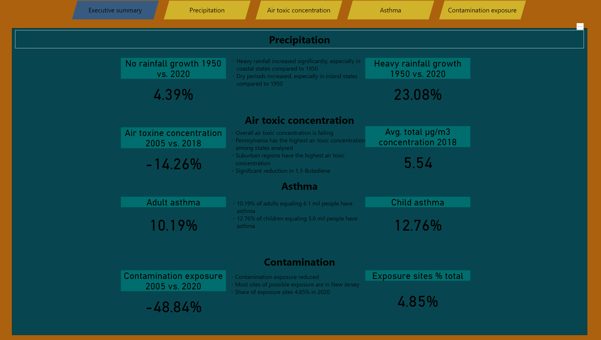
@sam.mckay and I both will be providing detailed feedback on each entry after closing, but I will say right off the bat that I love that you’ve put your summary of key trends right up front in your report, and backed them up with the KPI thumbnails. Also, thanks for the personalized precipitation warning. 
- Brian
1 Like
sorted publish to Web Brian. Thanks
Here is my entry for Challenge 17. Hope to a have a full writeup sometime over the weekend. Nothing too crazy with this entry, but tried to create colorful appealing themes for each of the pages of my report. Instead of having one overall color theme, each page had its own theme based on the background picture. Almost all of the design work was done in PowerPoint. Looking forward to seeing all of the upcoming entries.
Thanks
Jarrett
4 Likes
Very creative! The background images are beautiful
3 Likes
Nice impact write up Diana, I really like the layour and colours
1 Like