Thank you !
@KimC ,
I think the attached tab-delimited file should be just the ticket…
- Brian
2021_Gaz_counties_national.txt (632.5 KB)
1 Like
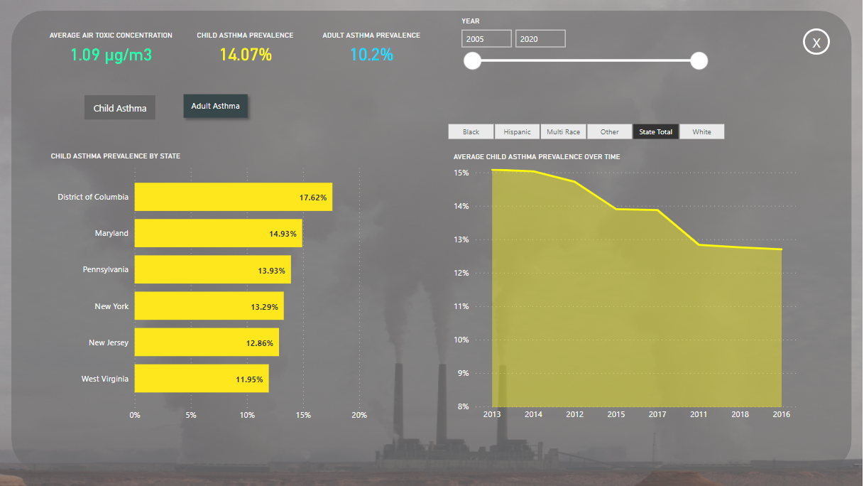
@JarrettM nice  I am not a fan of background pictures…I think background pictures overtake/ become predominant in the canvas and take away from the data analysis itself.
F Pastor
2 Likes
Perfect, thank you Brian
2 Likes
@FPastor ,
You definitely have to be careful when using background pictures in your report so that it doesn’t take away from the analysis, but if used properly it can give your reports the wow factor.
Thanks
Jarrett
2 Likes
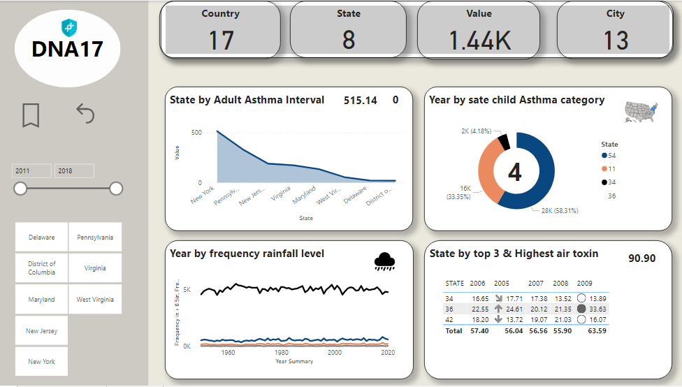
Attached is my submission for the challenge.
(@BrianJ - if you are able to upload this that would be greatly appreciated)
Some key notes in my approach:
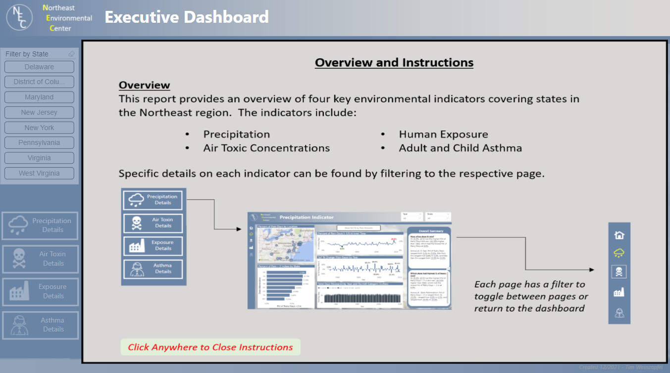
- First, I opted for a brief user experience by providing an initial set of a brief overview and instructions. I would have liked to have pursued this a bit further but ran out of time so opted with a simple screenshot of instructions that can be closed by the user.
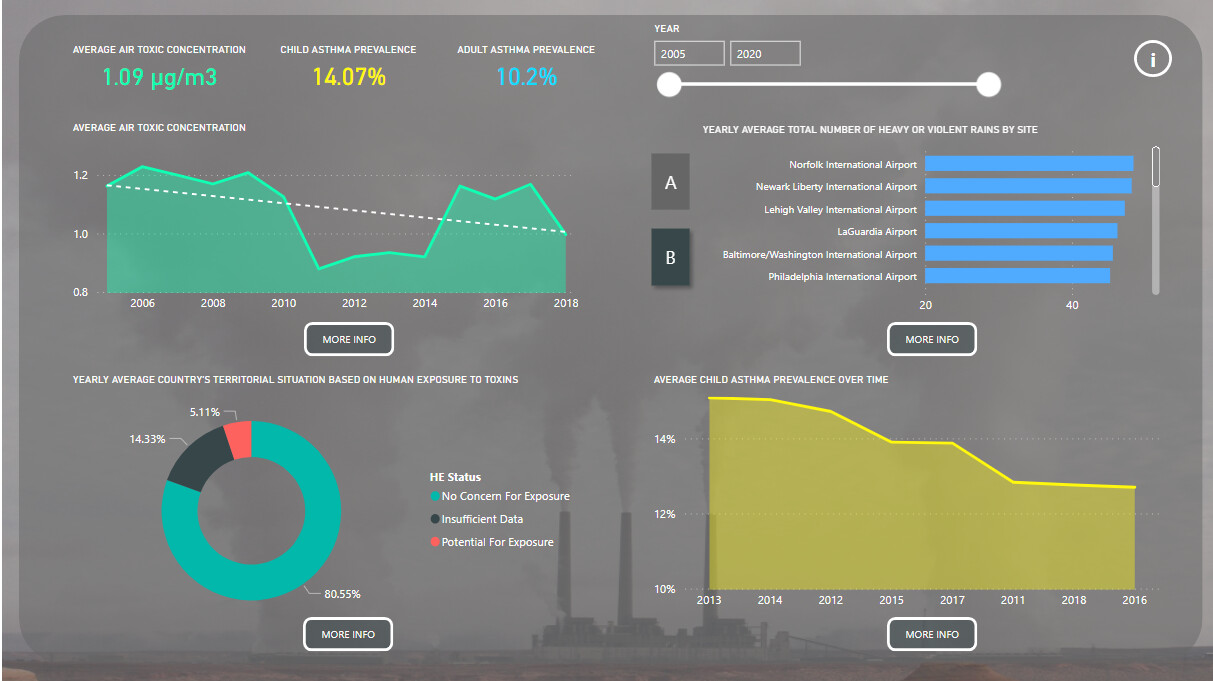
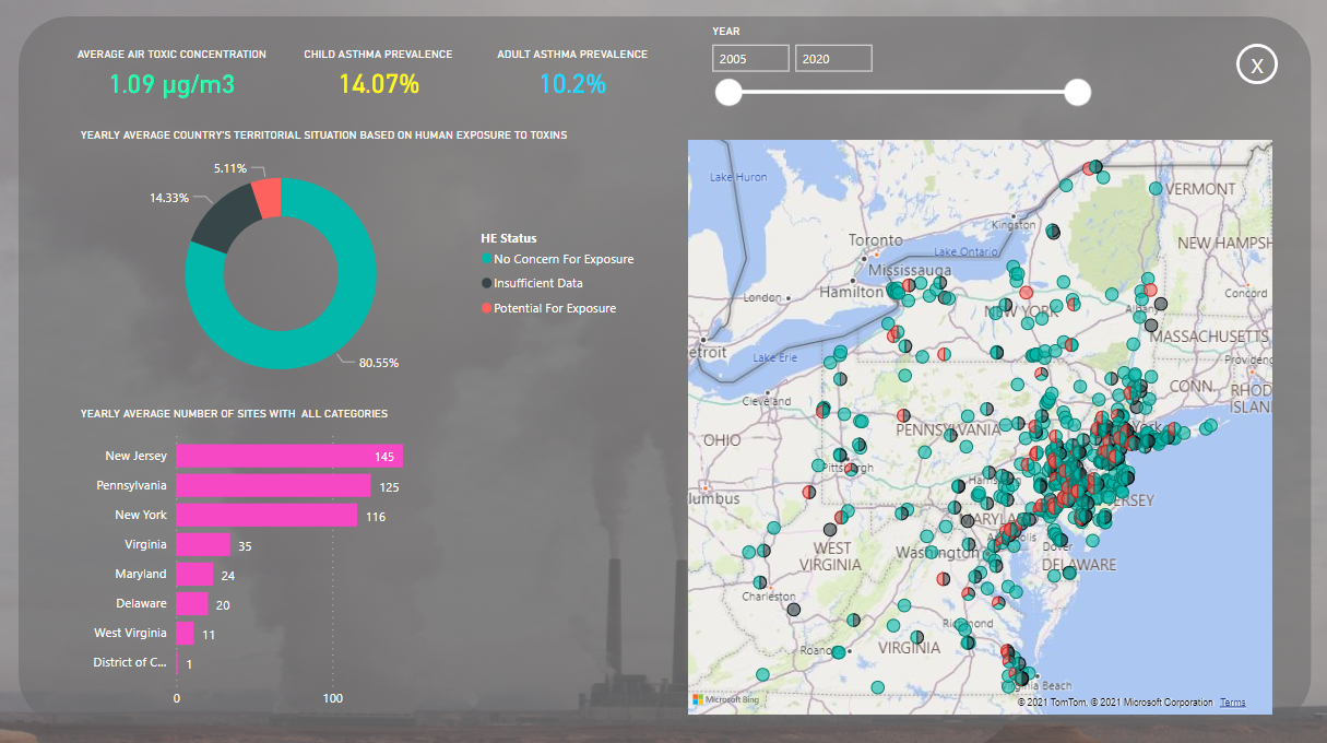
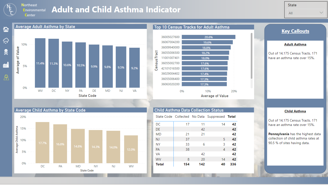
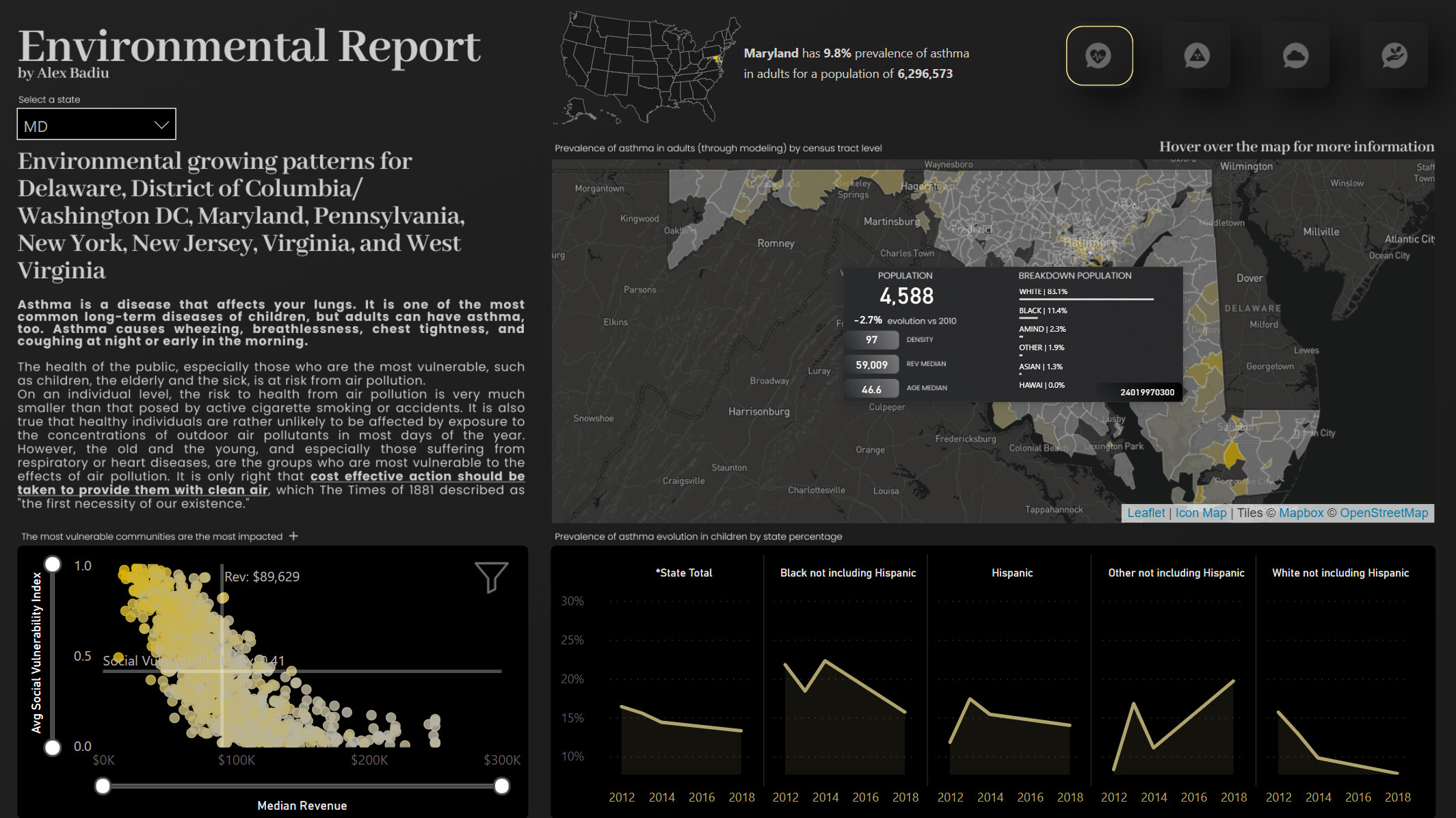
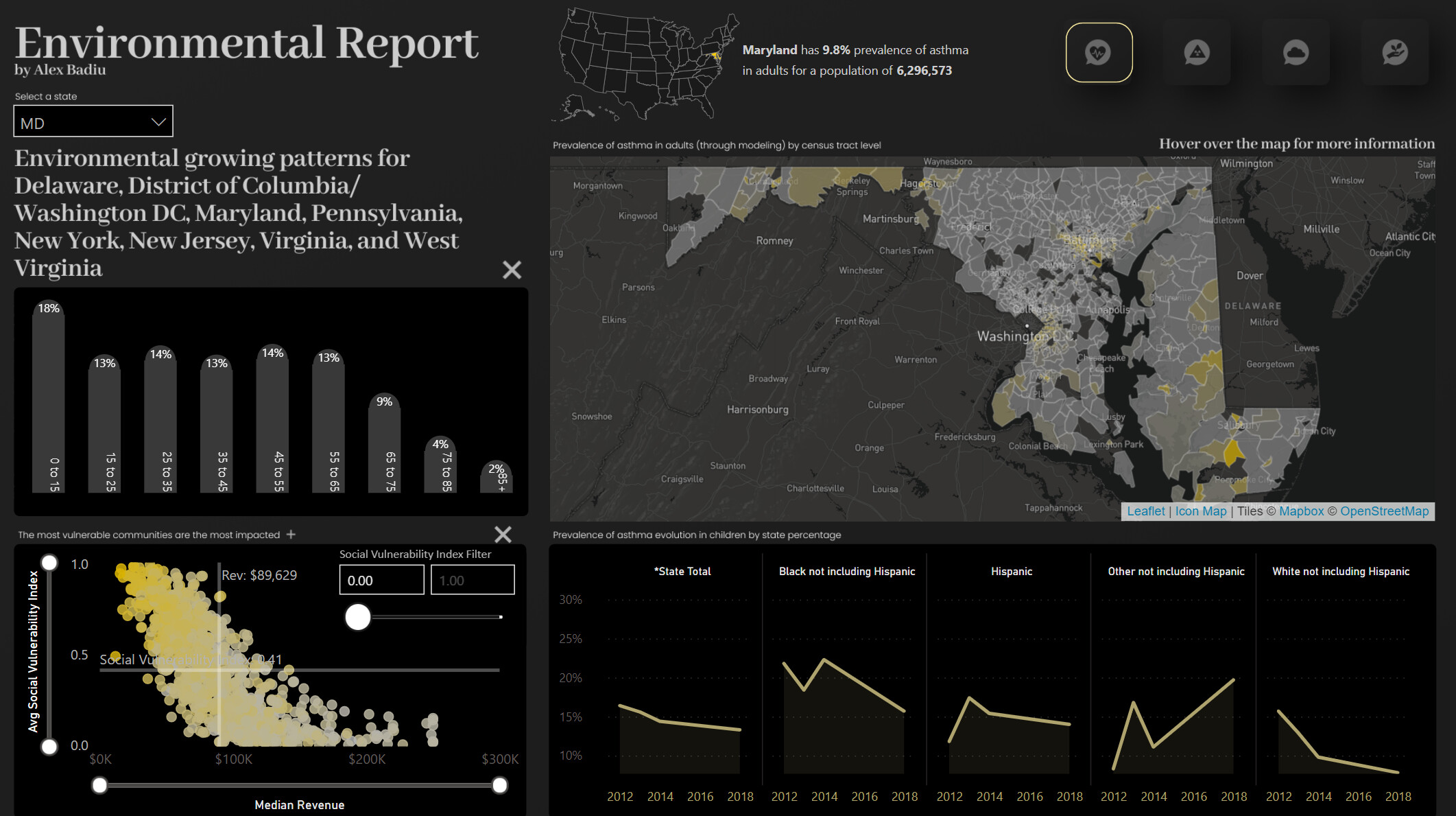
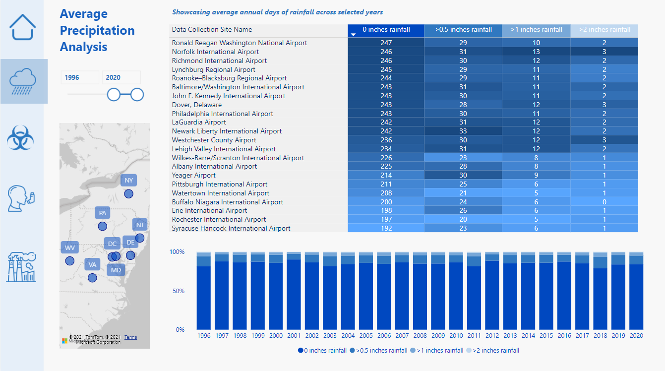
- The report is structured with an overall executive summary that provides some key charts for each indicator and then a separate page to drill further into the details for each one. Each screen has some simple navigation to allow the user to toggle between the various pages or return to the main dashboard.

Some Key Report Features:
-
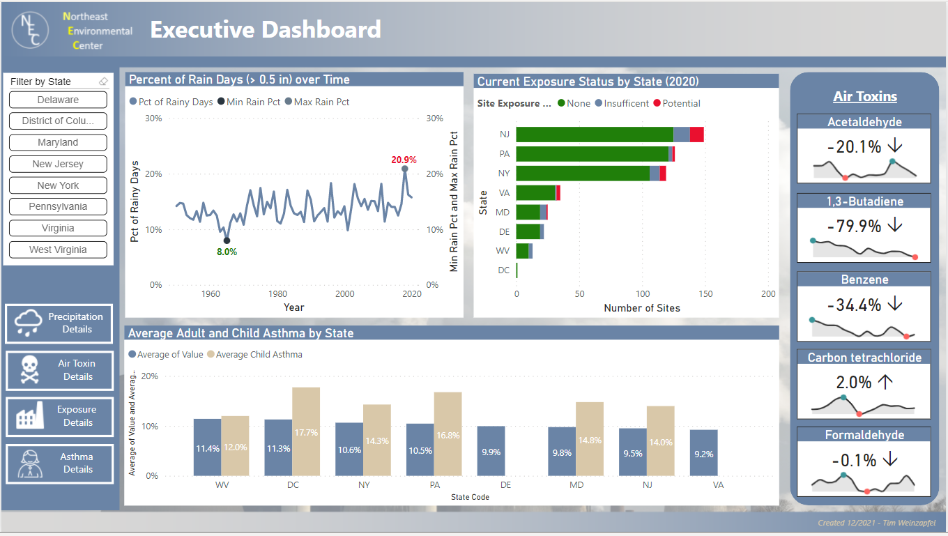
Even though each indicator is separate and not related to each other, the overall summary page can be filtered to specific states which then filter through all indicators on this page.
-
Most pages include smart narratives to provide some key callouts to various topcs
-
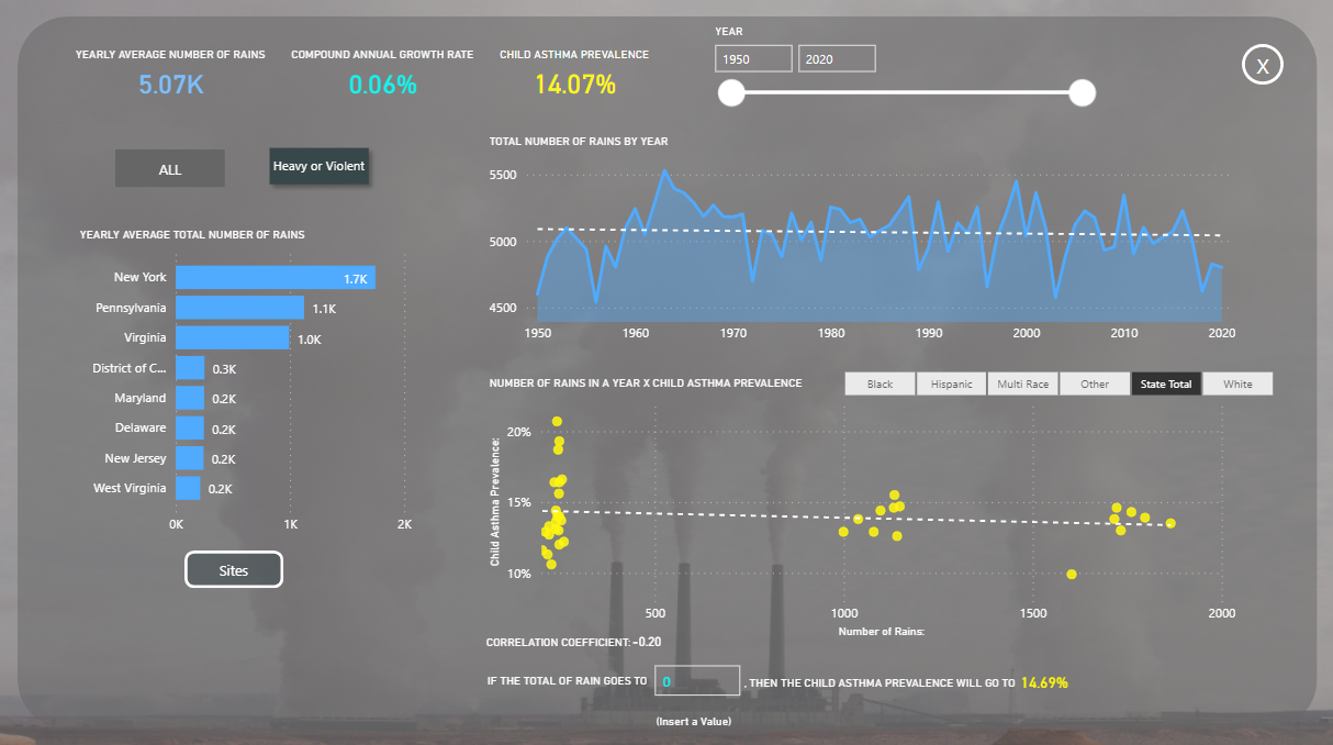
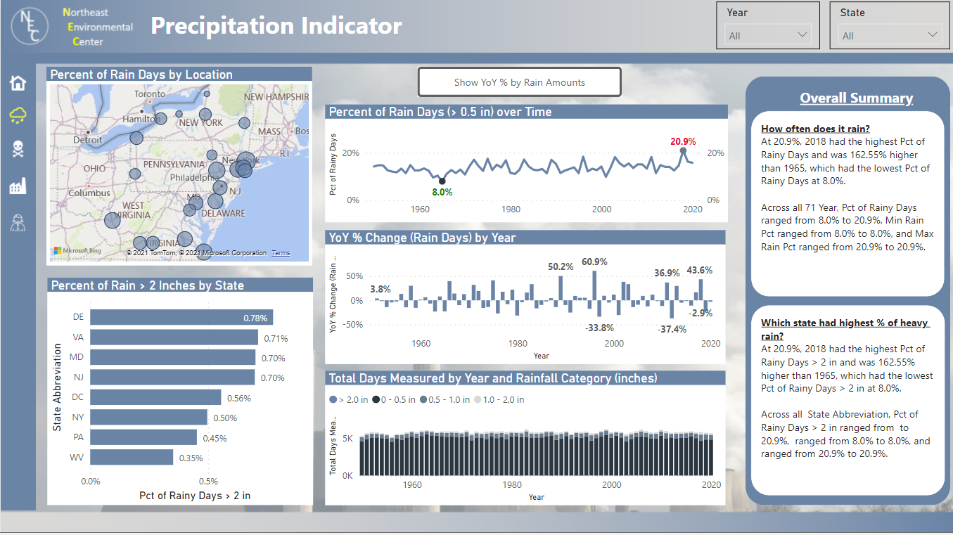
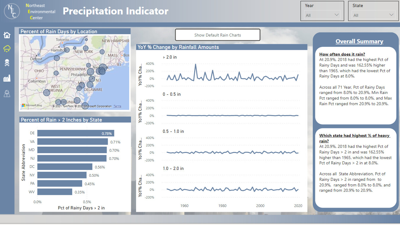
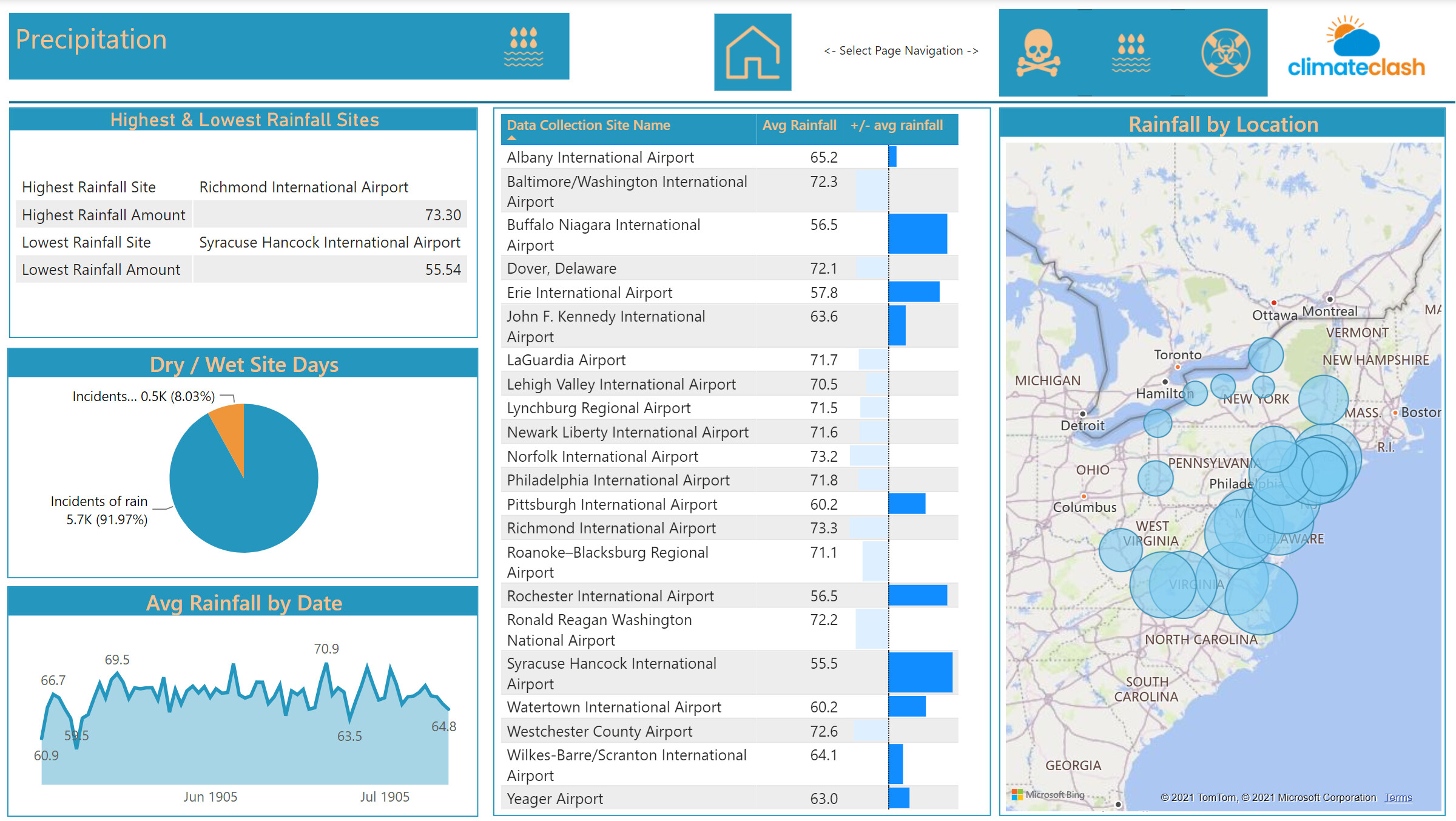
For the Precipitation analysis, there is a button to toggle between various rainfall trend charts. This was done to provide additional information without forcing the user to go to separate pages. Another key point here is that my analysis looks mostly at the percentage of rainy days versus the actual count. Because the data did not track rain amounts with a consistent number of days per year, I felt that this was a better comparison.
-
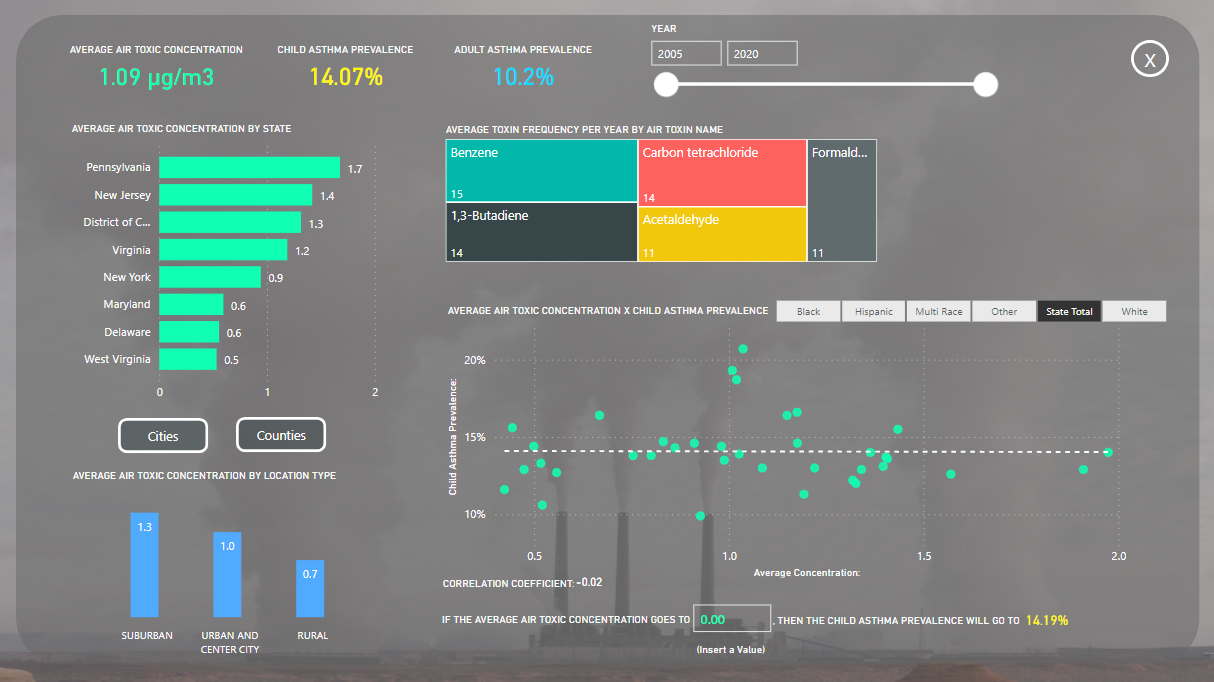
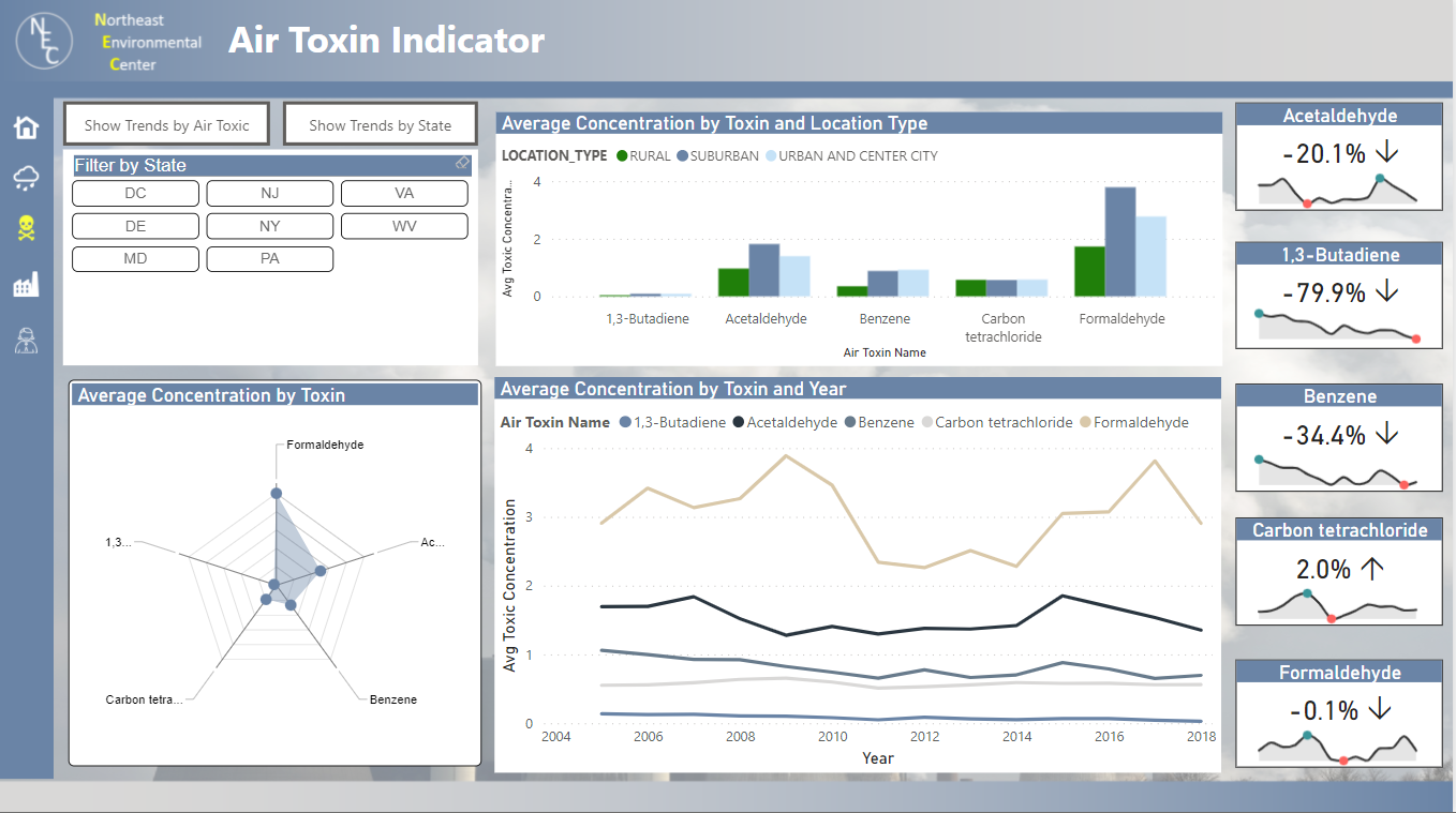
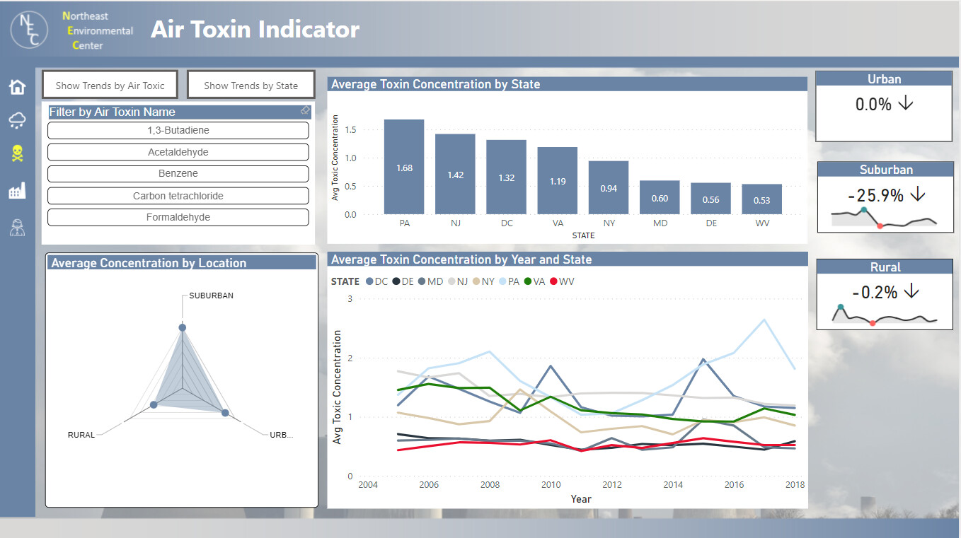
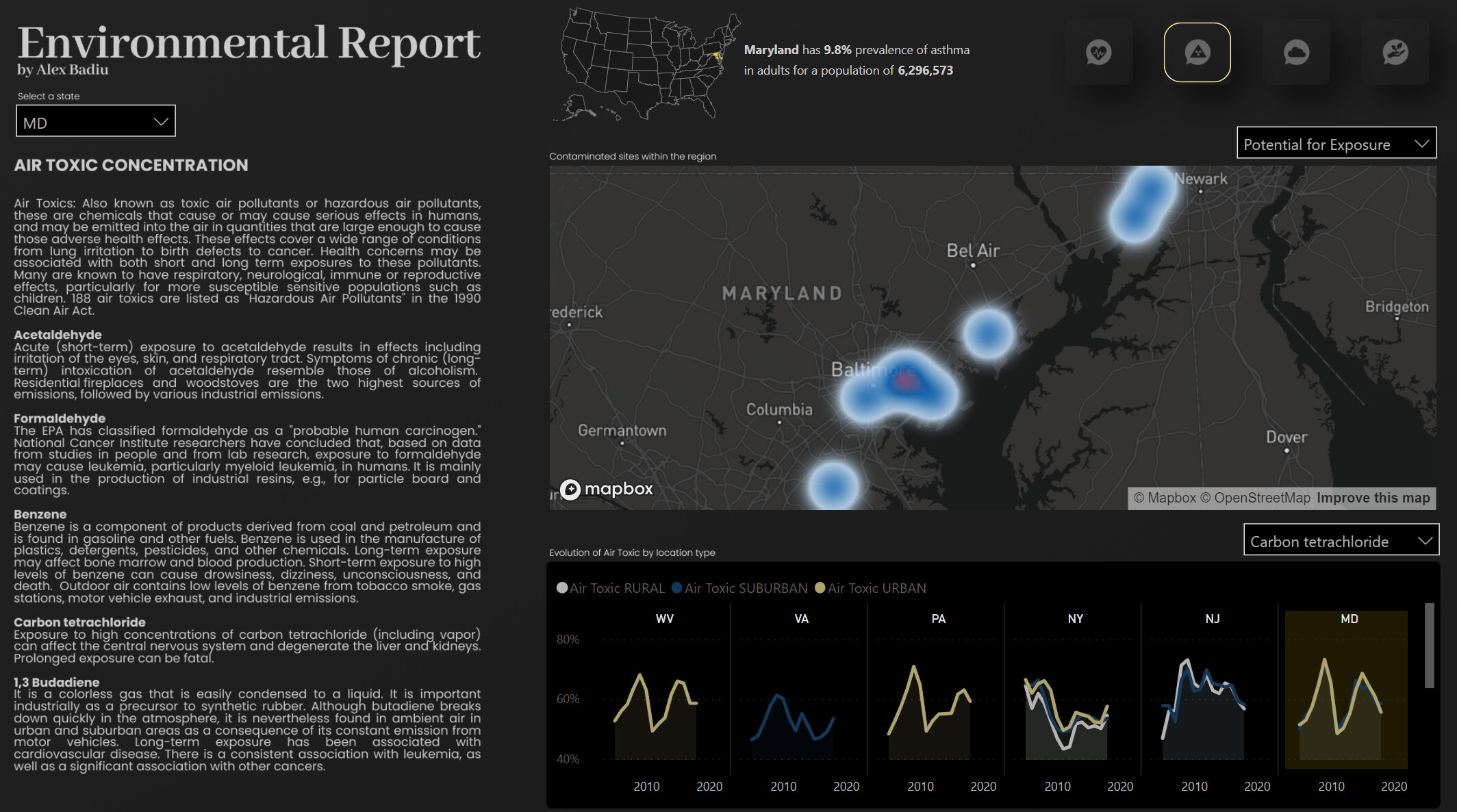
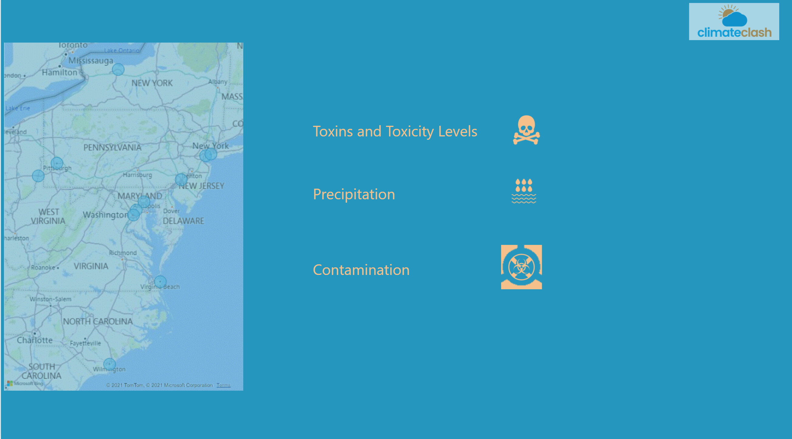
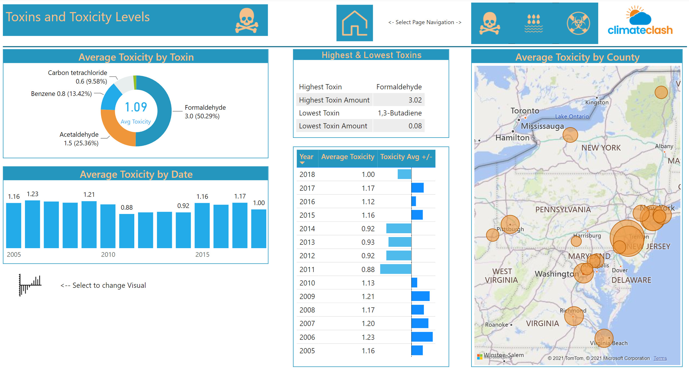
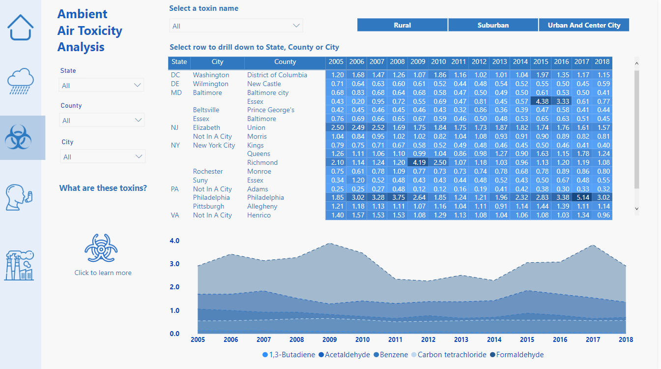
For the Air Toxins analysis, I wanted to provide the user with the ability to toggle between looking at the data from a State perspective (which would look at trends for all toxins in the respective states) or from a Toxin perspective (which would look at trends across the various states). Buttons were added which would toggle the visuals between these two comparison approaches.
Lastly – some special credits for resources used in the development:
- Icons used through were obtained from https://www.iconsdb.com/white-icons/
- Idea for the cards used in the Air Toxics section was taken from Havens Consulting (https://www.havensconsulting.net/) using both a standard Card visual along with the custom visual Sparkline by OKViz
- Radar Chart used on Air Toxics page done through the custom visual Radar Chart 2.0.2
Overall File:
Challenge 17 (Weinzapfel).pbix (9.2 MB)
5 Likes
Wow - absolutely epic entry. It’s obvious you put a ton of time and thought into this one.
Detailed comments to follow after close, but thanks so much for participating!
Here’s your publish to web link:
Fantastic! very well done!
1 Like
Please find below my entry for Challenge 17, Environmental Data Reporting
Spoiler alert: I found a use case for the latest feature in Power Bi - Rotate a pie chart ![]()
9 Likes
Spectacular! Though for the life of me I can’t figure out where you used the rotate pie chart feature.
Seeing a pie chart in one of your reports would be like seeing dogs playing poker in a Picasso…

- Brian
1 Like
Here is the Challenge 17 submission from Enterprise DNA member and Accelerator stalwart Steven Stanford:
Excellent work, Steven! Thanks for participating!
- Brian
3 Likes
Done!
Took bit longer than expected. Most of the time just thinking about my visuals.
Here’s my publish to web link
8 Likes
Wow Alex just wow
1 Like
This looks fantastic – I can’t believe you did this whole report in one evening.
The color theme and navigation reminds me a bit of your Challenge #6 entry.
- Brian
2 Likes
Yeah a similar vibe. I seem to feel that style is really me so I stuck to it today
2 Likes
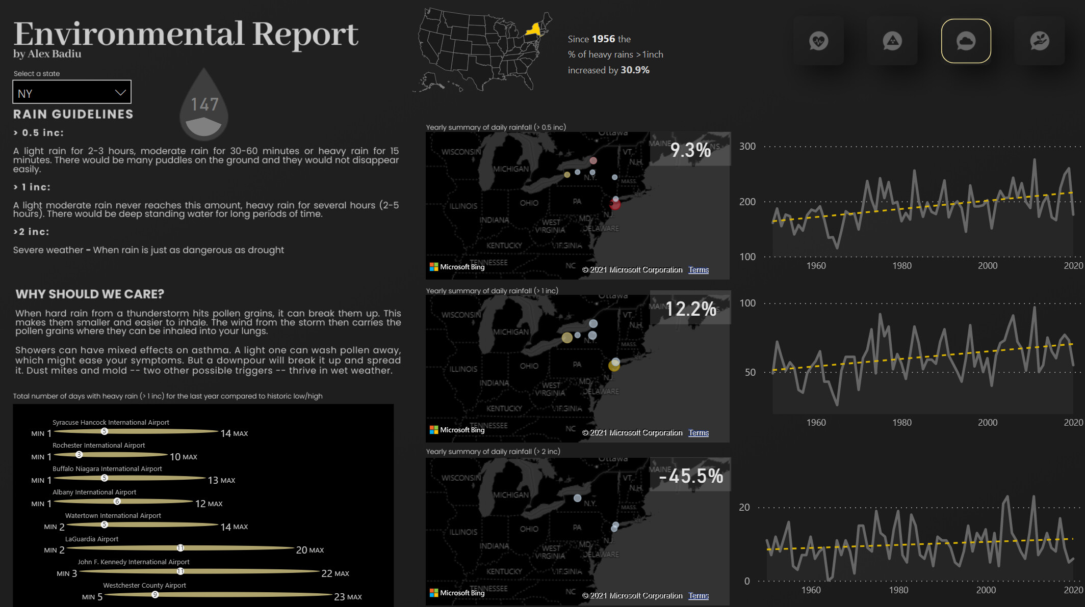
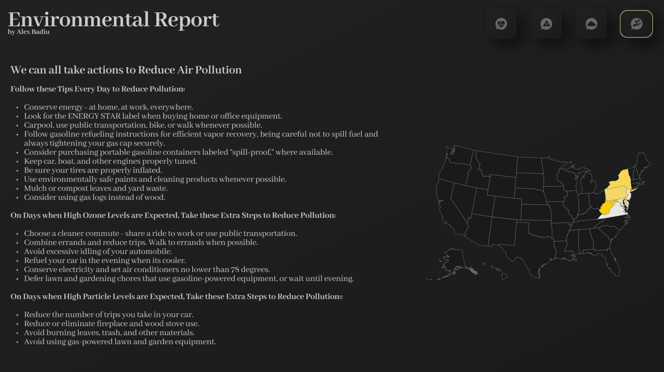
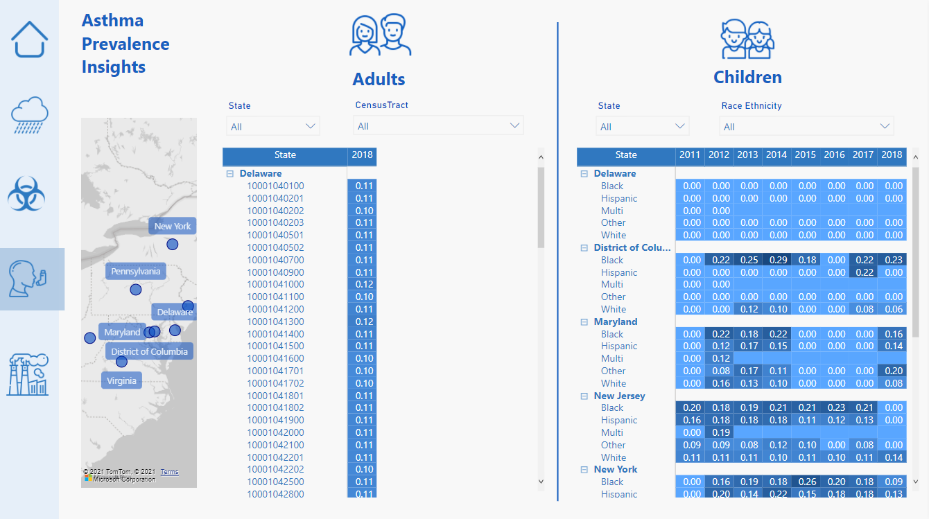
The asthma data was a bit difficult to do any quality analysis on. That’s the one page I’m not happy with but I just had to move on because I couldn’t dream up some interesting analysis that I just didn’t feel was there
1 Like