Yes, it is a bit of an annoying “oversight” on their part.
Absolutely right. I came across the same issue last week when I did the Bookmark Navigator and Page Navigator review videos of the November 2021 update. Microsoft did note it in the “known issues” documentation accompanying that update, but I think given the importance of that omission it was shockingly bad judgment to proceed with releasing the update without that functionality enabled.
– Brian
2 Likes
Hi @BrianJ
FYI
I’m not sure if they have fixed that issue in the latest update on December 1. There was update to Microsoft Power Bi on the Microsoft Store.
thanks
Keith
2 Likes
Okay. My first time doing a challenge. I have a free MS developer license. But I can’t publish to the web only share link. Any hints on how to make my report available?
In the very first post in this thread, there are specific instructions that answer your question. Please email @BrianJ , and he will do the publish to web for you.
Thanks
Jarrett
2 Likes
Hello eDNA community. I am a first time Power BI challenger but a Power BI user for almost one year. @Brian asked me to start doing these challenges so this is my first go.
When I first looked at the data and what the indicators were coupled with my target audience, my first thought was to find correlations in between the datasets. As an engineer, this is just out of habit. I think I was making this harder than what I needed it be.
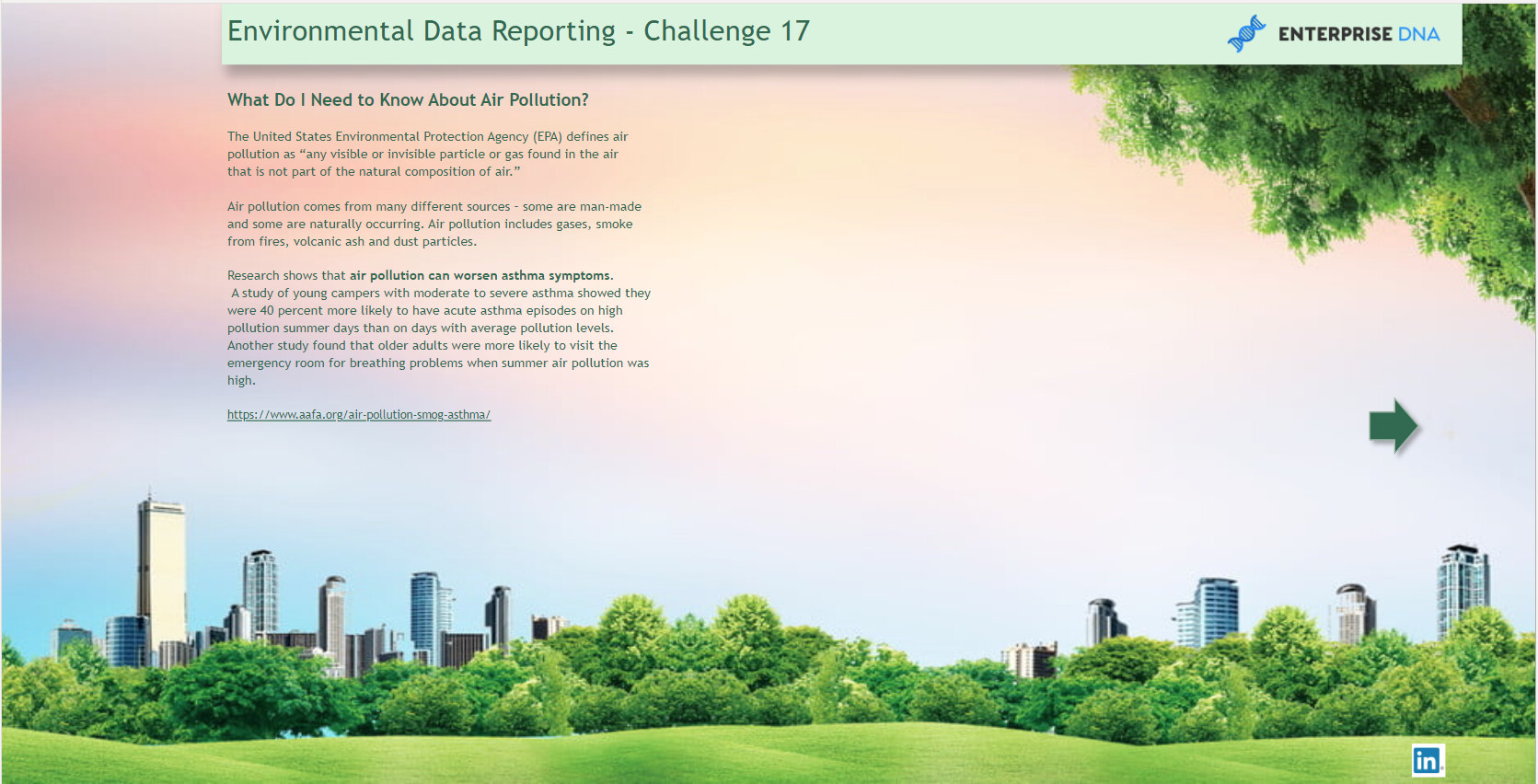
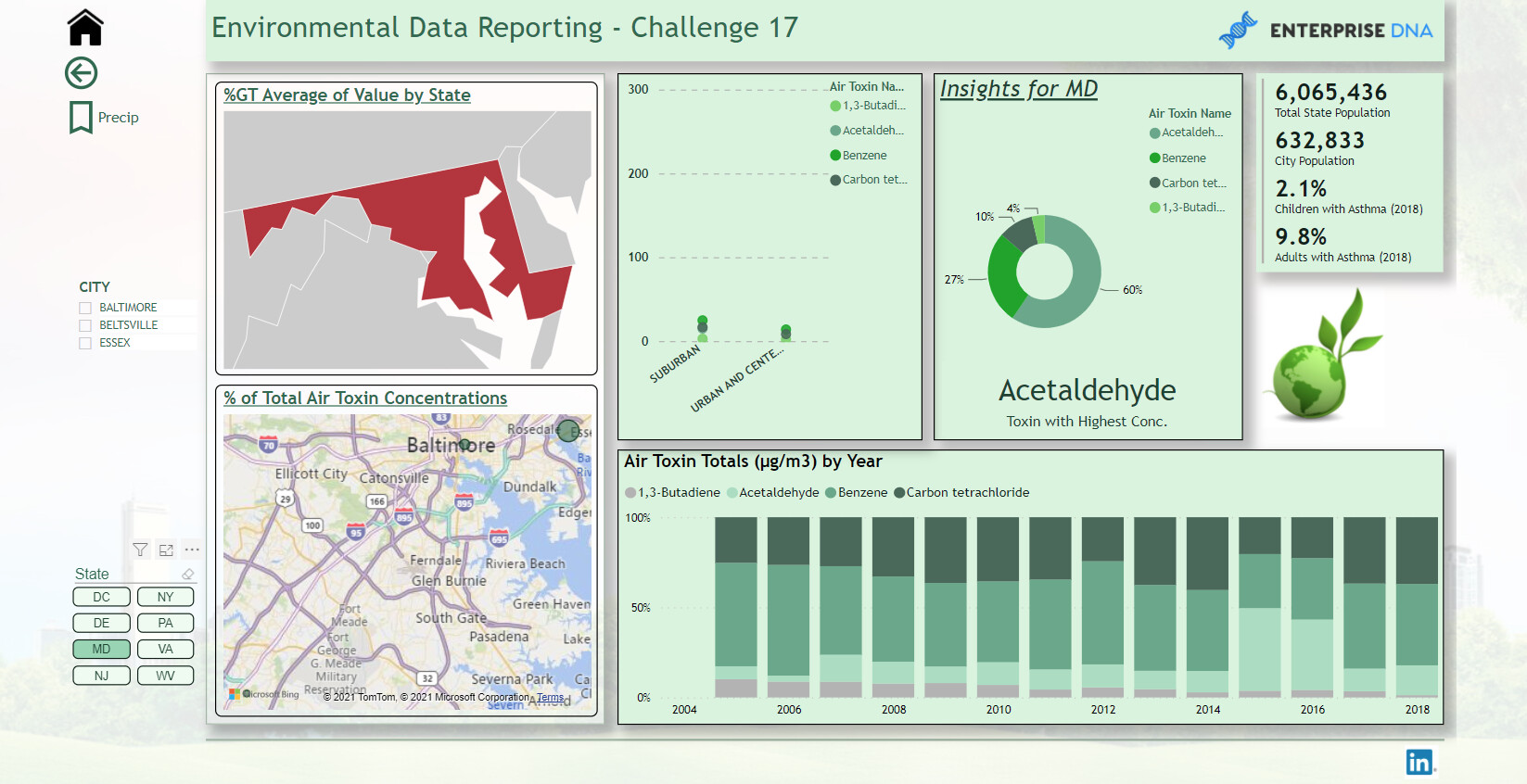
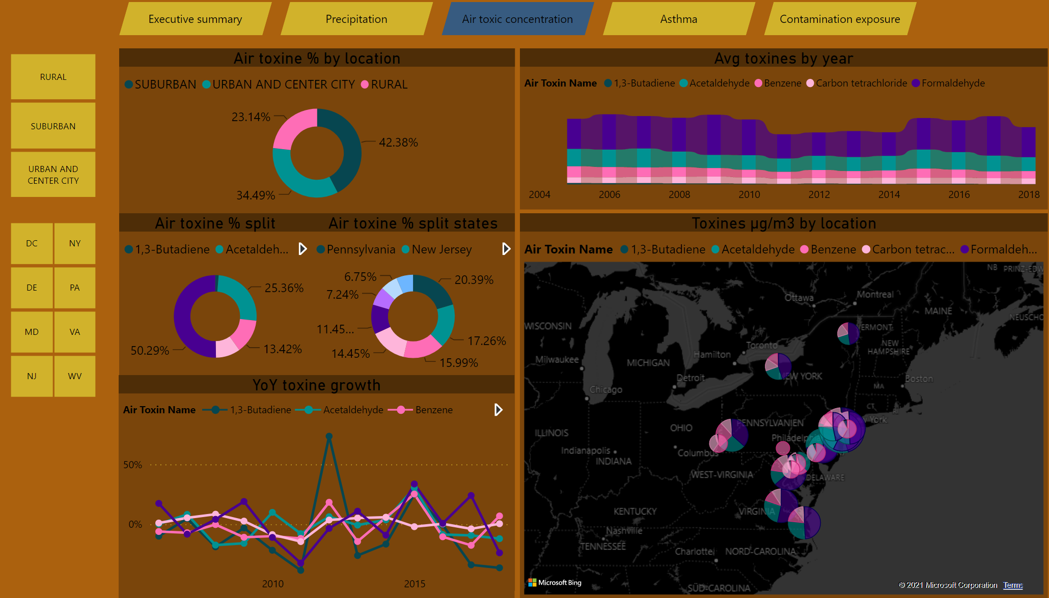
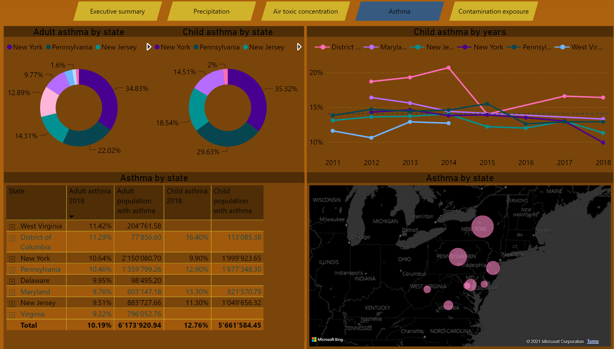
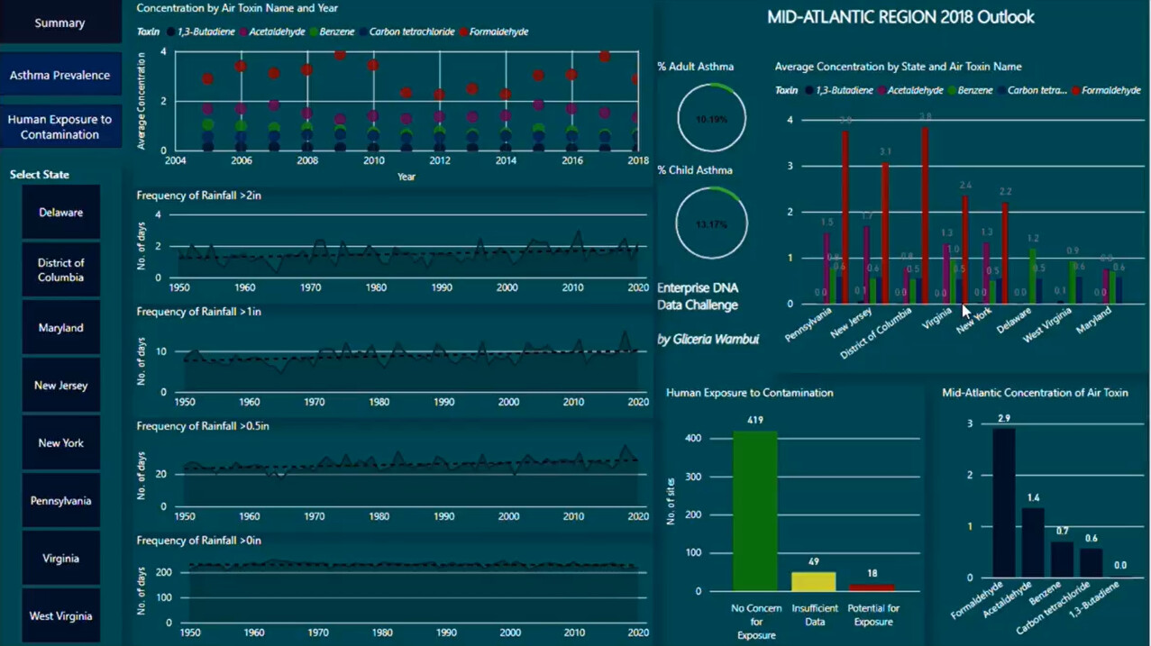
My approach at first was to see what toxins were related to number of asthma cases. Asthma in adults were higher than in children. But formaldehyde was a top toxin that was present in the majority of the states.
I tried to do a very simplistic approach. But doing this challenge I found that overall throughout the Mid-Atlantic states, children with asthma is slightly more than asthma in adults.
Also what was interesting, in all states over the course of years, formaldehyde was the highest contributor of air toxins.
What it Causes
Formaldehyde exposure is ubiquitous and occurs in homes, communities, and workplaces. Formaldehyde is a high-volume production chemical with numerous industrial and commercial uses as a solution, disinfectant, preservative or to produce industrial resins used to manufacture adhesives and binders in wood, paper, and other products. It is present in many household products, such as foam insulation, cleaning and personal care products, pressed wood products such as particleboard and plywood, and as a result is a common indoor air pollutant found in virtually all homes and buildings [1–9]. Homes are impacted by off-gassing of formaldehyde from new housing materials, with availability and rates of ventilation having minimal impact on exposure levels [10].
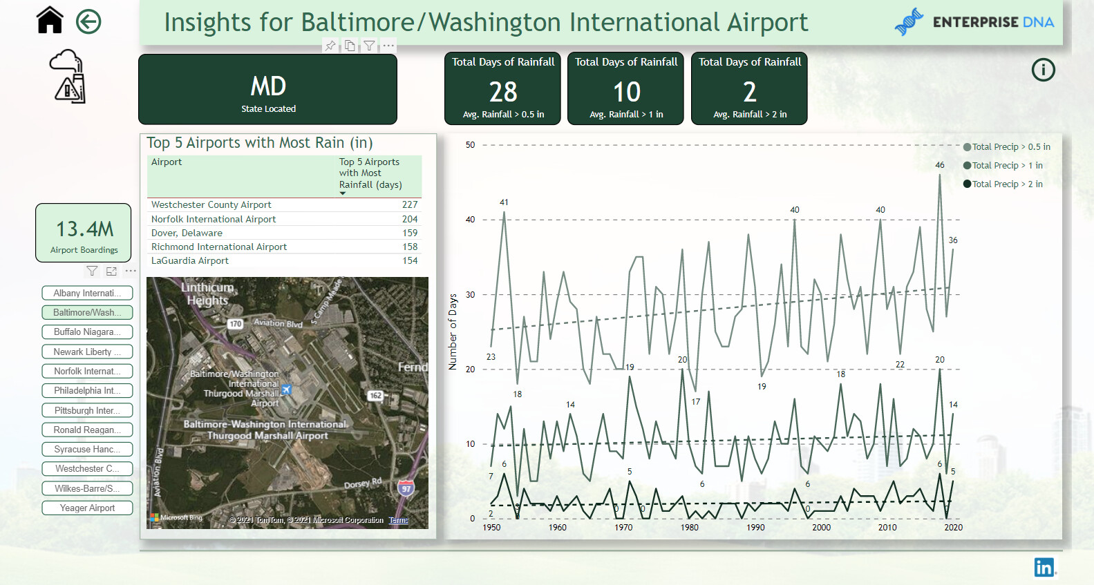
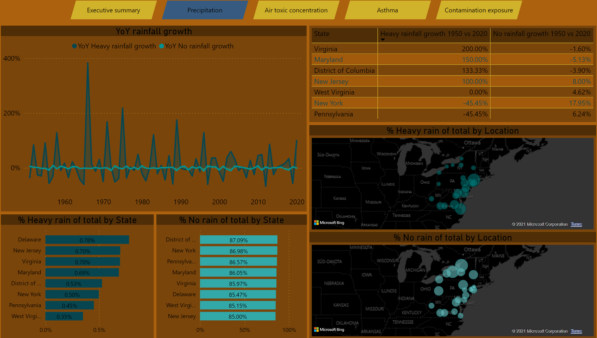
Rainfall totals were interesting. Westchester Airport had the highest amount of days out of year for rainfall. Rain and humidity can attribute to mold and mildew; problematic for asthma people. Westchester is NE of NYC. So my assumption would be that NYC would get a great deal of rain as well.
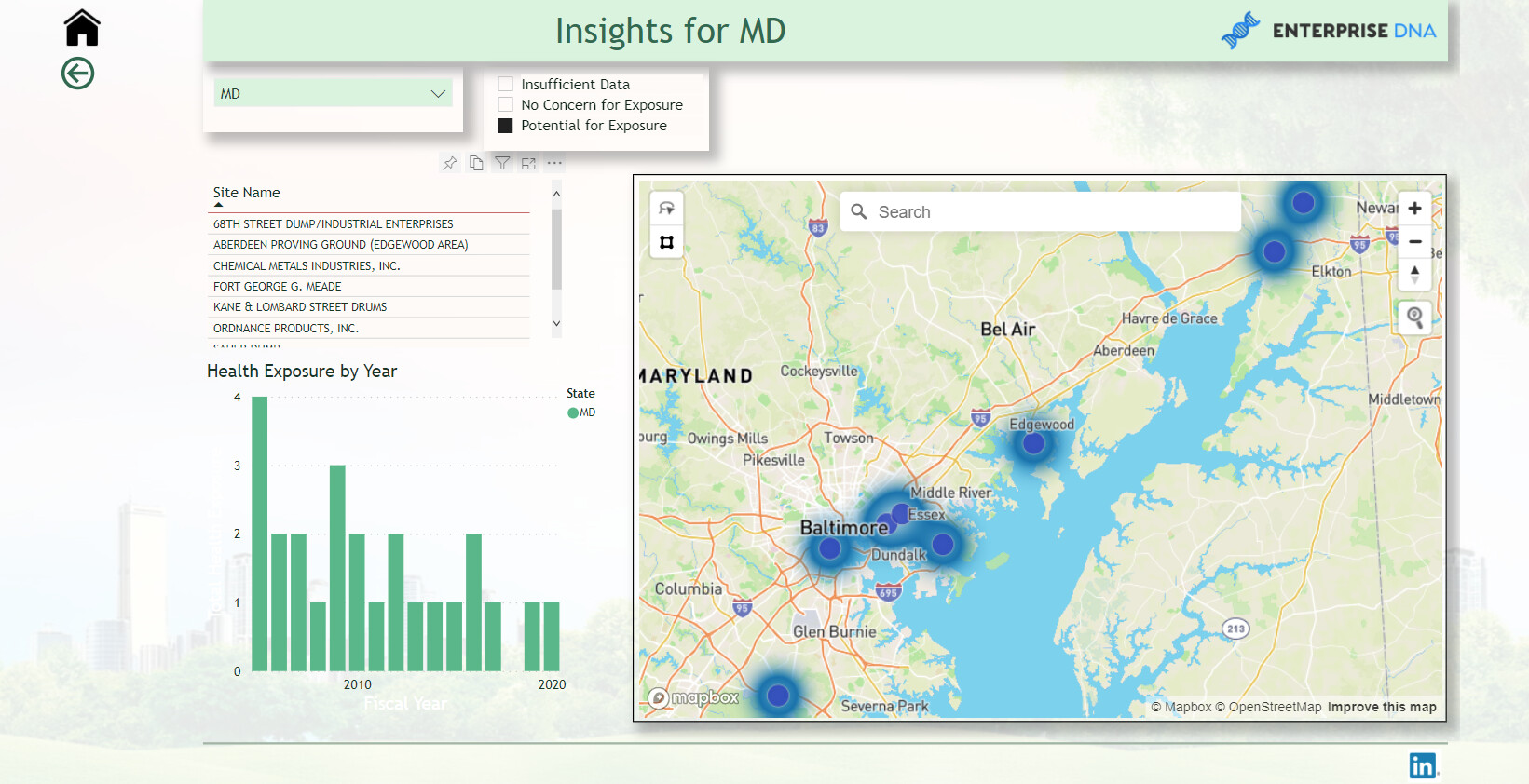
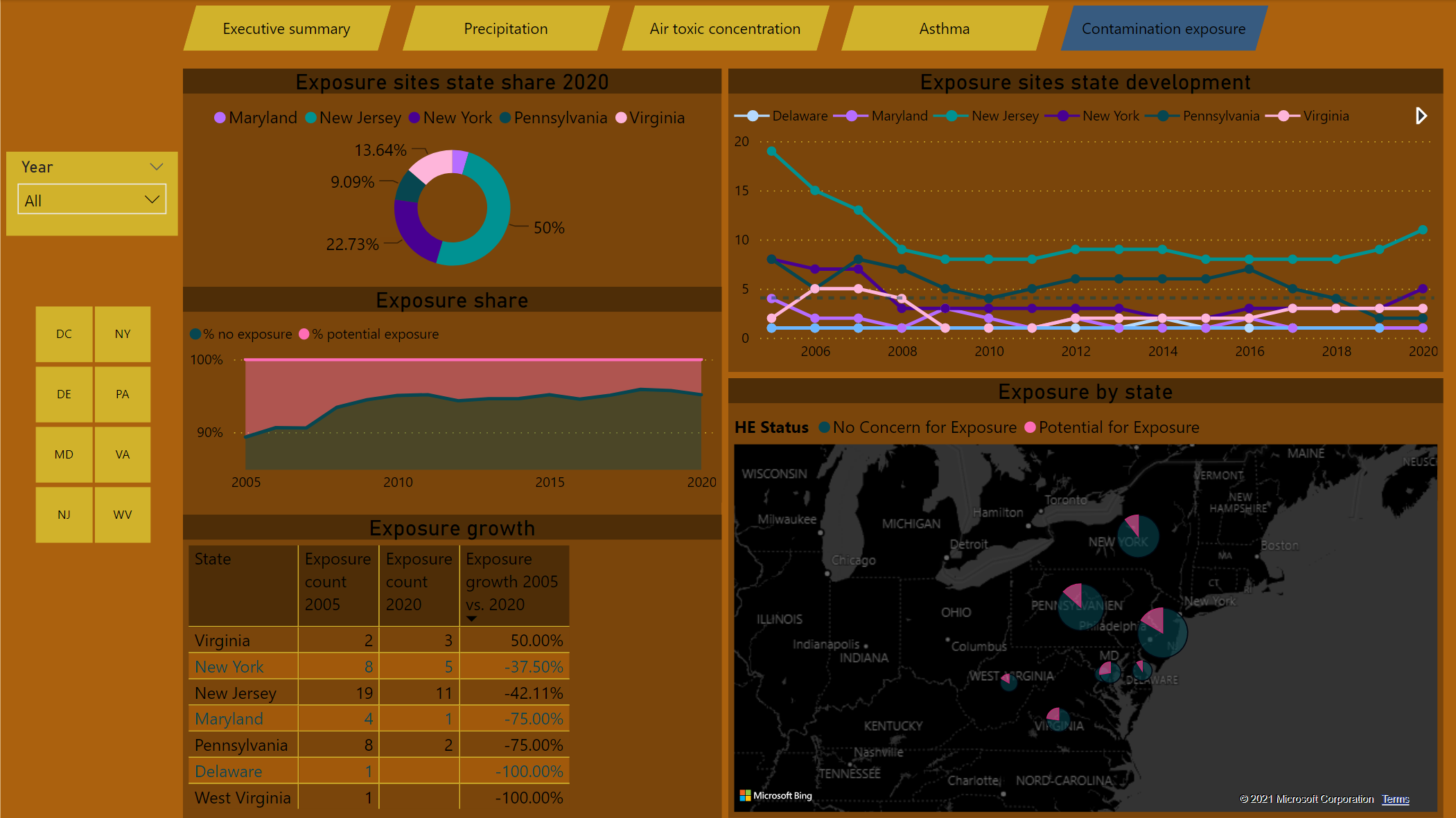
I treated human exposure with just a map with “heat map” selected in the visual. Then using a slicer to show which sites had the “potential for exposure”.
Throughout the report I used the basic DAX measures then expanded on those measures. I used TREATAS quite a bit to “bang” two data tables together virtually which helped a lot. I also used Dynamic Text Measures too for my graphs and titles. I feel it helps the user to know what value they selected to view in the Dashboard and to label the graphs.
Thank you for taking the time to read and to view my dashboard. I appreciate all feedback and thoughts.
Paul
6 Likes
Thank you. I emailed Brian.
Paul
1 Like
Nice entry Paul 
1 Like
Beautiful presentation!
1 Like
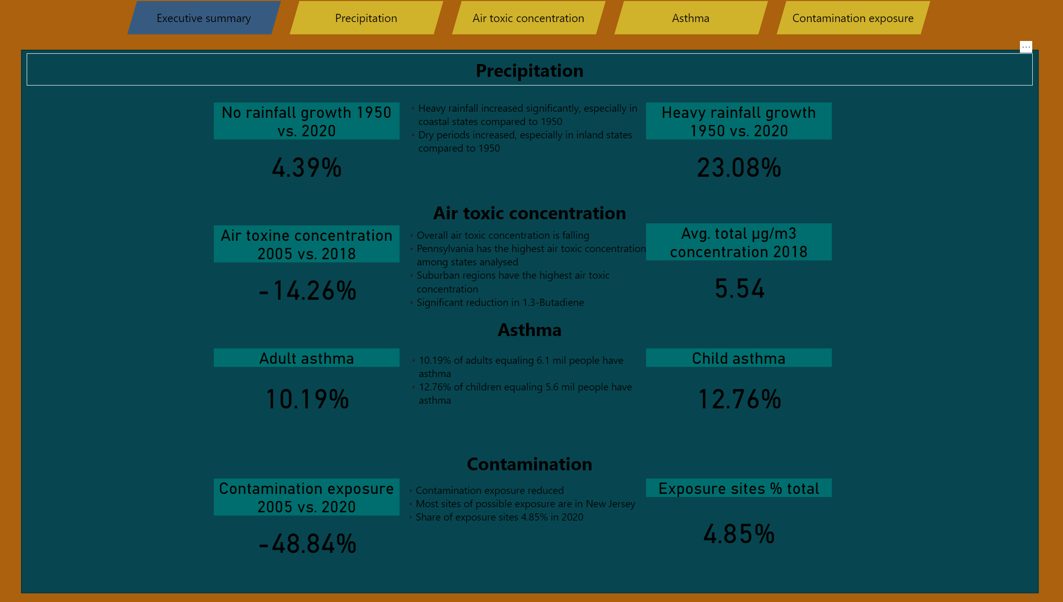
Hi together,
below my entry to the challenge, it’s my first time participating so don’t be too harsh 
Colour theme:
I had the idea for the theme before I read about the requirement for the colourblind friendliness,
I checked and got a supposely suitable colour theme which I used for the visualisation,
while maintaining my initial idea in the background theme & navigation.
Approach:
Looking at the data and the topic I knew I wanted to incorporate the geographical aspect so I decided to add a map to each page, I decided to show state values over location for contamination and asthma, and kept the location level for rainfall and air toxines.
Then I look into other angles and filter which could be useful to apply and tried to incorporate this to each page. For rainfall I struggled with the days analysis/harmonization so I decided to leave this out and just went with %. For asthma I left out the race component in the analysis.
I added some filter buttons on the side where I believe it may be useful.
Other than that I just went with the flow, added some growth rates, distribution charts etc. what seemed insightful. For some results I defer from other entries, so my DAX maybe a bit off in some cases.
Hope you like it, appreciate feedback and suggestions how to improve.
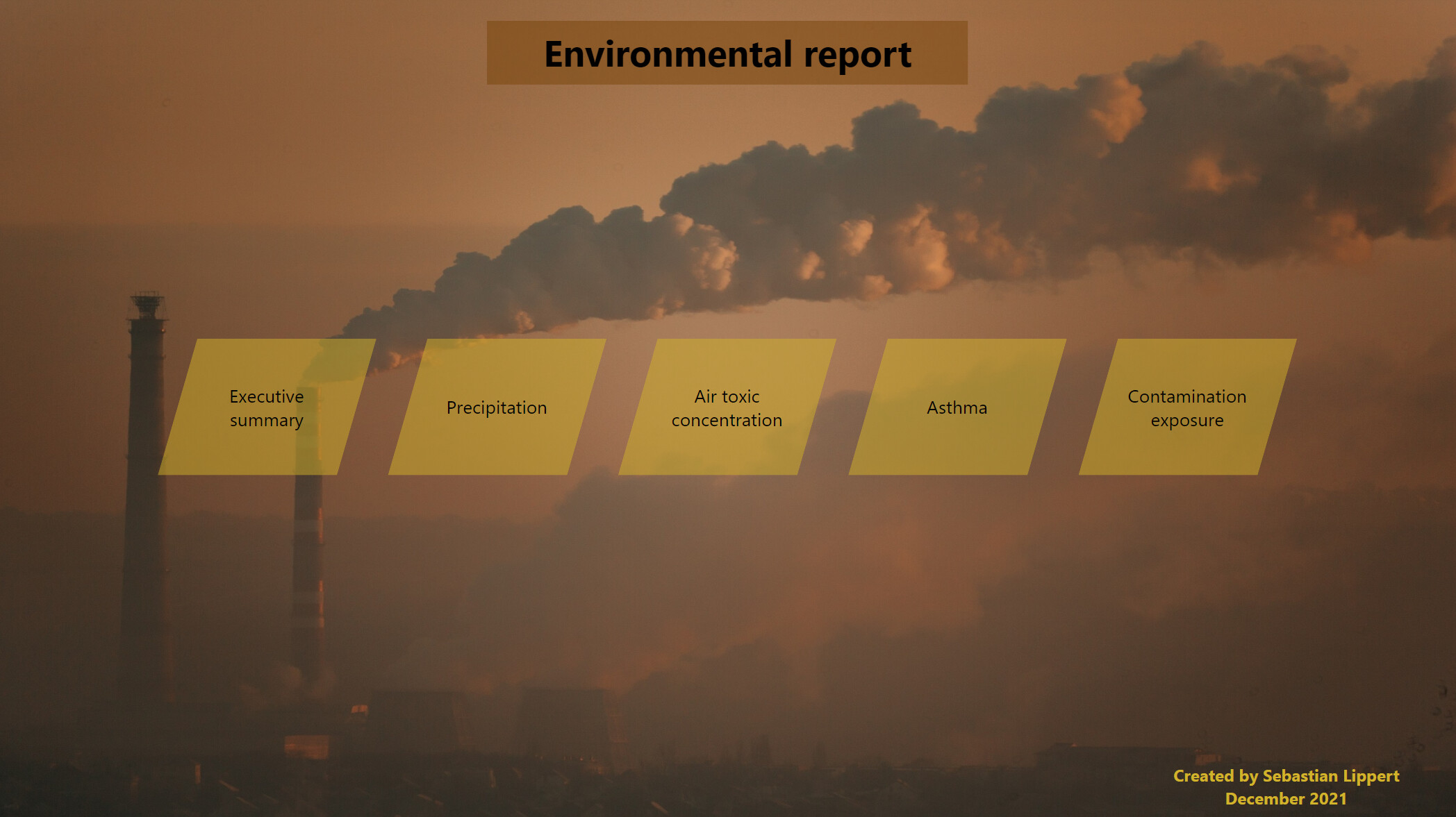
I sent the report to Brian for uploading.
Cheers,
Seb
6 Likes
@Slipper ,
Like some of the analytics that you have incorporated, but the color theme needs some work. Too many different colors that do not match. I would also use White as the overall text color, since you have a dark background on the reports. Something you may want to try is do a google search for a picture that you feel the colors are appealing, and then use the following website to pick the colors as your theme. https://imagecolorpicker.com/
I did a course on report development from start to finish. I would definitely suggest going through the course if you have not already done so. Keep up the good work. I look forward to your future entries!
Here is the link to the course I mentioned:
Thanks
Jarrett
4 Likes
Here’s the entry from one of our non-member participants, Gliceria.
Here’s how Gliceria described it:
I accepted the Enterprise DNA Ltd challenge for the first time. I enjoyed working on the environmental data with the aim of showing the growth patterns in key indicators: heavy precipitation, ambient air toxins, asthma prevalence and human exposure to contamination in the Mid-Atlantic region.
4 Likes
Thanks @JarrettM ,
I have not done any course on report development yet but surely will.
Thanks a lot for the tip with the pic and website!
BR
Seb
2 Likes
Here’s the entry from one of our non-member participants, Chandra.
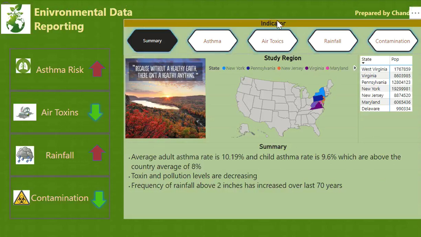
Here’s how Chandra described it:
Power BI Challenge 17 – Environmental Data Reporting
Enterprise DNA Ltd, I accepted the #EnterpriseDNAPowerBIChallenge.
Thankyou for giving the great opportunity to work with environmental data.
Any feedback would be greatly appreciated. Thankyou.
Data: United States Mid-Atlantic Region Environmental Data
Tools Used: Power BI
4 Likes
You had no need to be, but I can understand that feeling. Well done again for joining in the fun!
2 Likes

Excellent work Chandra, I know you for a while now in LinkedIn and your improvement is noticeable, meaning you’re doing your homework and putting the hours Well done
1 Like