Brian:
I need to make another point relating to my analysis.
In my analysis, anyone who finishes more than one lap in arrears, that is “were lapped”, I classified as being a DNF.
John Giles
Brian:
I need to make another point relating to my analysis.
In my analysis, anyone who finishes more than one lap in arrears, that is “were lapped”, I classified as being a DNF.
John Giles
@MehdiH Great submission & I really love the navigation bar on the left. The tooltips used in Map really tell all the necessary details. I agree with @Brian that you have taken the wider perspective to tell the historical story of F1 & embedded it cleanly in one pager dashboard.
As for debugging measures, it does happen & mostly at the very last minute we find out that it is not working correctly & it is frustrating indeed. Honestly speaking, it is sometimes not possible to degub everything & the best way to test it is to share the report & let other people play with it before the final launch or presenting it to the management. For these challenges, what i do is I try to do complete things first that fall withing my “Strengths Bucket” so I have enough time to focus on my weakness & to improve upon it.
After participating in 2 to 3 challenges more, you will surely see that your overall skill levels will improve drastically.
Thank you for taking out time to participate in the challenge as each & every submission has many unique features that I learn from & implement in my reports.
@Alvi ,
This is spectacular. As I explored through this report, the word that kept popping into my mind was “craftsmanship”. Everything in this report just fits beautifully together – it’s clear that so much thought went into the design before you even began implementing it in Power BI. The fact that you are able to successfully capture the full history of F1 in what looks like a single page, and that is so intuitive to navigate that it requires no additional text or guidance features is remarkable.
All the little details, such as the flag headers on the matrix to the background images on the tooltips just combine for an incredible user experience. I feel like an entire course could be dedicated to the design and implementation of this report, and it would be a great survey of the range of visualization and navigation techniques available within Power BI.
Totally blown away by this one. Great to have you back! 
– Brian
Hi Everyone,
Kindly find below my entry for challenge 15. This submission was challenging because of my little or no experience with F1, so understanding most key metrics was the major challenge experienced. I have to be using google search to help define some terms.
@haroonali1000 in the next challenge, please, if some terminology can be explained or a relevant link can be shared to understand most metrics in the data, it will be very helpful to guide our thought.
Regards,
David
Really fun sitting here watching all these great entries roll in.
Keep ‘em comin’, folks!..
Hi @JohnG
Looking at your PBIX file, I really like your way of presenting the data (filtering), based upon the 8 different metrics, circuits and the decades !
Also 3 tables and 3 graphs are nice visuals.
I must admit that dark purple, light green and black would not my first choice.
The idea of a running line is very interesting, and as far as I am aware of, new.
A possible workout is: (this still needs testing)
only using the table Laptime for the “Running line” calculation
add a calculated column in table Laptime, determining the Quarter of the race, based upon the lap. (calculated columns in the fact-table should be avoided whenever possible, but are needed when the context is not available in visuals ( in this case the quarter context information is only available in the Laptime table).
Qarter of race =
var Race2 = 'Lap Times'[RaceID]
var MaxLapinRace = CALCULATE( MAX( 'Lap Times'[Lap]), FILTER( 'Lap Times', 'Lap Times'[RaceID]= Race2))
var QinRace = ROUNDUP( 'Lap Times'[Lap] / MaxLapinRace*4,0)
return QinRace
add a measure to calculate the average position per race quarter per race id
`
Avg Position per Qarter Race = AVERAGEX( VALUES(‘Lap Times’[Qarter of race]), SUM( ‘Lap Times’[Position]))
Looking forward for your Challenge 16 submission.
Kind regards, JW
Make sure the add some images of your report so we can showcase it on the thread!
Awesome work on all the images. Really impressive
Hello Jan:
I appreciate the positive comments.
Regarding my choice of colors, this set is actually an improvement upon my previous submission. It’s not that I’m color blind; I’m color ignorant.
I will implement your suggestions as soon as I complete Accelerator #4.
Regards,
John Giles
Here’s Kim’s entry for Power BI Challenge 15. @KimC, would you like to share how you built this dashboard and what your inspiration is in building it?
Here’s the link to the report:
Thanks for these words @BrianJ.
I tried a few new things on the visualization and rest of the time was mainly focused on getting the correct metrics from the dataset. I have always believed that EDNA challenges are not only a great way to learn and improve PBI skills but also putting together these small bits of learning can vastly improve your report for each challenge. The inspiration one gets from PBI reports of gurus like @sam.mckay, @alexbadiu, @MudassirAli and others gives you that extra bit of motivation and confidence to try something new.
Your appreciation and kind words just highlight this fact and gives me the satisfaction on slowly moving in the right direction.
@KimC ,
Really nice report! Conveys a lot of information, truly in a one page report (though much respect also to the entrants who figured out how to cram a six page report into a one-page “box”…), without feeling cramped. I really like in your writeup how you talk about adjusting the scope based on available time. I think what you’ve chosen to focus on tells a very clear, specific, and interesting story.
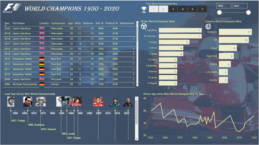
Excellent use of a wide range of techniques, including my favorite – a great application of the QueryOn Timeline custom visual. I also really like when a report reveals a finding or pattern that wasn’t initially apparent to me ,such as your finding of the dramatic decrease in the age of F1 World Champions.
Per your writeup, the list of things you’ve learned through this challenge is incredibly impressive, and ultimately the true mark of a successful challenge entry. The progress you’ve achieved between your first challenge entry last month and this month’s entry is phenomenal.
One constructive suggestion – I think instead of using the horizontal list slicer for number of world championships, a greater than or equal to single value slider would make for an improved user experience, though a very minor point.
Great job, and thanks for participating!
– Brian
Hi Everyone!
I’d like to share my submission for challenge #15.
Link to the on-line report:

I will also provide much more detailed description of the process as soon as it’s possible (with covering such topics as general context, visual techniques, measures and other fun functionalities).
For now, I honestly say that I have any knowledge related with formula 1 and following report was just made by intuition, along with some basic number veryfication using available sources (like e.g. formula1.com). If there is any topic that I’ve covered in the report, but it should be presented or measured basing on a different specliastic sport foundations, I’will be glad for any feedback in that matter.
According to the basic challenge requirements, I’d like to say that the whole report is physically just a one page with bunch of bookmarks techniques, object groupings, additional ppt backgrounds, tooltips etc.
There was a few fun challenges along the way, such as text/symbol coding (mostly related with names of drivers, names of circuits and others). There is also a bit challenging to identyfi +200 records (depending on a given data base) that automaticaly converted some decimal numbers into dates, that led to inadequate measures.
Below I would list some niuances related with functionalities and UI.
Hope You’ll enjoy it.
@Gustaw Just stunning!
Thanks for the encouragement @BrianJ 
I am happy with my progress and continue to be inspired by all the amazing entries in this challenge.
He managed to top his last challenge entry…somehow (Just gonna go and pick up jaw up from the floor)