@alexbadiu Stunning F1-information out of one page!
3 Likes
Wowsah! Amazing submission Jarrett
2 Likes
Congrats! Super work. Superb looking report
1 Like
The creativity!! Incredible
3 Likes
Hello Everyone,
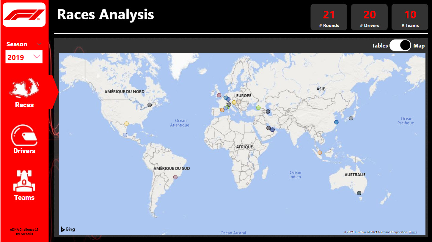
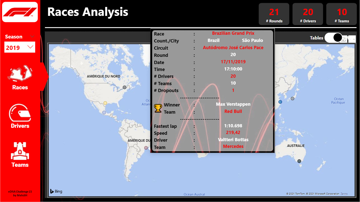
Here is my submission for the challenge 15.
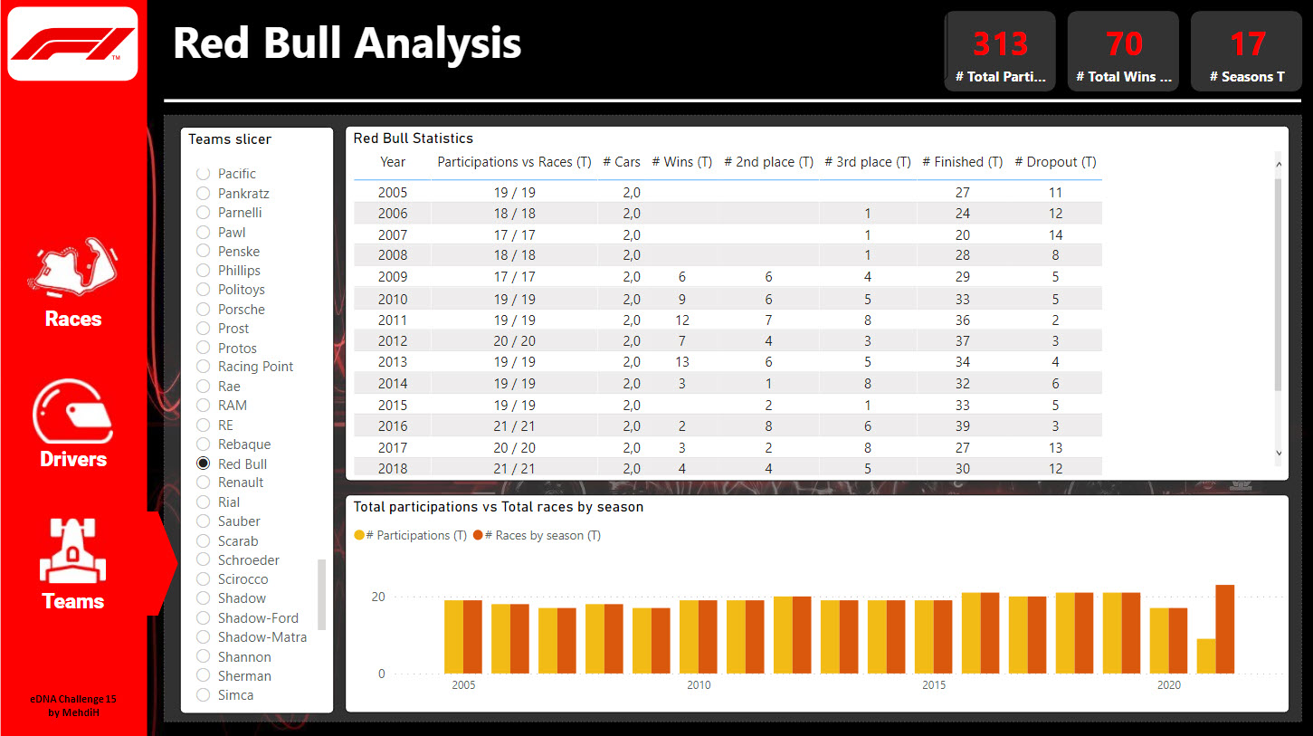
Building the measures these few measures was very challenging for me and I got very frustrated ![]() because many of them were working fine and at the last moment everything became wrong.
because many of them were working fine and at the last moment everything became wrong.
So I definitely need to review this work but I learned a lot especially working with Variables and DAX Studio to debug the measures😣.
Thank you ![]() all for this opportunity to learn and surpass yourself.
all for this opportunity to learn and surpass yourself.
PS : here is the link to the report on the service[spoiler] https://app.powerbi.com/view?r=eyJrIjoiNWM4MGY3OTYtOWY5ZS00YzYxLTgyOWItOThmODRhOGYyMjUxIiwidCI6IjgyMzVhNjMwLTY1ODUtNGY4ZC1iNTc1LWEyZGU2YTYwMDFmMyIsImMiOjh9[/spoiler]
5 Likes
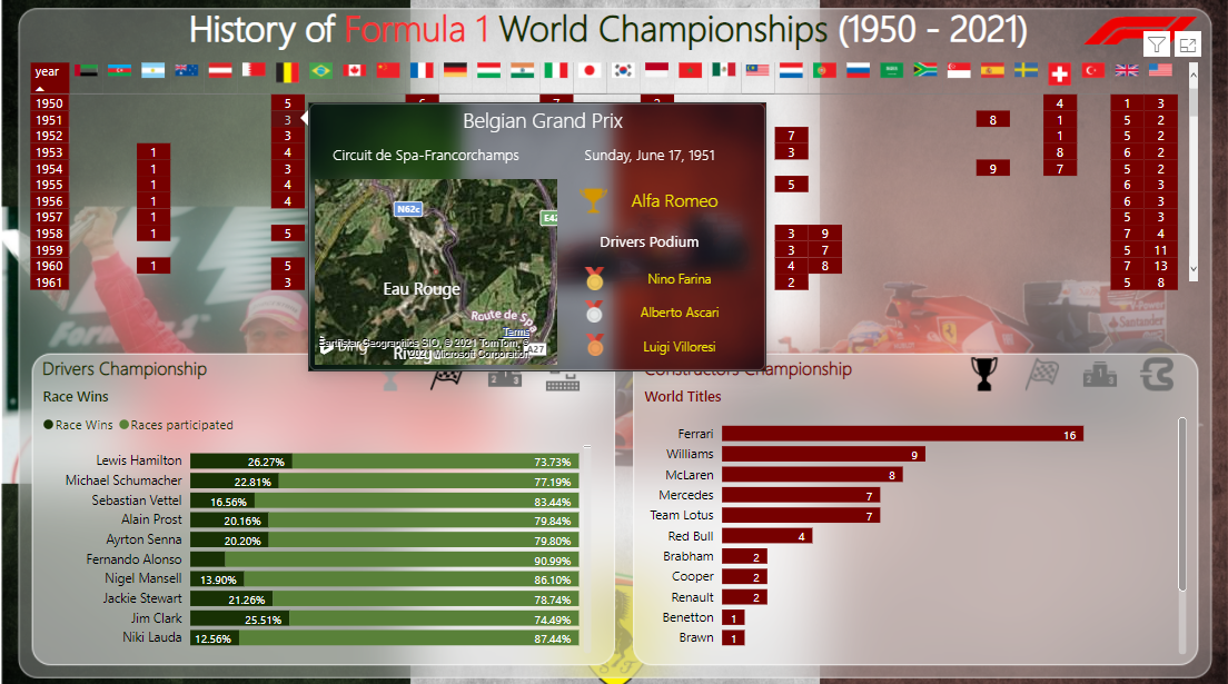
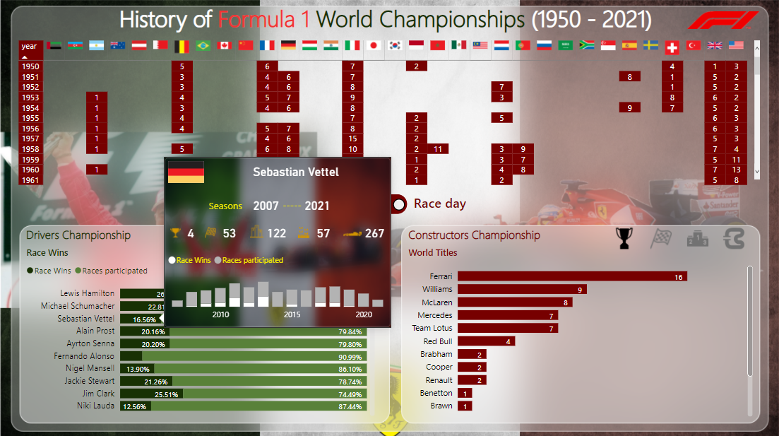
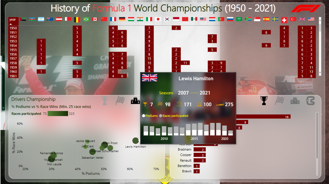
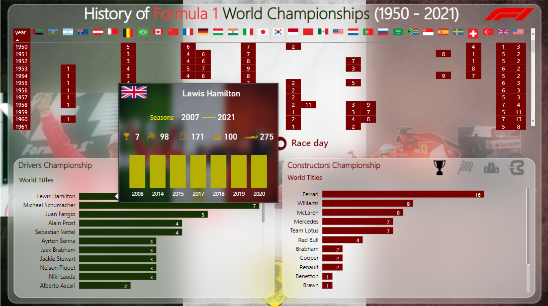
@MehdiH ,
Fabulous work! Really interesting how most of the other submissions so far took a micro view (e.g., comparison of drivers) to make the scope of the data more manageable. However, you have really embraced the historical nature and macro scope of the data and created a really terrific navigation interface to exploring the full history of Formula One.
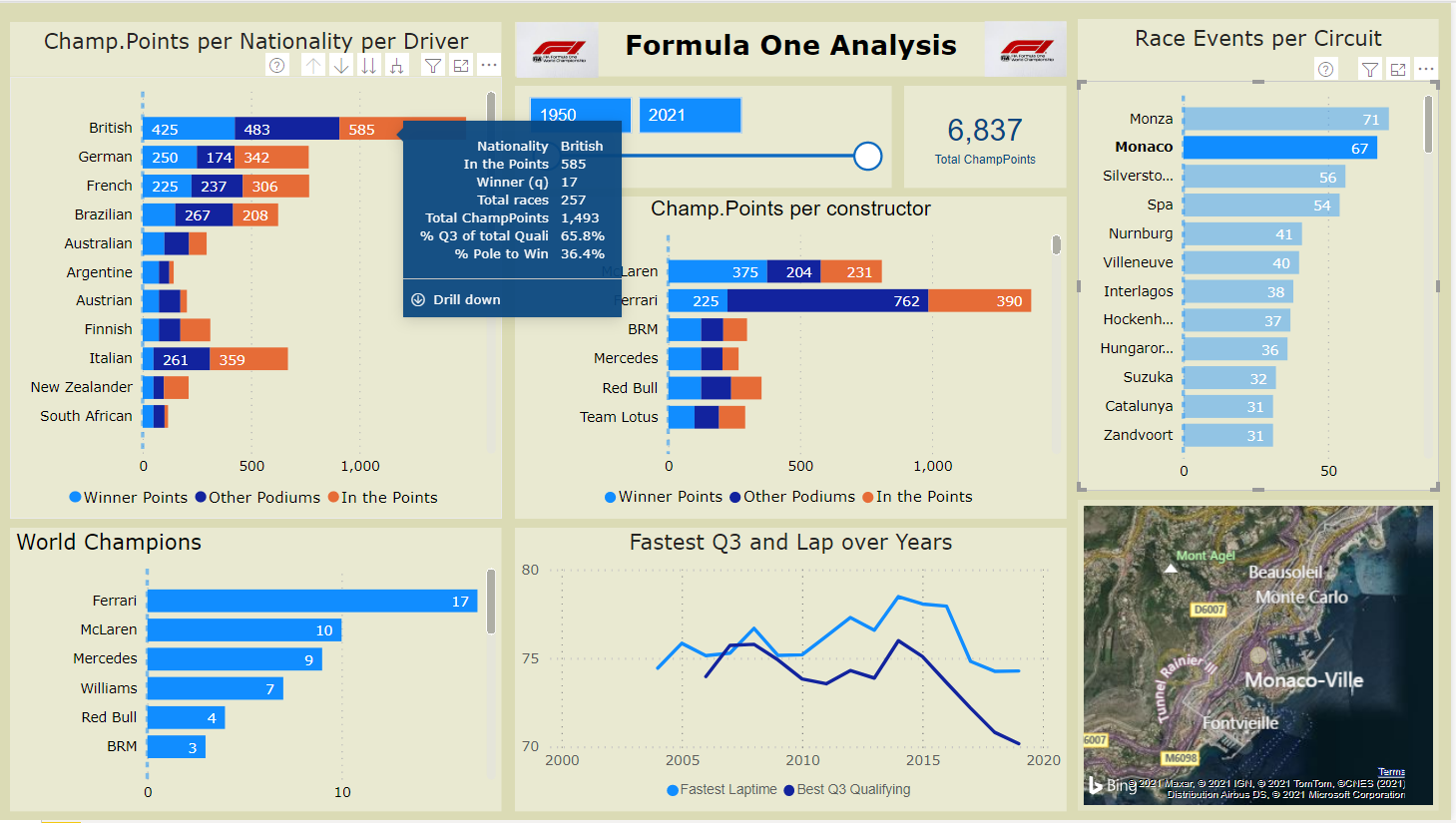
Also, love the detail tooltip you built on the map page. Extremely impressed with what you’ve done here.
– Brian
3 Likes
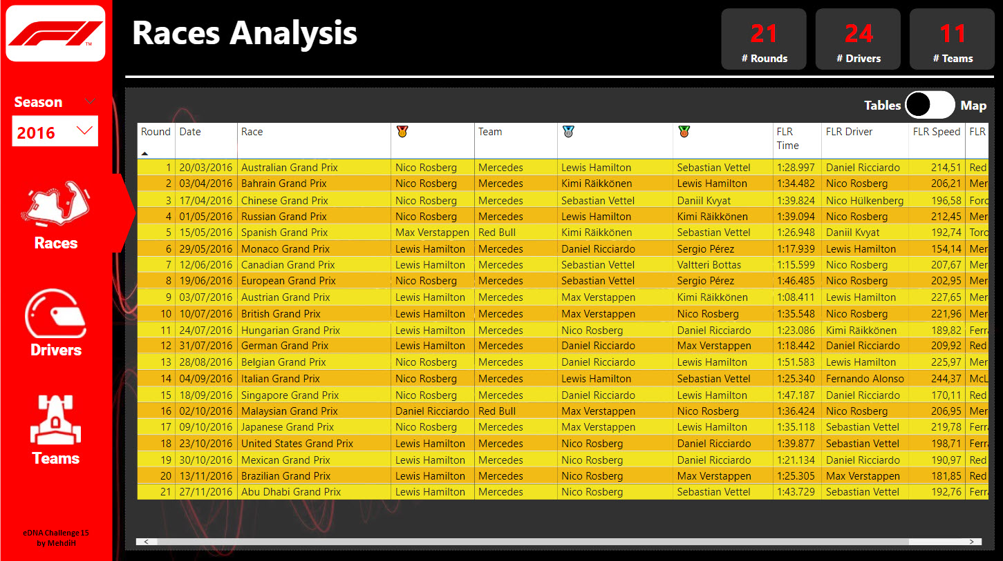
Here’s my submission everyone.
Originally I set myself a challenge to complete this in 1 hour. I started off strong but them working out my story and visuals was difficult and took me much longer.
I’ve ended up keeping the visual pretty simple, but went through many iterations before I got to this point.
I also tackled the data slightly differently to most of the earlier submissions. I wanted to dive into the data per race and then see how each season progressed.
I still have a few clean ups and upgrades I could make but it’s good enough for now.
Enjoy!
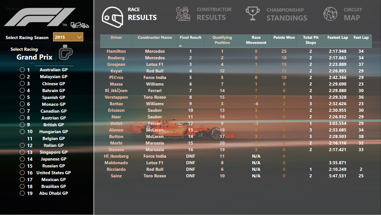
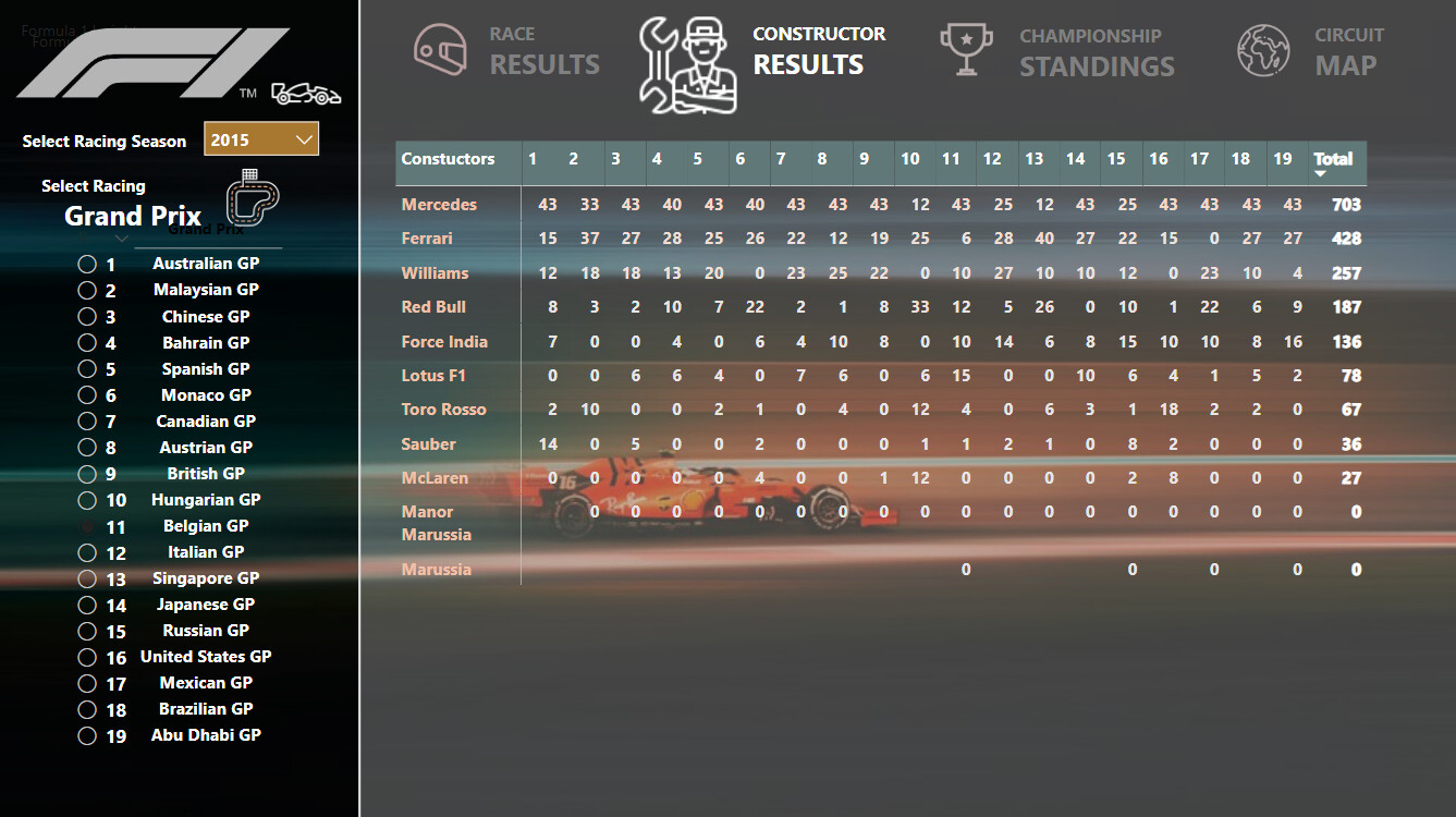
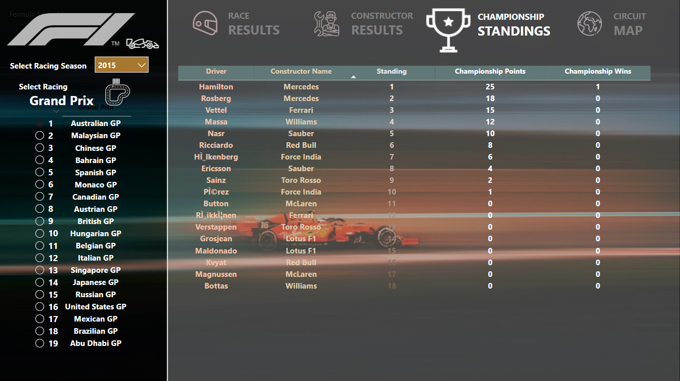
I cheated and had a few pages in the end, but set everything up so that it looks like only one when you view it online.
I’ll complete a longer write-up later.
11 Likes
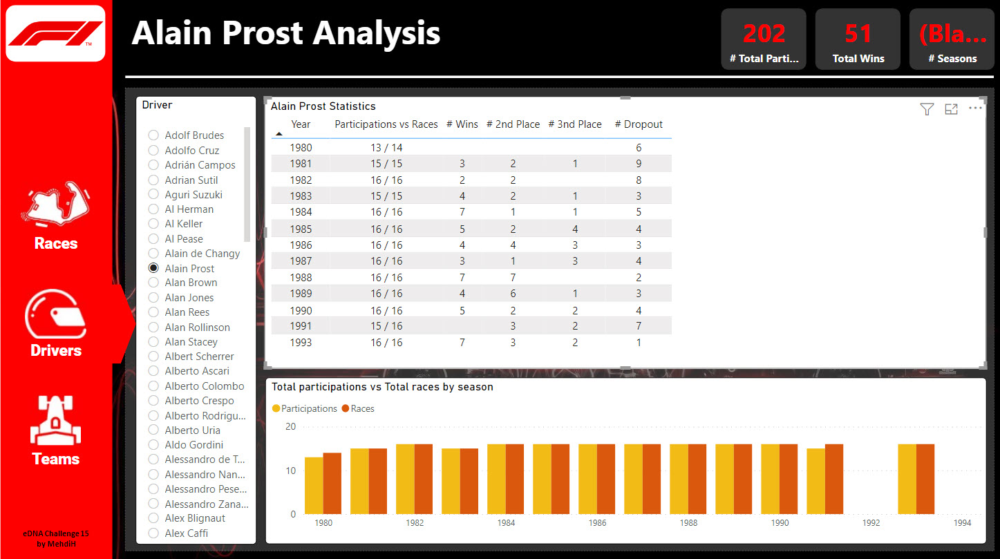
All:
Here is my submission for Challenge 15.
There’s very little to be proud of here.
- I used a different color theme, which is a vast improvement over that which I used for Challenge 14.
- I used a custom bar chart for two of the visuals. I saw custom Line Charts and Matrices, but they didn’t align with what I was trying to accomplish.
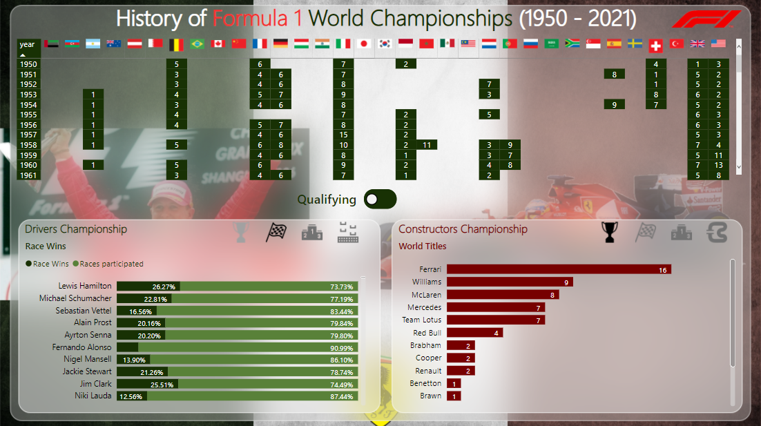
Background - I know very little about Formula 1. However, I am a thoroughbred racing enthusiast. I thought I could apply my knowledge to the Challenge.
I wanted to answer the basic questions: who won?, how fast were they?, who finished close to the winner?
Once again, I used a Multi Threaded Visual to provide that information. I thought that data related to Driver, Constructor combinations would be useful, hence, the Matrix.
It seemed obvious that the results should be filtered by Race Circuit.
While I know very little about F1, my guess was that it has evolved over the years, so I grouped Races by decades to identify trends. Also, since F1 has covered 70+ years, I thought using decades would limit the selections in the Slicer.
All of this was easy.
My main goal was to provide “Results Charts” and “Past Performance Charts” (thoroughbred terminology), for Drivers, Constructors and Circuits. I wanted to create Tooltips that would provide a Result Chart for each year/circuit, and “PP’s” for Drivers and Constructors. The key problem was in creating the “running line”; that is, the running position of each driver/constructor 1/4 into the race, halfway and three quarters into the race. To create a running line, I needed to link the Results and Lap Times tables. I struggled mightily. It was very disappointing that I couldn’t to it. I’m eager to see how others dealt with this matter.
In any event, here’s the PBIX, and I look forward to Challenge 16.
Regards,
John Giles
Challenge 15.pbix (5.7 MB)
4 Likes
John,
I honestly could not disagree with you more here. I think there is a great deal to be proud of in this report, starting with the analytical “cube” structure you’ve created that allows the user to slice by circuit, metric and decade (by the way, the decade slicer is really innovative and something I haven’t seen done exactly this way before).
The way you’ve structured the data for exploration really made me want to dive in and look at some of the trends you identified that I thought were interesting, such as the apparent upward trend over time in percentage of laps completed or the really anomalous spike in 2011 an average lap time.
The fact that not everything you wanted to accomplish came out as planned tells me you’re stretching yourself and trying new things, which is what these challenges are all about. In the end, there’s only one metric of success that matters in these challenges which is “how much did you learn and improve by doing it?”. Given that I learned some very interesting things from your entry, I suspect you did as well.
These are also great gauge of progress. If you keep working and keep submitting, I suspect you’ll look back in a few months at the things you were unable to do here and they will then look easy to you.
Keep up the great work! Here’s a published version of your report.
Thanks for participating!
– Brian
3 Likes
All,
For anyone who doesn’t have access to Publish to Web, either just tag me in your post with @BrianJ or send a copy of your PBIX file to me at brian.julius@enterprisedna.co and I’ll be glad to publish it to our tenant and send you the link to include in your post.
- Brian
2 Likes
Hallo everyone,
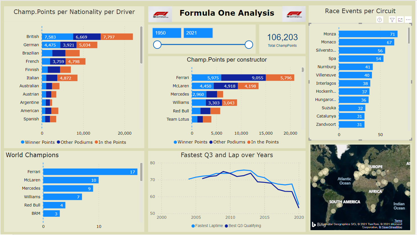
Please receive hereby my workout of the Power BI Challenge 15 Formula 1 Analysis.
This one page analysis report focuses on times and results from the start in 1950 till 2021 of the Formula 1. World Champion Points are normalized for the point-score nowadays.
Workout:
Data Model
- The data model follows the waterfall principle with Lookup table (marked including “LT”) and fact tables. During the development of this report several fact-tables appear not to be needed (Driver Standings, Laptimes, Constructor Standings, Pit Stops and Constructor Results), and therefore left out of the model, simplifying the data-model and reducing the data-load significantly.
- (The data appears 99% true…, Nico Rosberg is not Finnish, Ayrton Senna was more then two times World Champion . )
.
Data Enrichment
The data has been enriched to make the chosen report possible and/or easier to read.
- DriverLT: two calculated columns (Driver and Nationality) has been added with a category “Other”, to limit the listing of those dimensions
- Qualifying: qualifying times has be reformatted from text to seconds in Power Editor, whereby “/N” are replaced by 3.599,999 seconds, so Fastest qualifying is made possible by the MIN formula, Average qualifying is made possible by Average, and filtering out this extreme number.
-
Results: Fastest Lap and Fastest lapspeed columns reformatted to numbers (seconds) likewise at Qualifying.
In order to normalize previous years Champion Points with the values of today (like 10 points for a win in the past is currently 25 points, a “KeyRevisedPoints” column is added, calculated from columns “positionOrder” x 100 plus “points” (for example Position 1 and points 10 gives a key of 110) -
RevisedPointsLT new lookup table which translates WorldChampion Points to values which are used nowadays (e.g. 1990 10 points for a win is normalized to 25)
Only the normalised World Champion Points are used in the one page report -
SummWorldChamp: a calculated table, summarizing the Results table, is added, to calculate the quantity of F1 Championships per driver and per constructor
Most columns which are not needed, are removed in PE, to further reduce data-load.
.
Measures
- Three measure groups are set up; Circuits, Drivers and Toolkit with straight forward Dax-formulas used, like Average (av Q3), Max (speed), Min (fastest lap, Q), Countrows (q Winners), Rank(Driver) and Sum(ChampPoints)
- A few comparison measures are set up, like % Win from Pole, % improve from startgrid and Average progress from grid to final position.
- Due to the data model the upmost of the measures for drivers can also be used for constructors (drivers add up into constructors)
.
Report
- The report exist of charts, a slicer, a total champion points card, an image of F1 and a map.
- Be aware that all ChampPoints are normalized to points as given nowadays.
- “ChampPoints per nationality per driver” and “World Champions” have two levels (drilldown/up), resp. per Nationality and driver and Constructor and driver.
- Tooltip is heavily used, fed with measures, showed when moving over the data in the graphs.
- Most of the graphs interact strongly with each other (Edit Interactions settings)
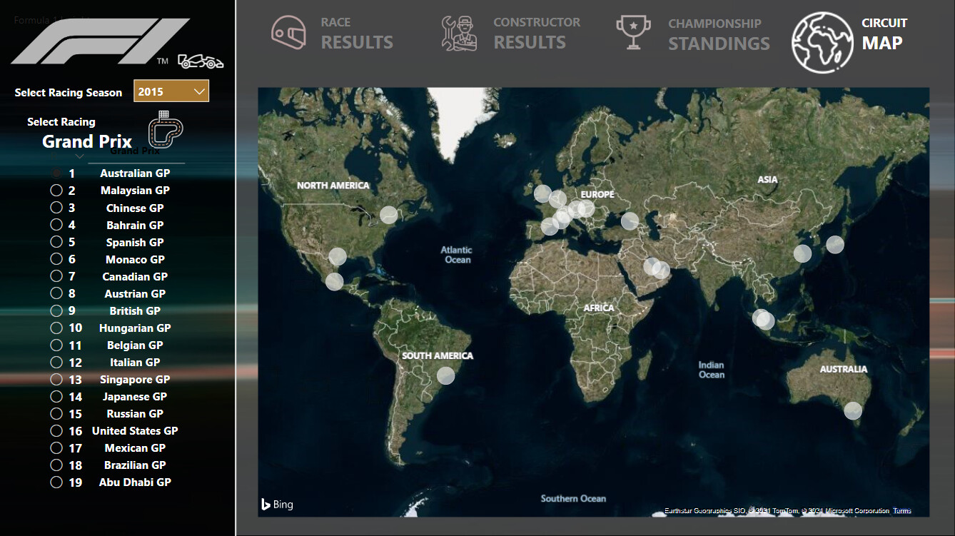
- It is nice to see the circuits itself in the map, when selecting one circuit from “Race Events per Circuit”
.
The Challenge of 15 Formula 1 Analysis
- First a big THANK YOU to Haroon and the EDNA group to provide this Challenge about Formula One data
- The biggest challenge was to determine what to present from the data, what is the story line ?
- I have heavily used “Toolkit” in this report, which works great to provide additional data. Possible using a filter which changes the majority of the page information might be a better alternative.
- Really amazing other submissions are published, very interesting to see the visual concepts used.
7 Likes
Hi Everyone
I missed out on Challenges 13 and 14 but this one is very close to my heart as I have been following F1 very closely for the last 30 years!
I am a super fan of Michael Schumacher and the Italian Scuderia Ferrari Team, as the theme of my report suggests. I have tried to capture important metrics at a macro level while spending time to correctly calculate all the key measures from the relevant columns in the dataset. I will cover the details in my write up.
Here are some of the screen grabs from the report. I thoroughly enjoyed working on this one and feel great to be back working on EDNA challenges!
You can see the complete published reports at the following link
Excellent submissions everyone!! Looking forward to hearing feedback / comments.
Regards
Alvi
11 Likes
Hi Brian:
Thanks for the uplifting words. I appreciate them.
While I was working on the report, I started to think about Multi Threaded Visuals.
I first saw an MTV in Sam’s Regional Analysis from a few years back.
Certainly, an MTV permits you to pass a great deal of information through a small amount of space, which is an advantage.
However, I’ve started to think that as you switch among metrics, you lose visibility from the previous metrics you’ve displayed.
Ultimately, you’re approach depends upon circumstances?
Please feel free to offer opinions and insights.
Regards,
John Giles
Brian,
One other point.
I investigated a few of the anomalies you pointed out. It looks like there may have been recording or reporting errors in the base data. I considered eliminating some of the offending errors, but decided to ride with data as is.
John Giles
It s great to see you back, @Alvi !
I can tell you are a big fan of formula 1 in your report. The attention to detail & analysis presented is impressive. There is a lot of work and heart invested in your report! A true pleasure to discover your entry 
4 Likes
Brian:
I need to make another point relating to my analysis.
In my analysis, anyone who finishes more than one lap in arrears, that is “were lapped”, I classified as being a DNF.
John Giles
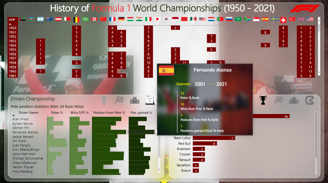
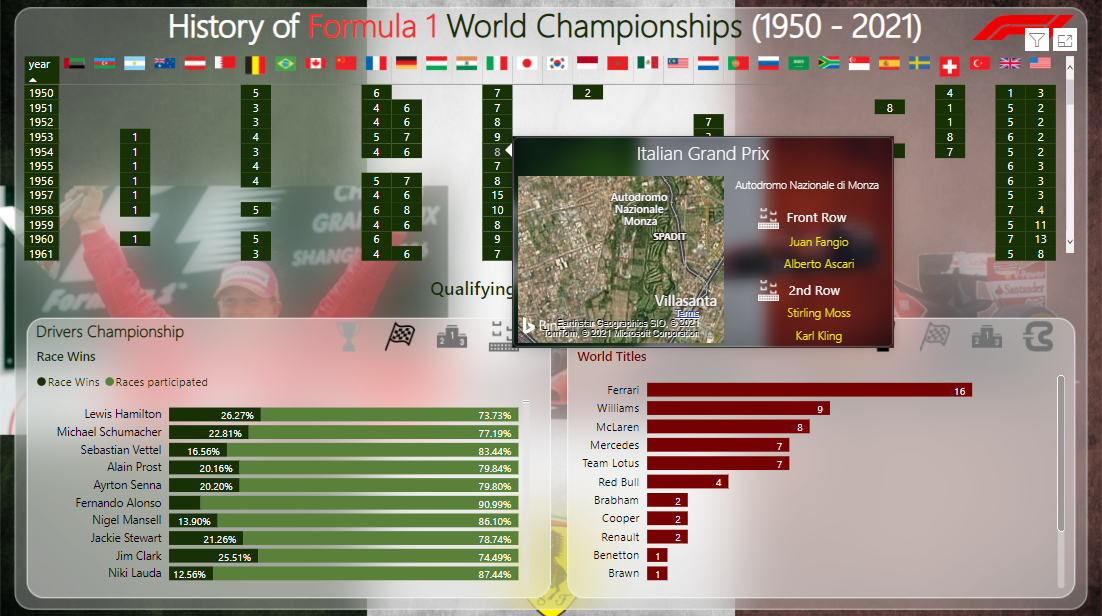
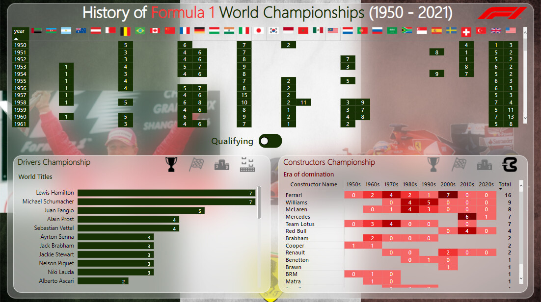
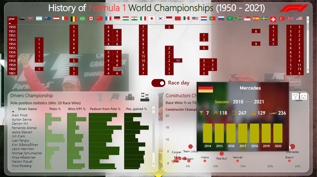
@MehdiH Great submission & I really love the navigation bar on the left. The tooltips used in Map really tell all the necessary details. I agree with @Brian that you have taken the wider perspective to tell the historical story of F1 & embedded it cleanly in one pager dashboard.
As for debugging measures, it does happen & mostly at the very last minute we find out that it is not working correctly & it is frustrating indeed. Honestly speaking, it is sometimes not possible to degub everything & the best way to test it is to share the report & let other people play with it before the final launch or presenting it to the management. For these challenges, what i do is I try to do complete things first that fall withing my “Strengths Bucket” so I have enough time to focus on my weakness & to improve upon it.
After participating in 2 to 3 challenges more, you will surely see that your overall skill levels will improve drastically.
Thank you for taking out time to participate in the challenge as each & every submission has many unique features that I learn from & implement in my reports.
2 Likes
@Alvi ,
This is spectacular. As I explored through this report, the word that kept popping into my mind was “craftsmanship”. Everything in this report just fits beautifully together – it’s clear that so much thought went into the design before you even began implementing it in Power BI. The fact that you are able to successfully capture the full history of F1 in what looks like a single page, and that is so intuitive to navigate that it requires no additional text or guidance features is remarkable.
All the little details, such as the flag headers on the matrix to the background images on the tooltips just combine for an incredible user experience. I feel like an entire course could be dedicated to the design and implementation of this report, and it would be a great survey of the range of visualization and navigation techniques available within Power BI.
Totally blown away by this one. Great to have you back! 
– Brian
2 Likes
Hi Everyone,
Kindly find below my entry for challenge 15. This submission was challenging because of my little or no experience with F1, so understanding most key metrics was the major challenge experienced. I have to be using google search to help define some terms.
@haroonali1000 in the next challenge, please, if some terminology can be explained or a relevant link can be shared to understand most metrics in the data, it will be very helpful to guide our thought.
Regards,
David
8 Likes
Really fun sitting here watching all these great entries roll in.
Keep ‘em comin’, folks!..
- Brian
2 Likes