Here’s Sorin’s entry for Power BI Challenge 14. @sorinlinx, would you like to share how you built this dashboard and what your inspiration is in building it?
To learn about the real-life scenario presented for the challenge, be sure to click on the image below.

1 Like
Here is my entry for Challenge 14
The main purpose of this report was to keep it as simple as possible with the perspective of an executive that must take a decision fast and is not ready to see ALL the information on the same page.
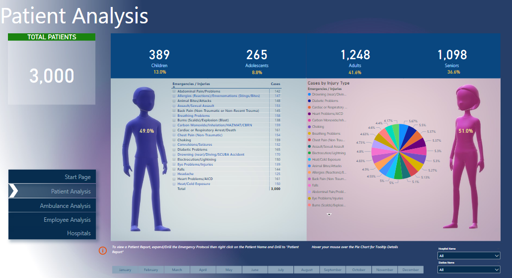
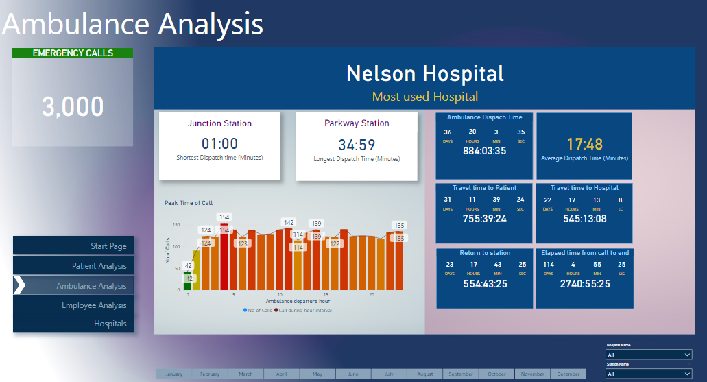
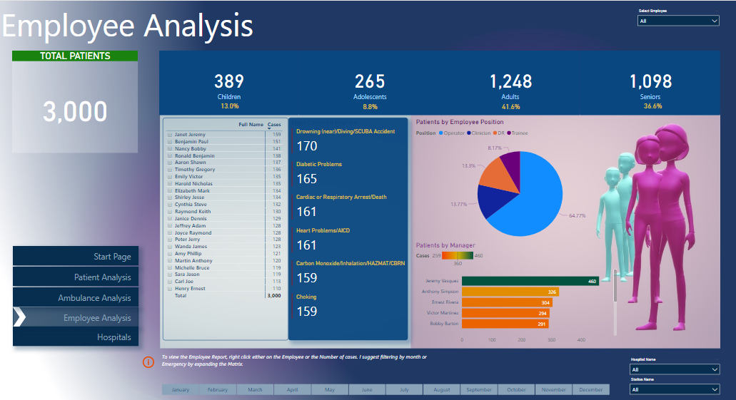
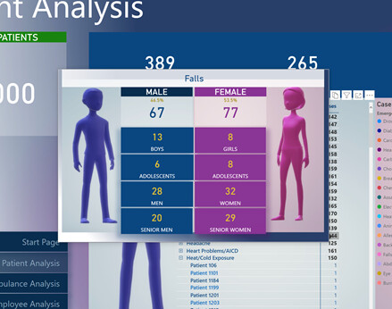
Therefore I created a Start Page where is possible to choose one of the categories (Patient | Ambulance | Hospitals and Employee)
Each page has what I believe are the main KPI. Needless to say that there are endless possibilities but those numbers were my choice😊
For Patients and Employees Analysis I created a Drill through to a landing Report page where the “Manager” can see more information about the Patient, Ambulance Performance, Protocol name and Duration of the task from call to end.
In the Patient/Employee Report Page I used a great feature available in Power BI, the “Value” when using the text. I love it!
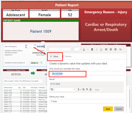
Also, for making it easier for the “manager”, I created some custom tooltips
Well, this is my first entry and clearly a lot to learn. However, I am PROUD to be a member of EDNA.
Cheers
1 Like
Wow super impressed by the innovation and loved how you have really thought outside the box around how you wanted to showcase the data and tell the story of the information that we had to work with on this challenge.
I love the imagery and the way you have created summaries of the information and used tall tips to drill down into specific information on the patient level.
I can see that you have spent a lot of time thinking about how to bring this together and also finding the actual images of the hospital and integrating them into the table is no mean feat. So congrats on your efforts on this one.
My only thoughts on improvement here are the colours and themes. To me there’s too much variations in the colours that you are using only want to make it as consistent as you possibly can. And also as simple as you can not over using colours. Like in one of the pie charts of use there’s just way too many colours.
Simple fix though so nothing that can’t be upgraded for your next submission.
Super work and can’t wait to see more from you .
Sam
2 Likes
Hello Sam,
Many thanks for your kind words!
I am taking a step at the time and I hope that after a few years I will become an Expert. Clearley Enterprise DNA has all the resources to help me with my goal.
Looking forward to the next Challenges and to support as many as I can on the forum.
Cheers!
1 Like