Hi everyone
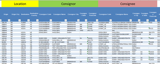
When I saw the challenge #12 dataset, I thought the dataset is so unusual, and in no way, I can pass this challenge since I’ve never worked with a dataset like this. However, I decided to do what I can do, even if the result would not be comparable with the eDNA experts’ reports. I started with understanding the dataset by checking the excel file and finding the most important columns, categorizing the columns that are somehow related, and considering the amount of missing data in each column. By doing so, I could clearly understand the data and organize my mind for creating a meaningful report. The “Data Dictionary” sheet also was a big help. This is an example of my Dataset Categorization
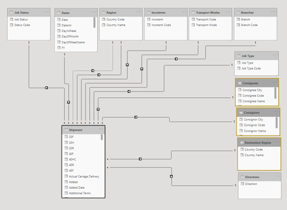
After importing data to Power BI and performing primary transformations like determining data types or adding some required columns, it was time for data modeling. I decided to create lookup tables for the categorical columns that I want to use in my report as a slicer, legend, field, and etc. So, I created these tables: Region, Job Type, Job Status, Incoterms, directions, consignees and consignors, Branches, and Transport Mode as well as Date Table which is a mandatory table in each report. Then I created my data model.
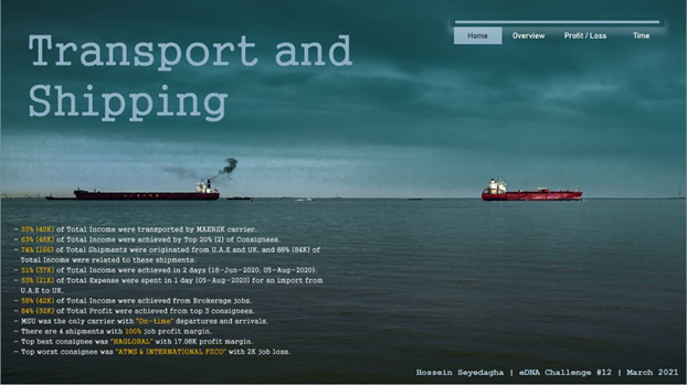
For Home Page, mudassirAli’s report in challenge #10 inspired me to use pictures as a background. So, I searched some free wallpaper sites like unsplash.com and pexels.com using “Transport”, “Shipping”, “Voyage”, or “Import & Export” keywords to find the proper background for my report. The reason I chose this picture was that I thought these two ships that are moving in the opposite directions are symbols of imports and exports, which is so related to the report. It could somehow show that the report consists of two main sections: Imports & Exports.
I used Adobe Photoshop for creating a beautiful Title for my report and also to write some details about the results of the analysis on the bottom left side of the home page (which I added to the home page after creating the other pages and analyzing the data). I also used buttons at the top right side of the home page for navigation through the main pages.
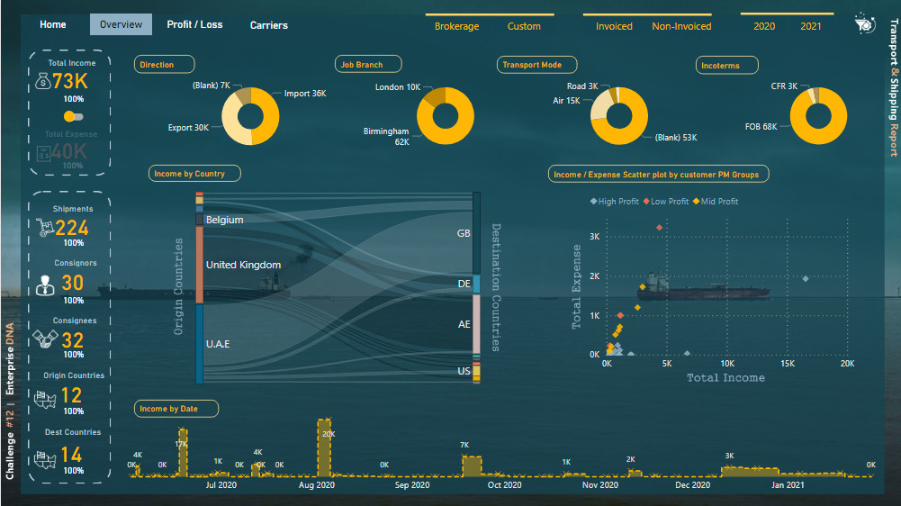
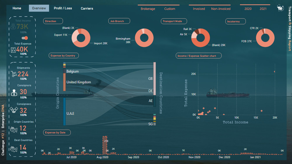
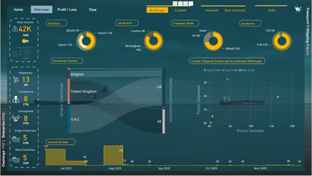
For the second (and third) page, Abu Bakar Alvi’s report for challenge #10 inspired me to use Sankey charts for showing the relationship between origin and destination countries. I used a regular scatter plot to show the relationship between total income and total expense and used supporting tables to categorize points in different categories based on their profit margin. For the left side of the page, I also created some % measures that show the percent of the total for the related measure. I used a switch button to switch between Income and Expense pages, and for showing that in which page we are (which page is active), I decided to place inactive information (Total Expense card) backward the main blue dark plane. I also used some icons in these pages downloaded from the “iconsdb.com” website.
# of Consignees = DISTINCTCOUNT( Shipment[Consignee Name] )

(%T) # consignees =
     DIVIDE( [# of Consignees] ,
     CALCULATE( [# of Consignees] , ALL( Shipment ) ) , BLANK()
          )
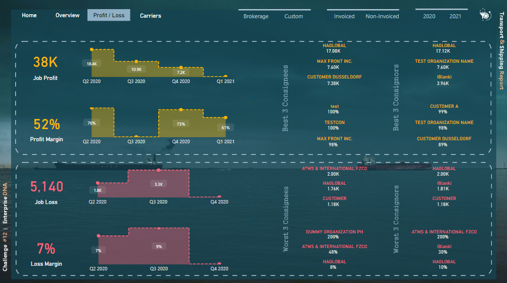
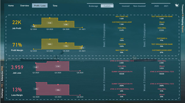
For the fourth page (Profit and Loss), I used profit & loss DAX formulas to show the top best and top worst consignees and consignors altogether. Since some shipments’ expense was greater than their income, I found that It could be great if I can somehow show it to the reader. I used the following formula for calculating Job Profit, Profit Margin, Job Loss, and Loss Margin:
Job Profit =
CALCULATE(
SUM( Shipment[Job Profit] ),
Shipment[Job Profit] >=0 )

Job loss =
CALCULATE(
-1 * SUM( Shipment[Job Profit] ),
Shipment[Job Profit] < 0 )

Profit Margin =
IF( [Total Income] > 0 ,
DIVIDE( [Job Profit] , [Total Income] , 0 ) ,
BLANK()
)

Loss Margin =
IF( [Job loss] > 0 ,
DIVIDE( [Job loss] , [Total Income] , 0 ) ,
BLANK()
)
For creating the Top 3 Best/Worst part I used the following formulas for creating names and amounts based on their rank:
#1 consignee Name JP =
VAR _Table =
SUMMARIZE( Shipment , Shipment[Consignee Name] ,
"job profit" , [Job Profit]  )

RETURN
CALCULATE(
VALUES( Shipment[Consignee Name] ),
    FILTER( _Table ,
    RANKX( _Table , [job profit] , ,DESC ) = 1
    ))

// This calculates TOP #1 consignee name based on Job Profit (JP)


#1 consignee Amount JP =
VAR _Table =
SUMMARIZE( Shipment , Shipment[Consignee Name] ,
"job profit" , [Job Profit]  )

RETURN
CALCULATE( [Job Profit],
    FILTER( _Table ,
    RANKX( _Table , [job profit] , ,DESC ) = 1
    ))

// This calculates TOP #1 consignee job profit amount (JP)
I also placed some comments in some DAX formulas for easily understanding the formula. For placing the “Best 3 consignees” texts I used photoshop.
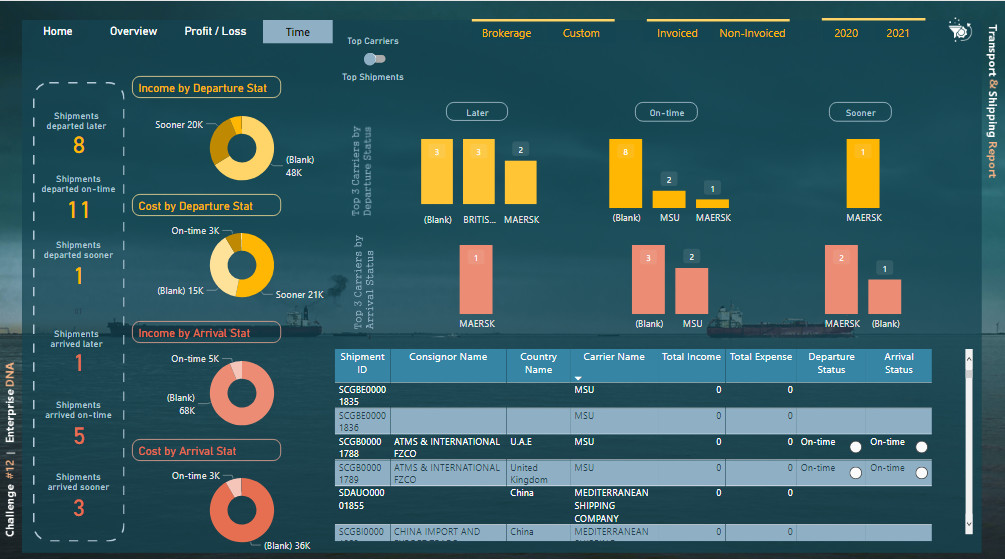
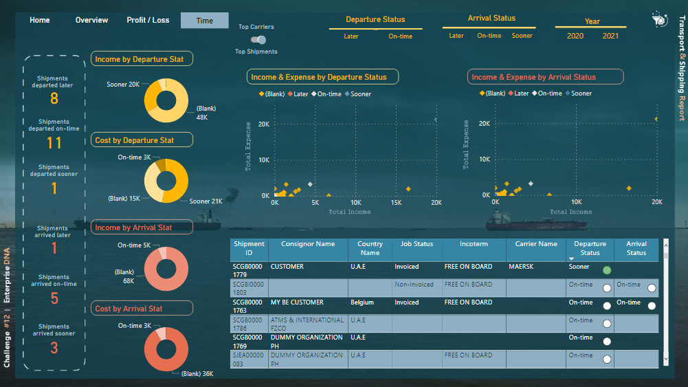
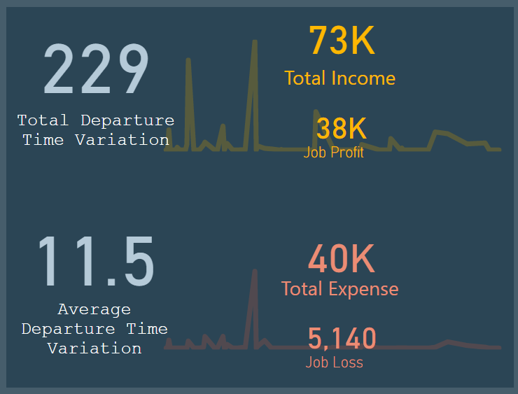
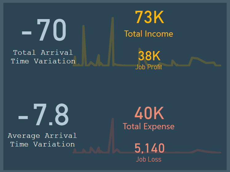
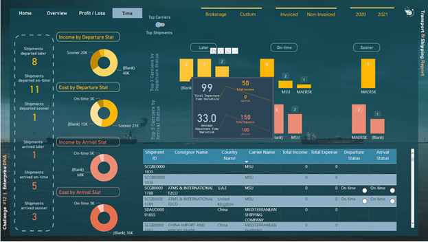
For the 5th and 6th pages, firstly I created two calculated columns (Arrival & Departure Status):
Departure Status =
 VAR DepTime =  DATEDIFF( Shipment[Origin ETD Date] , Shipment[Consol ATD] , DAY )
RETURN
   IF( ISBLANK( Shipment[Origin ETD Date] ) ||
       ISBLANK(Shipment[Consol ATD] ) ,
 BLANK() ,
     SWITCH( TRUE() ,
       DepTime > 0 , "Later" ,
       DepTime < 0 , "Sooner" ,
       DepTime = 0 , "On-time" ,
  BLANK()
) )

 Arrival Status =
   IF( ISBLANK( Shipment[Consol ATA] ) ||
       ISBLANK( Shipment[Destination ETA Date] ) , BLANK() ,
 SWITCH( TRUE() ,
        [Arrival Time Variation] > 0 , "Later" ,
        [Arrival Time Variation] < 0 , "Sooner" ,
        [Arrival Time Variation] = 0 , "On-time" ,
     BLANK()
))
And then created some measures based on these two columns:
# Shipments Arrived OnTime =
CALCULATE( [# of Shipments] ,
   FILTER( Shipment , Shipment[Consol ATA] <> BLANK() ),
   FILTER( Shipment , Shipment[Destination ETA Date] <> BLANK() ) ,
   FILTER( Shipment , [Arrival Time Variation] = 0 )
    )

# Shipments Departed Later =
CALCULATE( [# of Shipments] ,
FILTER( Shipment , [Departure Time Variation] > 0 )
)
I used two tooltips pages to show the extra information on top of the column charts.
I also created some other measures that I did not have the opportunity to use them in the report like “Pareto Analysis”, “Average”, “Cumulative”, and “YTD” measures.
At the end I should say that it was a great opportunity for me to participate in this challenge. I really learned a lot working by some unusual dataset with a lot of columns. This challenge was so tricky and doing it was a great achievement for me. I really thank @sam.mckay and all eDNA experts.
Best Regards
Hossein