Collaboration:
To help document the steps each team member took during collaborative development efforts, a hidden [NOTES] page was created for each user and was updated as work progressed.
We were still challenged (no pun intended) by the difficulty in sharing a single PBIX file among multiple developers, and worked serially with each developer updating the version number in the file name and appending their initials to make sure we didn’t overwrite others’ work. Still an issue with collaborative development.
As an aside, we tried to get the PowerBI.tips version control system setup on SharePoint, but after investing significant time and effort, we could not get it configured properly and ended-up writing our own simple Power BI report backed by an Excel spreadsheet to make reservations to work on the PBIX file.
Data Story:
Creating a story was the hardest part due to absence of requirement and we didn’t want to create a report without any story at all. Therefore, we decided to base our analysis on the profitability because it is the key metric that is of main interest for every business.
Assumptions:
We took many assumptions to complete the report that may be of interest to the client, but it was not about doing what the client wants but rather showing everybody what Power BI is capable of and what magic it can do with Data Transformation, Data Modelling, Analysis, and Storytelling. To be honest, there are many factors to consider before creating reports for the clients and the most important is to have a meeting with the clients and to get the clear requirements from them. We didn’t have that luxury, so we embarked on to create the report with different assumptions.
Data Loading and Transformation:
- as this were going to be multiple developers working on different versions of the PBIX file, a [SourceFolder] parameter was added in Power Query to facilitate the different work environments
- modified all data files loaded into Power Query to use the [Source Folder] parameter
- added Enterprise DNA Extended Dates table; audited raw data and set start and end from 2018-01-01 to 2021-12-31
Extended Date Table (Power Query M function)
- added [Admin Measures] table
- [Report ID], [Version], [Version Date], [Whitespace Character] measures
- added folders to [Admin Measures] table
- loaded source data into [RAW Shipment Profile] staging query; no transformations; disabled load
- created reference of [RAW Shipment Profile] as [CLEAN Shipments]; disabled load
- applied transformations to the [CLEAN Shipments] table, including:
- removed top 4 rows
- promoted first row as headers
- used [Origin ETD] column to create separate [Origin ETD Date] and [Origin ETD Time] columns
- used [Destination ETA] column to create separate [Destination ETA Date] and [Destination ETA Time] columns
- used [Added] column to create separate [Added Date] and [Added Time] columns
- used [Job Opened] column to create separate [Job Opened Date] and [Job Opened Time] columns
- renamed [Origin Country] to [Origin Country 2]; added calculated column for [Origin Country]
- renamed [Destination Country] to [Destination Country 2]; added calculated column for [Destination Country]
- these new calculated columns were added as there were “XX” values in [Origin Country 2] and [Destination Country 2] when the [Origin] or [Destination] are blank
- added calculated columns to [Shipments] table
- renamed "Total … " columns to “Total … 2” in [Shipments] table; hid “Total … 2” columns
- added "Total … " columns to replace calculations in data file
Dimensions:
- created dimension tables by referencing [CLEAN Shipments], keeping only relevant columns, adding index column from 1 as [… Key], for:
- [Container Modes]
- [Transport Types]
- [Customer]
- [Supplier]
- [Incoterms]
- [Job Status]
- [Vessels]
[Container Modes]:
- added DAX calculated columns
Container Mode =
SWITCH( TRUE(),
    -- modes currently in the dataset
    'Container Modes'[Container Mode Code] = "FCL", "Full Container Load",
    'Container Modes'[Container Mode Code] = "LCL", "Less than Container Load",
    'Container Modes'[Container Mode Code] = "LSE", "Loose Shipment",
    'Container Modes'[Container Mode Code] = "LTL", "Less than Truck Load",
    'Container Modes'[Container Mode Code] = "ULD", "Unit Load Device",
    -- modes that may be in the future dataset
    'Container Modes'[Container Mode Code] = "CL", "Container Load",
    'Container Modes'[Container Mode Code] = "COFC", "Container on Flatcar",
    'Container Modes'[Container Mode Code] = "FTL", "Full Truck Load",
    'Container Modes'[Container Mode Code] = "IMDL", "Intermodal",
    'Container Modes'[Container Mode Code] = "PTL", "Partial Truck Load",
    'Container Modes'[Container Mode Code] = "STL", "Shared Truck Load",
    'Container Modes'[Container Mode Code] = "TL", "Truck Load",
    'Container Modes'[Container Mode Code] = "TOFC", "Trailer on Flatcar"
)

Container Mode Short =
SWITCH( TRUE(),
    -- modes currently in the dataset
    'Container Modes'[Container Mode Code] = "FCL", "Full Container",
    'Container Modes'[Container Mode Code] = "LCL", "Partial Container",
    'Container Modes'[Container Mode Code] = "LSE", "Loose",
    'Container Modes'[Container Mode Code] = "LTL", "Partial Truck",
    'Container Modes'[Container Mode Code] = "ULD", "Air",
    -- modes that may be in the future dataset
    'Container Modes'[Container Mode Code] = "CL", "Full Container",
    'Container Modes'[Container Mode Code] = "COFC", "Container on Flatcar",
    'Container Modes'[Container Mode Code] = "FTL", "Full Truck",
    'Container Modes'[Container Mode Code] = "IMDL", "Intermodal",
    'Container Modes'[Container Mode Code] = "PTL", "Partial Truck",
    'Container Modes'[Container Mode Code] = "STL", "Shared Truck",
    'Container Modes'[Container Mode Code] = "TL", "Full Truck",
    'Container Modes'[Container Mode Code] = "TOFC", "Trailer on Flatcar"
)
[Transport Types]:
- added DAX calculated column
Transport Type =
SWITCH( TRUE(),
    'Transport Types'[Transport Type Code] = "AIR", "Air",
    'Transport Types'[Transport Type Code] = "RAI", "Rail",
    'Transport Types'[Transport Type Code] = "ROA", "Road",
    'Transport Types'[Transport Type Code] = "SEA", "Sea",
    BLANK()
)
[Incoterms]:
- added DAX calculated columns
Incoterm =
SWITCH( TRUE(),
    -- terms currently in the dataset
    Incoterms[Incoterm Code] = "", "<unspecified>",
    Incoterms[Incoterm Code] = "CFR", "Cost and Freight",
    Incoterms[Incoterm Code] = "DPU", "Delivered at Place Unloaded",
    Incoterms[Incoterm Code] = "FOB", "Free on Board",
    Incoterms[Incoterm Code] = "PPD", "Prepaid",
    -- terms that may be in the future dataset
    Incoterms[Incoterm Code] = "CIF", "Cost, Insurance & Freight",
    Incoterms[Incoterm Code] = "CIP", "Carriage and Insurance Paid To",
    Incoterms[Incoterm Code] = "CPT", "Carriage Paid To",
    Incoterms[Incoterm Code] = "DAP", "Delivered At Place",
    Incoterms[Incoterm Code] = "DDP", "Delivered Duty Paid",
    Incoterms[Incoterm Code] = "EXW", "Ex Works",
    Incoterms[Incoterm Code] = "FAS", "Free Alongside Ship",
    Incoterms[Incoterm Code] = "FCA", "Free Carrier",
    Incoterms[Incoterm Code] = "TPB", "Third Party Billing"
)

Incoterm Sort =
SWITCH( TRUE(),
    Incoterms[Incoterm Code] = "", 99,
    Incoterms[Incoterm Code] = "CFR", 1,
    Incoterms[Incoterm Code] = "CIF", 2,
    Incoterms[Incoterm Code] = "CIP", 3,
    Incoterms[Incoterm Code] = "CPT", 4,
    Incoterms[Incoterm Code] = "DAP", 5,
    Incoterms[Incoterm Code] = "DDP", 6,
    Incoterms[Incoterm Code] = "DPU", 7,
    Incoterms[Incoterm Code] = "EXW", 8,
    Incoterms[Incoterm Code] = "FAS", 9,
    Incoterms[Incoterm Code] = "FCA", 10,
    Incoterms[Incoterm Code] = "FOB", 11,
    Incoterms[Incoterm Code] = "PPD", 12,
    Incoterms[Incoterm Code] = "TPB", 13
)
[Job Status]:
- added DAX calculated columns
Job Status =
SWITCH( TRUE(),
    'Job Status'[Job Status Code] = "", "<unspecified>",
    'Job Status'[Job Status Code] = "CLS", "Closed",
    'Job Status'[Job Status Code] = "INV", "Invoiced",
    'Job Status'[Job Status Code] = "JRC", "Job Release Control",
    'Job Status'[Job Status Code] = "WRK", "Work in Progress"
)

Job Status Sort =
SWITCH( TRUE(),
    'Job Status'[Job Status Code] = "", 99,
    'Job Status'[Job Status Code] = "CLS", 1,
    'Job Status'[Job Status Code] = "INV", 2,
    'Job Status'[Job Status Code] = "JRC", 3,
    'Job Status'[Job Status Code] = "WRK", 4
)
[Vessels]:
- duplicated [Vessel] column, split on space, kept first word as [Line]
- replaced misspelled name in [Line] column; changed MAERKS to MAERSK
- edited M code for all 3 tables, replaced blank with “”
[Brokers]:
- created staging dimension tables by referencing [CLEAN Shipments], keeping only relevant columns, adding index column from 1 as [… Key], for:
- [Import Brokers]
- [Export Brokers]
- edited M code for both tables, replaced blank with “”
- disabled load for both [Import Brokers] and [Export Brokers] staging tables
- standardized column names in [Import Brokers] and [Export Brokers] staging tables
- created [Brokers] table my merging as new [Import Brokers] and [Export Brokers]
- Note: we didn’t end up using brokers
[Agents]:
- created staging dimension tables by referencing [CLEAN Shipments], keeping only relevant columns, adding index column from 1 as [… Key], for:
- [Sending Agents]
- [Receiving Agents]
- [Overseas Agents]
- edited M code for all 3 tables, replaced blank with “”
- disabled load for [Sending Agents], [Receiving Agents], and [Overseas Agents] staging tables
- standardized column names in [Sending Agents], [Receiving Agents], and [Overseas Agents] staging tables
- created [Agents] table my merging as new [Sending Agents], [Receiving Agents], and [Overseas Agents]
- Note: we didn’t end up using agents
Fact table:
- created [Shipments] fact table by referencing [CLEAN Shipments] table
- merged [Shipments] with dimension tables, kept [… Key] only, removed original column, for:
- [Container Modes]
- [Transport Types]
- [Customer]
- [Supplier]
- [Incoterms]
- [Job Status]
- [Vessels]
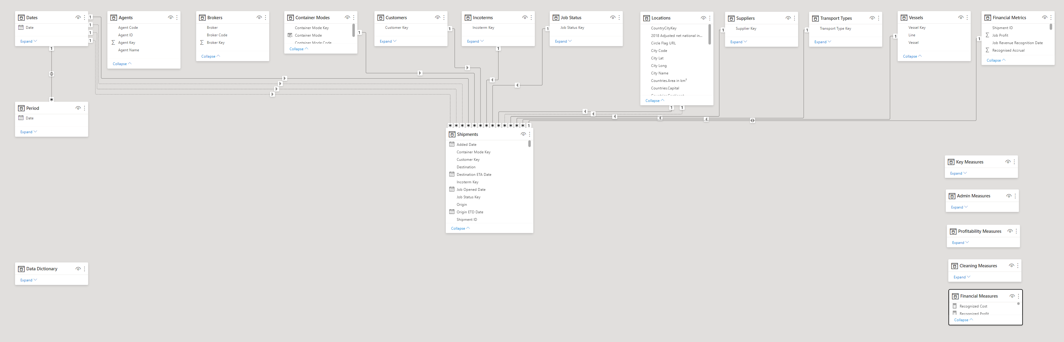
Data Modelling:
Used the standard waterfall layout approach to organize the tables in the data model, with dimensions on the top row, the fact table on the bottom, measure groups in a column on the right side, and the data dictionary reference/supporting table at the bottom-left.
Design and Report Layout:
It is always better to focus the attention on one or two main parts of the report when there are many things that can be analyzed in the report. This way, you can avoid the clustering of visuals & analysis in the report that becomes difficult for the end user to understand. If the end user can’t understand what the report is about in under 10 seconds, then it means the developer failed in data storytelling. Therefore, we adopted @alexbaidu’s approach and tried to tell more with less visuals in the report. The layout was carefully selected so to avoid more visuals on a page.
We searched and tried two layouts but found this one to be the best one and went ahead with it. If you are struggling to find good themes and report layouts then you don’t know how to use Google. We used Google to find the inspiration, used online editing tools to edit the layout and then used PowerPoint to do some more editing. That’s how we got the app-looking report style. Moreover, we used this challenge to do some marketing of eDNA (as you can certainly tell from the Home page).
As well, we added report admin information measures, and then added a smart-narrative textbox to display this information in the bottom-left corner of each page.
Report Admin Left =
VAR _Version = "V" & [Version]
RETURN
COMBINEVALUES( " | ", [Report ID], _Version, [Version Date] )
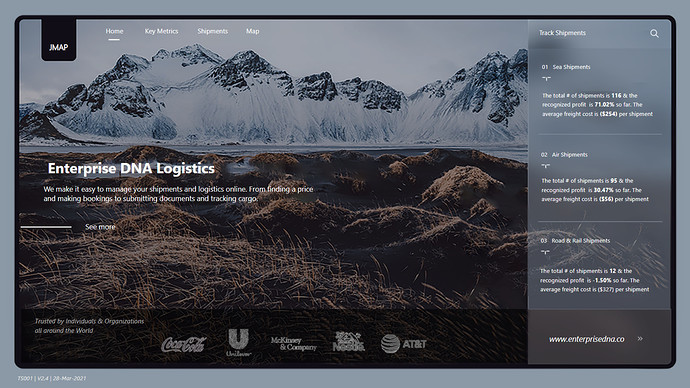
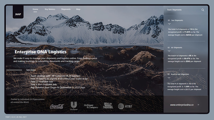
Home Page:
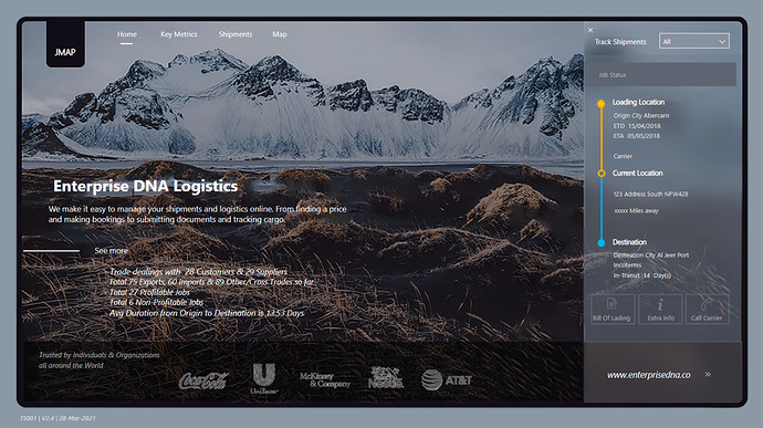
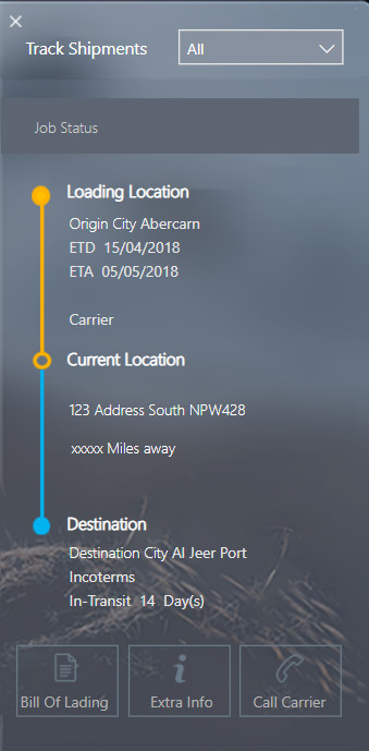
On the Home Page we included some key summaries to start with that are related to profitability and the average duration of shipments. Most importantly, included the Shipment Tracker on the right-hand side that can be tracked by Shipment Number that’s common in the logistics industry.
In the shipment tracker, we also included some other information that can be accessed by the end user, including:
- Bill of Lading / Material Bill #
- Extra Info (If there are special requests from the customers/clients)
- Call Carrier (In case if something happens/ need urgent information)
(Unfortunately, the data was not available for #2 and #3, but were included anyway as these are the must-haves for the logistics business.)
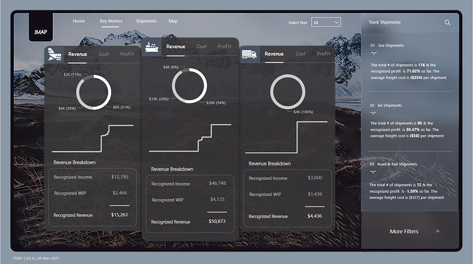
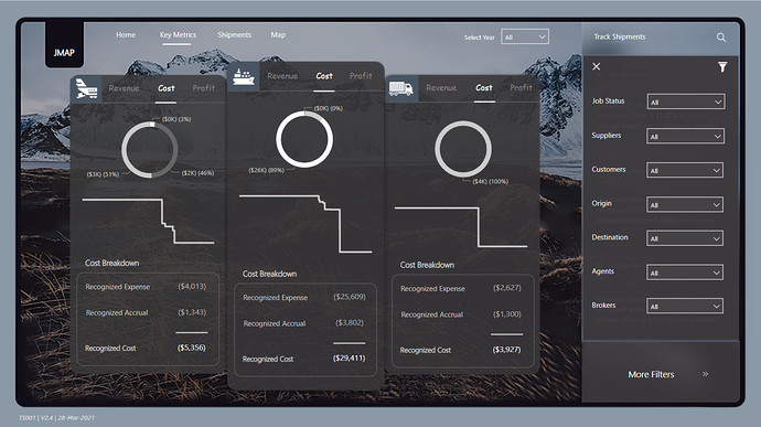
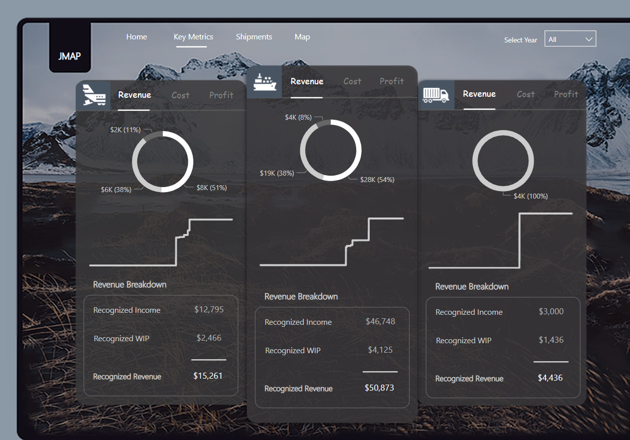
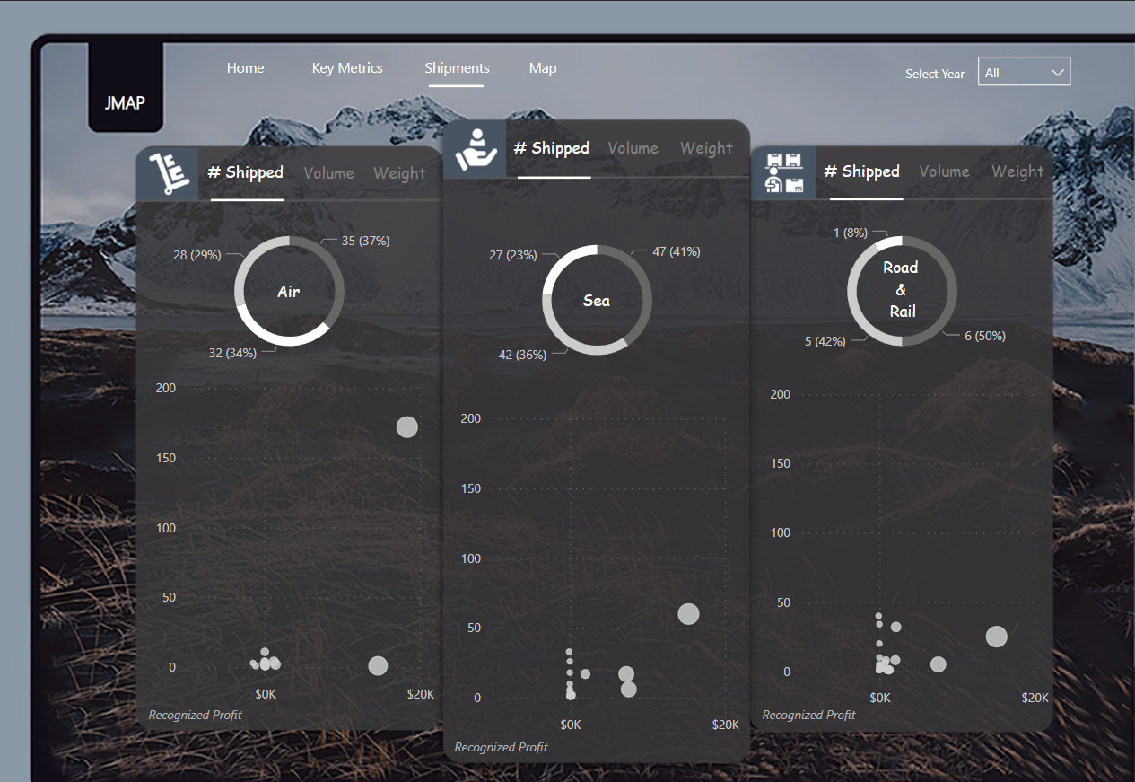
Key Metrics:
Three shapes that are joined together were created in PowerPoint by selecting the rectangle shape with round borders as the borders can be adjusted easily with this shape according to your liking. Each shape was used for a different transportation method (Air, Sea, and Road & Rail).
In this section, we analyzed the profitability of the business broken down into Revenue, Cost, and Profit; as well, we also provided further breakdowns into subsets at the bottom. The visuals in this section were carefully selected and each Donut Chart is being used as the filter for Imports, Exports, and Other/Cross Trades in the respective section (Air, Sea, and Road & Rail). The second visual is the cumulative trend for the metric selected (Revenue, Cost, or Profit) and the last one is the detail or breakdown of the metrics. So we tried to cover everything (Filters, Trend & Detail) in a simple way that are easy to grasp for the end user.
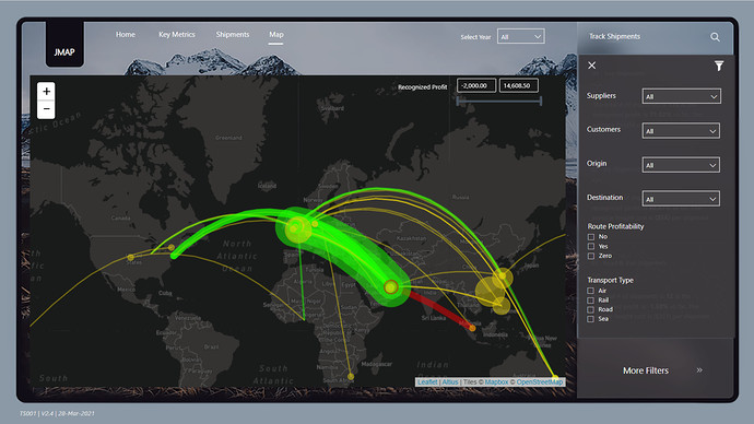
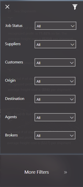
Moreover, other filters are included in the report that can be accessed by clicking on the More Filters option on the bottom right-hand side of the report. Sneaky but cheeky!
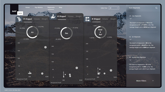
Shipments:
Under Shipments, we analyzed the profitability separately for Carriers, Customers, and Suppliers that are placed in different shapes. With Donut Charts, we again used this opportunity to use this as a filter for trade directions (i.e., Imports, Exports, and Other/Cross Trades) but this time categorized by Rail, Sea and Road & Rail. Now the end user can filter the report by trade direction and by transportation method.
In the second visual, the profitability is analyzed against different metrics (# Shipped, Volume Shipped, and Weight Shipped) for Carriers, Customers, and Suppliers, with the intent that the outliers can be easily spotted.
Here again, other filters can be accessed by clicking on the More Filters option.
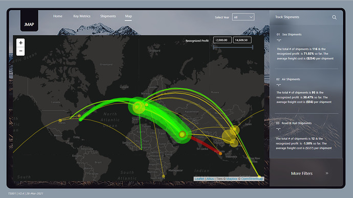
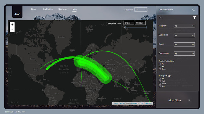
Map:
Early in our discussions, we decided that we wanted to depict the different shipping routes on a map to visualize profitability by route and mode. Getting the Countries dimension table in proper shape to do that was a multistep process. First, we had to obtain the city names, which we did through the UN 3 character LOC codes. This data can be obtained directly from the UN site, or in a better format/organization from datahub.io.
The problem with the UN data and the datahub.io version is that there are many missing values in the location coordinates field, and those that are present are in a format that the Power BI mapping visuals can’t read. So, geocoding the standard latitude/longitude data associated with the 38 unique from/to city pairs in the fact table was necessary. The simplest way to do this is via the “geography” data type in Excel, but the available SKU for Office 365 didn’t include that feature (gotta love the MS licensing model…). So, instead the Opencage.com geocoding API was used and called from within Power Query using the following R script:
# 'dataset' holds the input data for this script
library(opencage)
library(keyring)
oc_config(key = keyring::key_get("opencage"))
dataset <- DC12_Cities_for_Geocoding_for_Testing_Only
df <- data.frame(location = dataset$City, iso2 = dataset$Country)
output <- oc_forward_df(data = df, placename = location, countrycodes = iso2, limit = 1)
Note that the “keyring” functions are included to encrypt and protect the Opencage API key – given that only the first 250 API calls per day are free, accidentally giving out your API code is like publishing your credit card number.
For those interested, the code has also been published to the Analyst Hub Community site: https://analysthub.enterprisedna.co/apps/raw-code?id=h4vcsbbv
Once the data was properly geocoded, it was quite straightforward to map the routes by profitability in Icon Map. Paul Lucassen’s new Geospatial Analysis for Power BI platform course does a wonderful job explaining how to use this incredibly powerful custom visual, so it won’t be repeated here. Apart from the geocoded data discussed above, the only other components that were needed were two simple measures – the first to scale the route line thickness based on recognized profit, and the second to set the line color based on route profitability:
Line Thickness =
(ABS( [Recognized Profit] ) /200 ) + 2

Line Color Profitability =
SWITCH( TRUE(),
   [Recognized Profit] > 0, "#1AFF00",
   [Recognized Profit] < 0, "#F00000",
   "#E4CE0B"
)
From that point, it was just a matter of dropping the proper columns and measures into the Icon Map field wells, and setting the zoom defaults.
[Image]
Conclusion:
After expending significant time & effort and failing to get the PowerBI.tips version control system setup on SharePoint to struggling with data cleaning to completing the report in just a few days, it was nothing more than a rollercoaster ride where all the team members chipped in with their expertise and time to produce a report that tells a story with compact analysis in a way that looks nothing less than an advanced logistics application.
Once again thanks to all the JMAP team members who are very supportive, friendly to work with and don’t get me started on the crazy skill set that each individual team member possesses.
That’s all from our side and we will come back with different approach of collaboration in the next challenge.