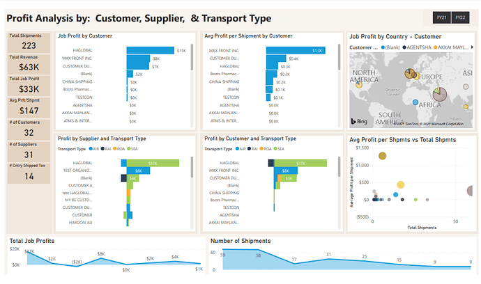
Here’s David’s entry for Power BI Challenge 12. @DMercier, would you like to share how you built this dashboard and what your inspiration is in building it?
To learn about the real-life scenario presented for the challenge, be sure to click on the image below.

1 Like
Hi,
My primary intents for this was:
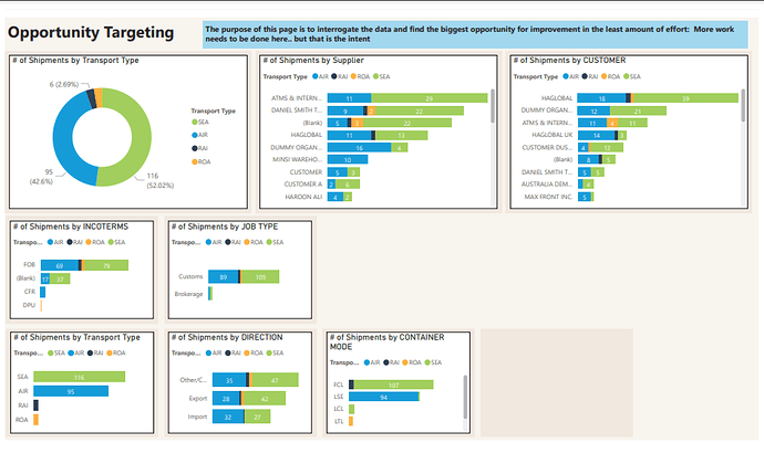
Building an “opportunity targeting device” for a business owner: Each Pareto Chart allows for selecting the “Biggest Bars” which filters the rest of the visuals for drill down targeting of information. This dynamic interaction by a business owner is more engaging than tables of data, pie chart or donuts… Users like the experience 
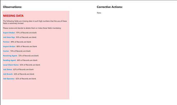
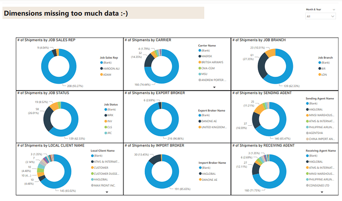
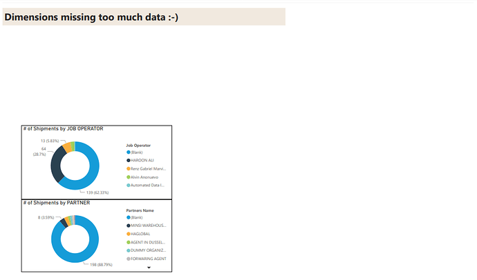
Improve operational efficiency - Show data fields that are not being used and target them for deletion or improve the discipline to use them by making it visible
I purposefully stayed away from a “monthly” report format.
The data modeling experience was intense, and I got stuck a few times
All feedback and suggestions are welcome
