Here’s Alvi’s entry for Power BI Challenge 12. @Alvi, feel free to add other details of your work.


Here’s the link to the report:
To learn about the real-life scenario presented for the challenge, be sure to click on the image below.

Here’s Alvi’s entry for Power BI Challenge 12. @Alvi, feel free to add other details of your work.
Here’s the link to the report:
To learn about the real-life scenario presented for the challenge, be sure to click on the image below.
Hi guys
Challenge 12 was perhaps the most difficult in terms of the dataset that was provided, which had issues with data quality and having 100+ data fields made it even more challenging to develop an understanding of the dataset.
Background
Although @haroonali1000 had given a basic introduction about the dataset both in his post and intro video, but a lot of understanding needed to be developed around the whole freight forwarding or consolidating process. I had zero knowledge about this whole process and I decided to read some basic tutorials to help get some sense out of the given dataset.
Based on my understanding, I figured out that the dataset (most probably) has 3 subsets which deal with the various functions of freight forwarding.
Based on this raw understanding, lots of null values in the dataset made sense, but still there were a few which have been treated as missing data.
Data Modelling and Transformation
This was the most frustrating part of this challenge that at one point even made me to think about not going further on the dataset :). It involved a lot of ‘Delete column’ and ‘Reference’ operations to make the best data model. I am still not sure whether my approach was the best or it could be improved, but I decided to make 3 Fact Tables, based on the 3 subsets of data that I explained above and the associated dimension tables. As I was finishing the challenge and making visuals, I noted a few improvements could be made but due to the lack of time I could not do that.
Personally, I feel this was the most annoying part of the challenge as it took me a number of hours over a few days to look at all the columns and get some sense out of it. There were a number of records where some of the values looked incorrect. A few of these were corrected but most were left as it is because I wasn’t a 100 percent sure based on my limited understanding.
Visualizations and Analysis
Based on my understanding, I tried to create some story using icons for various stages of the freight forwarding operation. This was partly to give myself some assurance that I was working on the correct lines  The focus was to develop visuals that correlated with my understanding and the flow of freight forwarding operations.
The analysis was divided in the fol 7 areas
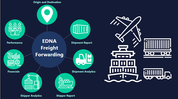
Cover Page
The cover page was designed for navigation experience to each of the 7 analysis areas for EDNA Freight Forwarding company
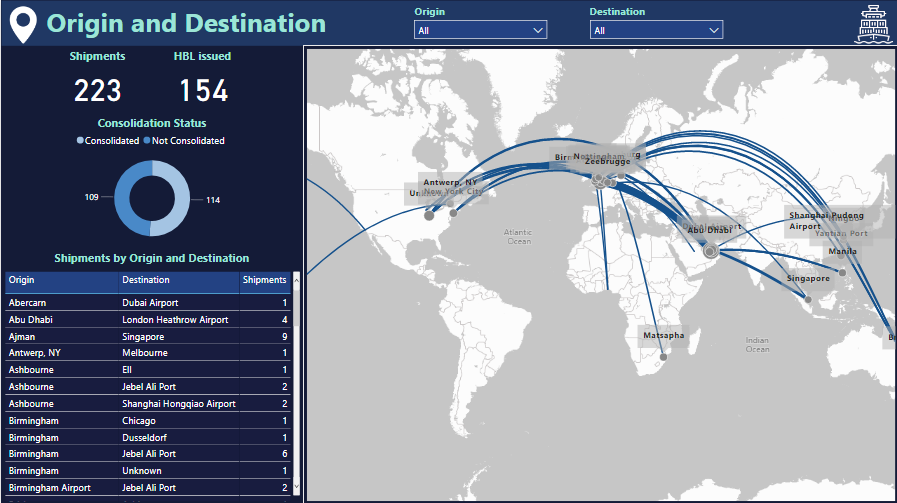
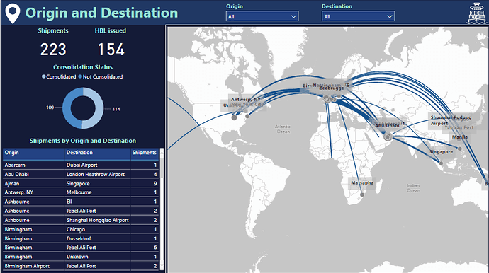
Origin and Destination (Shipment Tracking)
I used the custom map visual to show the shipment flow between origin and destination. Initially, the idea was to develop this as a “Shipment Tracking” page for tracking the shipment from origin (supplier) to destination (customer) with the departure and arrival times for each stage but due to incomplete information around majority of records, I dropped the idea and focused instead to just focus on the origin and destination routes. Some of the transportation modes for these records looked incorrect, especially for rail based routes so dropped that slicer as well from the slicer pane and focused just on the origin and destination and the number of shipments.
An important visual on this page is the consolidation status donut chart as complete route information (origin, destination, first load, load, discharge, last discharge) was only available for the shipments that had a ‘Consol ID’ associated with it. So this information was vital for all subsequent analysis on shipping routes and options associated with the carrier or shipper.
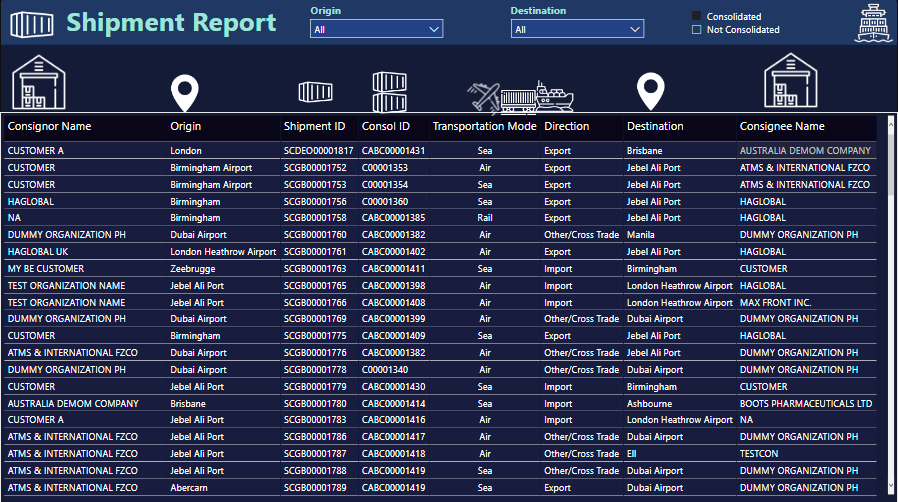
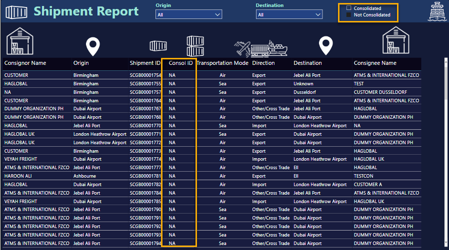
Basic Shipment Report
This visual is the first of the 2 where I have used icons to build a story about the shipping operations. The consolidation status is used as a slicer to highlight which shipments have been consolidated by the freight forwarder and which haven’t been consolidated. The ones which are not consolidated have no associated route or carrier information.
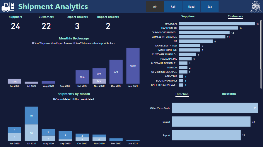
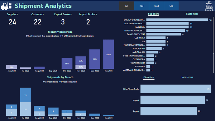
Shipment Analytics
This page highlights some of the insights that could be generated for the Fact Table associated with Shipments, Brokers, Suppliers and Customers. All visuals just focus on the analytics associated with number of shipment across various dimensions. The most notable is the consistent decrease in the number of bookings since July 2020, which might have something to do with the pandemic as well.
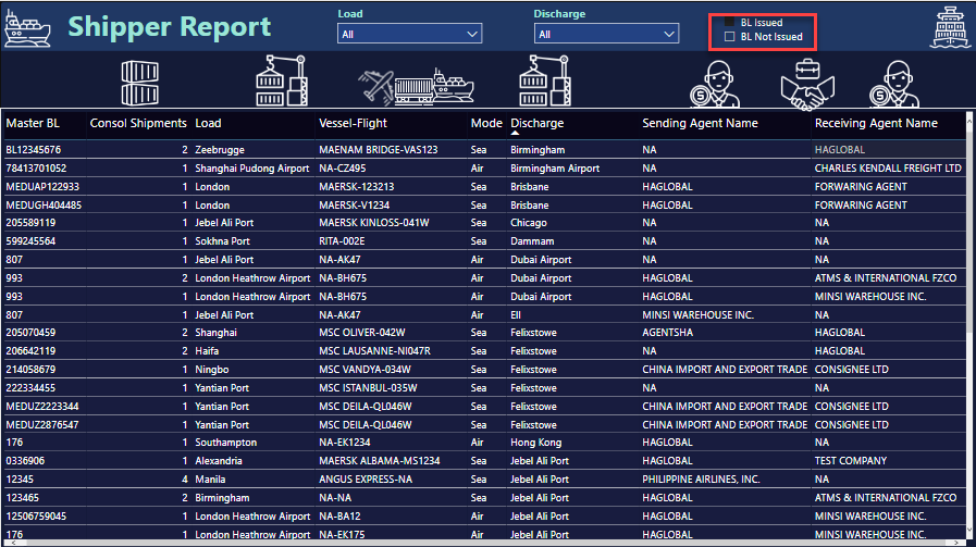
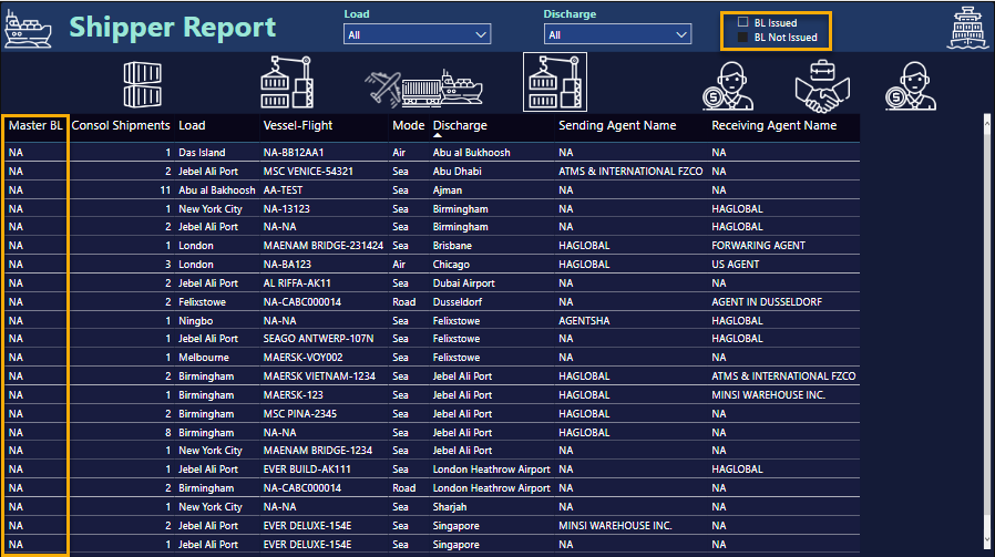
Shipper or Carrier Report
This page uses the 2nd Fact table that just includes the consolidated shipments where carrier and route related information is available. Another field which is important is the MBL or the Master Bill of Lading issued by the Carrier to the freight forwarder. This is a cargo receipt issued by the Carrier and contains details relevant to the shipment. More than 1 consolidated shipments could be associated with a particular MBL and this has been included in the table also. There were certain records where the MBL was empty or missing but the route information was available. I was not sure if this had something to do with my understanding or if it was actually missing data, so I used a slicer to segregate the records. The sending and receiving agents, which represent the consignor and carrier respectively at the discharge port, were also included in the report and explained through the icons based storyline.
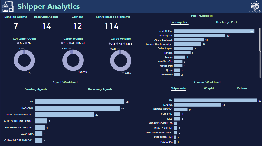
Shipper or Carrier Analytics
This page focused on the insights that could be generated from the 2nd Fact table and highlights the workload at loading and discharge ports around number of shipments, weight, volume and number of containers handled. Also, the sending and receiving agents have been included as a part of the analysis. Again, not a 100% sure about which visuals were more appropriate or important for analysis
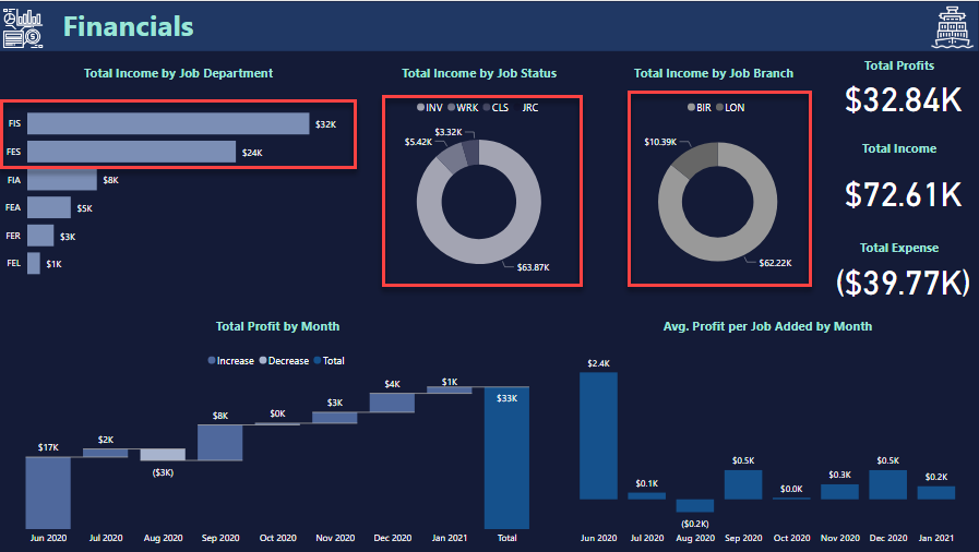
Financials
This page highlights the financial aspects in the dataset and uses the 3rd Fact Table. In the data exploration and understanding part, I could see that only the records having some associated date in the ‘Job Added’ column were reporting non-zero values for various columns on costs, revenue, accrual and WIP. Also, Job operators, Job Status, job Branch and a few others were only associated with these records. So it made sense to use only those records in this fact table. I only focused on the Total income, expenses and profits measures and tried to make sense which dimensions were driving the income and profits. Still not a 100% sure but sea based transactions, jobs with invoice status and Birmingham based operations seemed to be the driving factors, as highlighted in the visual. I feel I could have dug something more insightful but could not due to the lack of time.
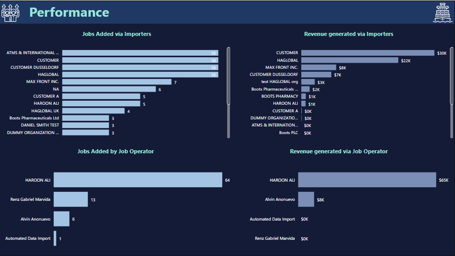
Performance
This is perhaps the most tricky page in the whole report because again I wasn’t a 100% sure on including which dimensions in the report. During the data exploration part, I could see the local clients or importers only coming into the picture whenever there was a job operator associated with the job. So, in terms of evaluating performance it made sense to include just 2 dimensions in the analysis. I even contemplated dropping this page altogether but eventually went ahead with my understanding.
Final words
I think this challenge was by far the most tricky and ‘mentally draining’ of all the challenges I have participated so far. The number of dimensions in the dataset, its overall quality and the limited domain knowledge related to freight forwarding made this challenge a very tiring experience. Normally my aim is to try and explore some new areas around data visualizations for my own learning, but to complete this challenge, with whatever limited, right or wrong understanding I had was in itself a big achievement. I think it was important to complete the challenge and get feedback on the overall understanding from the community rather than just focus on the creativity and innovation. Most real-life situations also have a familiar feel where the room to experiment and ‘creativity juice’ required for innovations, as @sam.mckay puts it, have a secondary importance. I am not sure if my understanding was correct or not but the most valuable part for me is to participate and get feedback from the community.
Thanks for reading this rather long write-up and I look forward to comments and feedback on the submission.
Regards
Abu Bakar Alvi