Hello,
First of all, this was a “crazy” dataset  Not easy to go through and draw conclusions for reporting.
Honestly at first glance I got quite desperate with the data and how to work around it… until I decided to focus more on the design or visual aspect of the report. It is not the right logic but at least it got me motivated and stopped me procrastinating ^^
> Design/Report theme:
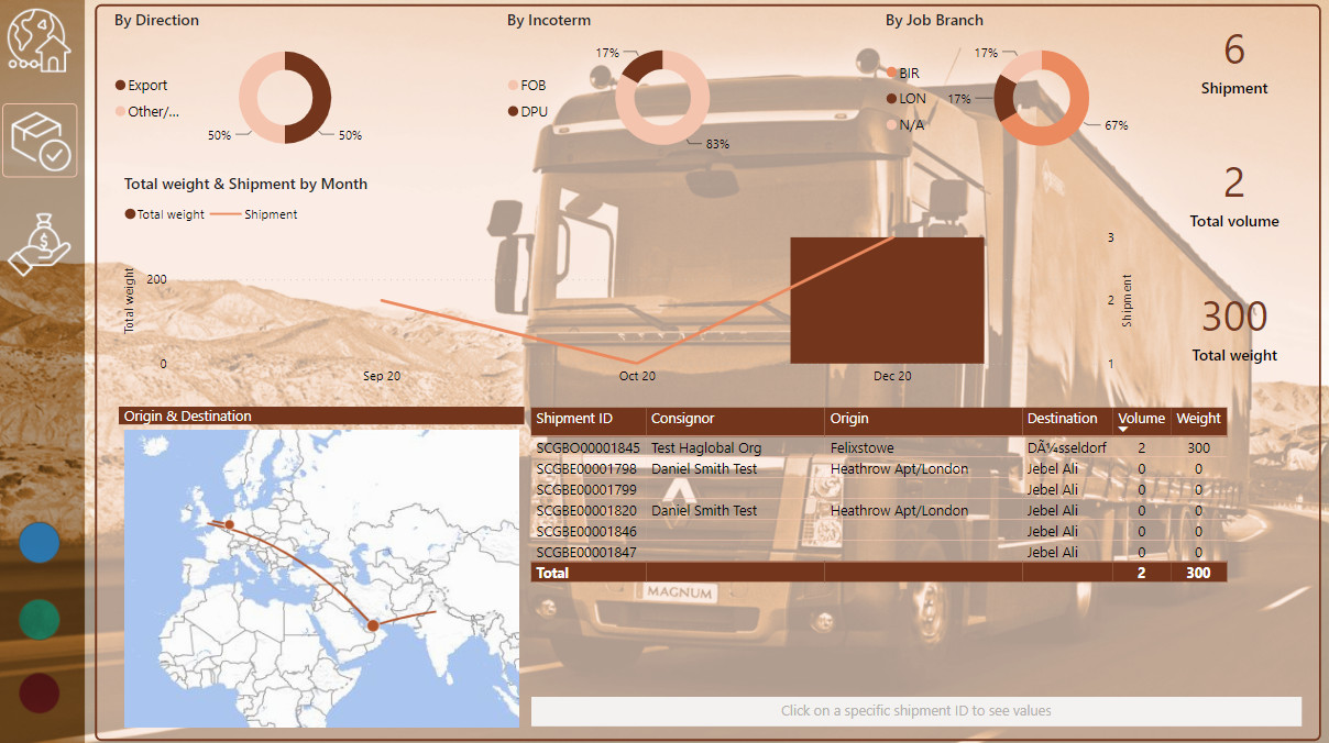
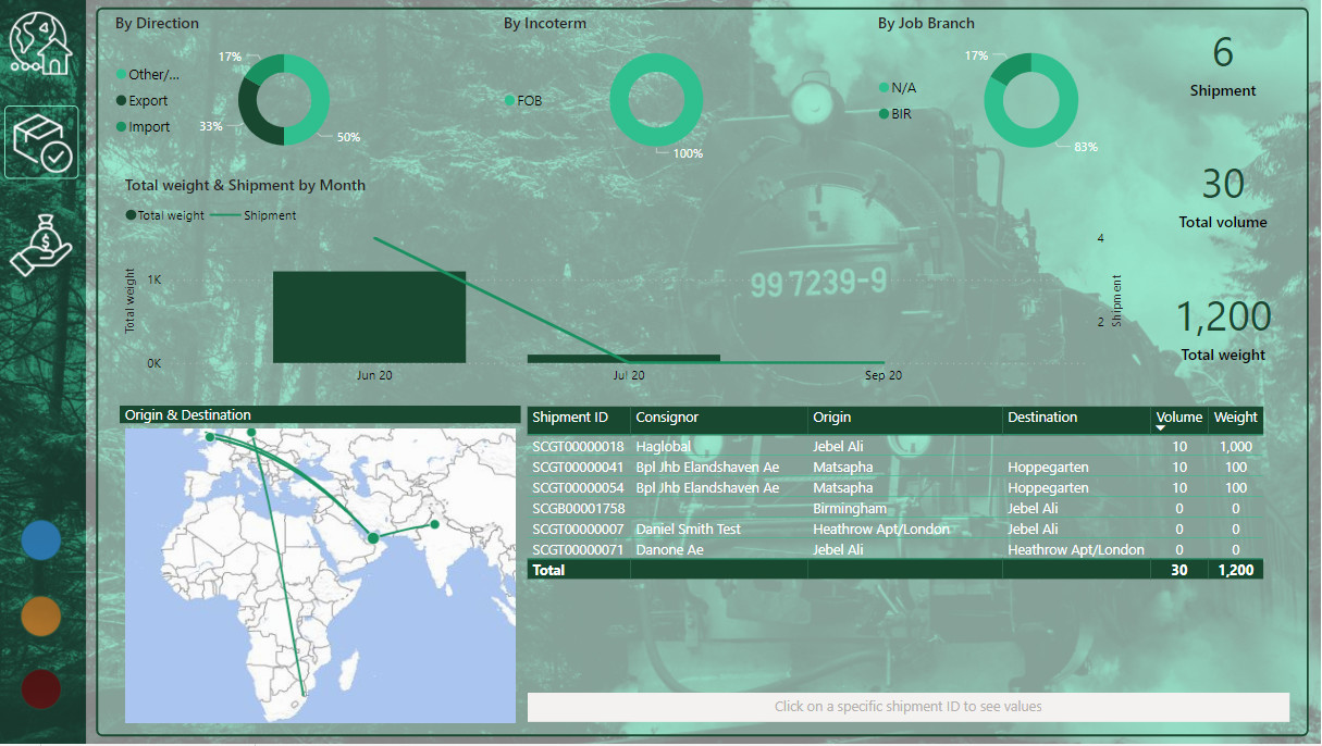
I had in mind this homepage with the four section represented by an image related to the transportation mean. I built it with Photoshop and uploaded it as page background in my report.
Then, to fulfil @AntrikshSharma’s curiosity, I just wanted to create an attractive way to access the related page section by hovering the image… and thought about this video from Havens Consulting I saw few months earlier. I reproduced the same method using my images from photoshop into powerpoint and creating the needed animation. I exported the animations as a .gif which I used in the fill section (on hover) of button visuals. End-result is cool  I almost wanted to stop the report at this stage as I was not sure if other pages would match this one…

By the way, perhaps later on Power BI will include animation/transition effects… that’d be awesome🙄
Otherwise it was the first time I used image as background into report and I decided to do so in all report pages to have a certain consistency on the visual aspect.
I used the same transportation backgrounds in each section with an minor opacity plus a ribbon on the left-hand side.
Later I adapted the visuals to the color theme to keep with the trend.
One cons I noticed afterwards was that high-quality image backgrounds (even if compressed) + gif make the pbix file heavier if I want to maintain a certain image quality standard.
> Data/Model [back to nightmare…]:
When having a look at the dictionary section of the excel source file, I learnt about the UN/LOCODE codes and also found a nice source to work with. UNECE website also provides explanation about these codes if you are interested in it.
I just kept things simple with 3 facts table (shipment info, finance info, container info).
There is no complex data-modelling neither complex DAX in the report.
> Report visuals
I had in mind using a map visual to show origin & destination, as many of us did, and specifically the icon map animations shown in James Dales videos but I realized that data was different so I just stuck with the Flow map visual which was also new for me.
I also tried and used button visual with drill-through feature to navigate to a Bill Of Lading sub-section of the report. I agree that this drill-through method is surely more friendly for end-user.
The Bill of Lading sub-section is a background image (thanks Photoshop ) and then I placed button with shipment information to complete it.
Feel free to comment any suggestion/improvement 
Regards,
Alexandre