Here’s Zoe’s entry for Power BI Challenge 11. @datazoe , feel free to add other details of your work.
Here’s how Zoe described it:
Here is my submission. I still have some things I want to add but it will have to be added in v2 later as I only had a few hours to work on this one.
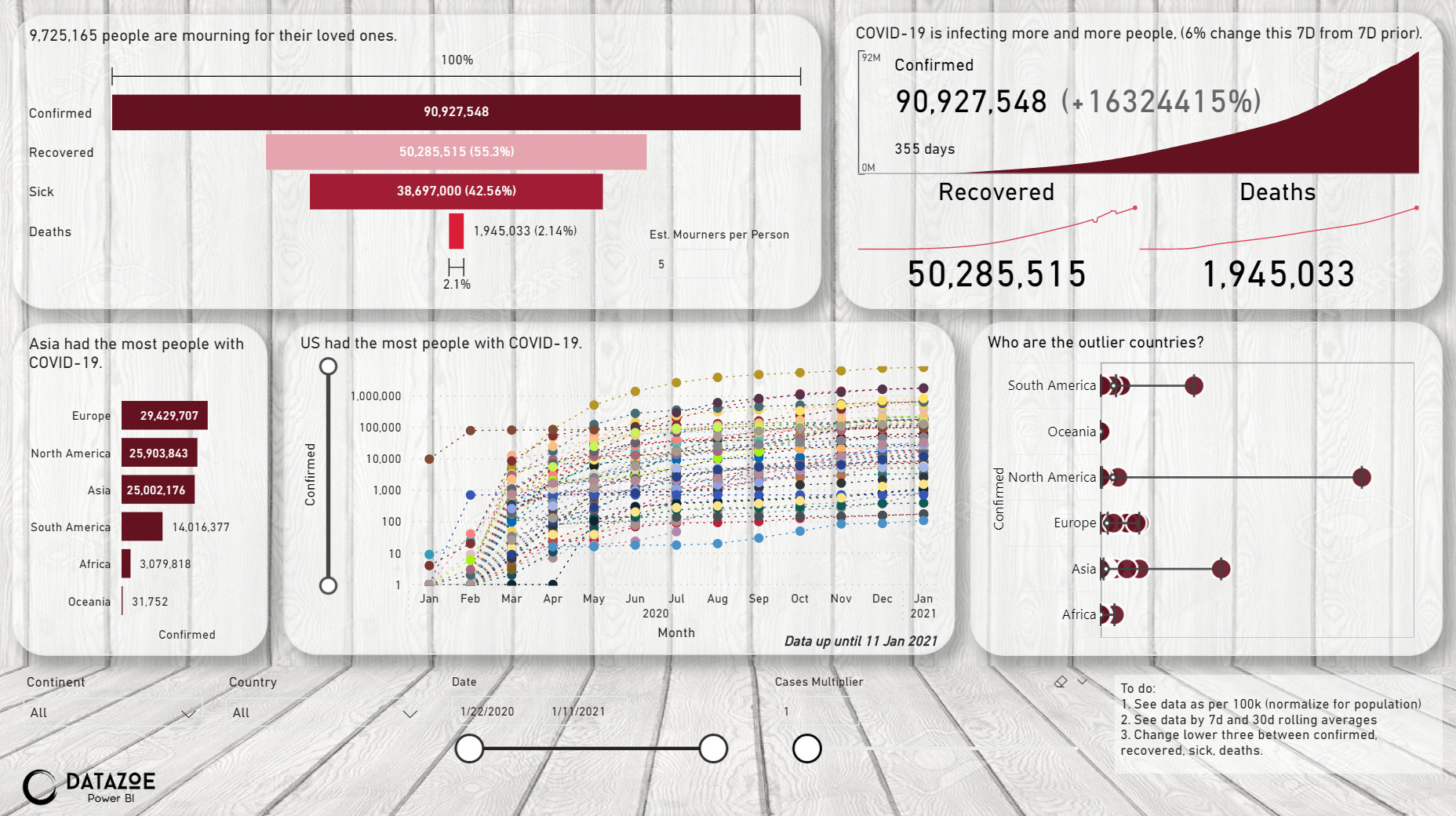
I added two parameters. The first one is to estimate the number of people mourning for their loved ones. I think this is an important impact of COVID-19 deaths. The second one is a cases multiplier. I added this one after articles saying the number of people reported as having COVID can be much lower than actual, due to mild sickness/asymptomatic or when many people get it in the same residence. After the first person is positive they no longer need to test to realize they have it, so it won’t get reported in official numbers. This is important for the deaths % of confirmed, and also confirmed per 100k population views (I haven’t added population yet!).
To learn about the real-life scenario presented for the challenge, be sure to click on the image below.

This one I call “the writing on the wall”.
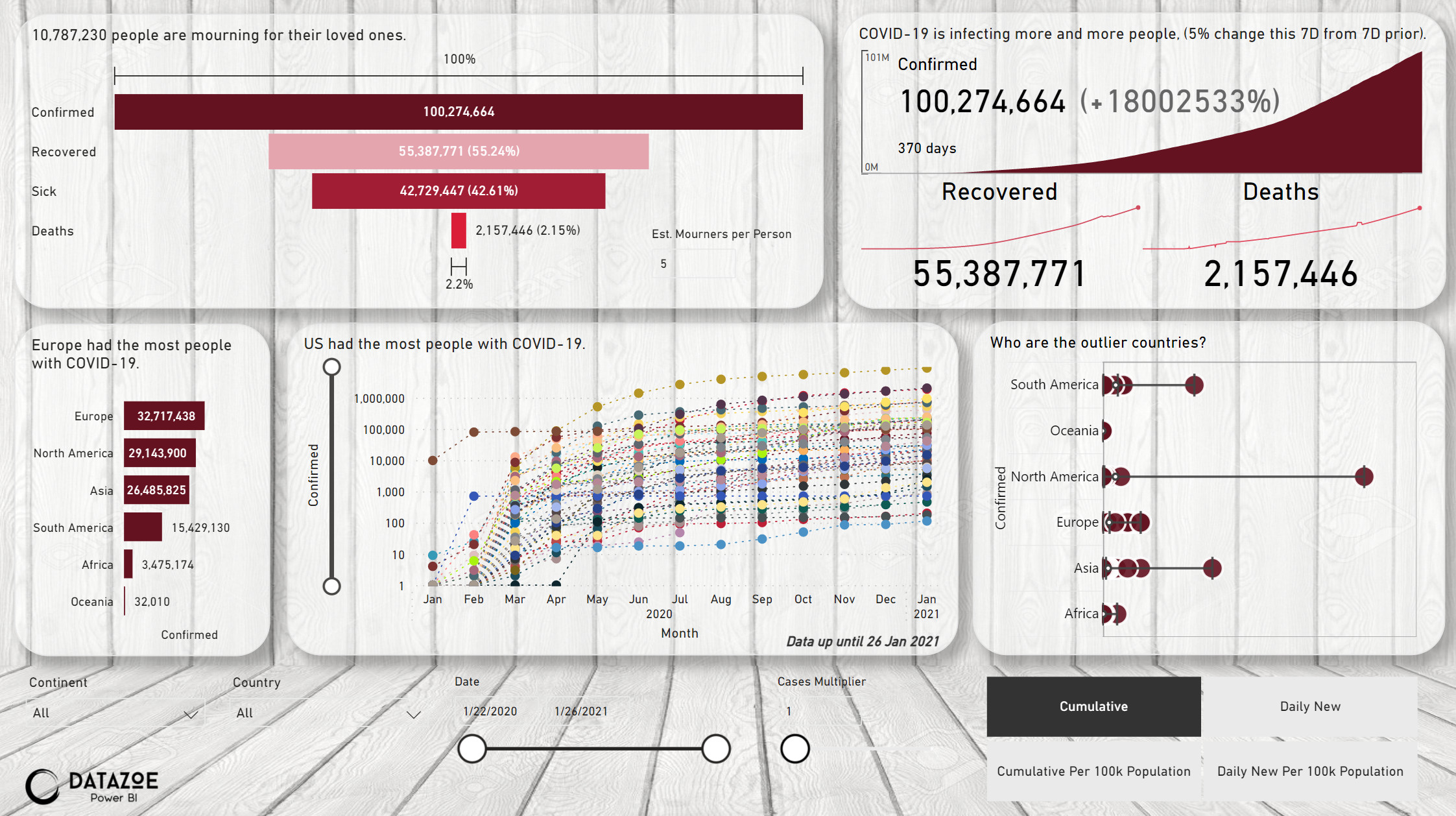
I have adjusted the report a little in the past few days, here is where I am now.
I chose a light background so I went with dark red to light red for colors. I did this to try and get the middle chart to only do shades of red (by only giving it red!) but it still did a bunch of other colors anyway. I didn’t want to manually set 200+ lines so the colors stayed.
There are many, many COVID-19 reports out there, and most are better than mine. Here are some key elements I wanted to add to my COVID-19 report.
- I added “mourners”. To me this is a big impact of COVID-19. The numbers of those who died is multiplied in the report by an adjustable number to show how many people are impacted by the death of a loved one.
- I added “sick”. Currently this is simply confirmed minus recovered and deaths, but then I realized the recovered number is not always available. I will maybe change this to rolling 14 day cumulative of the new cases, assuming new cases are sick for the next 14 days. This is meant to show how many currently can pass the virus to others.
- I added a “case multiplier”. There are a number of articles saying that the reported number of cases are under-reported. I have experienced this also, in cases where many people in a household get sick, after the first couple test positive there is no test needed to confirm what the others have when they fall sick. This impacts that % of confirmed that have died and also the per 100k population, so I added an adjustable variable to model that.
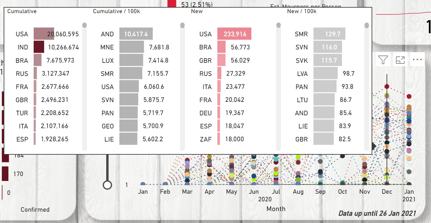
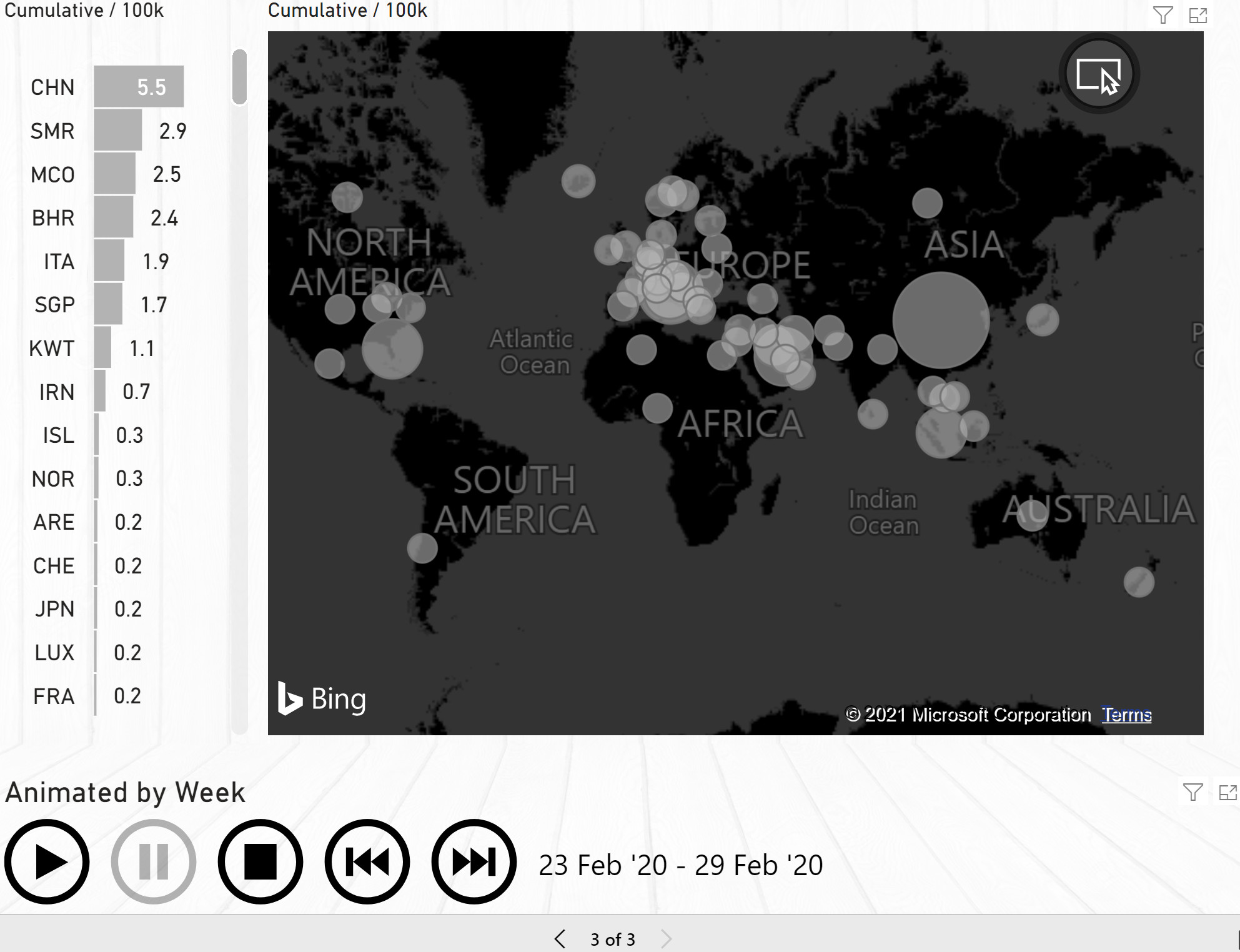
- I added a way to normalize for population with the per 100k measures. The US and UK have alarmingly high numbers, but they also have fairly high populations. To be able to compare countries of different population sizes I calculated the number of cases per 100k people, which fairly common on COVID reports. Then you can see that countries like Sweden are currently having many more cases per 100k than the UK.
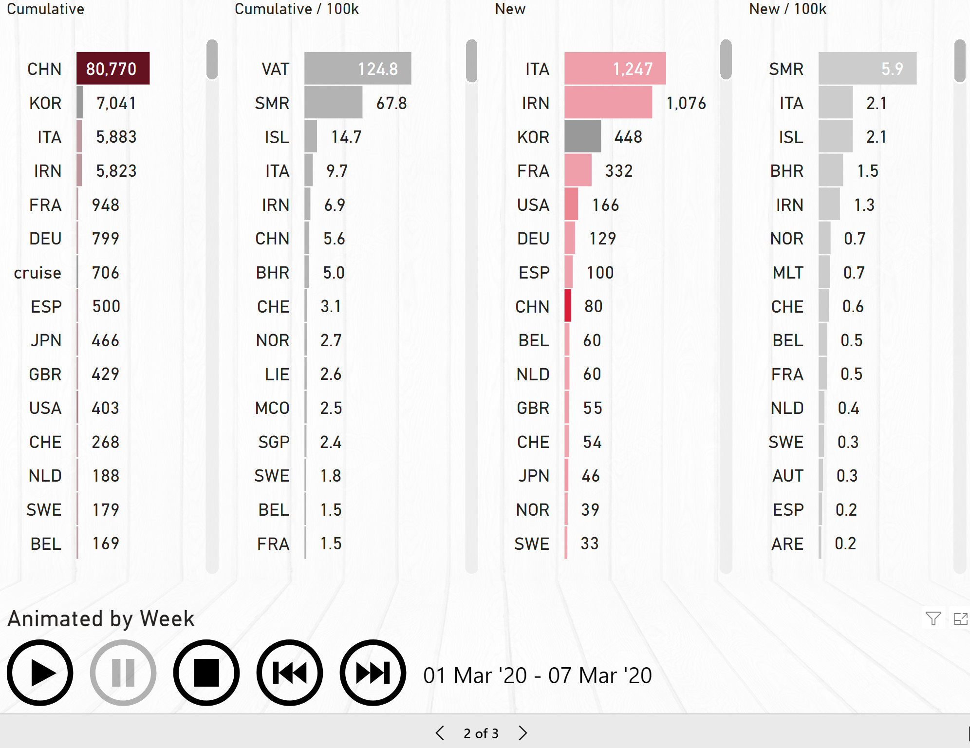
- I added context switching for cumulative, cumulative per 100k, daily new, daily new per 100k at the bottom right.
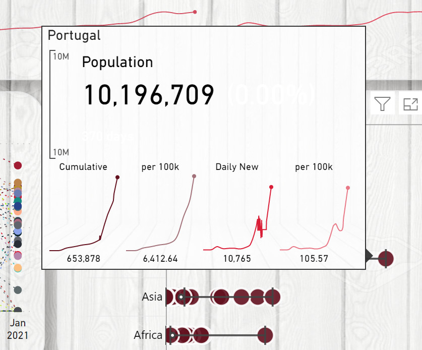
I also have added some tooltips on the bottom two charts, for comparing countries (including colors by population which is why India is a darker color than USA) and detailing by country:
Population data: Population by Country (2021) - Worldometer (worldometers.info)
I decided I really like the tooltip for the middle chart and pulled it out and did two animated pages. You can press play and watch, or play then pause to step through one week at a time.
3 Likes
Another fabulous submission here Zoe.
Really like how once again you’ve plenty of great elements inside your report.
It’s easy for the consumer to really get the story they need from the data.
Really appreciate the write up as usual. Diving deep into how you have gone about creating this is super valuable for all those who participate in the community.
I think one of the best aspects of the report is honestly you’re tooltips. And I love the tooltip where you can dive into each different country and see each different metric around that country.
Really super submission and impressed once again.
Sam
2 Likes