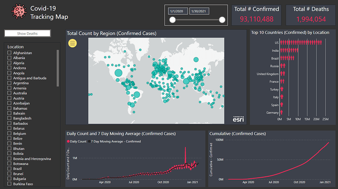
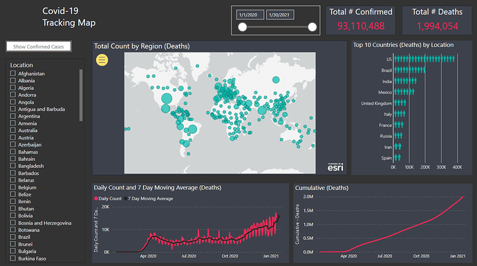
Here’s Timothy’s entry for Power BI Challenge 11. @tweinzapfel , would you like to share how you built this dashboard and what your inspiration is in building it?


Here’s how Timothy described it:
Data
Given that the count in the original data set is just the cumulative amounts for a given day, I created 4 additional calculated columns in the Covid Data table. I opted to go with calculated columns instead of measures as I just found it quicker this time and the data set was relatively small. The columns were:“Previous Day Count” – this was used to get the value from the previous day which would then allow me to calculate what the daily count was. I added variables to take both the category (Confirmed, Death, Recovered) as well as location.
“Daily Count” – this would just be the amount in the original Value column (provided with the dataset) minus the previous day count above.
I then added two more columns to find out what the daily change was from the previous day as well as the percentage change. I was hoping to use this information to track the % change over time – but ended up running out of time. I’m hoping someone else did something around this.
Key Measures
There is nothing fancy here. Mainly the daily counts for each category and then 7 day moving averages. I also created Top 10 countries for both confirmed cases and deaths.Visuals
Very standard visuals here. I did use the ArcGIS map visual but found that with this as well as the standard Microsoft map that the bubbles representing size aren’t very good at representing the actual amount. A small bubble could be 20 cases or 20,000 cases and they look to be the same size. So overall, I didn’t find this very effective. I am going to review others who used maps to see what you all did.A new visual that I have never used before is the one for the top 10 countries for confirmed cases/deaths. I used the Infographic Designer visual (available from the custom visual location) – and then used people as the icon. I thought this would be the most relevant to display the number of cases.
Credit for the icon
Icons made by Freepik from www.flaticon.com
To learn about the real-life scenario presented for the challenge, be sure to click on the image below.
