Here’s the entry from one of our non-member participants, Thangeswariy.
Here’s how Thangeswariy described it:
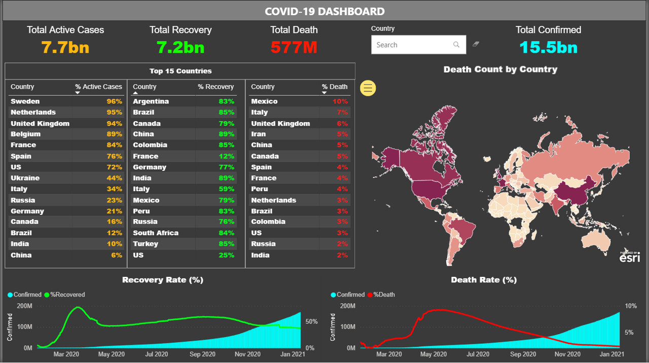
This dashboard has been designed to enable an end to end statistical visibility of Covid-19 current situation.
The total confirmed cases, active cases, death and recovery has been included.
Top 15 countries with highest active cases percentage, highest death rate and highest recovery rate can be visualized.
At the same time, the death rate and recovery rate over time has been manifested using combination of bar and line chart. A heatmap depicts the death count in each category by color saturation.
On top of this, for the ease of the user a search tool box has been added to type in the preserved country and visualize the information in the dashboard.
Thank you very much.
To learn about the real-life scenario presented for the challenge, be sure to click on the image below.
