Here’s Mohammed’s entry for Power BI Challenge 11. @chris786 , would you like to share how you built this dashboard and what your inspiration is in building it?
Here’s how Mohammed described it:
Learnt a lot in these 3 days of putting up the dashboard. Thanks to the team.
I had the same issue to update the data, thanks to Melissa and hajni157 for answering that and thanks to Emercado777 for asking the question.
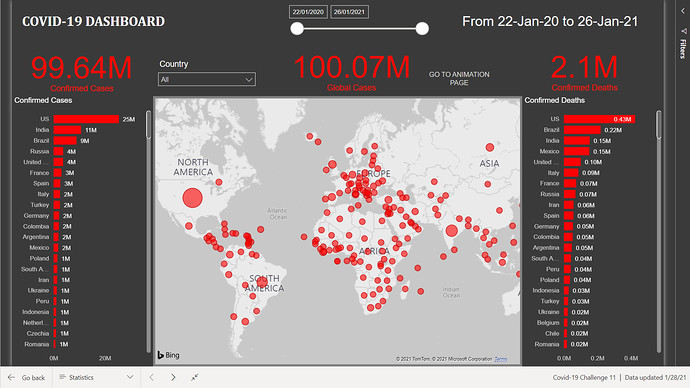
I have 2 pages and you can navigate via the button, the second page has some animation with the map visuals. Also have a custom tool tip , as you hover over the country, it gives you the statistics.
To learn about the real-life scenario presented for the challenge, be sure to click on the image below.
My Covid-19 Dashboard was inspired from the John Hopkins Dashboard. https://coronavirus.jhu.edu/map.html
I tried to mimic something of a similar sort.
The first big challenge was to understand the data and how to add up all the cases. After researching I found a solution how to find the MAX for each category that is for the recovered cases, confirmed and death cases.
My first page contains confirmed cases and confirmed deaths using the clustered bar chart.
There is a slicer by date from which the formulas dynamically update . I also used a custom text for dynamic date filters which shows the date selected.
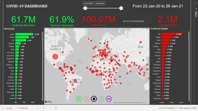
There is a button on the first page that when clicked goes to the animation page, it transitions seamlessly into the second page.
Tooltip: This is where I custom built a tool tip to add measures for confirmed cases, recovered cases , recovery rate, country selected and the confirmed deaths. So when the user clicks on a country in the map visual the tooltip provides the information.
The second page contains the play axis animation. What’s slick about the animation is all the measures dynamically change and so does the bubble on the map visual, as it tells a story of how the cases started rising rapidly in March and April 2020 globally.
Enjoyed making the report and my learning curve is progressing. Thanks to the Enterprise DNA team as they are very helpful in solving our questions when needed.
Kudos to all taking part…we all learn and progress from each other…
I appreciate the effort that has gone into creating this report. I think it tells a simple story of the data.
For the future maybe have think a little about being a bit more creatively around the data.See if you can create Insights that might not be directly embedded into the raw data itself. That’s how I feel you can tell an even better story and produce the value out of data most wouldn’t even realise is there.
Also just think about the contrasting colours you have in your report and why you use certain colours in certain areas. Simplify this down and use colours that are of a similar theme I think. Light blues, greens etc. Check out the Analyst Hub to learn more.
Also I really like your write up and how you were inspired by other dashboards that you saw. And also like the tooltip idea that you’ve used.
Thanks Sam, much appreciated for the advice. Yes, I agree, definitely need to add some creative insights in future reports, I need to build on this.
Will check out the Analyst Hub, the usage of colour combination is where I need to improve on as well.
Many thanks,
Mustafa
I’ve never been good at developing attractive color themes on my own, which is why I put together the following video on tricks for capturing the best color themes In the Analyst Hub Community section directly into JSON color theme files that you can import into Power BI and use as the basis for your own reports: