Here’s Jihwan’s entry for Power BI Challenge 11. @Jihwan, feel free to add other details of your work.
Here’s the link to the report:
And here’s how Jihwan described it:
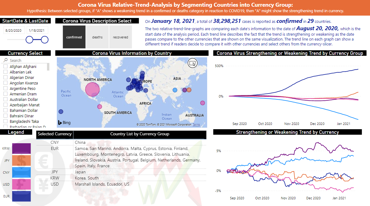
In the Power BI Challenge #11, I want to share what I described in the Power BI report that is with COVID19 information, and how I structured the information to provide useful insight.
One of the biggest struggling parts of this challenge for me was to build a one-page report covering what I believe to be the key statistics. Showing the information of “confirmed”, “deaths”, and “recovered” by using COVID19 data, and by combining it with information of populations, land size, life expectancy, and some others is already described by many great analysts.
However, I could not find any report that describes COVID19 data with currency information.
Well, it may be not worth it and meaningless to show COVID19 data together with currency data. But I wanted to see whether my simple hypothesis is in-general-applicable or not.
Perhaps, this might be proved by other people as not applicable. However, I think my report is still worth it if some other analysts start to work on it and prove it as not applicable by quoting my report. This means that at least my report started this argument.
My assumption is,
- Between selected countries, if one shows a weakening trend in a confirmed & deaths category, or a strengthening trend in a recovered category in reaction to COVID19, then the one might show the strengthening trend in currency.
When considering currency, it is always between two currencies. For instance, USD → EUR, GBP → USD, AUD → CAD, and so forth. And between the two, one always shows getting stronger in a certain period while the other shows getting weaker in a certain period. These two trend lines can be referred to as relative trend lines.
The relative trend lines are not only relative to each other but also relative to the start-date that readers of the information want to select. For instance, a reader selected November 1st 2020 as a start-date and EUR → USD was 1.20. When the date became November 5th 2020 and the ratio was 1.15, then the relative trend shall not show just a number that changed from 1.20 to 1.15. Instead, it shall show the difference ratio between the start-date and the selected-date. This makes all the relative trend lines to start from 0. Because the difference ratio between the start-date and the start-date(selected-date) is always 0.
When comparing the relative trends between three or more currencies, then the concept of average has to be taken into the consideration. For instance, if USD, EUR, and AUD are compared, then USD’s trend is the average of USD → EUR and USD → AUD. AUD’s trend is the average of AUD → EUR and AUD → USD.
You may find many articles that tell how to calculate relative strengthening trend and relative weakening trend between two or more currencies.
Regarding each country’s (or each area’s) reaction to Coronavirus, I calculated the ratio of relative trends like below.
Between two or more countries (or areas), calculate the average number. And if one country’s number is higher than the average, then it can be told that this country shows a relatively strengthening trend. And if the other country’s number is lower than the average, then it can be told that the other country shows a relatively weakening trend. These trend lines show not only relative to other countries that are selected to be shown on the same graph, but also relative to a start-date of the analysis period that was selected by report readers.
These trend lines may show different trends based on the selection of which currencies or which countries readers want to relatively compare. For instance, USD might show a strengthening trend line compare to Currency-A. However, USD might show a weakening trend line compare to Currency-B.
Australia might show a strengthening trend line in reacting to COVID19 compare to Country-C. However, Australia might show a weakening trend line compare to Country-D.
In order to compare properly between COVID19 data and Currency data, I grouped countries into the same group if the countries use the same currency.
I hope this helps analysts to consider not to limit the boundary of comparing the data with other information. Sometimes, it might not be properly applied, but in my opinion, it is also helping others to show that my report started an argument to be further proven whether or not applicable.
To learn about the real-life scenario presented for the challenge, be sure to click on the image below.


