Here’s Hajnalka’s entry for Power BI Challenge 11. @hajni157, would you like to share how you built this dashboard and what your inspiration is in building it?
Here’s the link to the report:
To learn about the real-life scenario presented for the challenge, be sure to click on the image below.

Hello,
Let me give you a short description of my work:
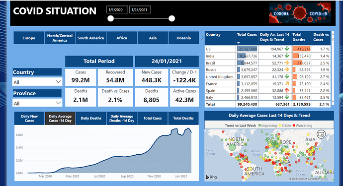
In the summary of COVID situation I had 4 main objectives :
1: have a quick global vision of main indicators with international comparison
2: be able to dig into any country in detail with all main measures to set up a country diagnosis
3: show trends, actionable indicators that decision makers need
4: keep historical data for further analysis
You can track daily new cases and deaths, but I also calculated 14 day average measures (generally used in covid statistics as well) to visualise cleaner trends without having the daily fluctuation in data.
By using the time slicer, you can visualise cumulated data for any period, for instance to compare the First Wave results to the Second Wave results of the pandemic.
On the map visualisation it is easy to have a global view how the different countries are impacted at the moment (size of the bubble = average daily new cases taking into account last 14 days). Trend is shown vs 7 days before to show the evolution of this same 14 days average indicator. By changing the time slicer you can see which were the countries with worsening trend for instance a month ago, and how this changed for now.
Continent category is mainly used to have better visualisation of data by geographical zoom on the map but also by ignoring “extreme data” : ex: without selecting Europe, it is difficult to see relative size of the bubbles for European countries due to US extremely high value.
I voluntarily did not focus on the active cases information, as it seems the least reliable and the least accurately managed by authorities.
Regards,
3 Likes
Really impressed by your efforts here. I like how you put your visualisations together in your report. The report is easy on the eye and super easy to navigate as well. Like from a consumption perspective.
I also like the way you have built the visualisation to be completely dynamic. I’ve always felt that this was a superior visualisation technique and I think you’ve used it really effectively here.
Also appreciate the write up. You got a lot out of participating’ and the challenge and look forward to seeing more from you as you used the opportunity to leverage off the others who have submitted really fantastic reports.
Thank you for your feedback! I am quite new to Power BI, and I highly appreciate being part of Enterprise DNA Community that I really feel helpful and constructive : ideal environment for learning!
1 Like