Here’s Emmanuel’s entry for Power BI Challenge 11. @emercado777 , would you like to share how you built this dashboard and what your inspiration is in building it?
To learn about the real-life scenario presented for the challenge, be sure to click on the image below.

Hi Rebecca,
Thanks for sharing.
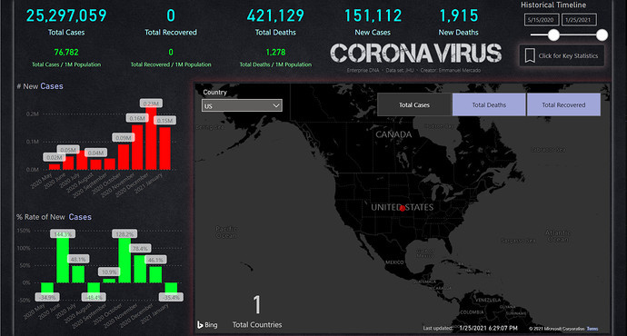
The inspiration was the JHU dashboard. However, I wanted to take it another step higher and look at percentages instead of just total counts. I thought it would also be good to track the results over time to measure the trends.
USING SWITCH:
I want to test out some of the things that I learned from the eDNA videos, particularly SWITCH. This was my first time using it, and found a perfect opportunity to use it with the toggle switches on the map.
Originally the toggle switches were not on the map, but then I realized I can bring them to front and then free up valuable real estate on the canvas.
USING A DYNAMIC CALENDAR:
I also decided to go with a dynamic calendar instead of a statics calendar. I used the video on eDNA to create the dynamic calendar. The dynamic calendar finds the first and last date in the data set to create the date table. I wanted a date table with start and finish states so the date slider can look more aesthetically pleasing.
PICKING COLORSl
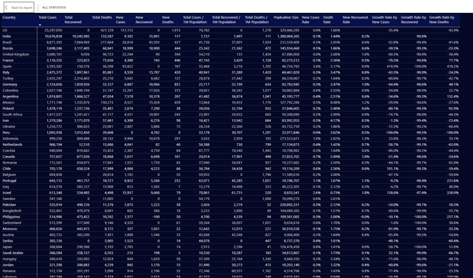
I then needed a design that would have high contrasting colors. I chose to go with bright neon colors which contrast well with the dark background. I then decided to add a button for any data nerds like myself, who like to see all the data against each country, so I added the key statistic button.
CHOOSING A FONT:
I think wanted an eye catchy font for Coronavirus, so I went to dafont to find a font type that would work well with this dashboard. I then imported the image in a png because adding the font as a typeface seemed liked an unnecessary hurdle.
MISSED OPPORTUNITES:
Some other items that I wanted to bring into the dashboard are economic data, and stock indexes, and 7-day forecast, but I didn’t have enough time to do this. Maybe I will get around to do it some day.
Hope this helps anyone on some of the steps I’ve taken.
2 Likes
This is great. I like how your produced a report with a substantial amount of detailed information. For next time the thing to focus on for me would be how can you simplify down your report and analysis into a more coherent story. instead of just showing all the data just available to the consumer. Think about walking them through the story embedded into the data. It takes some thinking time and a little bit of imagination and creativity but I’m sure that you can get there as part of the Enterprise DNA community.
Sam
1 Like