Here’s Chris’s entry for Power BI Challenge 11. @chrish , would you like to share how you built this dashboard and what your inspiration is in building it?
To learn about the real-life scenario presented for the challenge, be sure to click on the image below.
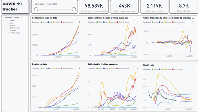
I wrote quite a lot of measures that I didn’t end up using in the visualisations - eg cases and deaths per 100k population, recovery rates, even cases and deaths split by gender of the leader of the country, (my wife had asked about that). So one of the key decisions was prioritising the information that I wanted to show.
Confirmed cases and deaths are hard data points while recoveries seem to be a slightly arbitrary measure, so I grouped the visualisations into a Cases group and a Deaths group and used a similar sequence of visulisations for each group
I wanted to show summarised information by Continent that you could drill into to get Country level info. I was surprised to find that line charts are not drillable in PowerBI - I would be interested if anyone has found a custom visualisation that enables this. Instead I used a custom tooltip to provide country level information in a table for the top 20 countries for each visualisation (creating these tooltips was my key learning from this exercise).
In terms of report design, I aimed to avoid use of non-data ink (icons, backgrounds) or visualisations that don’t add to the analysis (eg a map with a dot on countries - I assume readers know where countries are!) This can feel like the dashboard is a bit boring to look at compared to some others I have seen, but I hope it enables better accessibility.
Nice work on this one. I love these little charts you’ve made. You might see something like this in The Economist magazine or in a newspaper article. They really just show all of the key Insights that someone would need to know and they can obviously use the filters and slicers that you’ve embedded into the report page to drill deeper into certain aspects of the information.
Really impressed by the simplicity here and also the depth in which someone can dive into the information.
I think you’ve got some real talent and looking forward to many more submissions in future challenges. I’m sure others can draw inspiration from the simple and effective design that you’ve presented.