Here’s Brad’s entry for Power BI Challenge 11. @bradsmith , feel free to add other details of your work.


Here’s how Brad described it:
I decided to specialize my report to my home state of Minnesota in the United States to add a personal touch to the report and allow for a deeper dive into the data. This also allowed for me to take direct inspiration from the Tableau reports and one Power BI report the Minnesota Department of Health already use to report to the public. Combining these reports into a single comprehensive report, as well as incorporating the Minnesota COVID-19 model developed by an interdisciplinary team at the University of Minnesota School of Public Health and the Minnesota Department of Health, this allows for a single source for all COVID-19 data in the state as well as allowing for someone to split the report into multiple parts to improve performance.
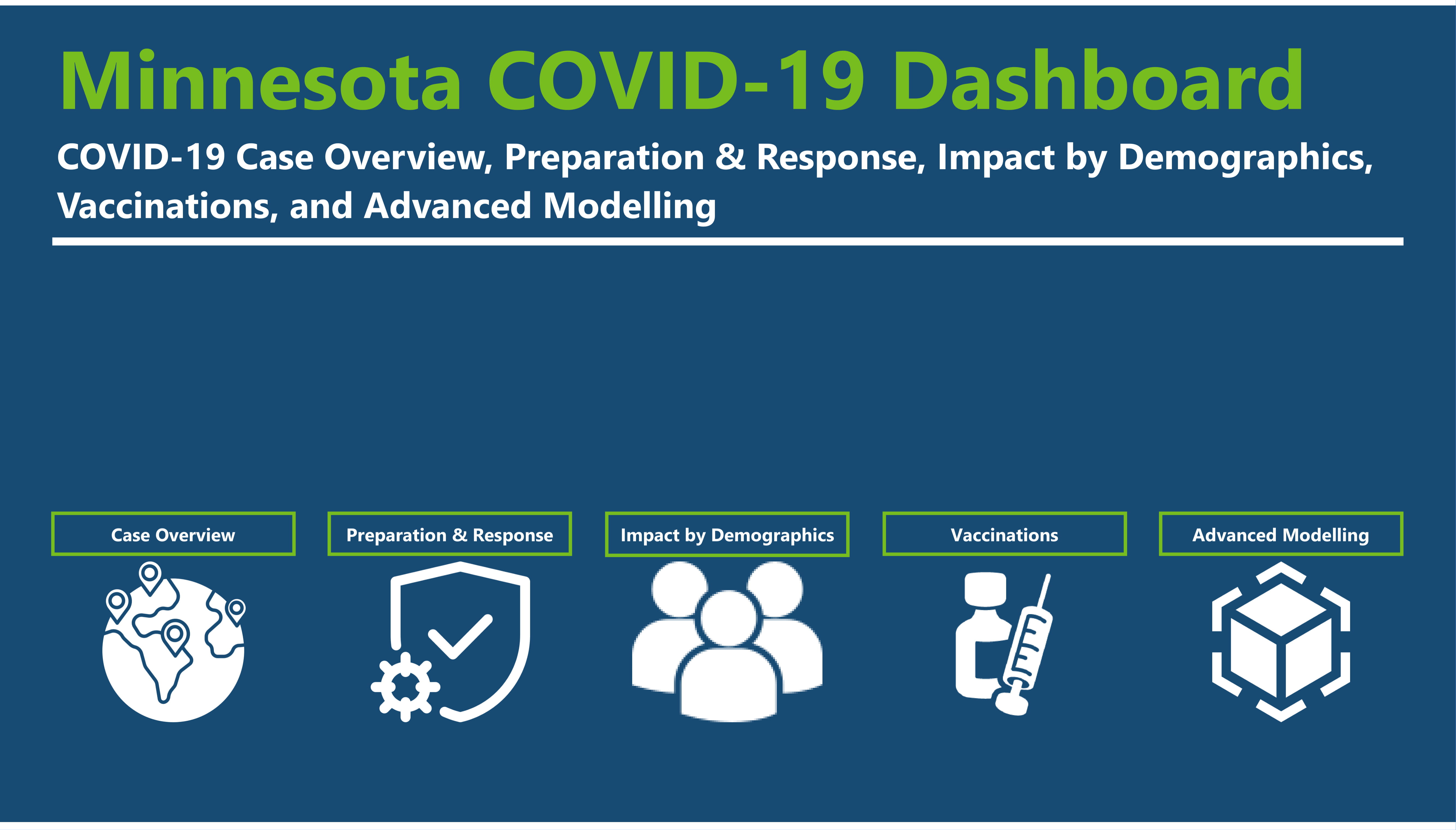
Now, let’s dive into the report itself! The report has 5 distinct parts: Case Overview, Preparation and Response, Impact on Demographics, Vaccines, and Advanced Modeling. Below you will see a brief summary for each page and a screenshot of the complete page. Some of the pages are very tall, but as all the information is related I chose to keep them on one page and allow the user to scroll.
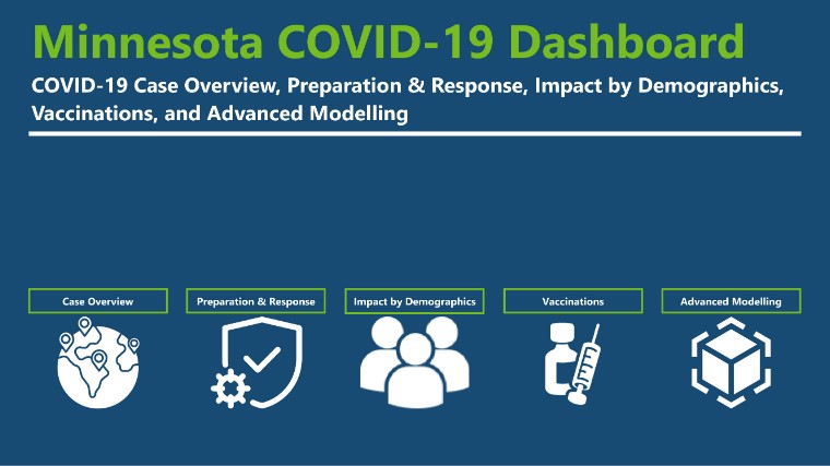
Home
Basic landing page with icons to direct the user to the appropriate report.Summary
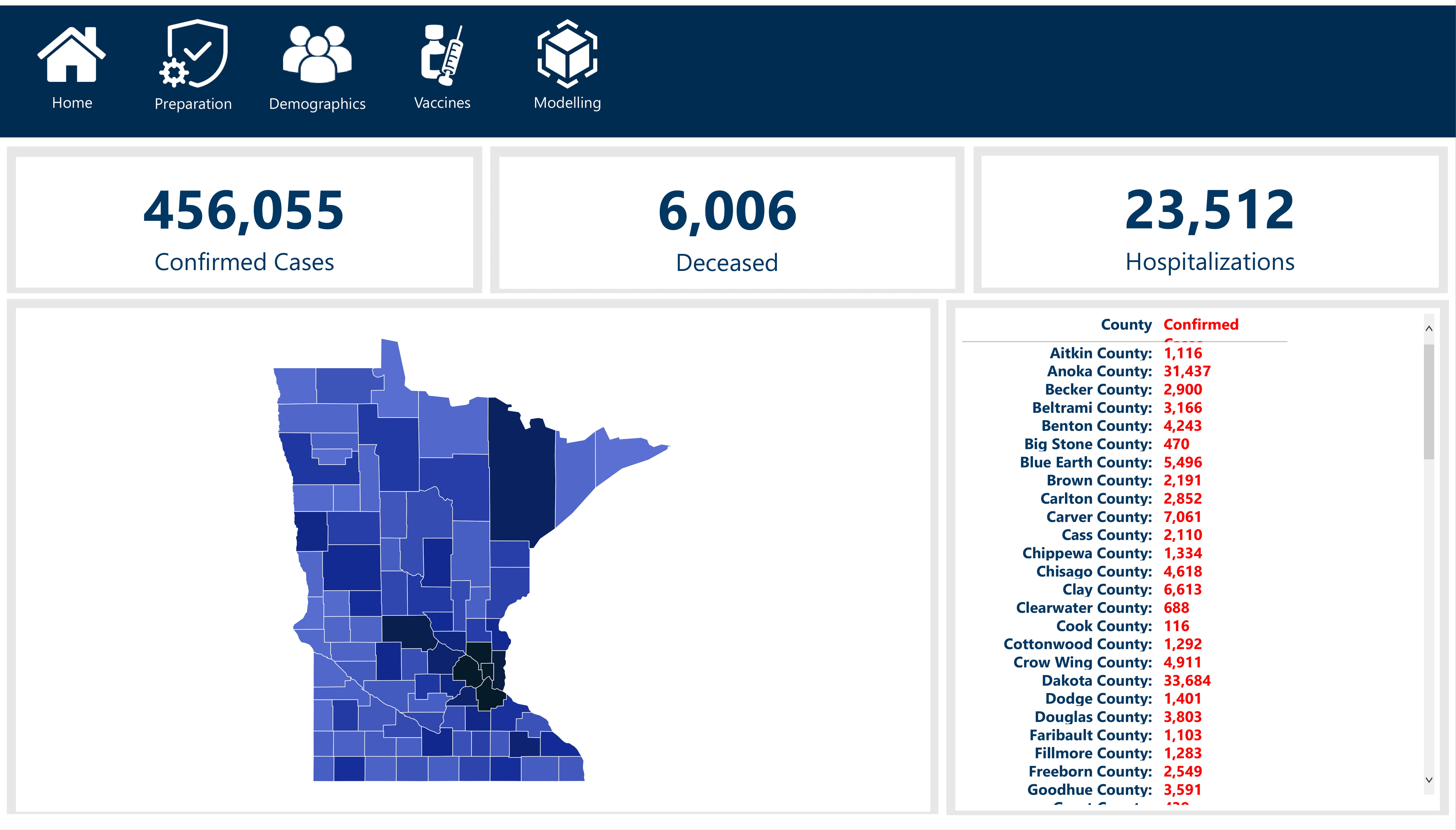
Case Overview
This is really the single quick view that higher ups and the general public would look at. Basic stats, clean, and minimalistic. This would most likely answer most peoples questions that aren’t looking for much more information.Summary
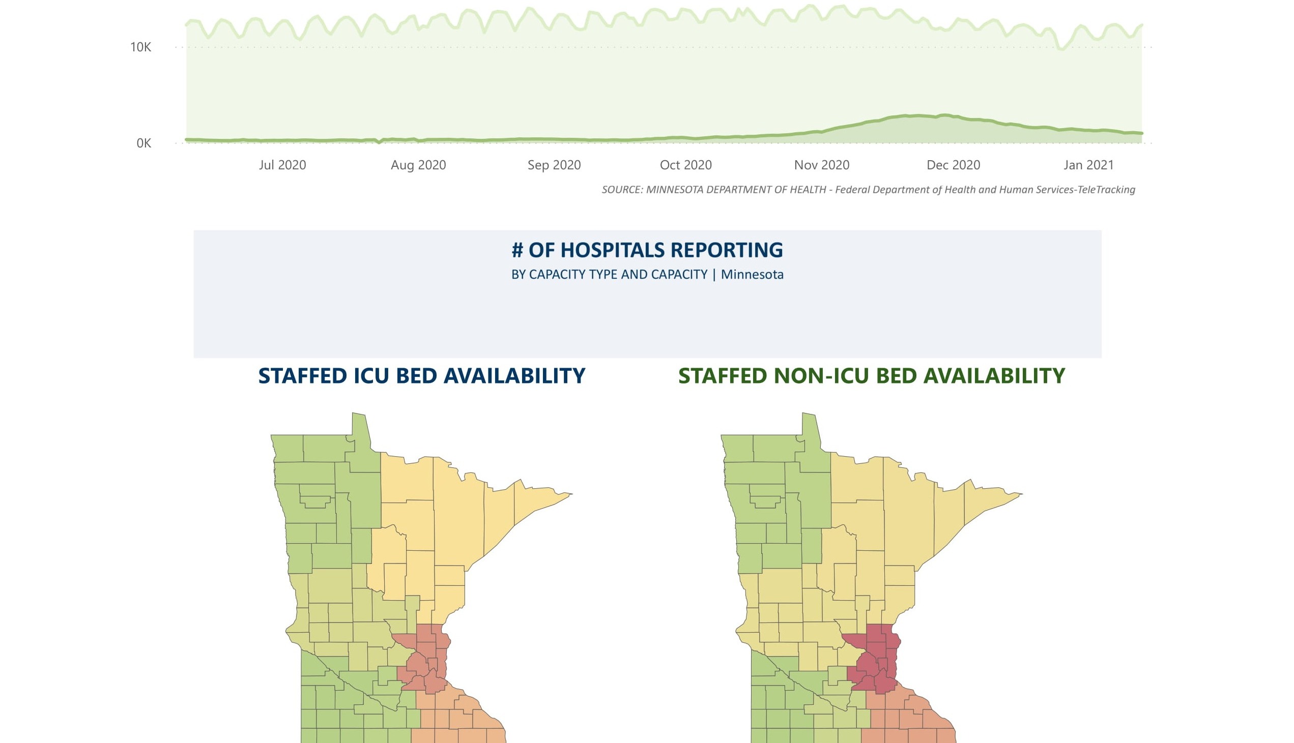
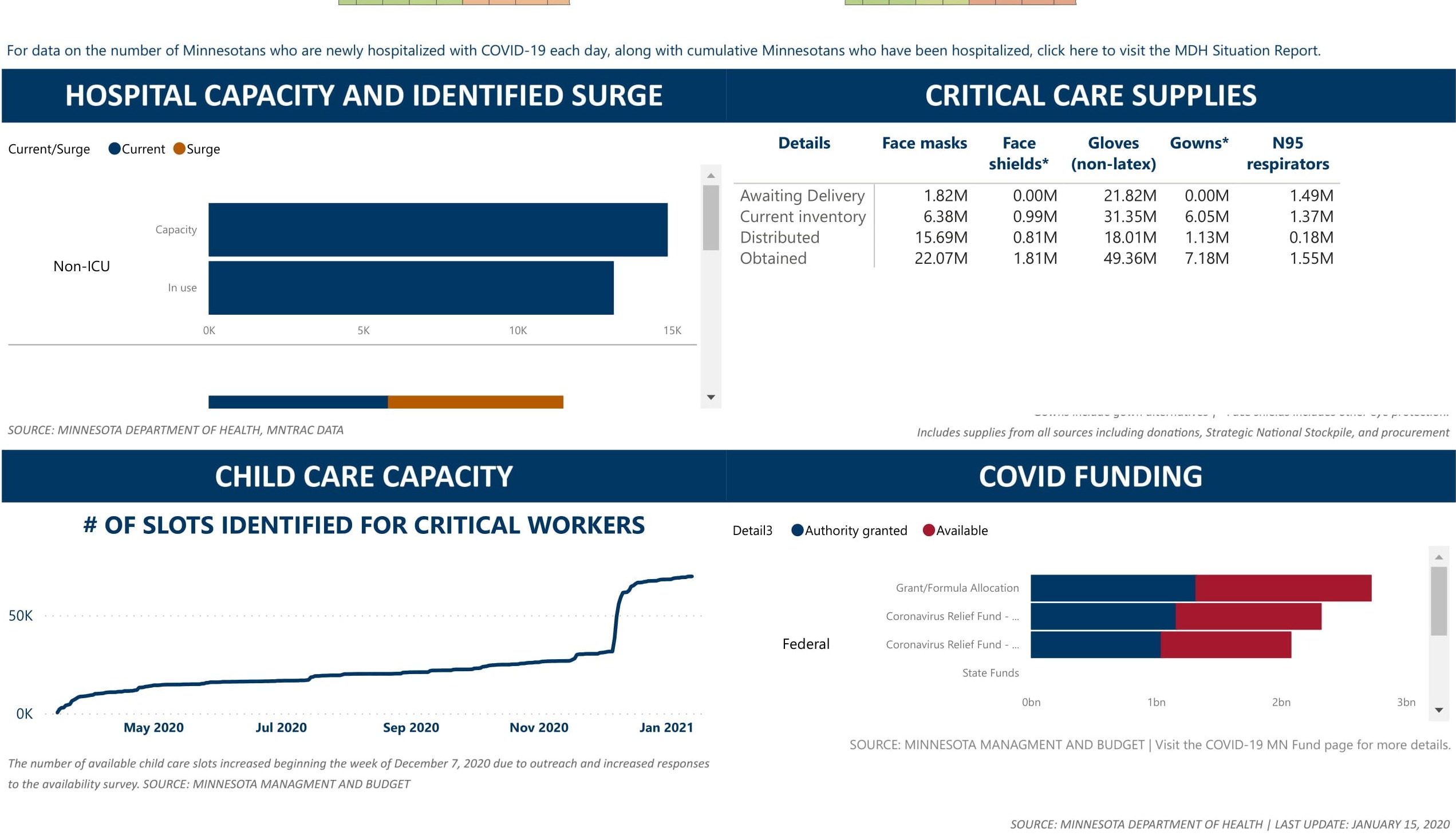
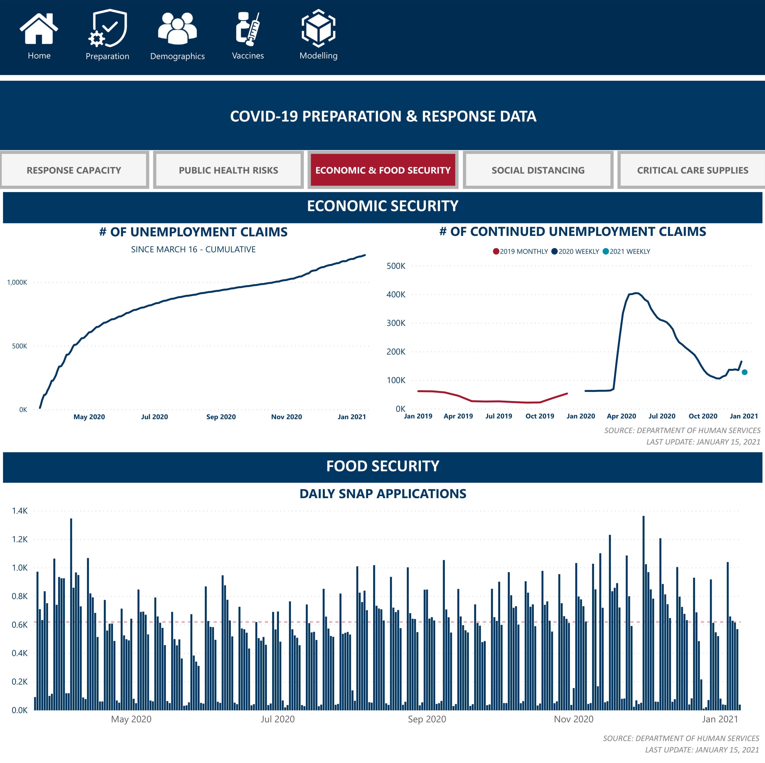
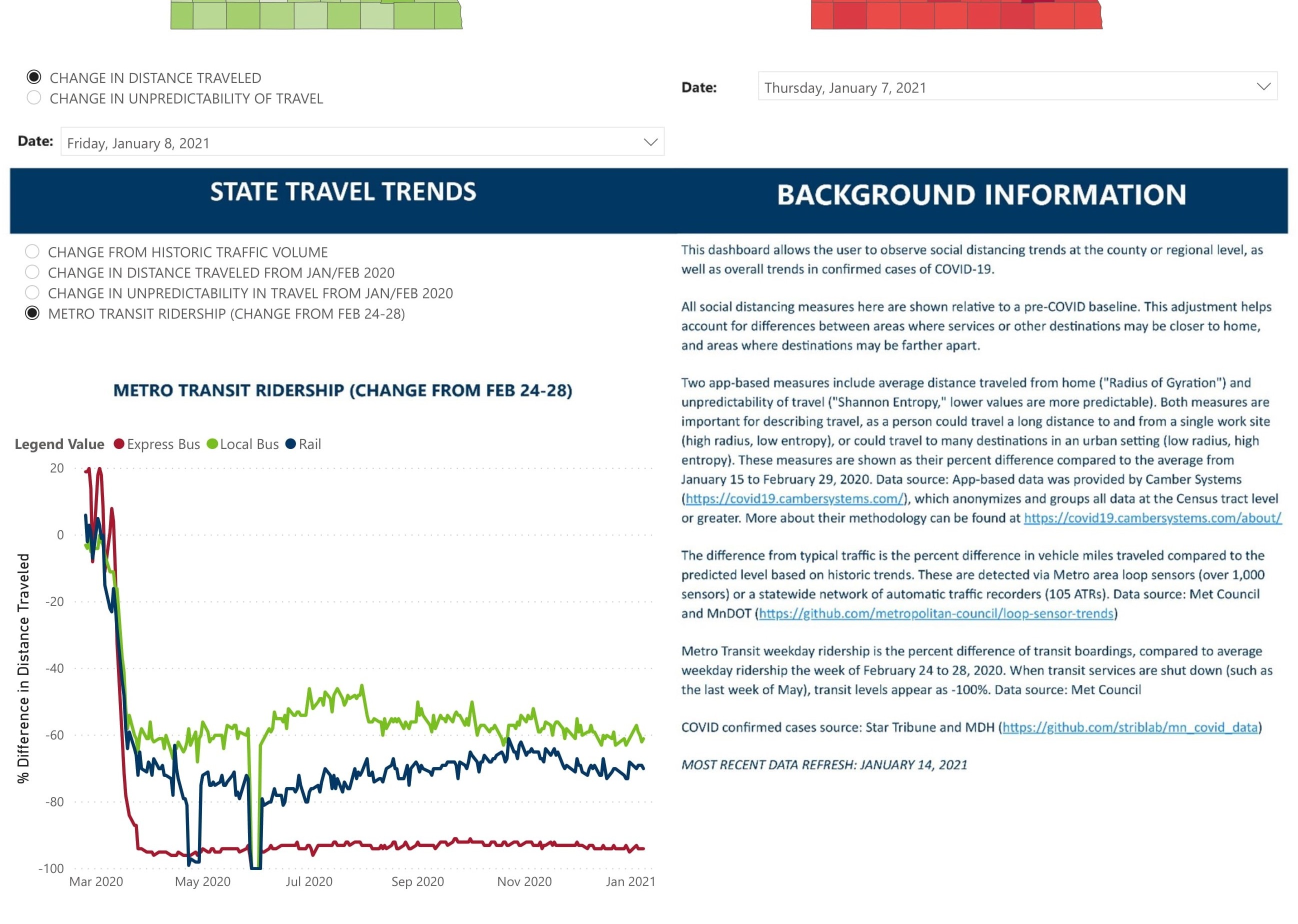
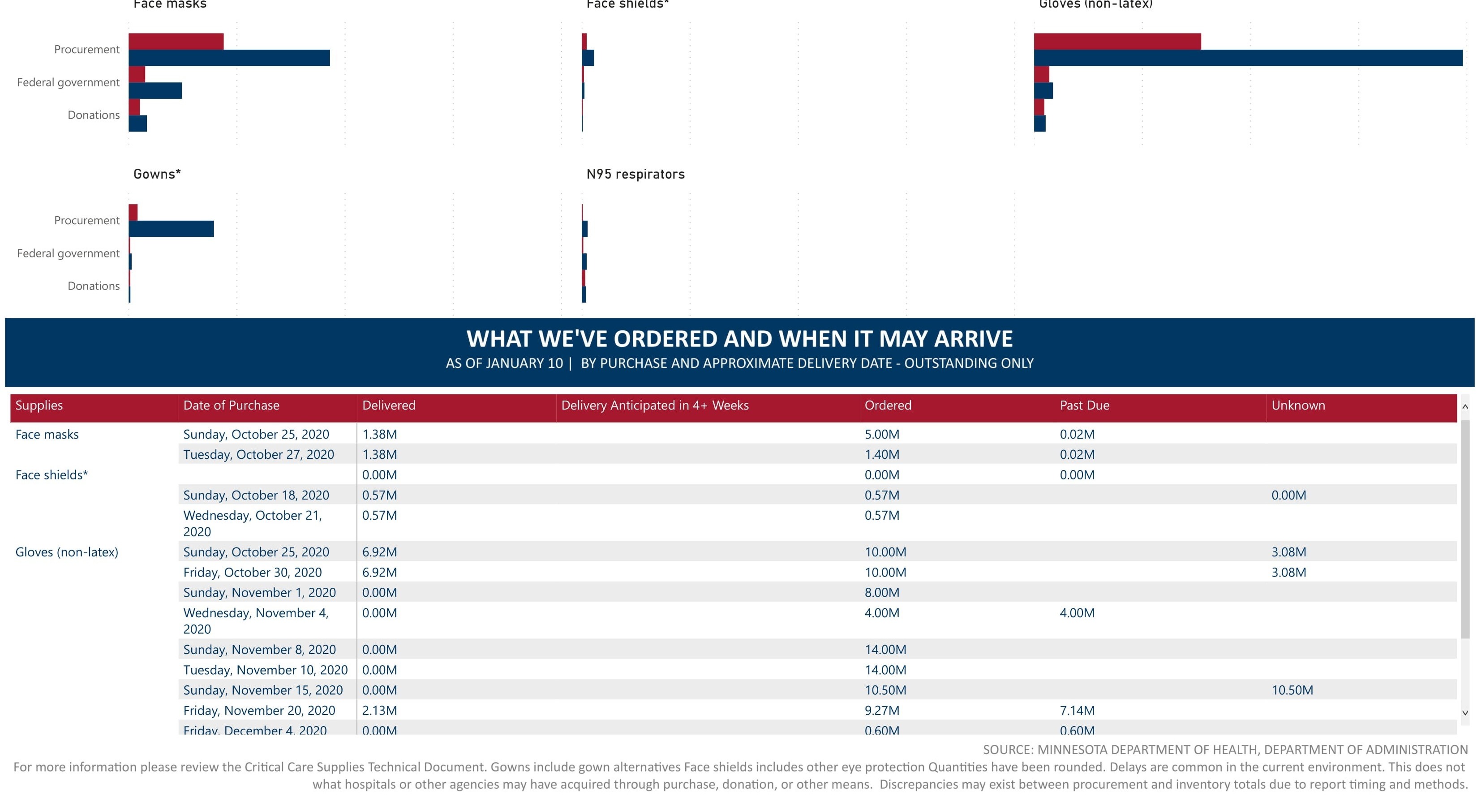
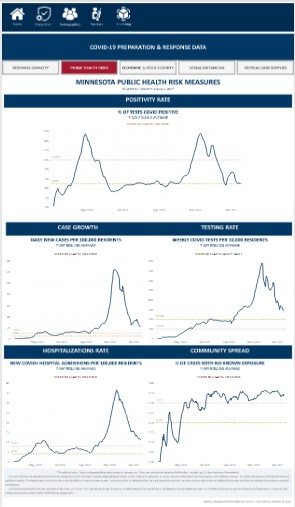
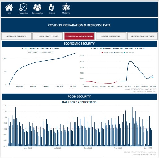
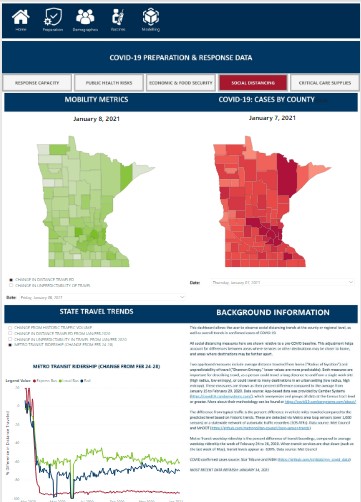
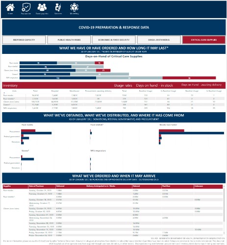
Preparation and Response
This is the operation side of the pandemic (i.e. capacity, economics, public reactions, etc.). There’s five pages in this section including: Response Capacity, Public Health Risks, Economic & Food Security, Social Distancing, and Critical Care Supplies.Summary
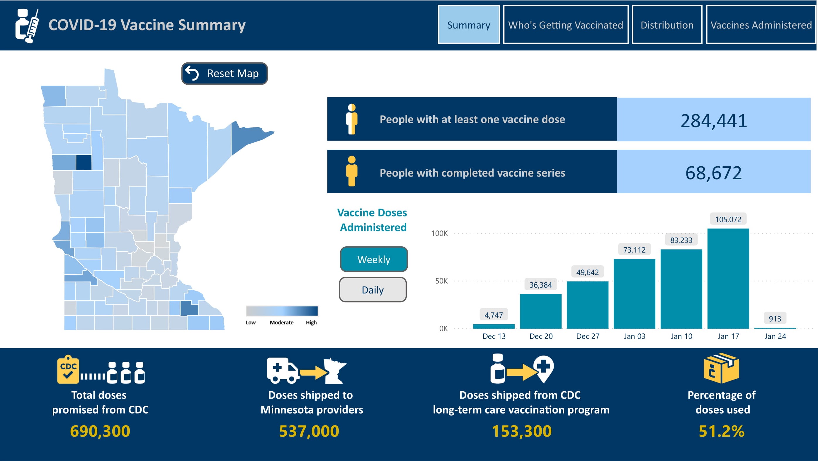
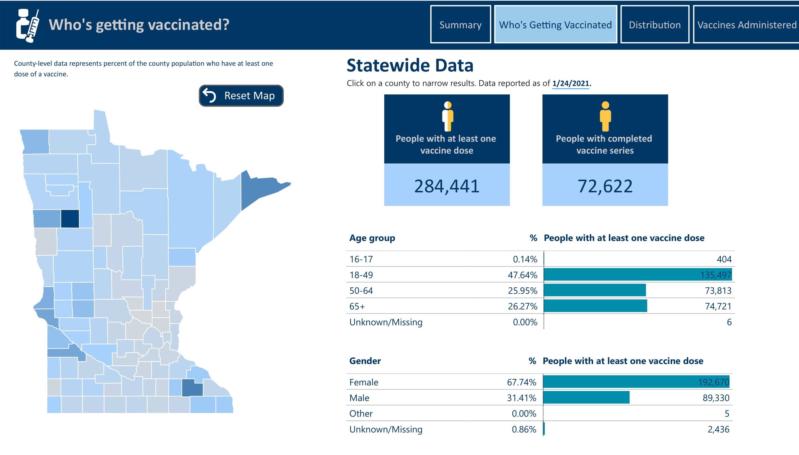
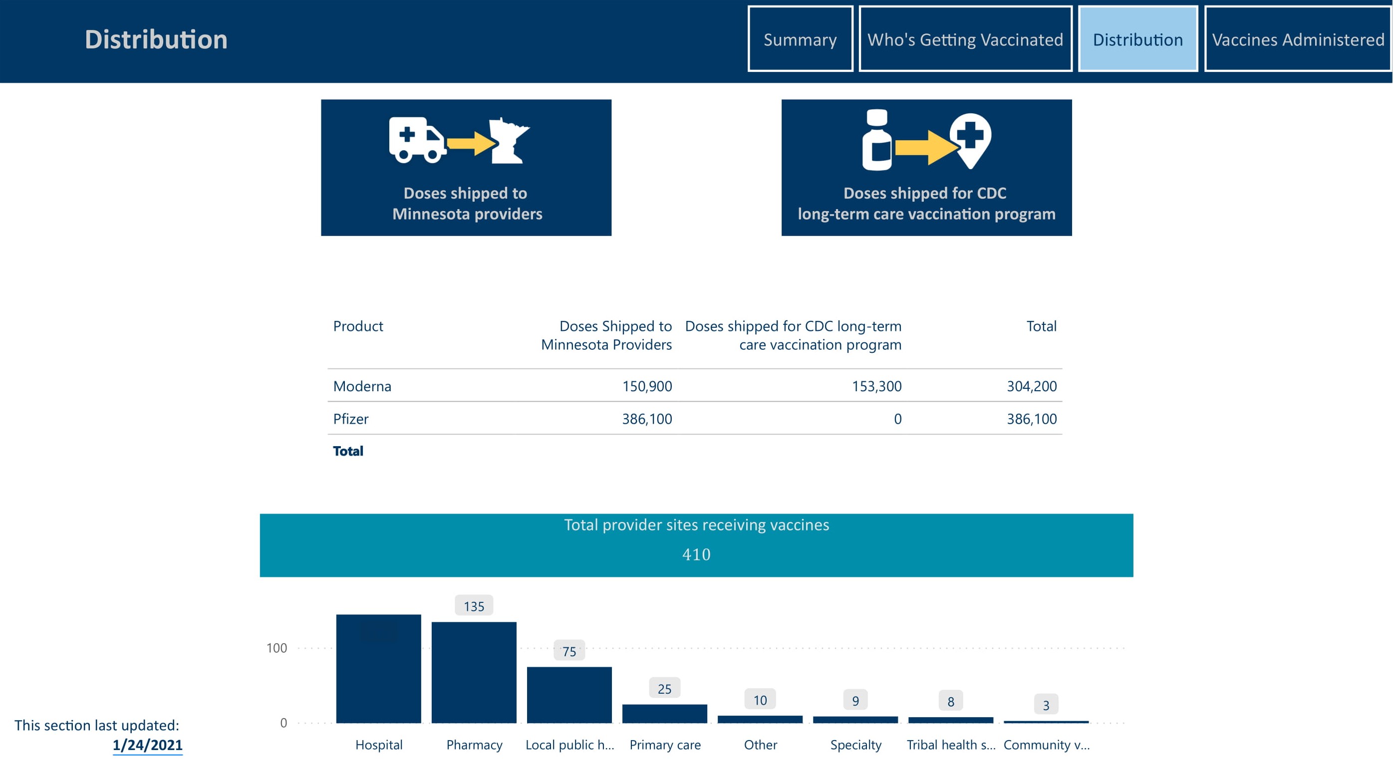
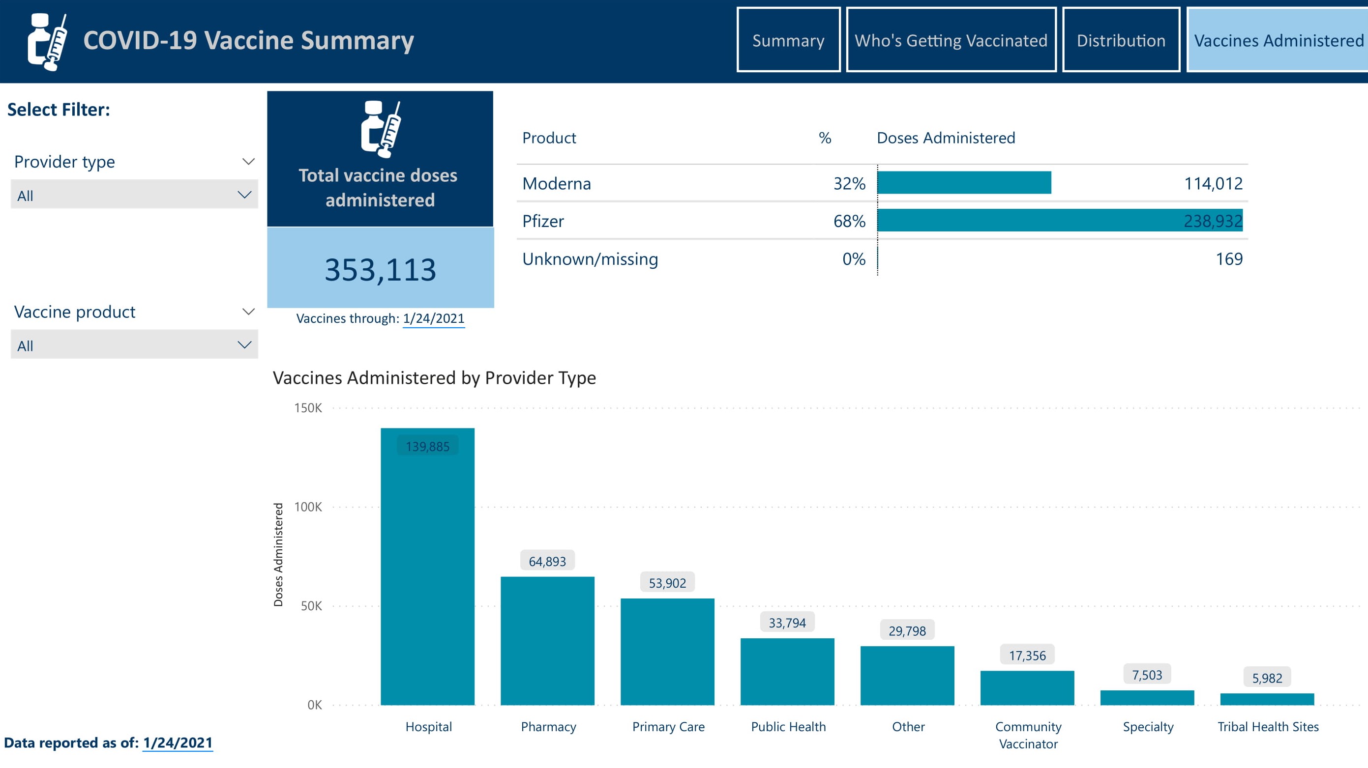
Vaccines
Now that the vaccines have been created and distribution is in full swing, we are no longer simply trying to hold off the virus, but bringing the fight to it. Demand for the vaccine is of course very high so this section of the report includes a high level vaccine summary, demographics on who is getting vaccinated, supply and distribution, and administration of the vaccine across the state.Summary
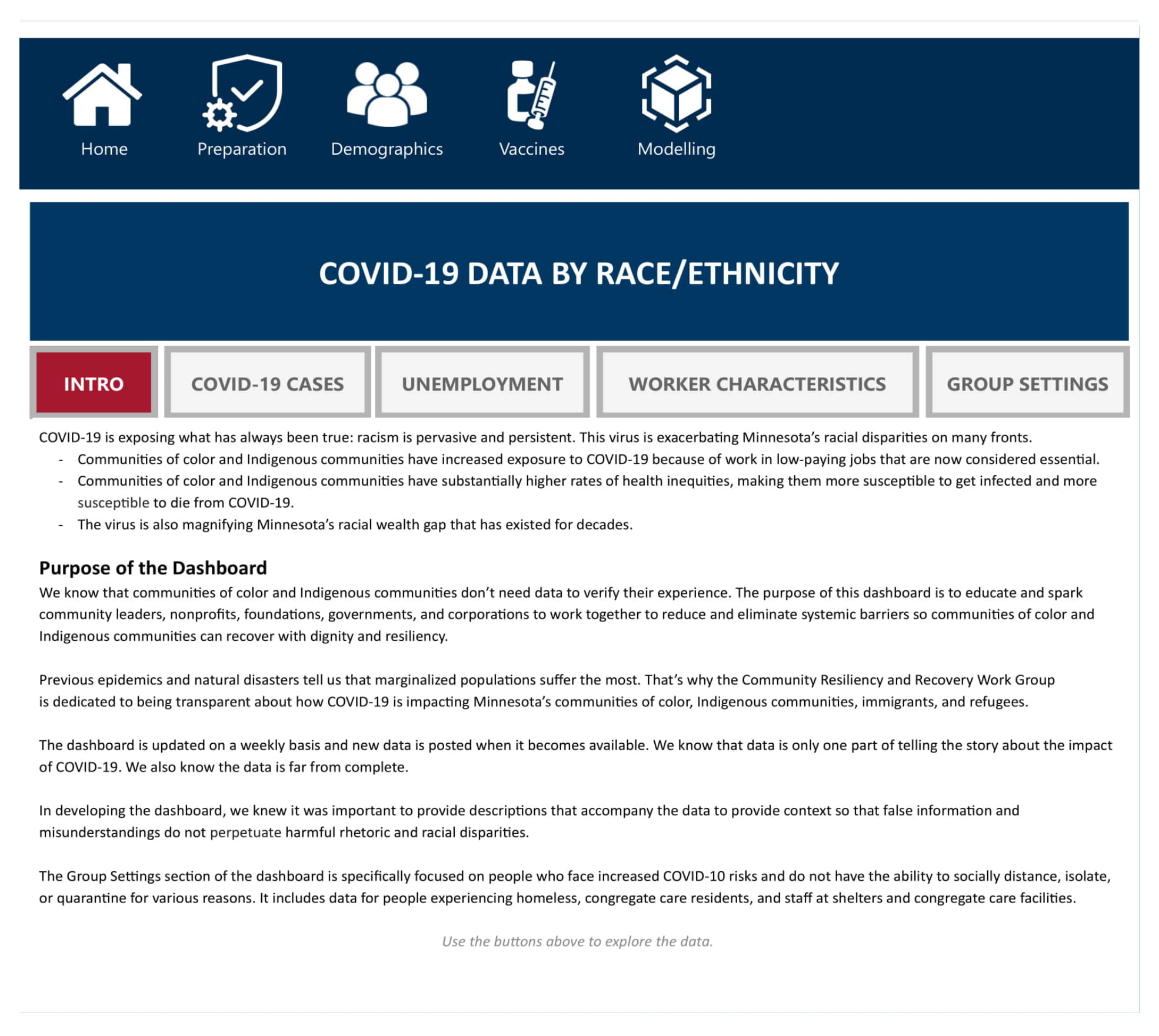
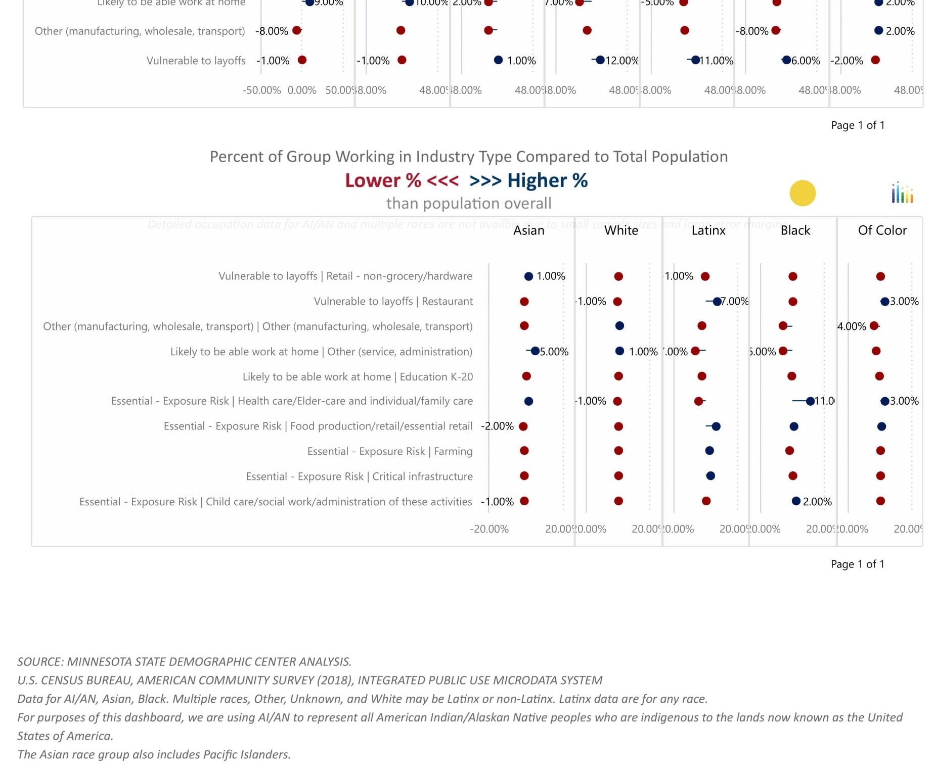
Demographics
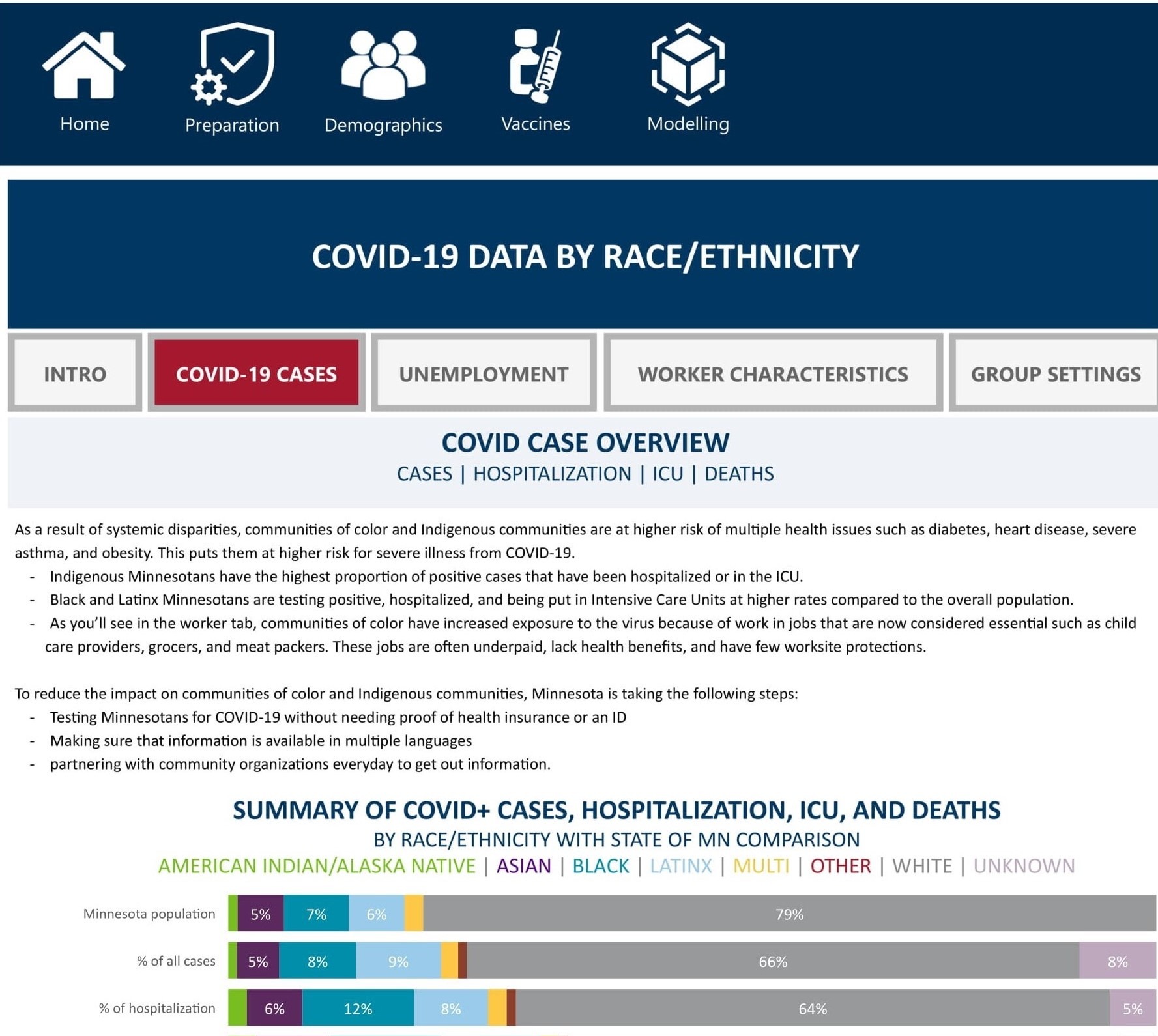
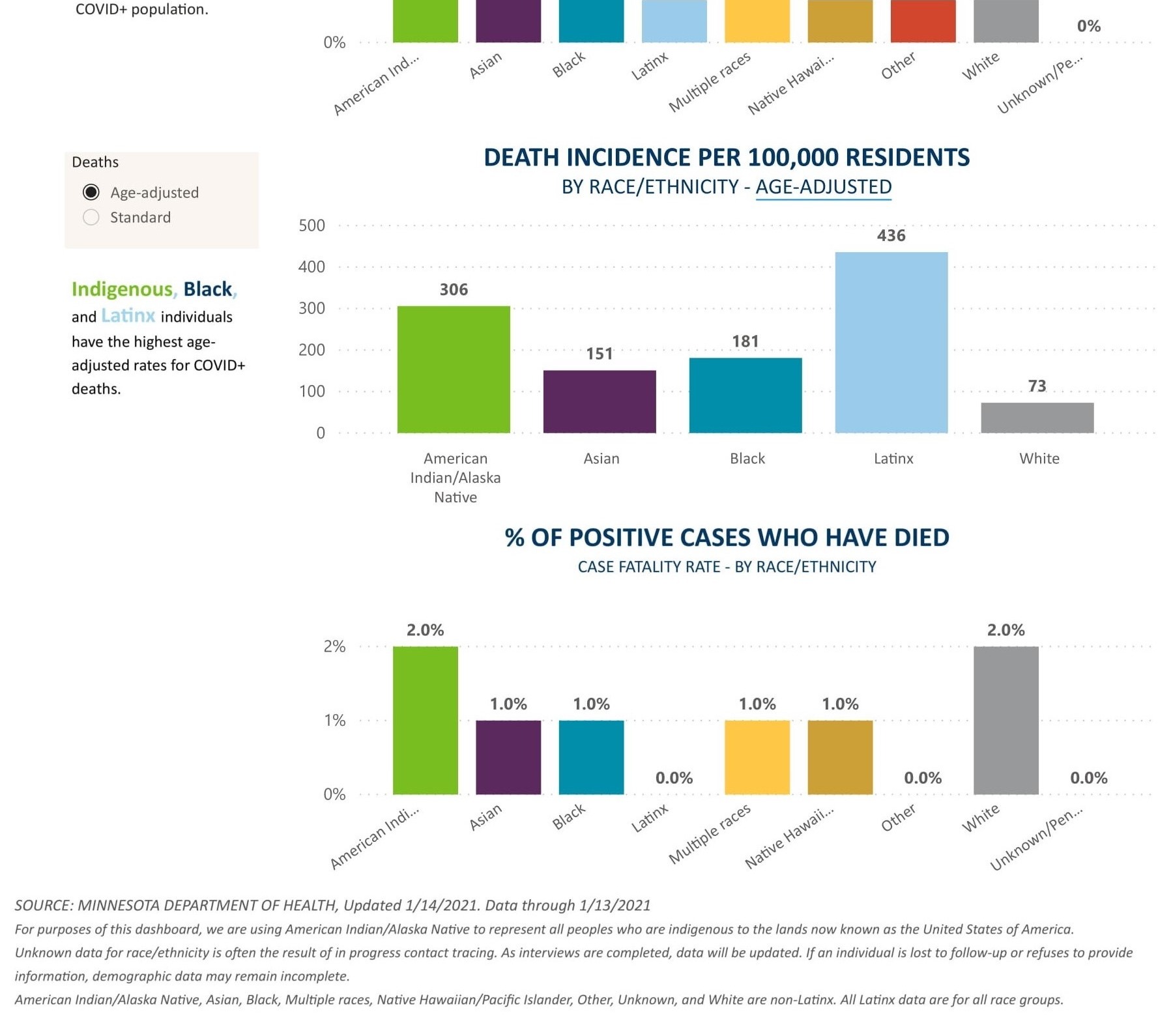
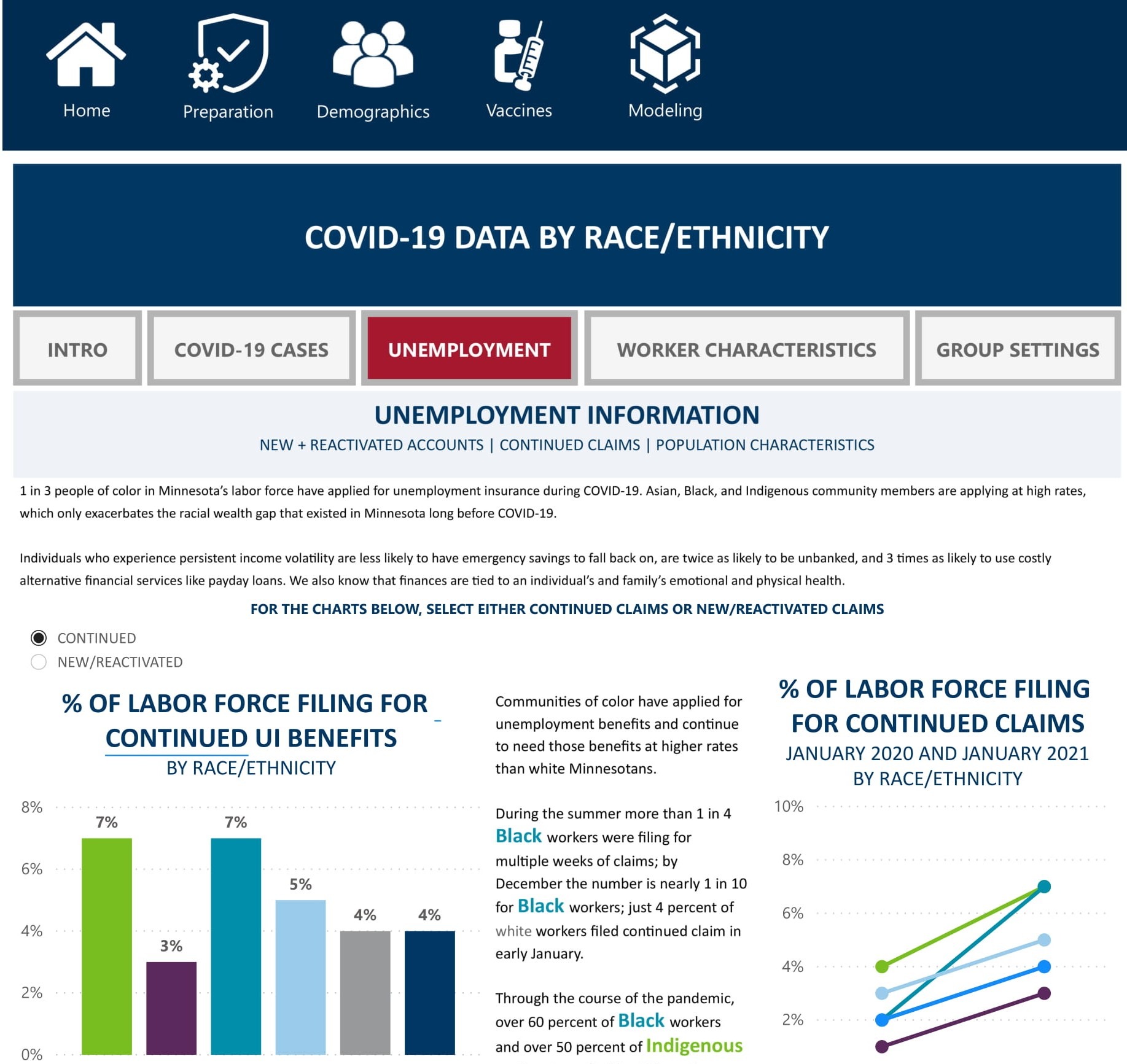
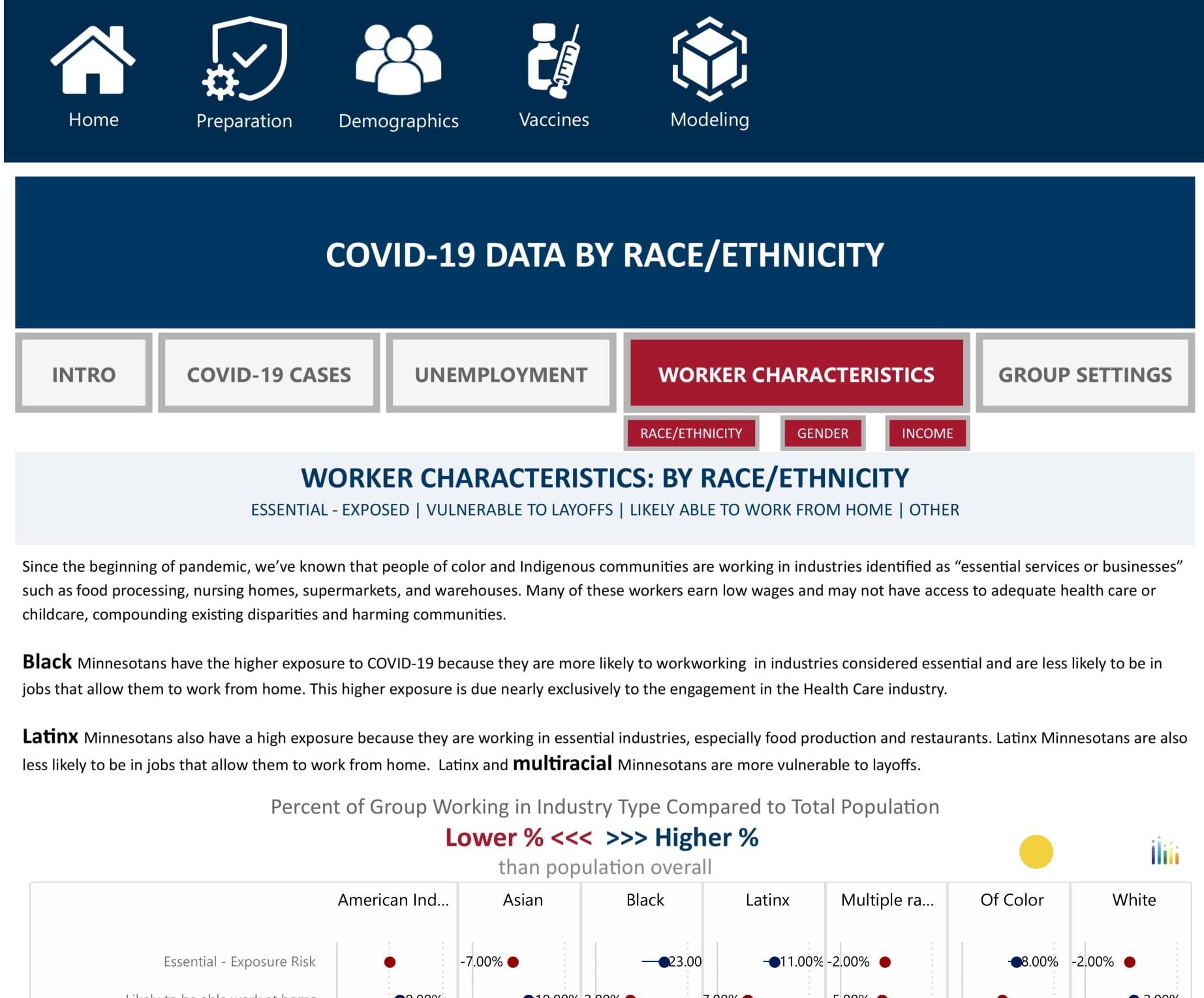
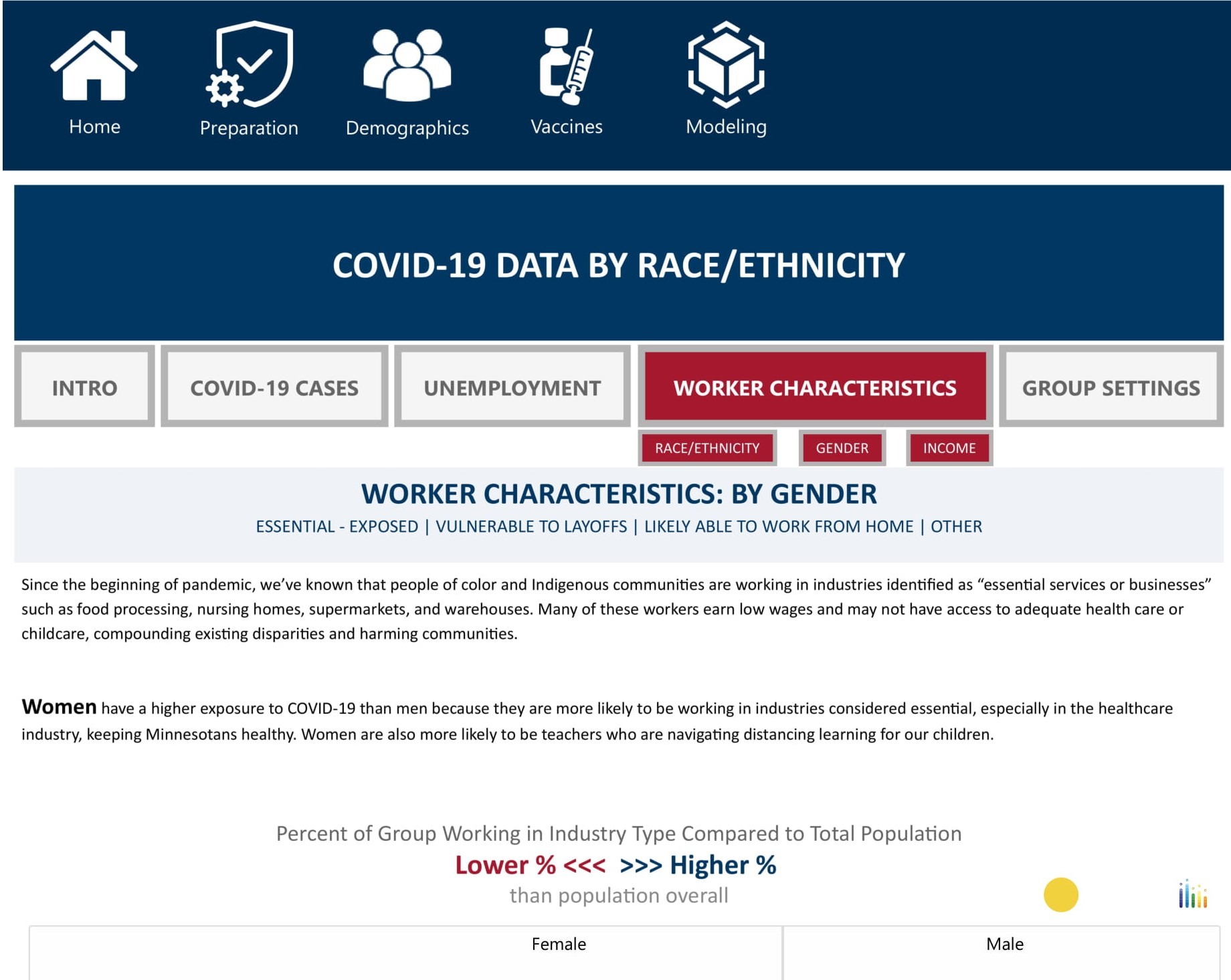
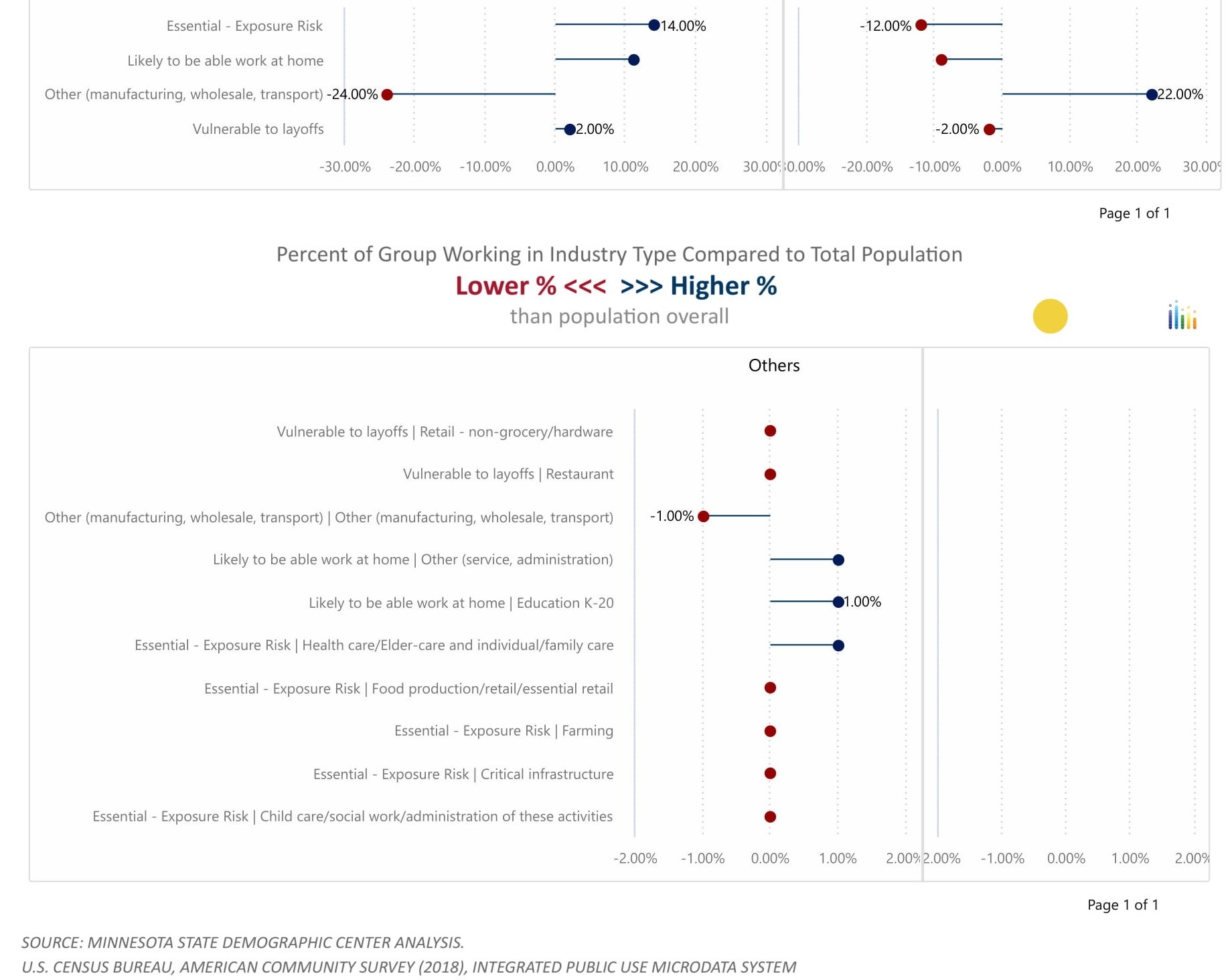
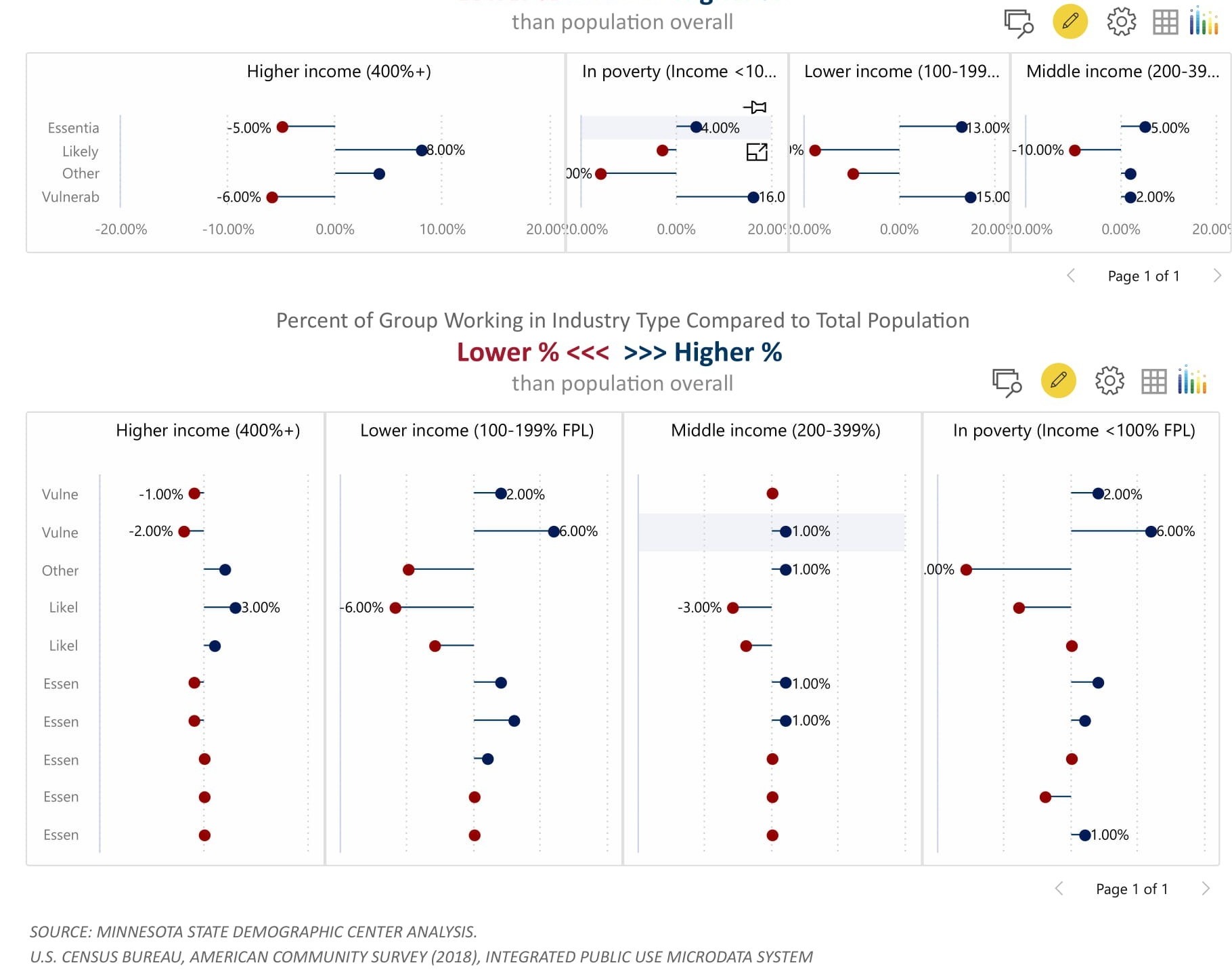
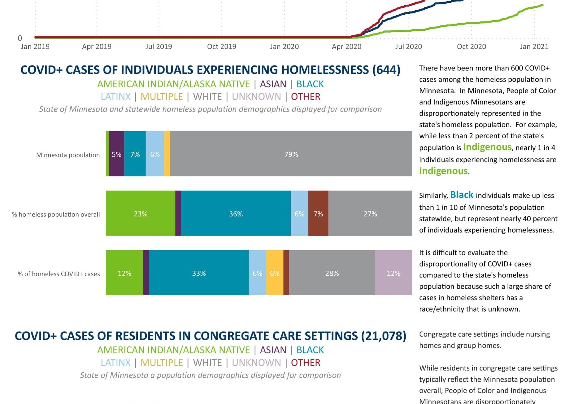
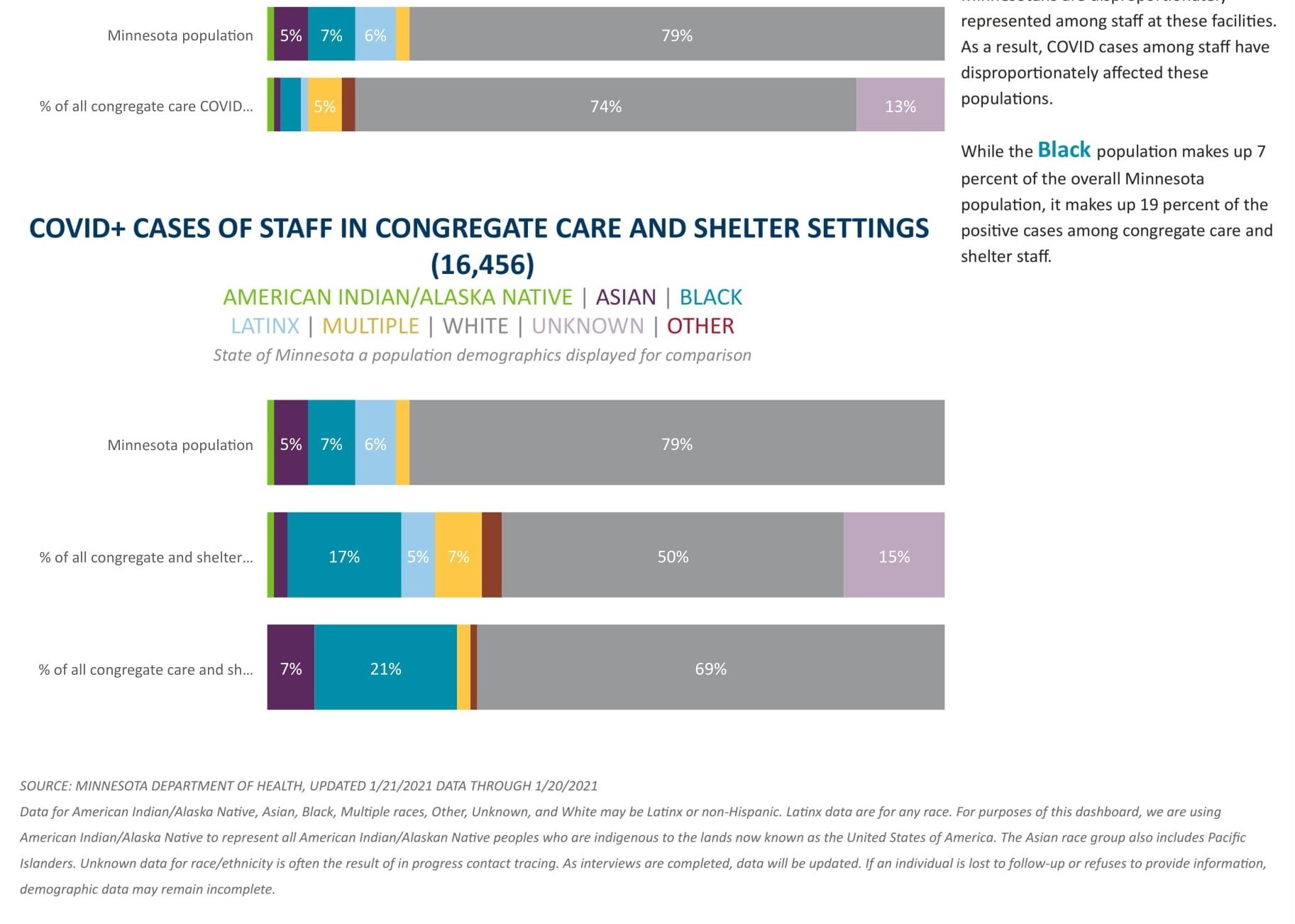
This is probably the most fascinating part of the report in my opinion. This analyzes the impact COVID has had by demographics with a special focus on its effects by race/ethnicity in different facets of life. This section touches on the effect COVID has had on different demographics not only by the number of cases and deaths, but also by unemployment, worker characteristics, and homelessness.Summary
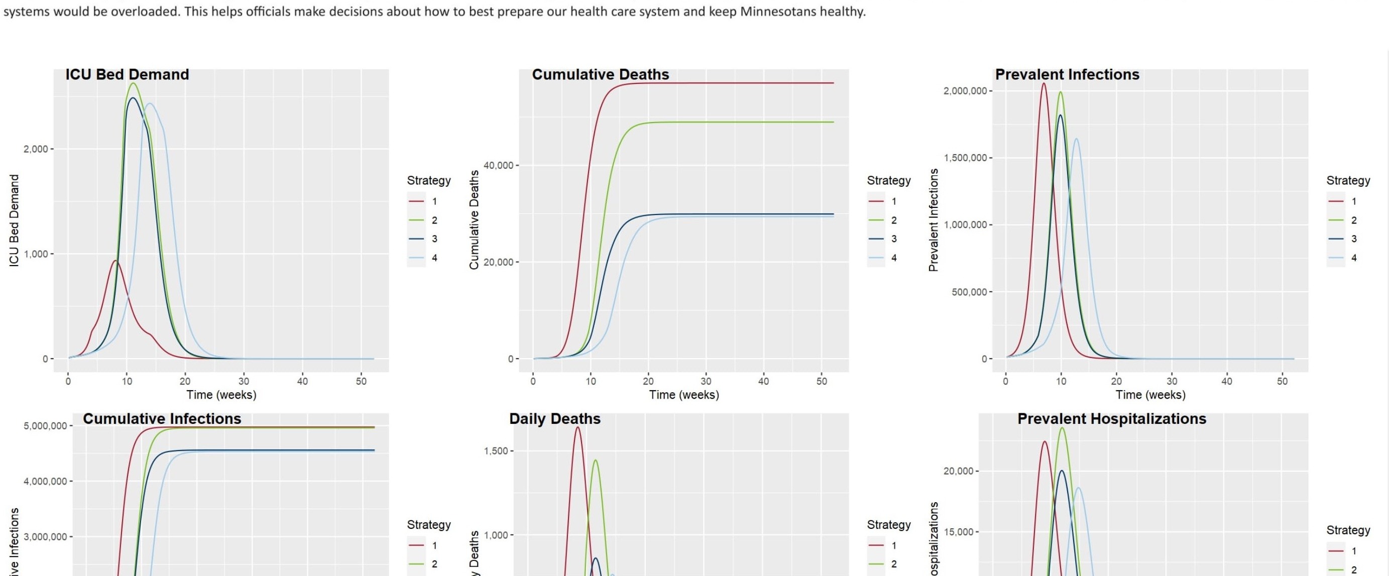
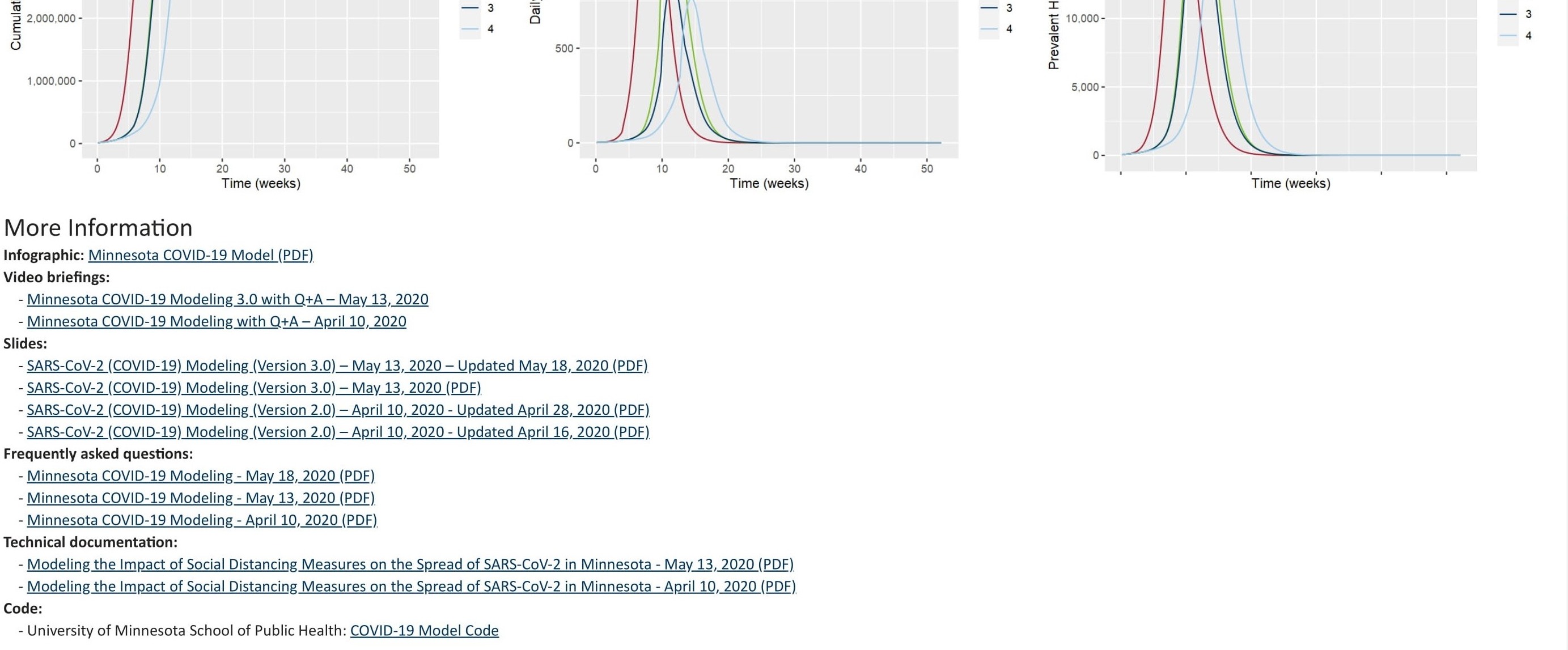
Advanced Modeling
I wish I could show you this visual, but I am having major network issues so this model isn’t able to connect to the source data, but it’s an incredible model. When my connectivity issues are resolved I’ll update this page.A little bit about the model itself - the model used is a SEIR (susceptible-exposed-infectious-recovered) model and the interesting part about their model is that it contains a lot of flexibility around uncertainty which has really had a big impact on the spread and treatment of the virus. I was going to implement some additional what-if parameters to allow for a user to see directly how things like the availability of ICU beds, increases/decreases in travel, and funding impact the spread and treatment of the virus over time, but I since the code for this model is publicly available I am planning to incorporate that into some training videos for everyone. The model is rather easy to implement so I think it will be great for everybody to see the implementation of a model like that and how to add parameters to a machine learning model in Power BI.
Summary
I hope you like it!
To learn about the real-life scenario presented for the challenge, be sure to click on the image below.