Here’s Ankit’s entry for Power BI Challenge 11. @kkrj.ankit , would you like to share how you built this dashboard and what your inspiration is in building it?
Here’s the link to the report:
And here’s how Ankit described it:
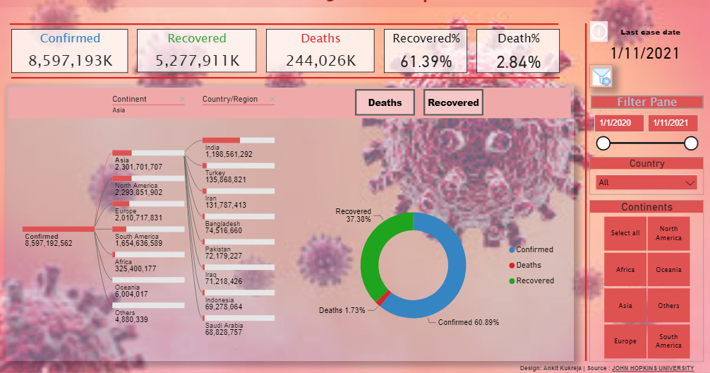
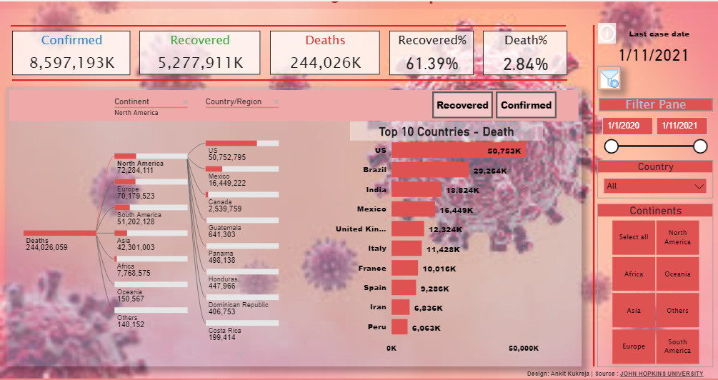
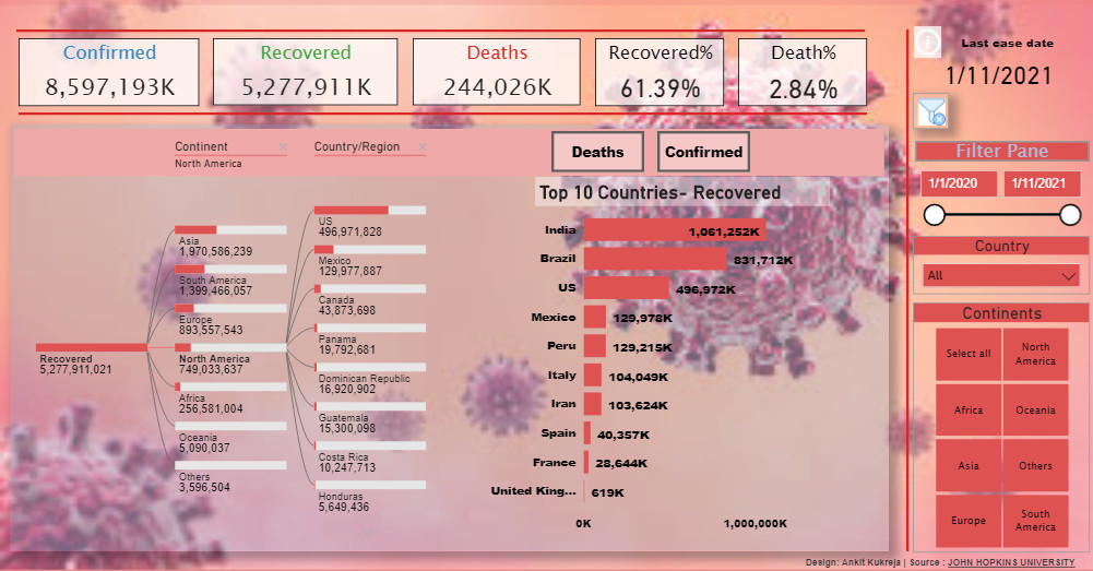
My report is the analysis of Covid-19 data provided by John Hopkins University, data ranges from 1st January, 2020 to 11th January, 2021.
The data analysis for all the countries and includes Confirmed, Recovered and Death cases.
I’ve kept the analysis quite simple and straight forward by showing count of cases for Confirmed, Recovered and Deaths. I’ve showcased the Recovered and Death percentage to give a glimpse about the total Recovery and Death rate for the world.The report shows top10 Countries with Confirmed, Death and Recovered cases and also shows the distribution of all those cases as per Continent and Countries in Decomposition tree visual.
Report also allows user to view the data as per their requirement by slicing the data with the given filters.
To learn about the real-life scenario presented for the challenge, be sure to click on the image below.
