Here’s Amira’s entry for Power BI Challenge 11. @amira.bedhiafi.pro, would you like to share how you built this dashboard and what your inspiration is in building it?
To learn about the real-life scenario presented for the challenge, be sure to click on the image below.

2 Likes
This post is part of the Enterprise DNA platform improvements, through the Data Challenge our members can now share how they built their dashboard and what their inspiration is in building it. We hope all members can utilize it efficiently .
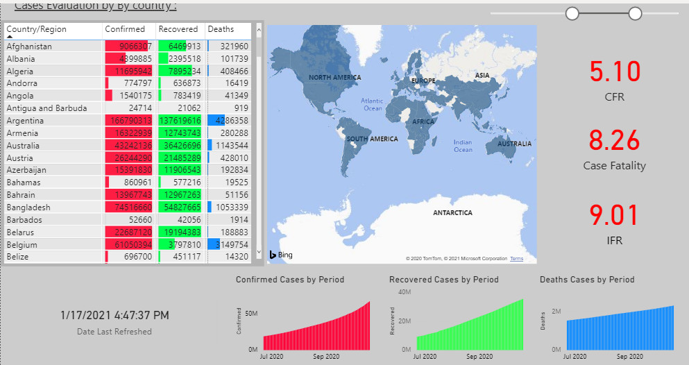
Thanks for your contribution to the challenge. I think you’ve made a nice start here but there’s certainly many things that could be done and quite easily completed to improve the look and feel of this report. First I would try and create more bold titles. Maybe even have a title and description up the top of the page so that the consumer knows what they’re looking at.
I also think the alignment in some of your visualizations could be improved more. There’s too much blank space where you have selected to place some of your visuals. Also the colors to me are a bit too out there. Even though they are a similar color palette I think if you can utilize the same or more similar colors it makes your reports stand out a little bit more.
Sam