Power BI Challenge 11 - Covid 19 Reporting from Alexandre

Here’s Alexandre’s entry for Power BI Challenge 11. @Alex7891, would you like to share how you built this dashboard and what your inspiration is in building it?

image

image

To learn about the real-life scenario presented for the challenge, be sure to click on the image below.

power-bi-chal-1

1 Like

This post is part of the Enterprise DNA platform improvements. Through these posts, members and non-members can showcase the resources and inspirations on how they come up with their challenge submissions. We hope all members can utilize it efficiently.

1 Like

Hi all,

Again a pleasure being a member of this community and having the opportunity to develop expertise through the challenges.
This was my 2nd submission. Here to access the Publish to Web report.

The topic was of course interesting due to the current situation we all live in…
I first tried to read more about COVID-19 statistics and discover existing dashboards to make my mind about what I would like to present… I am still not 100% creative on my own and I am often doing “copycat” according what I see :stuck_out_tongue:

→ The data:
I began working with the data available on the challenge’s brief (from JHU) and ended up with the cumulative headache issue. Thanks to Brian post, I read this topic and worked with the techniques shown on “thebiccountant” website.
However after loading the data into the model I wanted to be able to show further metrics, besides the ones from JHU, and started to look for other sources.
Finally, I sourced from “Our World in Data” website where they offer a COVID-19 master data gathering additional indicators (e.g. tests, hospitalizations, vaccinations, etc.)… and as a bonus they already show the data on daily/cumulative scale.

→ Visualization:
For sure I wanted to display a map visualization and started to compare between the Filled Map, Shape Map, Azure Map, Icon Map and it made me feel already crazy ^^
At that time the famous JMAP Team released its submission and I chose to give a try with the Icon Map they featured on their report.
Although I did my best to follow Brian’s instructions detailed on “Where in the World Is Enterprise DNA? ” … I guess I did something wrong (perhaps I did not simplify it correctly with Mapshaper.org) as my end-result was a fail :confused:

So, I went for the Shape Map option and found a nice .json file on GitHub

Then I got emotional, fall in love with this dashboard developed by “Our World in Data” and started to think how I could reproduce some of the concepts in my dashboard…

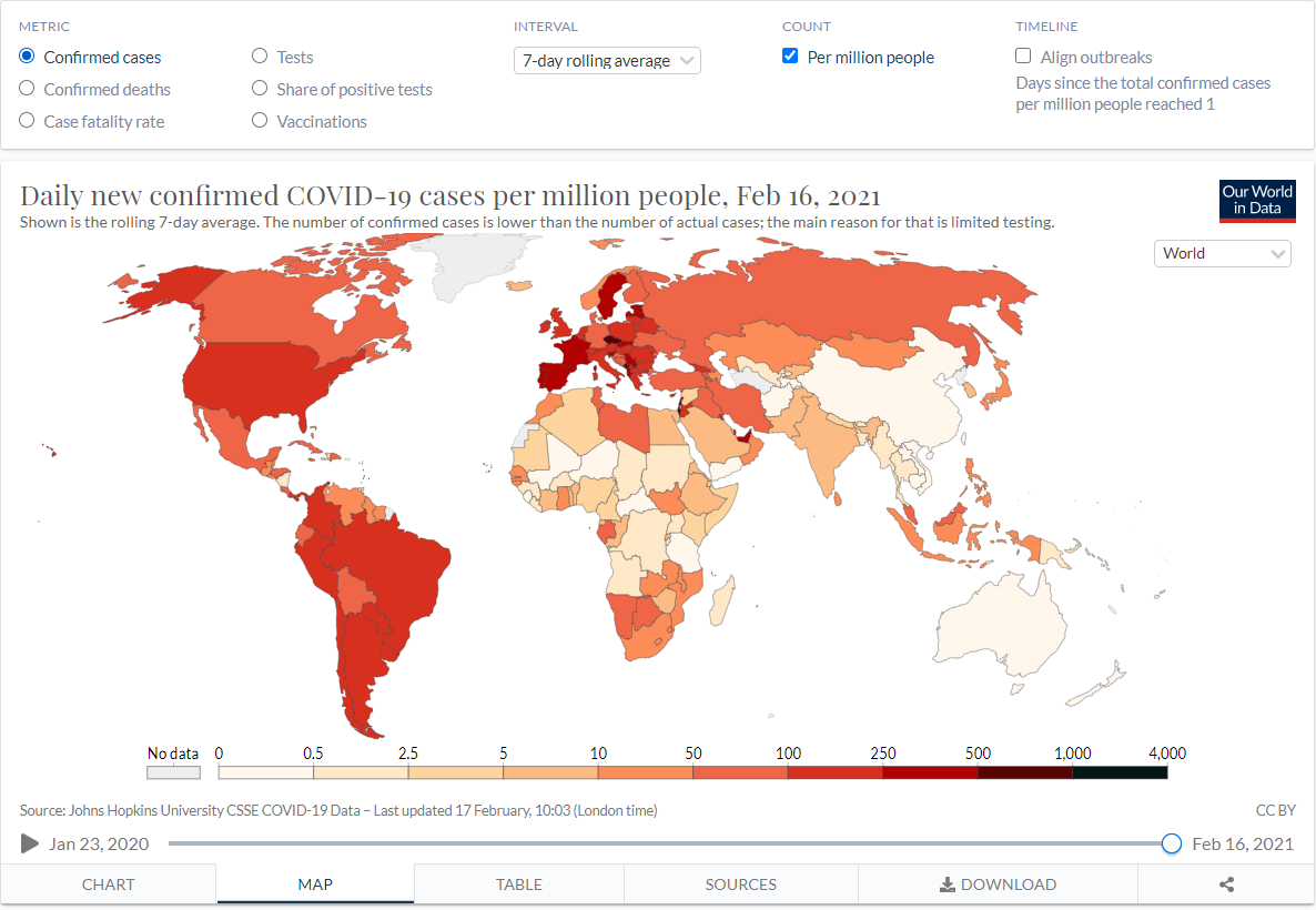
. The color-gradient bar which is also a slicer is great… I’d love to know how to build it. I searched, experimented but unsuccessfully.

. The horizontal date slicer + play-axis is great too… My workaround was to use the Play Axis custom visual combined with a date slicer and overlaying the date slicer with a shape visual to hide the pick-up date selection.

At the end, 4 metrics are presented over the dashboard (confirmed cases, deaths, tests, vaccinations) with 3 different interval options (daily, cumulative, 7-day rolling average).
The metrics are set up with toggle using native button (see Havens video for details) and bookmarks. Interval calculations using SWITCH/TRUE DAX fx and a tooltip showing some country’s data when overlaying the map

Still on the learning curve… would appreciate any feedback :slight_smile:
Thanks.

Alexandre

3 Likes

@Alex7891,

For only your second challenge entry, this is outstanding but the real shining star here is your write up. Here’s what I love about it:

  1. you are pushing yourself HARD into new and unfamiliar areas
  2. you are entirely unafraid to fail in some of these areas
  3. you are incredibly candid about what worked and what didn’t

If someone were to ask me what is the fastest and most effective way to improve their Power BI skills (or any skills for that matter…), I think those three points (in addition to practice, practice and more practice) above are exactly what I would tell them.

I know I am always struck and inspired by the honesty and openness in @alexbadiu and @Greg’s reports about dead ends they encountered and aspects of their reports they felt didn’t work, and I think it’s no coincidence that they are also two of the best report designers in the world.

There’s so much I like about this report – smart use of color for emphasis in a way that looks good and makes intuitive sense, the choice of questions to answer and the visuals to depict those answers, the way you are synthesizing external sources for inspiration, etc. The things that didn’t work are mainly technique-based, which can just be ironed out with study and additional practice.

In terms of the color gradient slicer bar, you can do that with a one line table dressed up to look like a legend. @MudassirAli used the same technique in the quartile legend in his awesome redesign of the Where in the World is Enterprise DNA map.

I’ll need to look at your PBIX to see where your Icon Map choropleth went sideways, but I suspect it is in the simplification and the subsequent “restitching” in DAX to get around the PQ text limit per cell. I’d be happy to work with you in getting that to work if you want to give it another go.

There’s also something a bit funky going on with your country/continent rankings, which are mixing together (e.g., USA being treated like a continent) - something to take a look at.

However, in the big picture, which is to use these challenges to continually learn and improve, this is a grand slam. Keep doing this and I guarantee you will producing top-tier entries in very short order.

Well done! :clap: :clap:

  • Brian
2 Likes

Hi @BrianJ,

Thanks for your comments and support, I appreciate it (a lot) !
I will study the color-gradient slicer solution worked by @MudassirAli :wink:
And I corrected the ranking issues , thanks for pointing it out!

Just need to dedicate regular time to keep learning and progressing with PBI :wink:

Regards,
Alexandre

2 Likes