Hi everyone
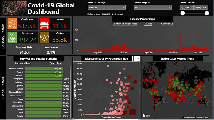
I have split the analysis into 2 parts, country / region level details, selectable from the slicers, and global details which focus on comparing some key metrics related to Covid-19.
Data Cleaning and Preparation
As highlighted in other posts, the data provided by JHU had some issues related to the cumulative count and 0 values appearing in some rows within the data. I used the approach highlighted by @Melissa in her post to clean the data and for US dropped the Recovered column as it had an ambiguity with its total after Dec 2020. I also included the Population statistics for year 2020 from the website https://worldpopulationreview.com/ so that it could be used to compute the Cases per million and Deaths per million measures for all countries.
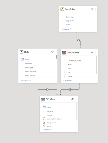
Data Model
The following data model was used for the challenge.
Data Visualization and Analysis
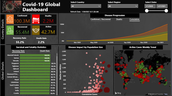
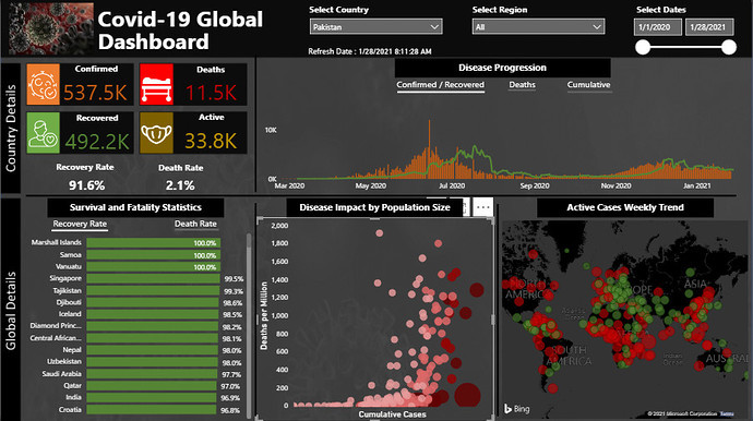
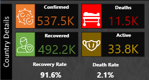
For the country level analysis, the following measures were computed
Daily and cumulative Confirmed Cases count
Daily and cumulative deaths
Daily and cumulative recoveries
Daily and cumulative Active cases
7-day % change, 7-day moving average and 30-day moving average for these measures.
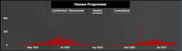
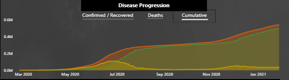
I chose to stick with the daily and cumulative counts only as the rest of the measures were not adding much value to the visuals and creating more of a clutter. Adding some of these as statistics inside cards was also taking the page longer time to refresh and making the overall experience bad without adding any value. The statistics captured are shown in the visual below. The same color scheme has been used inside the other visuals.
I have used bookmarks to toggle between the different views for disease progress over time as seen in the visual.
Confirmed/Recovered
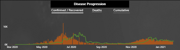
Deaths
Cumulative
For the global details, I have focused on the following measures for comparison
Death Rate
Recovery Rate
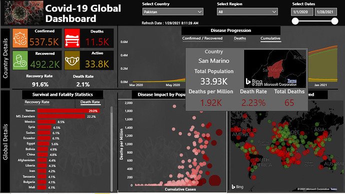
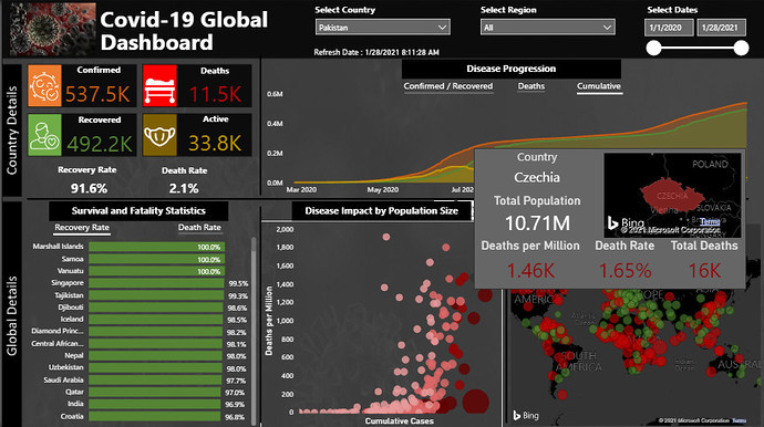
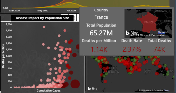
Deaths per million vs the cases count and population
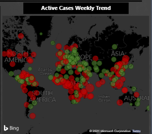
Weekly trend of Active cases (disease spread increasing or decreasing)
Death Rate and Recovery rate for all countries have been shown in a bar chart and the views can be toggled by using bookmarks
Death Rate
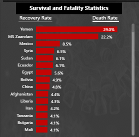
Recovery Rate
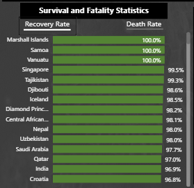
These are probably the most important statistics for any region / country.
Another important comparison is the deaths per million compared with the number of cases and population of the country over time. This has been shown in the scatter chart where the size of each bubble shows its population and the color based segmentation shows to which group does that country belong. The 4 segments are
Population between 0 and 5 Million
Population between 5 Million and 50 Million
Population between 50 and 100 Million
Population greater than 100 Million
A tooltip provides a summary of population and death related statistics for each country highlighted in the visual.
The last map visual shows the Weekly trend of Active cases for all countries. Green color shows improvement, Red color shows deterioration and the size of bubble shows the % age value associated with increase or decrease.
I have kept the report to just 1-page as highlighted by @haroonali1000 in his problem description and only used bookmarks and a tooltip page for showing my analysis. More details could have been added if more report pages were used.
Overall the challenge was interesting and something we all can relate to, given the impact Covid-19 has on our lives and livelihoods. The challenge provided a chance to see some of the actual numbers associated with other parts of the world, the impact it had on the population and how it has been tackled.
As always, please do share your feedback, views and suggestions. I can myself feel that how slowly and gradually these challenges have helped my understanding about data visualization and analysis over a period of an year and half as a Power BI user.
I look forward to participate in more challenges for further improvement.
Regards
Abu Bakar Alvi