Here’s the entry from one of our non-member participants, Vida.

Here’s the link to the report:
Here’s how Vida described it:
I used only Supplier Quality table in the model as it contained lookup values already. Ideally if it had IDs instead of descriptions I would load all tables to the model, but with current structure it would be not efficient to merge tables to obtain IDs.
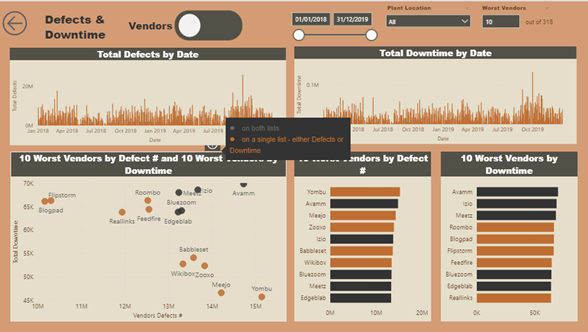
The report contains two data analysis pages. However, user can see more details due to Bookmarks and Tooltips. Defects & Downtime page can navigate from Vendors to Plants and Combinations page can navigate from Vendor-Material to Vendor-Plant.
One of the key questions was to show the greatest defect quantity/ downtime by Vendor/ Plant location. To achieve this, I used vendors/ plants ranking, but I wanted to give user the flexibility to choose how many worst vendors/ plants they want to see. So, I added parameter and it is linked to number of vendors/ plants. The parameter would not allow to enter more vendors/ plants than the max number of vendors/plants. The user can also see how many vendors/ plants are in total.
I then wanted to highlight vendors which appear on both lists, i.e. are the worst with defects and downtime. Conditional formatting was applied via a measure.
I also wanted to show both - defects and downtime - in a scatter chart and highlight the vendors, which appear on both lists. Let’s say user wants to see 10 worst vendors by defects and downtime. If there were 5 vendors on both lists, scatter chart would show only 15 vendors instead of 20.
Scatter chart was created with help of calculated table, which shows summarized defects and ranks for both lists. I tried to achieve the same result by only creating a measure, but I failed. I am still not sure if it is possible to have a measure instead of calculated table.
When users hover over the scatter chart they can see information icon which contains tooltip with colours explanation. Ideally I wanted to move information icon on chart title, but due to lack of time didn’t do it. Number selection filter and bar charts also contain information icon.
When hovering over bar charts, user can see more details through page tooltip.
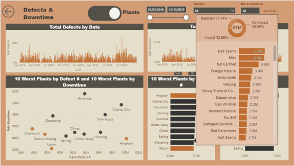
Plants reports has exactly same structure and is on the same page. User just needs to click on navigation button.
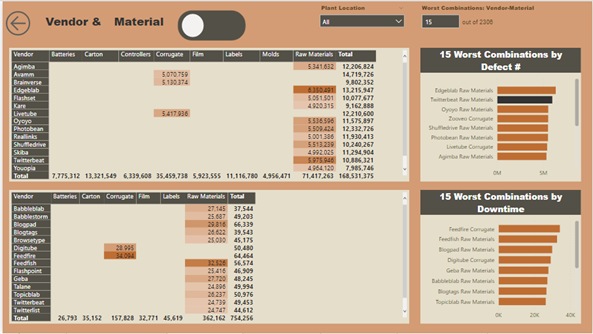
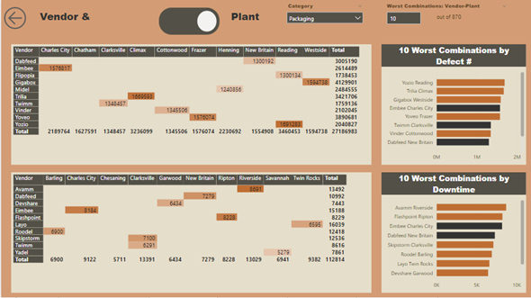
Combinations - Vendor-Material/ Vendor-Plant – were achieved through matrix. Users can choose how many worst combinations they want to see. They can also filter by additional information.
The report contains a lot repetitive measures. I was thinking that calculation groups, which can be achieved with External tools, would be ideal in this situation, but again due to lack of time I could not look into this quite new feature.
To learn about the real-life scenario presented for the challenge, be sure to click on the image below.
