Here’s the entry from one of our non-member participants, Jihwan.
The first page is the cover page that is shown below.

The top of the cover page describes trend lines of Defect Quantity and Downtime Minutes by selected dates range (①).
The middle of the cover page answers briefly the key questions that the business questioned. Furthermore, the answers are dynamically changing by altering the date range (①). By seeing the trend line charts, the readers can be interested in looking into more detailed information by a certain date range. The exact date can be known by hovering over each trend line chart.
The readers can go to detailed report pages by clicking the buttons (②③④⑤).
By clicking ②, the readers can see the below report page, which is the Total Defect Qty Report page.

The date-slicer (⑥) is synchronized with the cover page’s date range, and the readers can still change it freely here.
Below the date-slicer, the detailed information is described (⑦). The date can be also selected by CTR+dragging in the line chart (⑧) or can be selected by clicking a specific date on the line in the line chart. By altering the date or date range, the described detailed information changes dynamically. It is also responsively changed by selecting one or many plants in the map visualization (⑨).
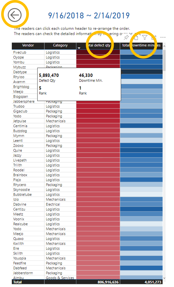
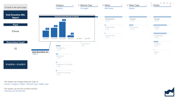
If one plant is selected in the map visualization, then the readers can drill through to another page, that shows the decomposition tree analysis by illustrating with defect type, category, material type, defect, and vendor. In the decomposition tree visualization, the readers can freely change the order of dimensions. Moreover, the monthly trend of each data is shown by hovering over the data-bar.
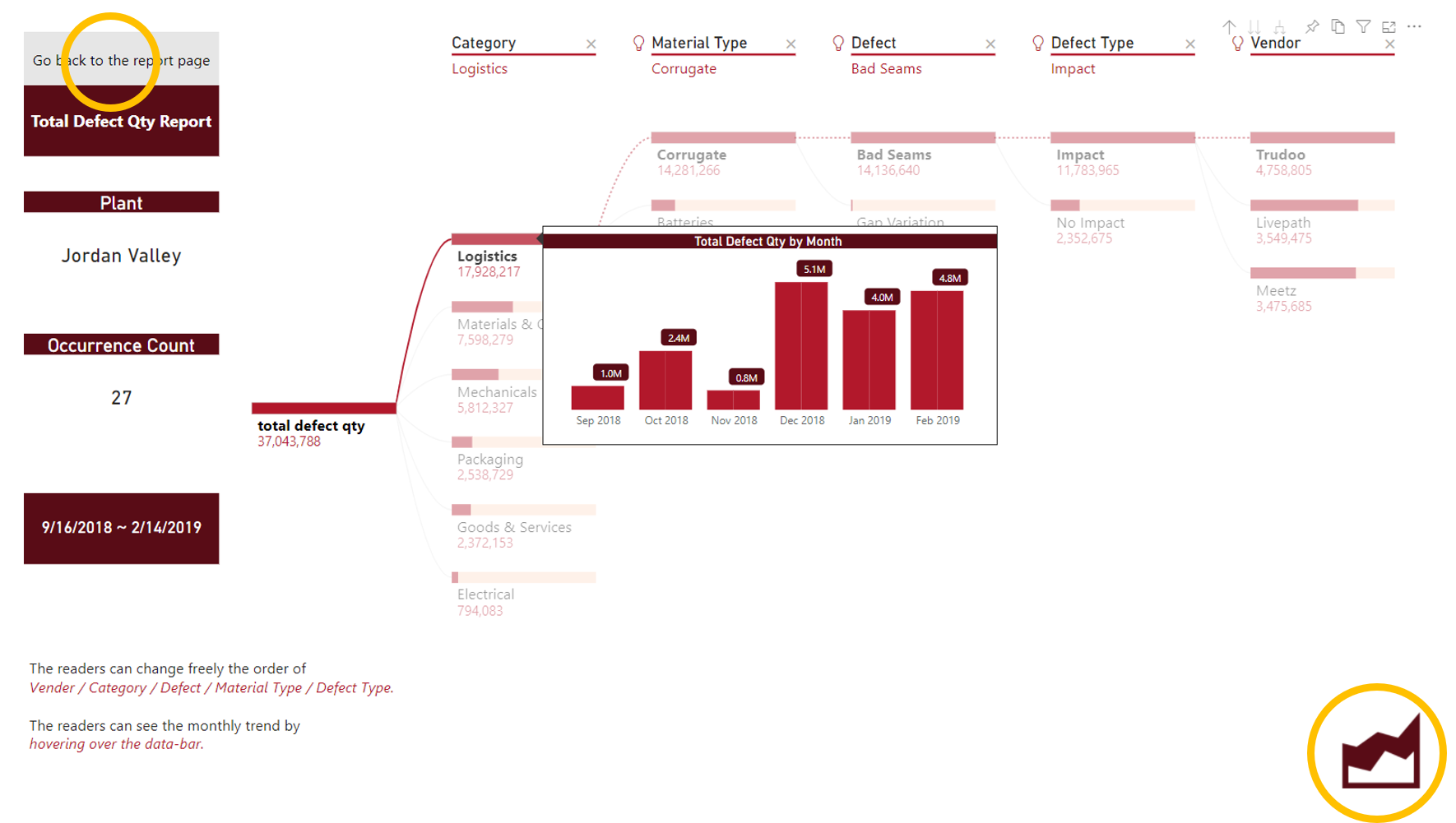
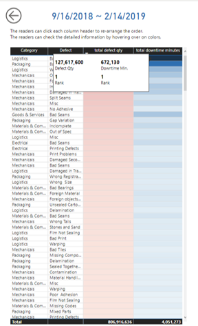
The readers can see the information about the combination of selections on slicer ⑩ and ⑪. Each slicer filters out the dimension that is selected on the other slicer to prevent duplicated selection. Once the selection is made on each slicer, then the readers click ⑫. The detailed information of the combination is shown on the table visualization with conditionally formatted colors. The readers can change the order from descending to ascending by clicking each column-head. The detailed information is shown by hovering over the colors, that are conditionally formatted (dark red or dark blue: high value).
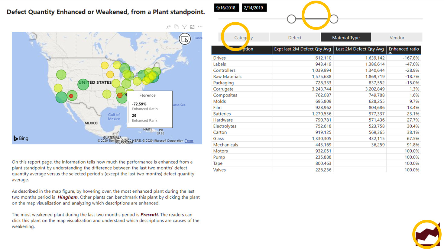
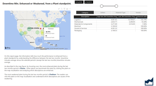
When clicking ⑬, the readers can go to the enhancement report page. It describes how much the performance is enhanced from a plant standpoint by understanding the difference between the last two month’s defect quantity average versus the selected period’s (except the last two months) defect quantity average. The date-slicer is synchronized with the previous page’s slicer and it still can be altered. By altering the date-slicer, the information that is written down below the map visualization dynamically changes. By selecting the dimension-slicer, that is below the date-slicer, the information in the table visualization dynamically changes. The information on the table also changes by clicking the enhanced or weakened plant on the map visualization. By clicking the most enhanced plant on the map visualization, it tells what descriptions enhanced the most during the selected date range. Moreover, it also can tell which plant weakened the most and what descriptions in the table are the causes of poor performance.
The readers can click ⑭ to go back to the cover page and go to another page. Or, can click ⑮ to directly go to the Total Downtime Minutes Report page.
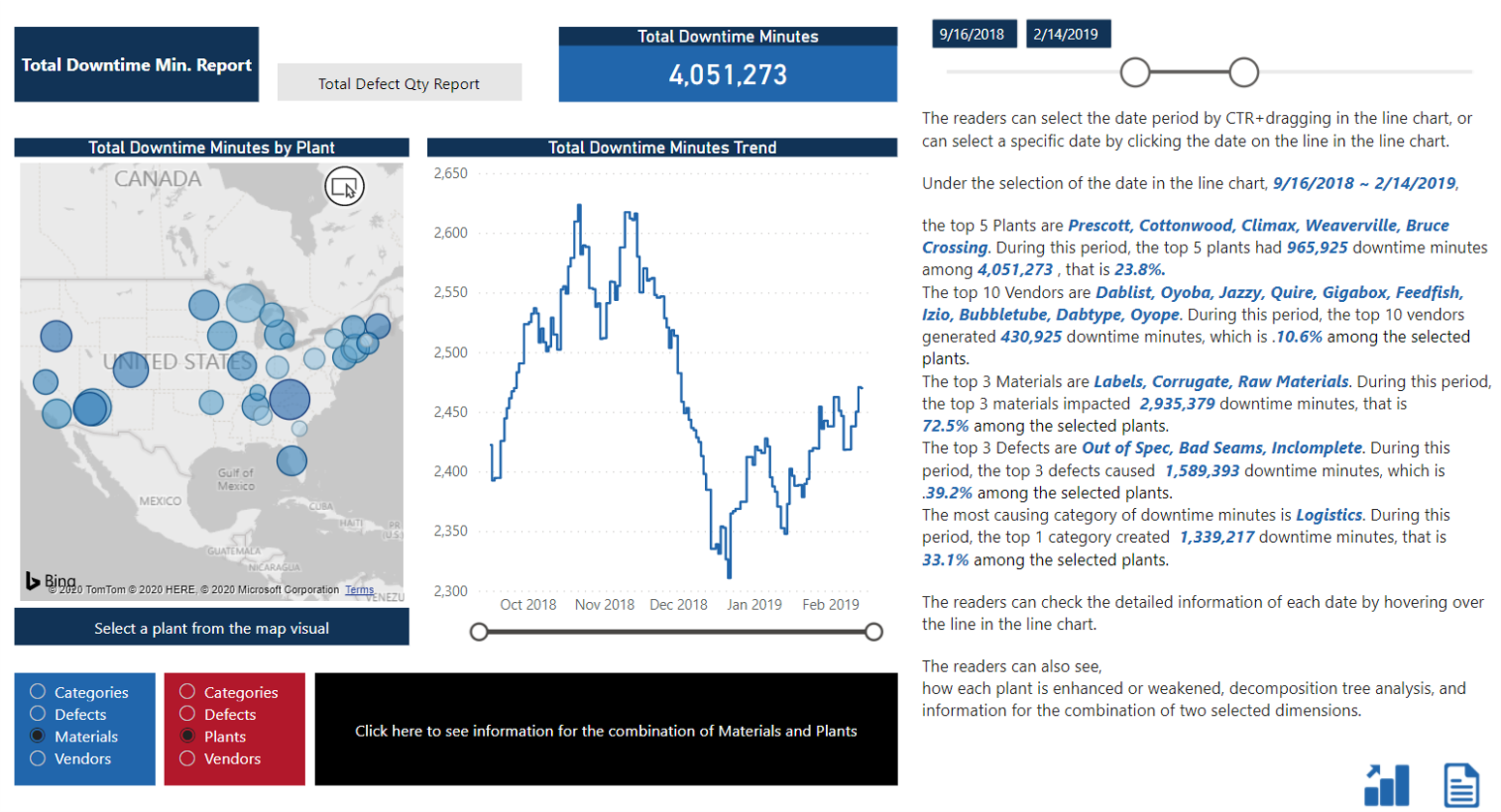
By clicking ③ on the cover page, the readers can go to the Total Downtime Minutes Report page. It is structured the samely as the Total Defect Quantity Report Page. Clicking ④ and ⑤ on the cover page helps readers to directly go to the Enhancement Report page.
I hope this report helps readers to understand what caused defect quantity and downtime minutes and to plan actions for improvement.
Here’s the link to the report:
To learn about the real-life scenario presented for the challenge, be sure to click on the image below.

