Power BI Challenge 10 - Supplier Insight from Hideo

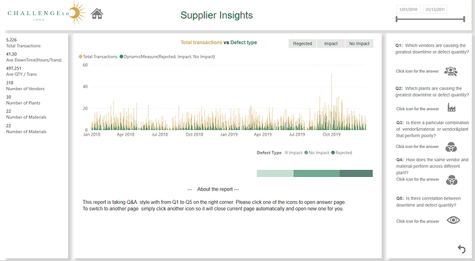
Here’s Hideo’s entry for Power BI Challenge 10. @Hideo, feel free to add other details of your work.

(First Screen)

I have tried to as simple as possible for the first screen so the consumer can have enough time prepare for the next screen.

This time I took Q&A style. Please press icons to answer for the questions.
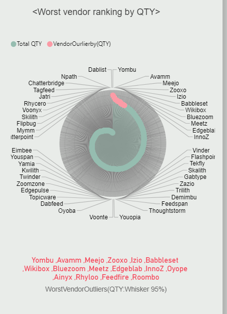
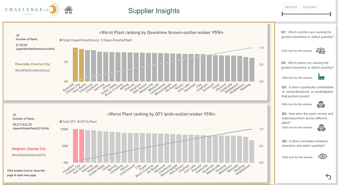
image

(Q1 screen)

For the first question. Rader chart is showing from the worst ranking. Worst start from top and goes around down as clockwise like a snail shell. Outliers stands out as gold or pink colour.

To go to next screen, simply press another icon which will close current screen and automatically open the desired one and I think it is easier for the consumer.
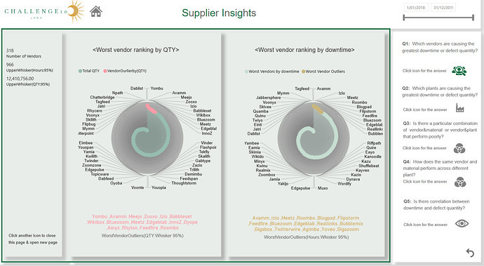
image

(Q2 screen)

Similar question as Q1 but I have used different visual to make sure consumer won’t get bored.

image

(Q3 screen)

Worst vendor and material combinations.
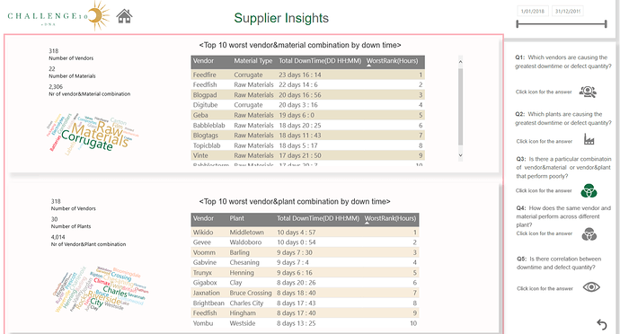
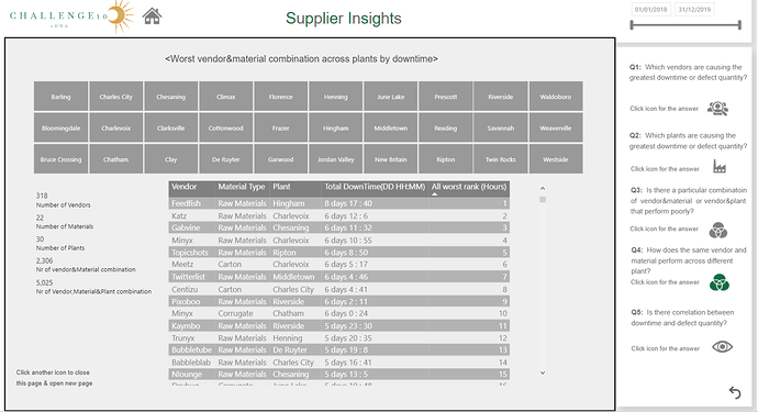
image

(Q4 screen)

Another worst combination including plant.
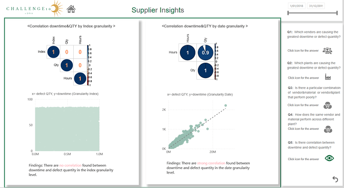
image

(Q5 screen)

If there is correlation between downtime and defects QTY , I wanted to create overall worst ranking for all the combinations but as the data showing there is no correlation in the index
(I have created index) level so I decided not to create overall ranking.

image

Here’s the link to the report:

To learn about the real-life scenario presented for the challenge, be sure to click on the image below.

power-bi-chal-1

Hello eDNA members,

Here is my digestion of the report.

(Power Query & Data Model)
Unlike last challenge 9, there are only small clean up with power query this time and data model went very simple water fall model which is nice.

image

(Dax)
# To find outliers
UpperWhiskerPlant(QTY:95%) =
PERCENTILEX.INC(ALLSELECTED(‘Plant Location’[Plant]),
[Total QTY],.95)

# To create joint ranking

WorstMaterial&VendarRank(Hours) = 
var ranking= RANKX(
           FILTER(GENERATEALL(ALL('Material Type'[Material Type]),ALL(Vendor[Vendor])),
                    NOT(ISBLANK([Total DownTime(Hours)])) ),
                               [Total DownTime(Hours)]+ DIVIDE([(VendorrankbyHour)],1000,0), ,DESC)

var result= IF(ISBLANK([Total DownTime(Hours)]), BLANK(), ranking)
return result 

# To count joint ranking

    Nr of vendor&Material combination = 
 var combi= COUNTROWS(FILTER(GENERATEALL(
                               VALUES(Vendor[Vendor]),VALUES('Material Type'[Material Type])),
                                   NOT(ISBLANK([Total DownTime(Hours)]))))
return combi

(Visualisation)
I am really impressed by the nice visual from the radar chart (import visual) as I was not expecting this good. If there is an option to change vendor name colour that was perfect for me. This time I could change only value (QTY ) level colour as an outlier.

(Analysis)
When I was checking dataset initially, it does not look like there is any correlation between downtime and defect quantity but when I have checked again in PBI later there is linear correlation(in date level granularity)… so I was a bit confused and wanted to find out why.
By creating index in the fact table, I found that there are no correlation by the index granularity level.
Initially I was planning to create overall ranking by scoring downtime and defect quantity but after finding this fact I just have decided to create another question (Q5 ) as of my findings.

Thank you so much for reading my write up.

All the best for all the members in eDNA.

Regards,

Hideo

2 Likes