Thanks very much for the positive feedback. I just posted my PBIX file up above with my original entry. I hope you find it useful. Feel free to give a shout if you have any questions.
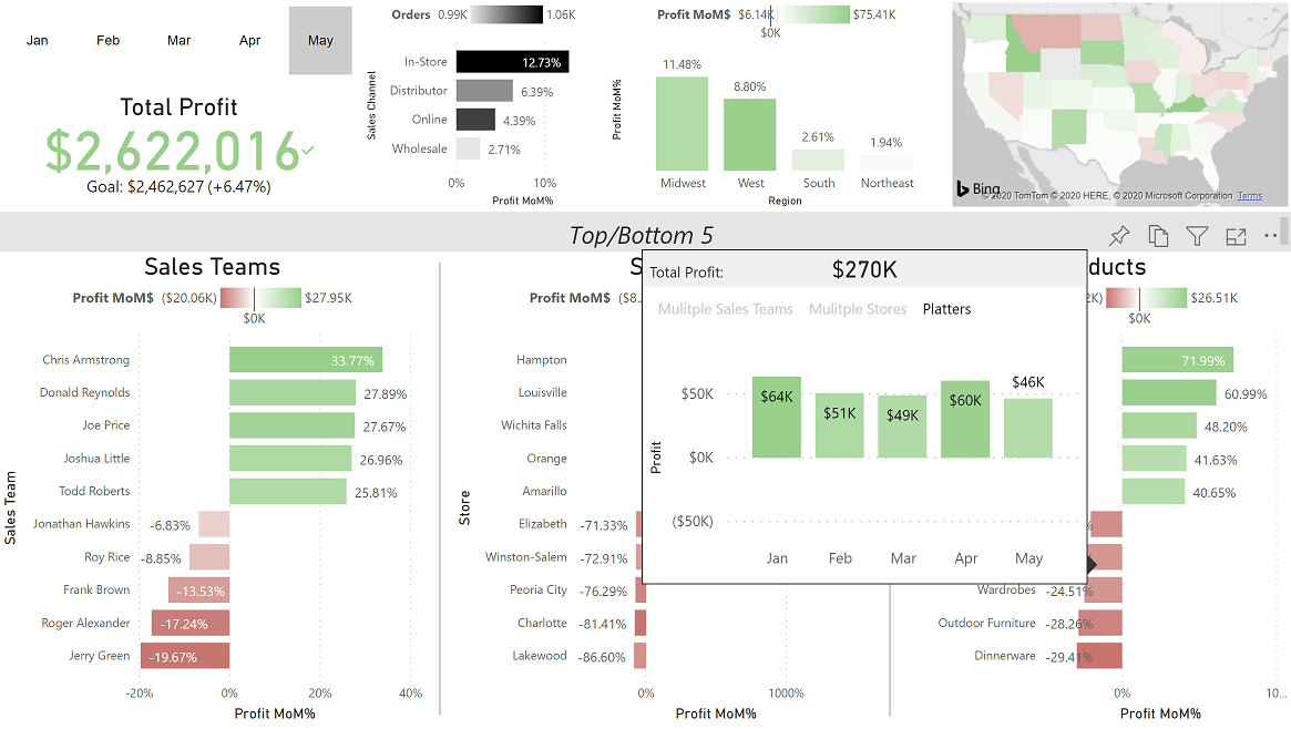
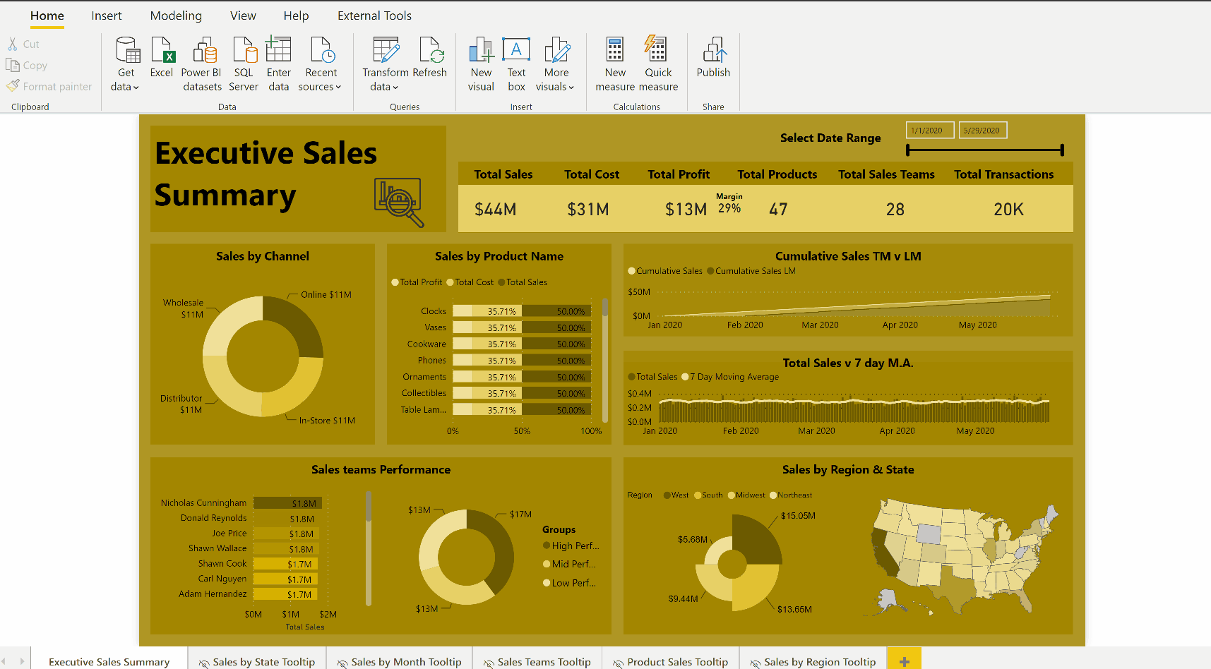
As an executive dashboard I made it one page only.
With this one I focused on:
Profit as the primary measure (Are we making money?)
Comparison to previous month as baseline (How are we trending?)
Top and bottom 5 (Where did we do well? Where did we need improvement?)
One of the challenges with this data source was it was rather flat, as in the downs were usually met with an up at other times. So I provided a tooltip on the top/bottom 5 that gave the whole view as well.
For example, some teams were in the bottom 5, but had actually made more profit over the whole time period than top performer for that month.
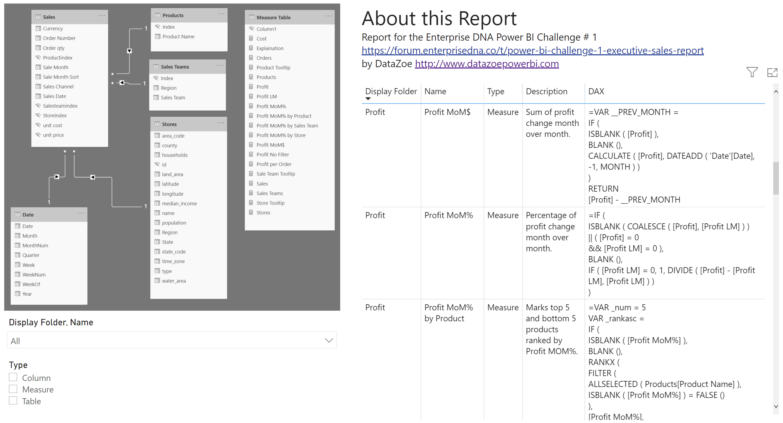
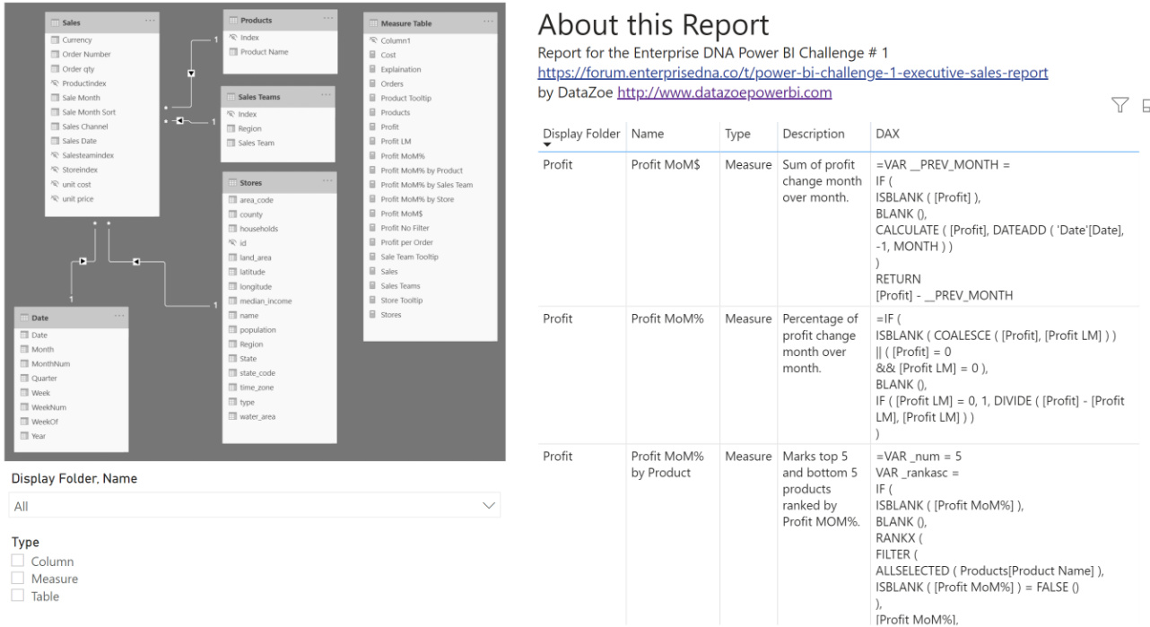
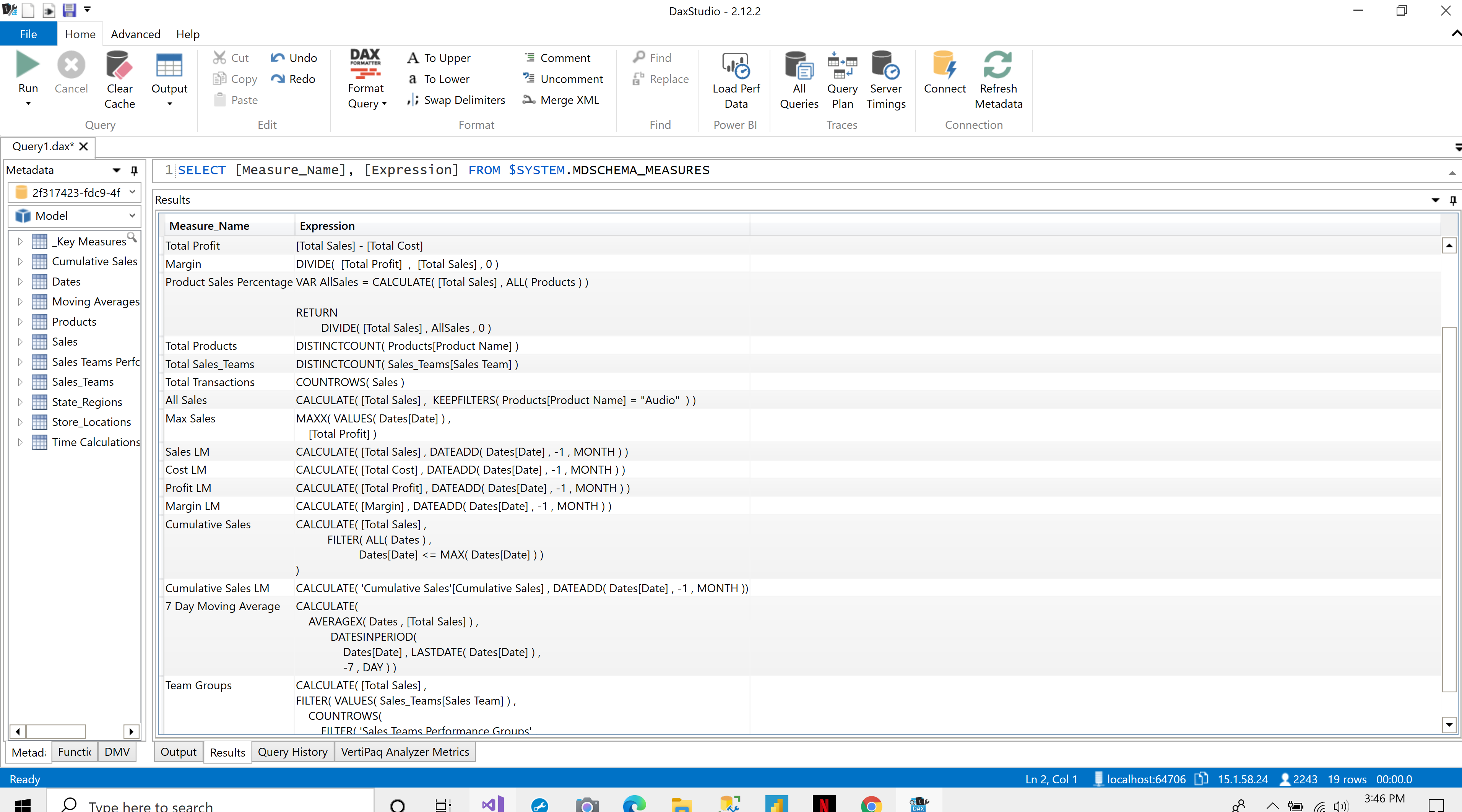
I’ve also included all the model and measures surfaced in the report:
The longest part was getting that tooltip to show profit every month while keeping all the filters from the main page (so you could choose a state from the map, as an example, and then see the tooltip as of that state/product combo on the product bar). I eventually gave up trying to use the Date table on the axis and used the Sales table [Sales Date] to create a [Sales Month], with a REMOVEFILTERS(‘Date’) on a separate [Profit] measure. I learned there is some interesting filter ordering in play with tooltips and filtering.
Terrific entries, and I’m really enjoying reading your writeups. I’ve always included an "About"page at the end of my reports as well, but it never occurred to me to make them anything other than a static page. I love the way you’ve structured yours, both the info included, and the way the table is sliceable.
@BrianJ Thank you for your kind words! Your posts and entries are always great too!
Every power bi data model I create I utilize the Vertipaq Analyzer for, so I copy that table from the “Dax Expressions” tab and include it in via “Enter Data”.
You can also directly query a model to get the same data, which is what I do for my Power BI Premium or Analysis Services data models.
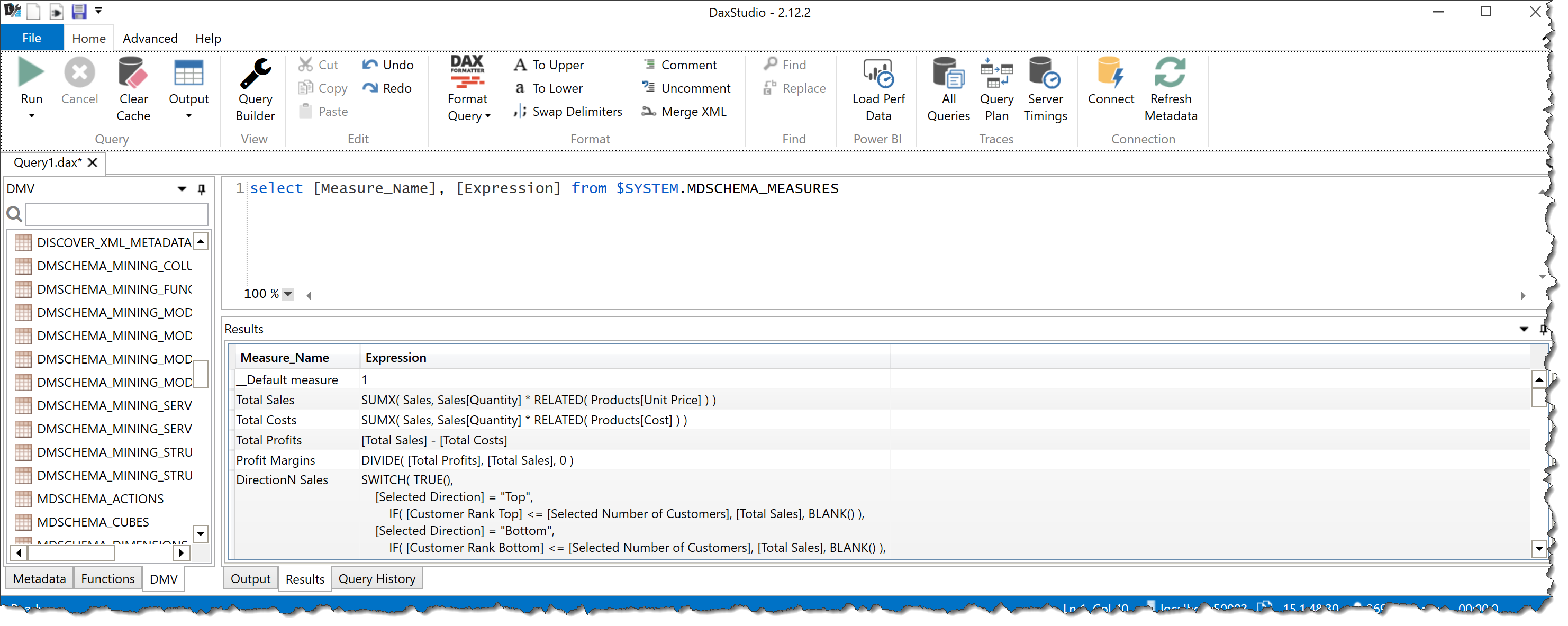
You can also get the expressions for measures using the DMV’s inside DAX Studio, specifically the $SYSTEM.MDSCHEMA_MEASURES data management view. Use a SQL query like:
SELECT [Measure_Name], [Expression] FROM $SYSTEM.MDSCHEMA_MEASURES
I absolutely love that you and @datazoe have been going back and doing the challenges you missed. I think this is a terrific entry, one that would’ve been in the running for the top slot. Really well focused on the objectives of the brief, well-organized and making great use of multiple tooltips to pack a ton of information on a single page. Kind of an offbeat color theme, but I really like it.
@BrianJ,
I appreciate your kind words. I think I am addicted to these challenges. I believe some of my techniques have improved since I started participating in these challenge thanks to you and others.
Therefore, I am thinking of going back to some of the challenges and work the reports again to see how I actually improved.
@Neba I love it! How did you do that bottom right donut like that? That is awesome! I like the logical grouping, flawless execution of the color theme, and the great spacing in the report.
@datazoe Thank you so much for your Positive feedback.
The donut chart is an imported visual called Aster plot. It looks much better than the native donut chart since it expands based on category and amount. The only down side is you can’t customize the tool tip.
Actually, there might be a way to do so based on the awesome video below that @sam.mckay posted last night. You may be able to lay a standard donut chart overtop of the Aster version, and make the overlay completely transparent but take advantage of its tooltip properties, in effect grafting the customizable tooltip from the native visual onto the custom visual:
While I haven’t been redoing my earlier challenge entries, I have been doing something similar by reworking my work reports based on all that I’ve learned over the past six months of challenges. I’ve been amazed by how much better the newer versions look and operate, employing all the techniques and tricks I’ve learned from others’ challenge entries.
You should definitely share some of your “before and after” pics.
@neba I absolutely love this entry …Amazing !!
The Sales Teams performance part where the tooltip shows the list of High & Mid Performers is very intuitive and informative. It’s really great to see you going back and completing the previous challenges. Every challenge teaches you new things and make you more confident in handling any type of dataset.
Well Done!
@MudassirAli , I know right. As I progress in my Power BI Development journey, I am realizing that there are very few options of native visuals in Power BI. So, I always find myself looking to import visuals.