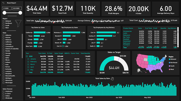
@Neba I love it! How did you do that bottom right donut like that? That is awesome! I like the logical grouping, flawless execution of the color theme, and the great spacing in the report.
@datazoe Thank you so much for your Positive feedback.
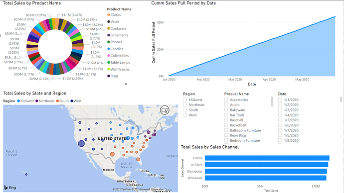
The donut chart is an imported visual called Aster plot. It looks much better than the native donut chart since it expands based on category and amount. The only down side is you can’t customize the tool tip.
@Neba I never knew about that one, that’s great. Thank you!
Actually, there might be a way to do so based on the awesome video below that @sam.mckay posted last night. You may be able to lay a standard donut chart overtop of the Aster version, and make the overlay completely transparent but take advantage of its tooltip properties, in effect grafting the customizable tooltip from the native visual onto the custom visual:
While I haven’t been redoing my earlier challenge entries, I have been doing something similar by reworking my work reports based on all that I’ve learned over the past six months of challenges. I’ve been amazed by how much better the newer versions look and operate, employing all the techniques and tricks I’ve learned from others’ challenge entries.
You should definitely share some of your “before and after” pics.
- Brian
@Neba Everything looks better than the native visuals 
I will check the video. Thank you
That is a great idea. I will definitely post the old and new reports side by side.
@neba I absolutely love this entry …Amazing !!
The Sales Teams performance part where the tooltip shows the list of High & Mid Performers is very intuitive and informative. It’s really great to see you going back and completing the previous challenges. Every challenge teaches you new things and make you more confident in handling any type of dataset.
Well Done!
@MudassirAli , I know right. As I progress in my Power BI Development journey, I am realizing that there are very few options of native visuals in Power BI. So, I always find myself looking to import visuals. 
@BrianJ I just got the idea. How about creating a forum where people either posting their first ever report they created in Power BI followed by their latest submission or the report just before joining the challenges followed by the last challenge submission. It has been 8 challenges so far so it will be good to see the development so far.
Will be very interesting and cringe-worthy to look at those submissions.
@Neba
Just my 2 cents. Before looking for custom visuals, try to be as creative as possible with the base visuals. You will learn a lot in doing so even if you can’t make it work.
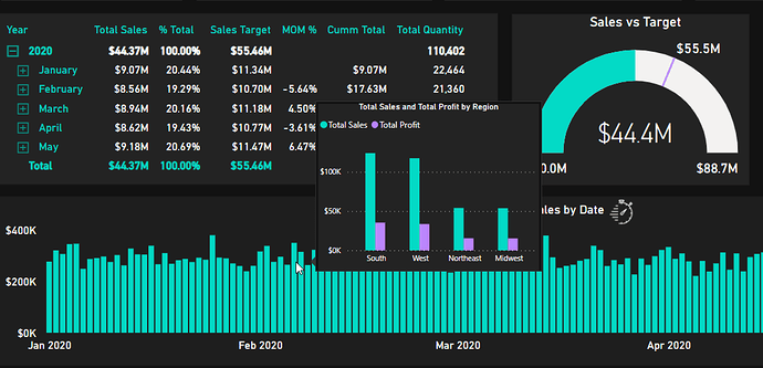
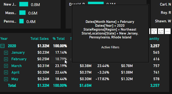
@Neba I am working on my company’s report so stealing your idea of using many tooltips. I know it will work because of the audience I am preparing for.
@MudassirAli,
Yes you are absolutely right. I should learn using and combining native visuals to tell a story. Your entries are some of the best and creative in combining the native visual.
That is Awesome. Good luck with your report.
Jeez! Why didn’t you just suggest we just post our high school yearbook photos…
I’m pretty sure that if I posted my first report, @JarrettM would take one look at the color scheme and show up at my door and want to fight me (and I wouldn’t blame him in the least…)
- Brian
@BrianJ LOL
And to top it off , @haroonali1000 to pick the most cringe-worthy report 
Here is my submission for Challenge 1, I am still learning and hopefully will get better in the coming days:
Here is my write up:
You definitely got me! I just sent Brian a message saying " Is this a late April Fools Joke?"
Well Played! 
Thanks
Jarrett
@JarrettM hahahahaha!!

@AntrikshSharma LOL great way to surprise people…Great first start by the way… We will see you in the next challenge…We have a competition…
