Power BI Accelerator Week #4 is Live!

@MehdiH ,

Wow – thank you so much for the detailed feedback! This sort of input is invaluable to us in developing the Accelerator problem sets, and also identifying what to focus on during the live solution events.

The one statement that made me cringe was “It took me about 10 hours to get the correct result…” Trust me, I know EXACTLY how it gets under your skin when you can’t get a problem to work out, but, PLEASE don’t spend that kind of time on any Accelerator problem. Just get as far as you can in a reasonable amount of time, and flag it for us so we know to go over that specifically in the solution event.

Really nice job on the problem set, and thanks so much for your weekly participation and contributions.

– Brian

1 Like

Thank you @BrianJ for the feedback.

Don’t worry about the time spent on tasks because for me it is a valuable effort and a very good investment.
Thanks again for your encouragement.

2 Likes

With a little hindsight, I normally ended up finding a solution to the two problems I encountered.

To Highlight “Jan” and “Feb” months in the “Is ‘Dumpuary’ Real? (do studios drop their least promising films in Jan/Feb?)” visual.

  • I used a Combo chart with 3 lines and 1 column. The Column is plotted using a measure that return 10 if month is Jan or Feb and 0 else. It is not perfect because I have an indicator in the legend but at least I highlighted the two months.

I also figured out how to add the title of the movie in the “Largest +/- Discrepancies between Viewers and Critics” visual.

  • Originally I was unable to use the ‘Title’ in the ‘Details’ field because I was not summarizing the ‘Viewers Score’ and ‘Critics Score’ (the default summarization was set to "Do not summarize’). Changing that to Sum let me use the ‘Title’ in the ‘Details’ field and turning on the category showed the Title in the chart.

Lesson learned :heavy_check_mark:

2 Likes

Awesome problem setting Brian. Definitely understand topn, rankx, maxx and minx better than two weeks ago.

Formatting that pesky table and scatter graph took up most of the time! Would not have been able to format the table without your guidance to KieftyKids and help from other submissions to get the scatter graph working.

Failed to colour the Jan / Feb part of the Dumpuary Graph or include a background for the discrepancies. Did include a tooltip in the Dumpary which highlights when the most promising films are dropped. Looks more holiday dependent than anything else.

Again thanks. This was a great challenge and a fantastic learning experience.

1 Like

Here’s my submission

Did a few different things, but get to the same insights I believe.

Power BI Accelerator – Week #4 Final Exercise.pbix (11.2 MB)

2 Likes

Really great dataset by the way.

So many ways that you could analyze this.

Maybe a great future challenge.

2 Likes

Hi @sam.mckay,
I am curious what visual you used for Total Movie by Month vs Critic Score?
image

1 Like

Hi @KimC,

That’s some master sourcery by @sam.mckay
It’s actually a combination of 3 visuals. A stacked bar chart and a table with a transparant shape placed over them preventing the user from making a selection within these visuals, changing the sort order or even selecting one of the underlying visuals.

Hope this is helpful.

4 Likes

Hello Brian:

Here is my submission.

I thought this accelerator was terrific and challenging. I can see how Variables provide the answer to many of the questions I’ve had.

I was able to complete the exercise with one exception, that being to limit the Average ROI to the Top 5. I was all around it, but just couldn’t put the pieces together. Certainly, I will refer to the solutions of other participants, also.

I’ve reviewed Medhi’s solution. Very nicely done. It’s amazing how straightforward the answer to a problem can be when you attack it logically. I didn’t incorporate his solution into my submission, although I will do so after the fact.

  1. Critics/Viewer Choice Cards - I thought this was fairly straightforward until the visuals failed due to ties. I tried to use Concatenatex to list the multiple movies, but failed. I tried to lift the logic that Alberto Ferrari used in the Variable Debug tutorial, but failed. He knows how many variables are being passed because of the slicer. I guess there’s no way to identify/trap when Topn returns more variables than the stated number? In any event, I found a way to break the tie.

  2. Breakdown by Genre - This was an easy one ( I hope my solution doesn’t make a liar out of me). I did use the Filter Pane to limit by the .02 threshold. Perhaps, I’ll go back to adjust the visual to use DAX.

  3. Top 5 by Avg ROI - I sailed along on this one until it was time to limit by Top 5. As I said above, I came close, but just couldn’t nail it. At the risk of becoming cross eyed, I had to walk away from it.

  4. Dumpuary - Another straightforward visual. I decided to pass on the shading of January and February in favor of spending more time on DAX related activity.

  5. Scatter Chart - I thought this visual would be very difficult, but it was fairly easy. Again, I took a run at the shading, but decided to return to the Top 5 Avg ROI visual. I was unable to find a means of listing the Movie Title adjacent to the bubble.

  6. Highest/Lowest Cost per Critics Review Point - The DAX was easy here, but I had a problem with the right hand column that list the Highest and Lowest data. The fog lifted when I realized that Accelerator 3 had a similar requirement. I referred to my submission and saw that SELECTEDVALUE and SWITCH settled matters. I will check to see how others eliminated the Column Headers.

I any event, here’s my PBIX. As far as the Accelerators, keep ‘em comin’.

John Giles

Power BI Accelerator – Week #4.pbix (11.2 MB)

3 Likes

Hello Kim:

Not that you need to hear this from me, but very nice work on your alternate page.

I’m a staunch advocate for multi threaded visuals, and you did a terrific job with your entry.

Regards,

John Giles

3 Likes

@Melissa, I thought there was something tricky going on by the master!! Thanks for the tips, I can see what he has done now :grinning: I really like how @sam.mckay has combined the chart and table together and the transparent overlay is genius.

3 Likes

Hi Mark,
Explore the Analytics pane of the Scatter Plot visual.
You can apply many features including “Symmetry Shading” this is what I used.

4 Likes

Thanks @MehdiH. As with the table high / low table its simple when you know where to look!

2 Likes

Yep that’s right from Melissa. It’s just a table next to a bar chart. I’ve hidden the first column which is sorting the table correctly. I also placed a transparent shape above it so no one can click on it which ruins the visual.

2 Likes

Thank you, @MehdiH. I need to spend a little time on the analytics options it seems.

1 Like

All,

Thanks so much to all who participated in the week #4 cycle of Accelerator! @sam.mckay and I were incredibly impressed by the solutions you provided, and the creativity in working around some of the challenges you encountered.

For those who didn’t complete every sub-problem successfully, that is 100% OK. We want these exercises to be a reasonable stretch, and I guarantee if you stick with it to the end that you will look back on some of the problems you struggled with in the earlier weeks and find that you can now breeze through them. I even saw that from week #3 to week #4, where some of you struggled with the MAXX curveball I threw at you in week #3, and then made quick work of an even more difficult version of that in week #4.

I hope you found last night’s solution session valuable, and for those who weren’t able to join us live we are working on getting that posted to the portal later today.

A couple of things I didn’t have time to run through yesterday that I wanted to make brief mention of now:

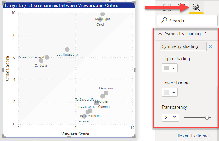
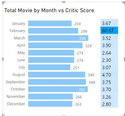
In the “Dumpuary” graphic, number of folks asked how I did the shading for January and February. Honestly, my hope was to use the new August 2021 features that let you assign measures to constant lines in the Analytics Panel. However, that only works for continuous fields, and the field we were using on the access was categorical. So I took a much less impressive approach of just adding a shaded rectangle around January and February, making it partially transparent and moving it to the back layer. Pretty primitive, but in the words of a wise forum member “if it works, it ain’t dumb”. For a much more clever solution, please check out @MehdiH solution file above. Well done, Mehdi! – extra credit points for you this week.

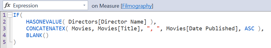
The other measure that gave some people problems Was the Filmography listing in the Top Five Directors visual. Here’s the DAX I used for that one:

CONCATENATEX is one of my absolute favorite DAX functions – it lets you do all kinds of wizardry involving returning multiple values while still being categorized as a single value scalar. Tuck that one away in your memory bank - I guarantee you’ll see it pop up again in future weeks of Accelerator. The HASONEVALUE function is used to test whether we are in a detail row or the total row of the visual, and prevent returning a listing of all movies in the total row. That’s another one to mentally bookmark, since it will be critical when we talk about fixing broken totals.

If you have any questions after looking at the solution files posted in the portal, or pertaining to the lesson, please post them here and we will be glad to continue the dialogue.

Thanks to all again for participating! And look out next Wednesday for the new Week #5 problem set. This one will focus on time intelligence, and we actually have our first real client – another forum member who has asked us to apply our collective skills to a report he is developing. See you then!

  • Brian
2 Likes

All,

All of the solution information, including the video from Wednesday are now up in the portal. I just re-watched the session, and wanted to address a question from @bboehnke that unfortunately went unanswered (on Re-Stream, unfortunately when I’m teaching I can’t see the comments coming in). Brad asked:

The answer this is no. Anything in a visual imposes FILTER context, not row context. Row context is related to the actual table itself - regardless of whether that table is virtual or physical. For example,

MINX( Sales, Sales[Unit Cost] * Sales[Order Quantify] ) imposes a row context on the physical Sales table, steps row by row through the table calculating the unit cost * quantity for each row and then returning the minimum value for that calculation over those rows.

Additional filter context provided by the visual can be imposed on top of that. I hope that’s clear, and answers your question - let me know if you still have additional questions around that.

Also, there was a request for the link to my video this week explaining whey we have to remove filters on two date fields rather than one in one of the examples from Wed. Here’s the link:

Finally, in the solution session, there was an example regarding iterators and variables that I said I would get back to, but never had time to do so. I think it’s quite an interesting and instructive example, so I plan to make a YouTube video about it for next week, so keep you eyes out for it mid- to late-week next week.

I hope that helps tie up some loose ends. Thanks again for your interest and participation in Accelerator!

3 Likes

Thank you @BrianJ for your encouragement.
The Filmography measure you provided is very interesting. Thank you for sharing

I have a question that relates to the Data Cards for Critics Choice and Viewers Choice when there were ties based upon the time period selected.

Is there a means to identify when the tie occurs and use CONCATENATEX to display the movies that tied, or display a message that indicates that there’s a tie?

The DEBUG DAX tutorial that Brian attached to the Accelerator comes close, but the context isn’t a complete match to the Accelerator.

Just wondering.

Regards,

John Giles

@JohnG ,

Bingo! - great suggestion (I wish I’d thought of this when I put my solution together). CONCATENATEX works perfectly for this purpose. Check it out (just subbed the CONCATENATEX line for MAXX):

Highest Rated Movie (Viewers) = 
VAR MaxCritScore =
    MAX( Movies[Viewers Score] )
VAR Result =
    CALCULATE(
        CONCATENATEX( Movies, Movies[Title], ", ", Movies[Title], DESC ),
        Movies[Viewers Score] = MaxCritScore
    )
RETURN
    Result

Awesome that you’re digging into this at such a detailed level - keep up the great work!

  • Brian
1 Like