Hi @BrianJ,
Just to let you know I received mine last night.
thanks
Keith
Hi @BrianJ,
Just to let you know I received mine last night.
thanks
Keith
@stevens ,
Thanks – that’s a nice construct. I’ve popped a copy of that into Analyst Hub for future reference/use.
– Brian
Hi @BrianJ
Please see below for my submission to the Accelerator Week#3 task.
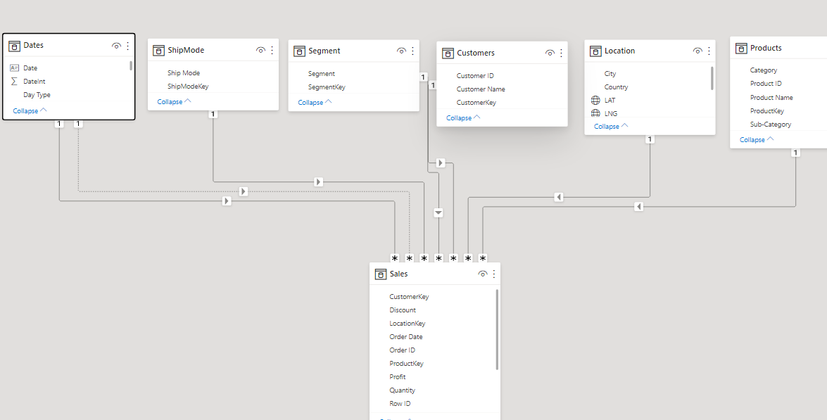
Here is a screenshot of the data model i used
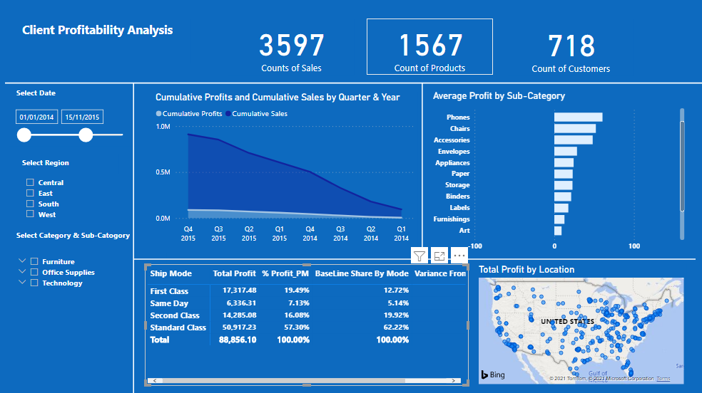
The report page is below;
Attached is the pbix file, can you please help me publish it.
ClientProfitability.pbix (1.8 MB)
Learning Outcome
Thank you all, feedbacks will be greatly appreciated
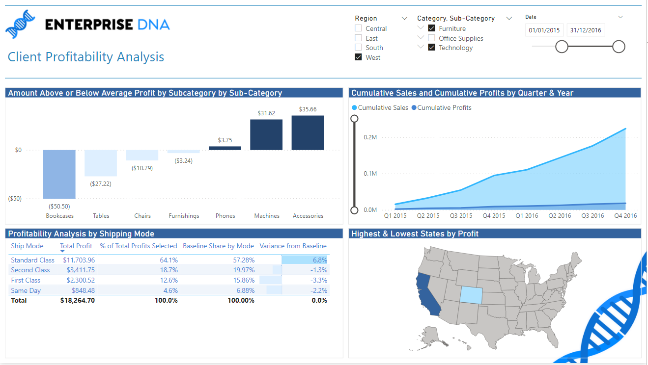
Hi @BrianJ
Here is my submission to the PBI Accelerator Week#3.
Very interesting work on context.
Thank you 
@JBocher ,
Spot on in every respect. Very nice approach on the min/max profitability map visual.
Well done, and thanks for participating!
Please see attached
@Eze ,
Excellent effort. Still some learning here to be done, but that’s what this initiative is all about. I think it will make the solution we go over tomorrow much more resonant and meaningful for you given the effort you’ve put in.
Thanks for partipating!
I’ll confess, it took a bit of trial & error, my DAX requires a lot of work.
Hahahah, good point!
@DavieJoe Thanks for showing how minx and maxx works on the state visual. You made it look easy!
I did have to play around with it a bit, I’d done something similar for the first accelerator entry.
@stevens Think I first picked it up from this video by Curbal[spoiler]
[/spoiler]
Hi,
Thanks so much for the week 3 problem.
It took me a while to figure out which metrics are needed to solve the Mockup and what gave me the most trouble is the formatting of the “Shape Map” visual.
This exercise has been very useful and very informative to me and I look forward to the solution that you will present later.
Please find below my proposal for the week 3 problem.
I can give myself 3 out of 4 here, as the shape map didn’t work out and I chose to review a solution from another member here. Thank you for these accelerator exercises. I’m finding that there is so much that I understand when reviewing video, DAX code, etc., but it is another thing to be able to write it creatively and understand proper syntax. The practice is useful.
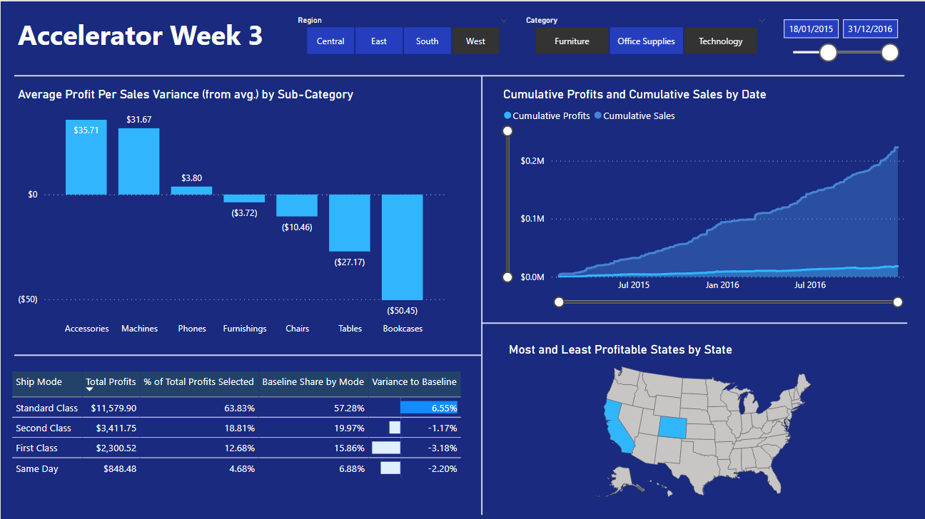
Here’s my submission
Enjoyed going over this during the webinar.
I jazzed up my visuals a little bit to make the insights stand out.
Sam
Can anyone help in linking me to the Accelerator week 3 solution video replay? I watched part of it and wanted to finish it off, but I cannot now find it.
Hi @The_Bishop ,
the replay was sent to me in email message. Check your personal email box also it might have gone to your junk box.
thanks
Keith
HI @BrianJ
when i click on the replay for the Week #3 in the email message. Its not in the Course material
Could you please check it out?
thanks
Keith