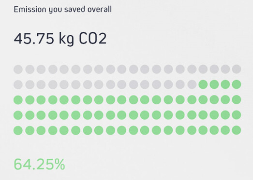
I’m looking to create a below kind of visual in my report. However, I cannot find the equivalent visual in power bi. Please let me know if you have any visuals that are similar to below visual.
In below image, each green color dot indicates 1 percent of CO2 emission saved.
Did you check custom visual waffle chat - Mudassir Ali has a whole chapter in his course Power BI Advanced Visualization Techniques - you can find it at:
As well, you could perhaps create your own composite visual using the Waffle Chart template posted in the Deneb Showcase forum section along with standard cards or textboxes.
Thank you very much, @Greg for your prompt response. I’ll test both options and use the best one in my report.
I just wanted to share a quick observation about the Denub visual with you. Initial visual load takes little delay at my end. Please notify me. if you’ve also noticed this type of behavior on your end.
I’m the member of Enterprise DNA Support Forum. A few days ago, I was able to access below given link, but when I tried to access it again now, it is asking that I need to upgrade my account. May i know the reason for it.
 for the quick help.
 for your prompt response. I’ll test both options and use the best one in my report.