A waffle chart is often used to illustrate a KPI as a percentage. There has been some chatter in recent days (July 2022) about using native Power BI visuals (scatter plots) with conditional formatting to produce a waffle chart.
I thought it might be easy to use a Deneb/Vega-Lite scatter plot as well, and it turns-out to be even easier that I thought using one of the templates built-in to the Deneb custom visual.
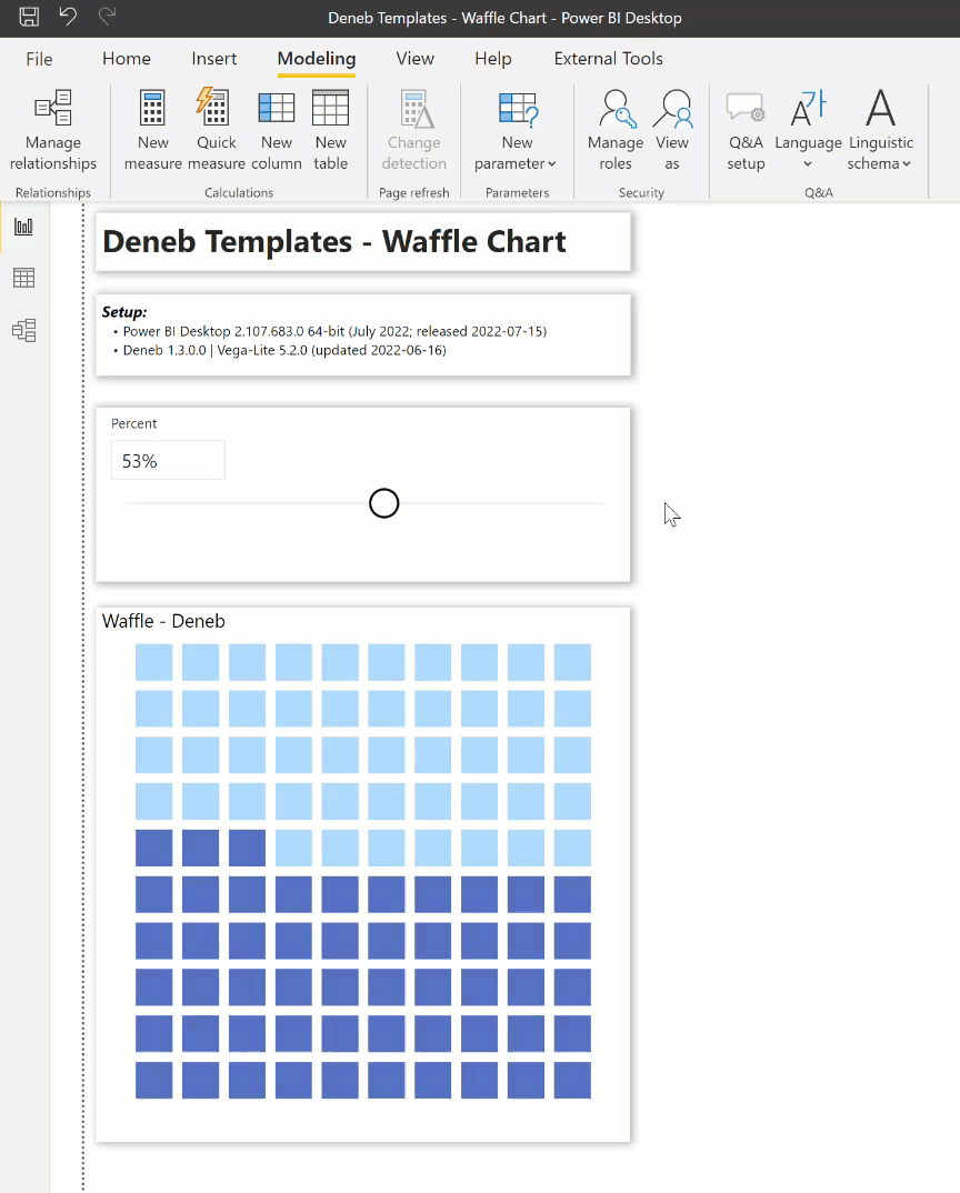
This solution was easily created, and I include a brief step-by-step process below:
-
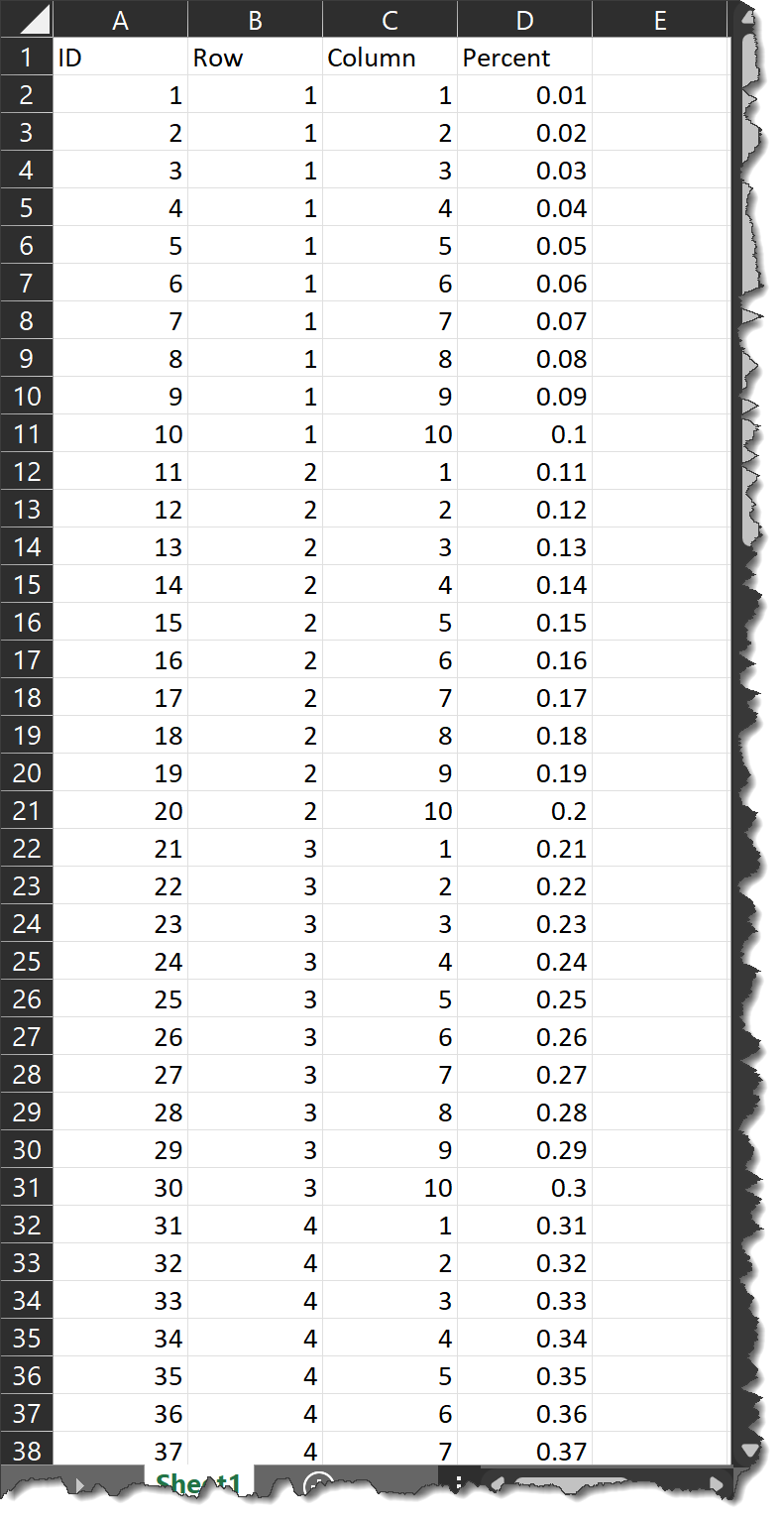
Import a 10x10 grid dataset (row 1-10, column 1-10, percent 0.01-1)
-
Create a [Percent] parameter
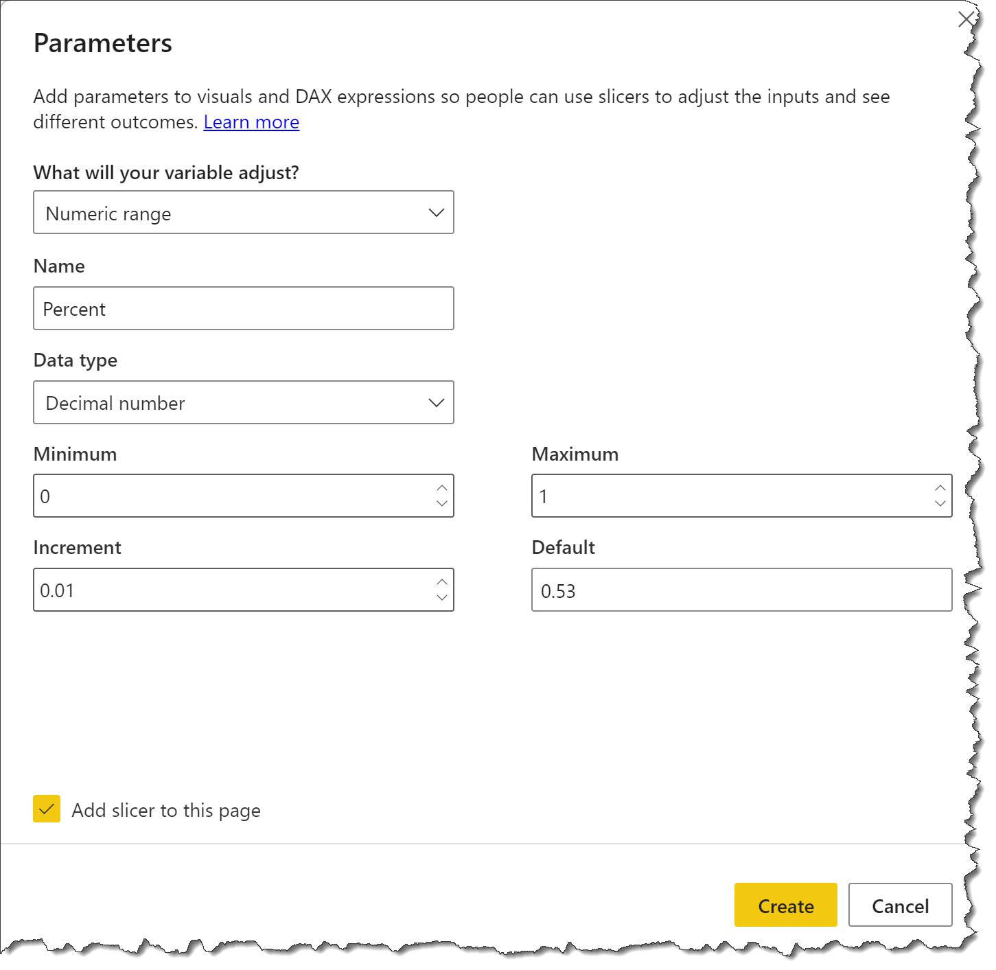
- ensure add slicer to page is selected
- format the [Percent] as a percentage
- Add a measure comparing the grid [Percent] to the slicer selection
Value =
IF(
    MAX( Grid[Percent] ) <= [Percent Value],
    1,
    0
)
- Create new Deneb visual
- Add [Row] and [Column] columns; add [Value] measure
- Edit the new Deneb visual and choose the “Colored Scatterplot” template with mappings:
- X-Axis = [Column]
- Y-Axis = [Row]
- Series = [Value]
- Turn off the X-axis (add to the “x” encoding)
"axis": null - Turn off the Y-axis (add to the “y” encoding)
"axis": null - Turn off the legend (add to the “color” block)
"legend": null - Change the mark type to “circle”
- Add a size property to the circle mark
"size": 1000 - Change the “color” block to use a condition and named colours
    "color": {
      "condition": [
        {
          "test": "datum['Value'] == 1",
          "value": "red"
        }
      ],
      "value": "lightgrey",
      "legend": null
    }
- Leverage one of the new features in Deneb v1.3 and change the “color” block to use a condition and Power BI theme colours
    "color": {
      "condition": [
        {
          "test": "datum['Value'] == 1",
          "value": {
            "expr": "pbiColor(7)"
          }
        }
      ],
      "value": {"expr": "pbiColor(0)"},
      "legend": null
    }
- Change the mark type to “square”
The full Vega-Lite code for such a visual is:
{
  "data": {"name": "dataset"},
  "mark": {
    "type": "square",
    "size": 1000
  },
  "encoding": {
    "x": {
      "field": "Column",
      "type": "quantitative",
      "axis": null
    },
    "y": {
      "field": "Row",
      "type": "quantitative",
      "axis": null
    },
    "color": {
      "condition": [
        {
          "test": "datum['Value'] == 1",
          "value": {
            "expr": "pbiColor(7)"
          }
        }
      ],
      "value": {"expr": "pbiColor(0)"},
      "legend": null
    }
  }
}
Also included is the 10x10 grid XLSX file and a demo PBIX file.
Greg
10x10_grid.xlsx (10.5 KB)
Deneb Templates - Waffle Chart.pbix (1.4 MB)