I have what should be an easy one, but just cannot get the solution I am looking for. I have a file where I have many employees, each employee works on certain days and each work date equals a certain pay period end date (in my case a Sunday) I want to identify for each employee when a new pay period end date occurs and then flags the last work date in which this occurs. From there I can perform some further calculations on each occurrence. Attached is an excel file representing what I am trying to do.
Thx for the help
Book1.xlsx (10.4 KB)
Can we please add a pbix demo file of the scenario?
Including outlines of the data, tables and model, how you want to visualize the information etc.
The context for your visuals is essential here, because that will determine the DAX measure.
I wouldn’t recommend doing anything in calculated columns here. Just unnecessary.
All of this information is essential to assist effectively on this.
If you provide all this information that would be very helpful.
Thanks
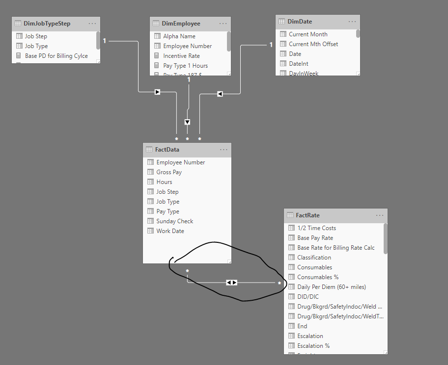
Here is the pbix file that Nick and I have been working on. What I am attempting to do is apply a weekly incentive, to do so I need to determine if the person had hours paid in the week, if they do then they are eligible for the incentive. If no hours then no incentive.
Thanks.
Copy of Data.xlsx (320.7 KB)
Find Rate between two dates.pbix (492.2 KB)
Just reviewing the model.
Few observations
This below is not a recommended best practice.
Somehow you want to make this a separate fact table or integrate it into one fact table. There should never be relationships from fact table to fact table.
Unless I’m not getting it and this actually is a lookup table. The multi directional relationship has me slightly confused on this one.
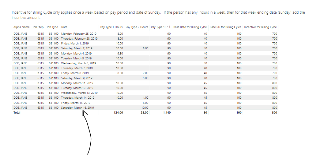
One thing also that doesn’t seem clear to me is that you are attempting to work out something by week here but the table you have is really set out per day.
So how ultimately do you want to visualize this?
To work out if a day isn’t a Sunday is pretty straight forward as a measure. But how is this going to be used for some visual or the next calculation? That’s still not very clear in my view.
Based on the below here where is the calculation falling over? And is there something else that’s missing here, or is this the end visual you want?
The FactRate table above isn’t quite a Fact Table, but didnt quite see it as a Dimension table either, though I think it’s more dim than fact, which is why I used the bi-directional relationship.
Nick