I really enjoyed recently working through the latest’s Power BI Challenge from Enterprise DNA. This was not an easy scenario that we were dealing with. We had some HR consultation data and the required analysis was quite unique.
You can view the demo showcase here
But these are the challenges that I love and it showcases the immense variability and flexibility that you have with the Power BI toolset, most importantly Power BI Desktop.
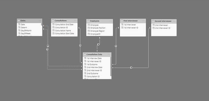
There was a bit of work to do at the power query level where I organized my data model in a way that I could simplify the fact table of the consultation data.
The consultation data started off as our main Excel file, basically our database, and if I wanted to optimize it for Power BI I needed to break it out into more of a shape suited for a data model. This was the waterfall technique that I use frequently with my lookup tables at the top and my fact tables down the bottom.
By doing that I was able to break out a range of different lookup tables like consultations, interviewers, employees and dates.
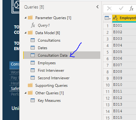
It’s always important to deeply consider the ultimate model that you create because my ultimate visualizations would have been impacted significantly if I did not follow this methodology in creating my data model for Power BI.
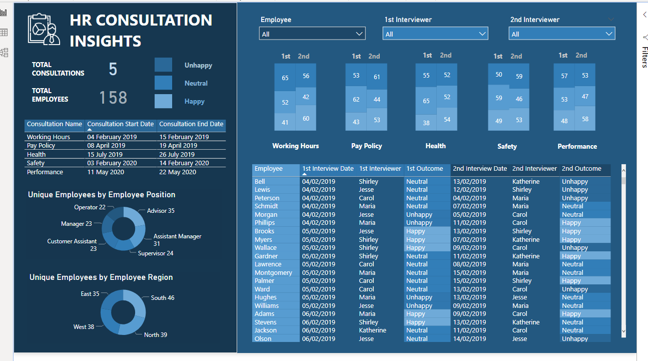
Interesting with this challenge as well is that I didn’t have to create a huge amount of DAX measures. A big part of the challenge was basically working out how to showcase these insights in an effective way. So I spent a lot of my time thinking and planning out how this visualization could work and flow for a consumer.
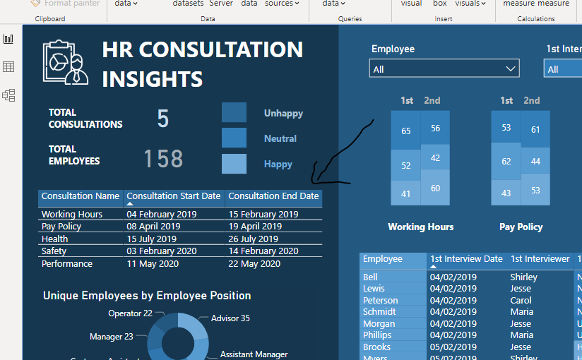
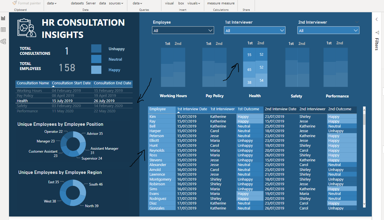
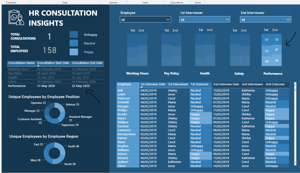
A manager would want to look at this data and be able to see a specific consultation and then see the more specific outcomes of each consultation. So on the left-hand side I created a simple table listing out each different consultation with its start and end date. Then on the right-hand side I summarized each consultation and the interviews encapsulated within each consultation.
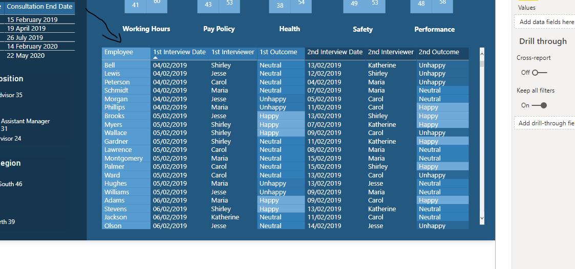
Then we have a more detailed table with all of the granular information for each employee. This would be important for a number of reasons for a manager because they would be able to evaluate how individual employees reacted to each consultation but then also look at the trends for each interviewer.
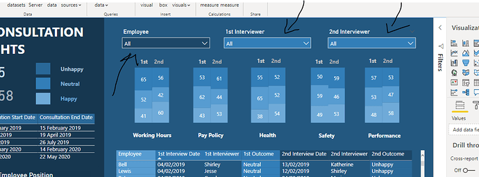
Also importantly at the top I created some dropdown slicers which enabled even further filtering of the information on the report page. A big part of understanding how the consultation went was reviewing how each interviewer performed versus how well the employee thought the outcome was of each consultation. I think that this is represented quite well when you are able to filter by one particular employee or for a variety of different interviewers.
I really enjoyed working on this report. As mentioned it wasn’t actually that difficult from a calculation perspective it was more thinking creatively about how to showcase data in an efficient and effective way for key decision-makers. And sometimes that’s all it really is about. I think sometimes we can look to overcomplicate things when they don’t need to be, and that was a good lesson that I got out of working through this report development.
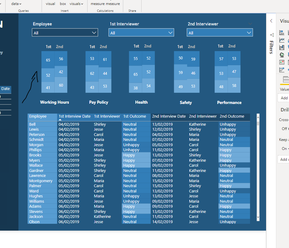
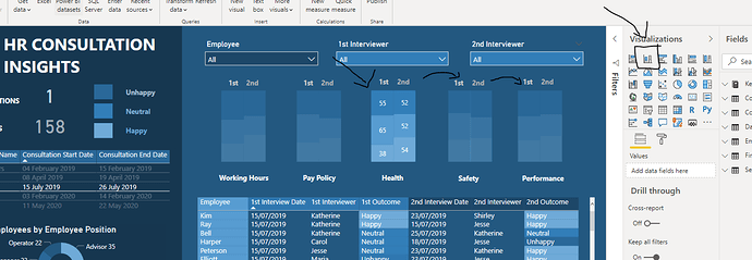
One thing I will also add here is that to create the stacked column visualization… what I did there was I created 2 stacked column charts, removed all of the axis information, title information and legend information. Then brought them both together so that they stood side by side and looked like they were one visual. I then copied and pasted it five times to showcase the differences between interview one and interview two for each different consultation.
It took me a while to work out this visualization technique and I had to actually draw it out, to begin with but once I decided that this was a good way to represent the data I followed through and created this unique visualization for the right hand side of my dashboard.
Hope you liked reviewing how I created this and well done to all the other submissions in the challenge. There really has been some incredible work in Power BI in this challenge and all the other challenges of late.
So great to see this after putting in many years now of educating thousands of Power BI users around the world. It’s amazing to see everyone’s development.
Well done.
Sam

