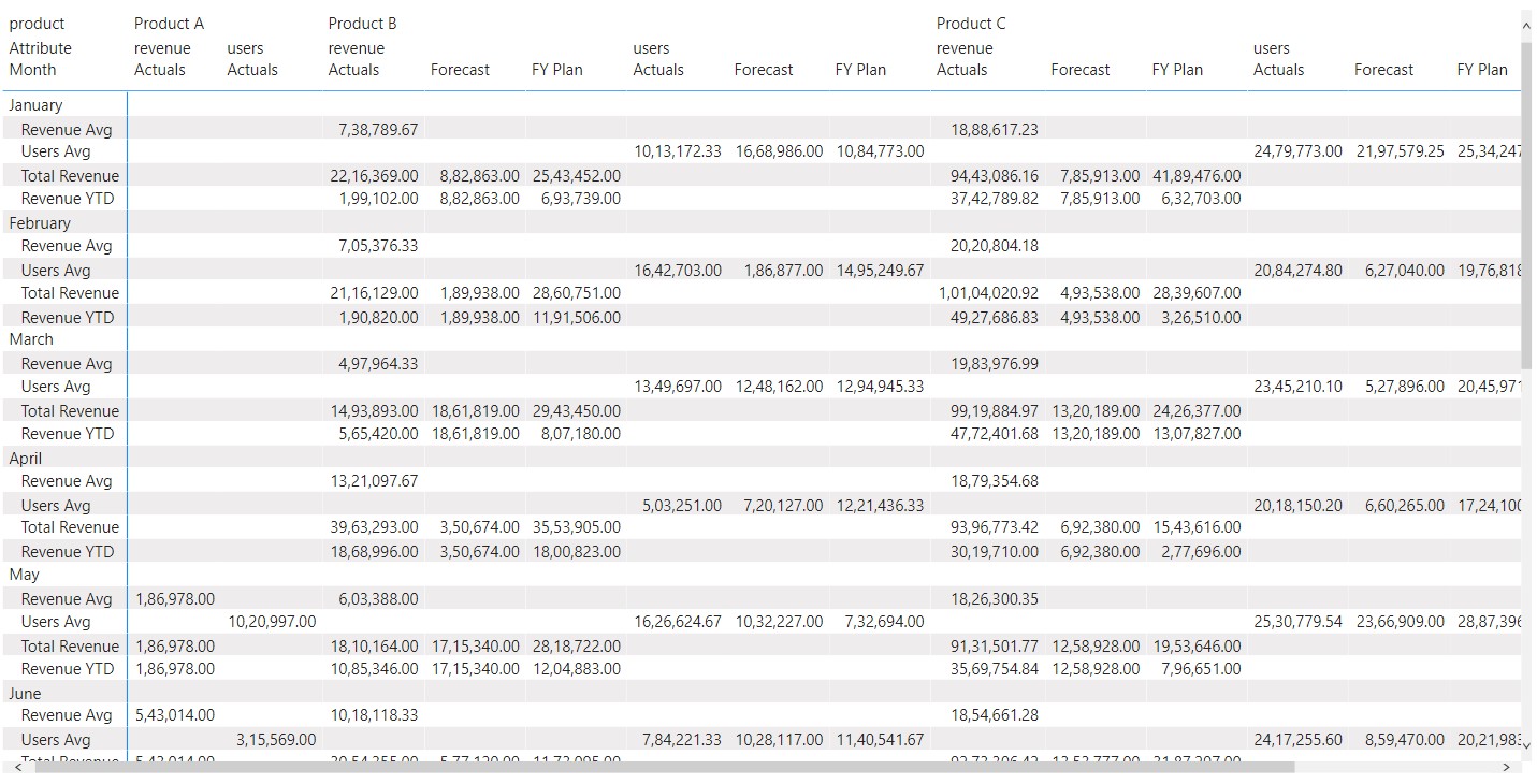
Is it possible to group/categorize measured columns in a matrix table? As you can see from the attached PBI, I have two groups–Revenue and Users. Within those groups, I have different measures like user avg, total revenue, revenue YTD, etc…
I’m running into a problem where a measure like Revenue Avg. is appearing under the Users group in the table. Is it possible to have the measure only show under their respective groups as opposed to blanks? And if not, is there a workaround?
The way the data is un-pivoted there’s no other option/alternative to group your measures because still it will continue to show the “Blank”.
What you can do is while un-pivoting the data you need to create your attributes columns in such a manner where one column is attributed specifically for the “Revenues” and other one is for the “Users”. By this way then, when you drag the measures under the respective scenarios, the “Blank” values will get disappeared.
I’m providing a link of the course based on “Advanced Data Transformations and Modelling”. Please go through it so that you can have better understanding how you can model your data to avoid this kind of situations.
Hi @Max , did the response provided by @Harsh help you solve your query? If not, how far did you get and what kind of help you need further? If yes, kindly mark the thread as solved. Thanks!
Thanks, @Harsh! So are you saying that I should create a Revenue column and User column with the values in their respective columns? Would it be possible if you could update the sample file?
Yes, you need to have two different columns because right now you’ve clubbed everything under the one roof and therefore, it’s showing you as Blanks.
Once you’ve bifurcated these into two columns then under the Scenarios where you’ve 2 categories - Revenues and Users the blanks will get removed because then you’ll have specific categories for specific measures. And ultimately by this way measures will be grouped under the one roof of each specific category.
The link which I’ve provided contains the Resource Files you can simply download it from there.
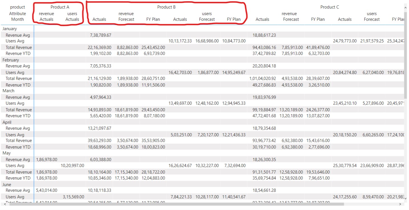
Hi @Harsh – I’m still running into the same issue. It’s less about the blanks but the fact that the measures are still appearing under their unrelated groups. For example, Revenue Avg. is still appearing under the Users group and vice-versa. What I ultimately want are the measures to only appear under their related group in the matrix table.
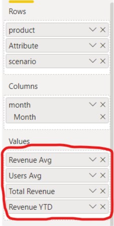
Right now the measures are being dragged independently under the “Values” section which is being applied to both the scenarios i.e. Revenues as well as Users.
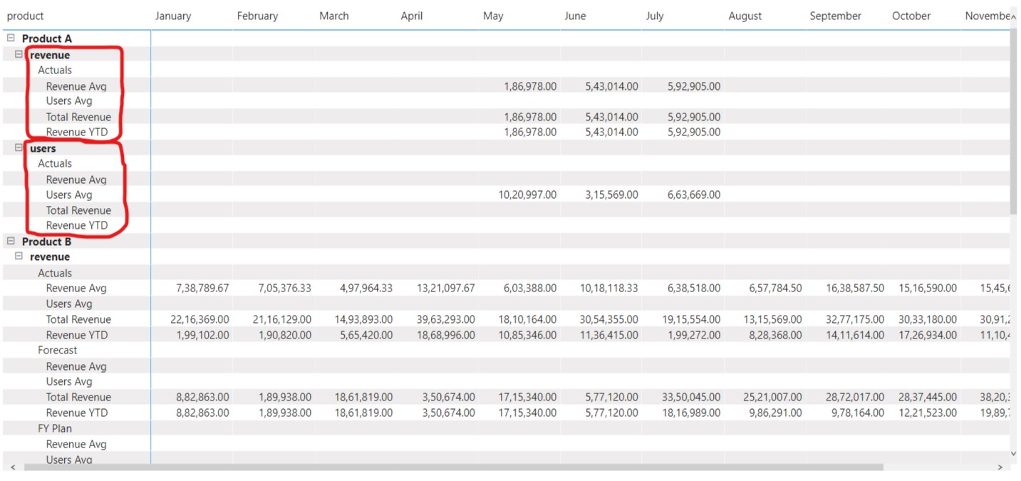
Lastly after several hours of head scratching I was able to group your measures under the same category. And this is the only way around that this type of result could be achieved due to the asymmetrical nature of the data. Because we’ve 3 measures for the “Revenues” but only single measure for the “Users”. Now, since we’d “Product”, “Attribute” and “Scenario” into the rows section and the “Month” in the columns section we’re not able to club these measures and therefore we’d ample amount of blanks rows specifically under the “Users” section.
Now, I just tweaked the Matrix by switching their dimensions i.e. “Product”, “Attribute” and “Scenario” are now being dragged under the columns section instead and “Month” has been dragged under the rows section. And this firstly helps to get avoid the unnecessary blank rows which we’d had specifically under the “Users” section side. The result absolutely remains the same and accurate only the presentation of the Matrix has been changed.
Below is the screenshot provided for the reference about how the result actually looks like -
Now, why I’ve to change the format of the Matrix is just because we’ve only one section available for the “Values” and this is applicable for both the scenarios i.e. for “Revenues” and “Users”. Now, since we don’t have two different sections of “Values” for two different scenarios we need to change the layout of the Matrix in order to achieve the desired result. And this is what I’ve mentioned if you refer the screenshot no. 2 in my previous post.
I’m also attaching the PBIX File of the working for the reference.
Hoping you find this useful and helps you in your analysis.

 I was able to group your measures under the same category. And this is the only way around that this type of result could be achieved due to the asymmetrical nature of the data. Because we’ve 3 measures for the “Revenues” but only single measure for the “Users”. Now, since we’d “Product”, “Attribute” and “Scenario” into the rows section and the “Month” in the columns section we’re not able to club these measures and therefore we’d ample amount of blanks rows specifically under the “Users” section.