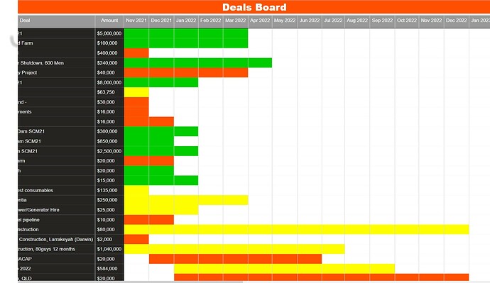
Hello All - I need to put together a visual as a Gantt chart that shows upcoming projects over the course of the year. Basically start date to end date by month. Then show the total revenue expected each month (bar graph). I’ve attached an example of what the sales team is looking for.
Projects Deals Board Draft.pptx (47.3 KB)
Are you able to use custom visuals in your report? If so, you may want to explore the market - there are a handful of both free and ‘additional pricing’ models available.
https://appsource.microsoft.com/en-us/marketplace/apps?product=power-bi-visuals&search=gantt&page=1
I suggest clicking on the visual image to explore the options that are offered, and to try a sample before downloading into your report.
@mkaess ,
That’s not going to be an easy visual to put together. There’s nothing I’m aware of that handles that out of the box. I think your best bet is going to be to create the bar chart and then create a custom Gantt chart with a fully transparent background and overlay the latter over the former.
In terms of the technique for creating the Gantt chart, @MehdiH just submitted an outstanding entry in Data Challenge 16 where he created almost exactly the type of Gantt/bar chart hybrid I think you will need for the upper overlay. Here’s a link to his report:
I hope this is helpful.
- Brian
hi @mkaess .
I’m not sure if this is exactly what you want but this video was just created on Youtube
I haven’t watch the full video but you never know if might help.
Thanks
Keith
Thanks @BrianJ for highlighting the technique I used to make a visual that looks like a Gantt chart.
Mehdi
Hi @Keith ,
This exactly the technique I used.
Mehdi
For the record, @MehdiH posted his entry first, so it would actually be accurate to say “this is exactly the technique that Bas used”. ![]()
- Brian
@BrianJ
To be more accurate, working on the report I was thinking to apply an Excel trick I learned years ago then Bas posted his video on YouTube so he saved me a lot of time and technically he used it before me 
I am able to use custom visuals and are using one of those from App Store. Had to split the bar graph from the Gantt visual though.
This looks promising. I’ve started with a visual from app source but it’s limited in how I can customise the chart. I’ll give this technique a try and report back.
@mkaess ,
Would love to see what you ultimately come up with on this one, since I’ve never seen anyone try to produce a visual exactly like the one exactly like the one you’re attempting here.
Thanks!
– Brian
Will definately post the results once I finish. The customer is asking for some ‘enhancements’ to the Gantt chart that the OOoB visuals won’t do so this should be interesting.
So far the outcome has been excellent. Thanks @Keith for putting me onto the video. This technique is AWESOME. Thanks to There are a few minor issues that I’m still trying to sort out. Such as the Amount column. It’s coming directly from the fact table but I’d rather have it as a measure. Not sure if that’s possible.
@mkaess
I was just viewing videos on youtube when i saw this and remember your posting about Gantt charts.
I just thought i would let you know it was there for your viewing. I wasn’t sure if it would help or not.
thanks
Keith

