Deneb Workout 10 - Line Chart with Hover Highlight

Difficulty Rating: 3 out of 5

Deneb Workout 10 - Line Chart with Hover Highlight

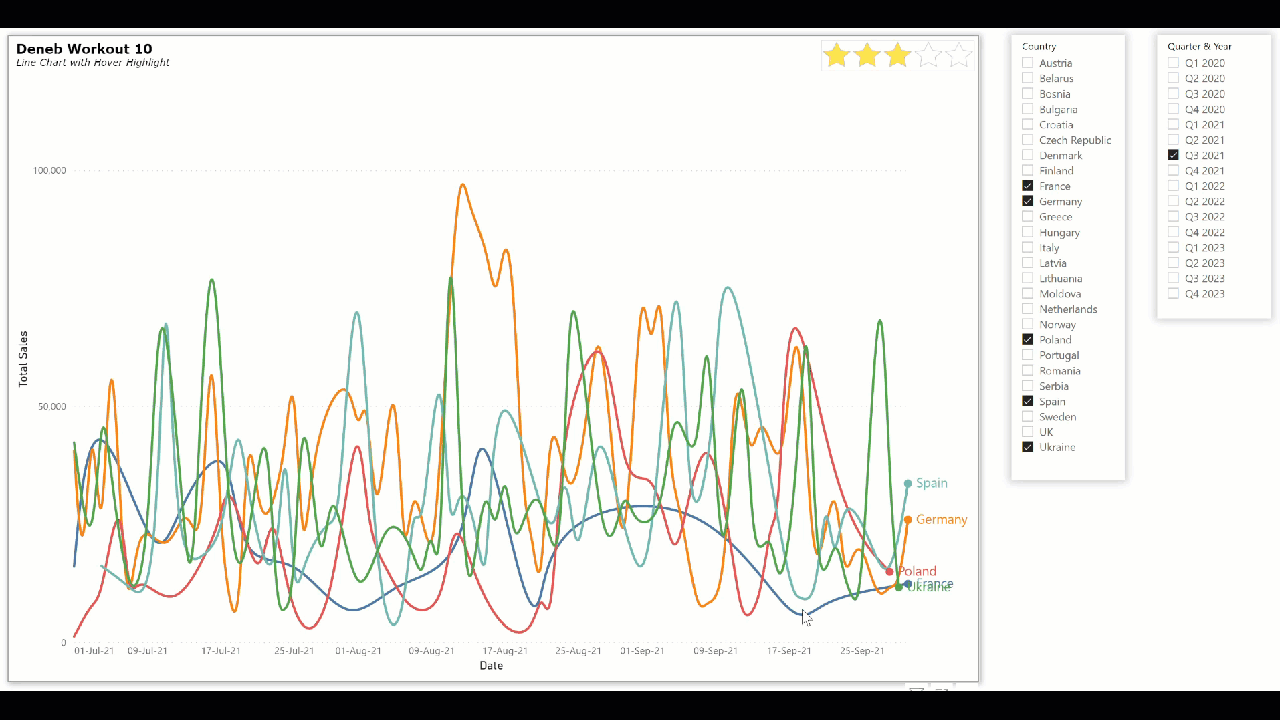
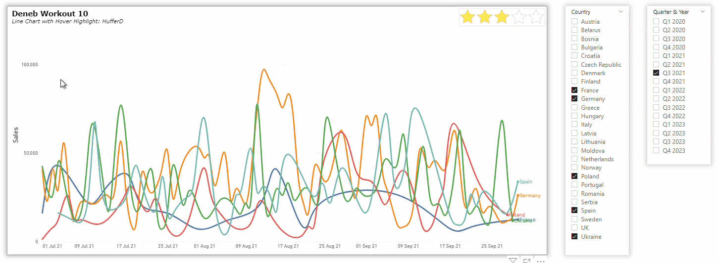
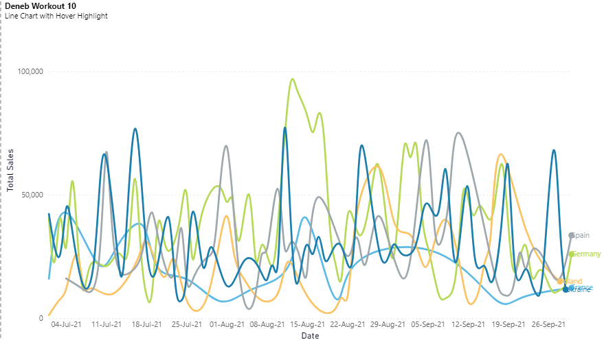
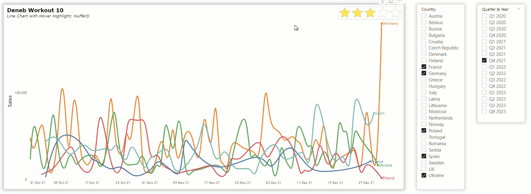
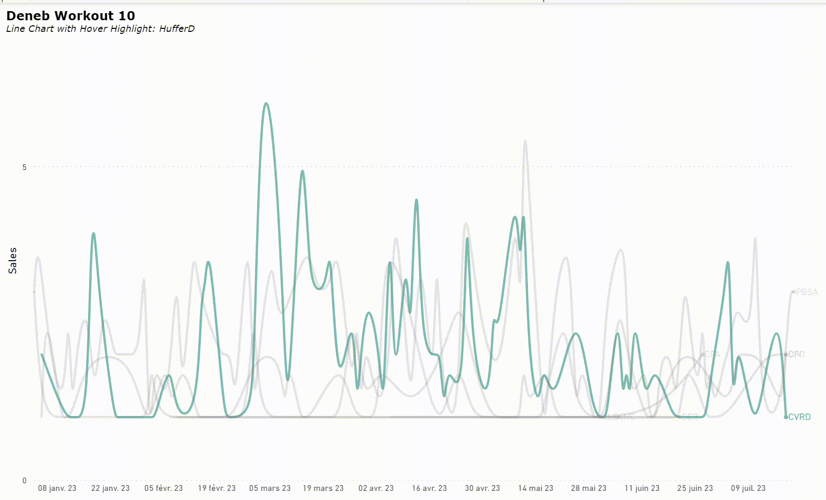
Interactivity can be added Deneb/Vega-Lite visuals detecting the position of the mouse. A “hover” event can be used to increase the insights from complex datasets, for example by displaying only the hovered line in full colour while making all other lines a background colour; all lines remain visible, but the selected line is highlighted.

Goals

Using the simple supplied PBIX file (which uses the Enterprise DNA Practice Dataset), produce a Deneb visual in Power BI that:

  • • includes a line chart for sales by date by country
  • • includes a marker and the country name at the right end of each line
  • • displays the hovered line in full colour and “greys-out” all the other lines
  • • displays the line colours according to the current Power BI theme
  • • displays the day, month, and year in the X-axis
  • • includes a title and subtitle

Submission

Using the data in the supplied Power BI file, create your solution, and reply to this post. Upload a screenshot of your solution along with the Deneb/Vega-Lite JSON code used. Please format your JSON code and blur it or place it in a hidden section.

Period

This workout will be released on Monday June 19, 2023, and the author’s solution will be posted the week of July 3, 2023.

Greg
Deneb Workout 10 - Data - Enterprise DNA Practice Dataset.pbix (1.7 MB)

2 Likes

@Greg,

I used the following specification and config:

Specification
{
  "title": {
    "anchor": "start",
    "align": "left",
    "offset": 10,
    "text": "Deneb Workout 10",
    "font": "Verdana",
    "fontSize": 16,
    "fontWeight": "bold",
    "fontStyle": "normal",
    "subtitle": "Line Chart with Hover Highlight: HufferD",
    "subtitleFont": "Verdana",
    "subtitleFontSize": 12,
    "subtitleFontWeight": "normal",
    "subtitleFontStyle": "italic"
  },
  "data": {"name": "dataset"},
  "mark": {"type": "line"},
  "encoding": {
    "x": {
      "field": "Date",
      "type": "temporal",
      "axis": {"format": "%d %b %y"},
      "title": null
    },
    "y": {
      "field": "Total Sales",
      "type": "quantitative",
      "axis": {"tickCount": 2},
      "title": "Sales"
    },
    "color": {
      "scale": {
        "scheme": "pbiColorNominal"
      },
      "condition": {
        "param": "hover",
        "field": "Country",
        "type": "nominal",
        "legend": null
      },
      "value": "grey"
    },
    "opacity": {
      "condition": {
        "param": "hover",
        "value": 1
      },
      "value": 0.2
    }
  },
  "layer": [
    {
      "params": [
        {
          "name": "hover",
          "select": {
            "type": "point",
            "fields": ["Country"],
            "on": "mouseover"
          }
        }
      ],
      "mark": {
        "type": "line",
        "interpolate": "basis",
        "stroke": "transparent"
      }
    },
    {
      "mark": "line",
      "interpolate": "basis"
    },
    {
      "encoding": {
        "x": {
          "aggregate": "max",
          "field": "Date"
        },
        "y": {
          "aggregate": {
            "argmax": "Date"
          },
          "field": "Total Sales"
        }
      },
      "layer": [
        {"mark": {"type": "circle"}},
        {
          "mark": {
            "type": "text",
            "align": "left",
            "dx": 3
          },
          "encoding": {
            "text": {
              "field": "Country",
              "type": "nominal"
            }
          }
        }
      ]
    }
  ]
}
Config
{
  "view": {"stroke": "transparent"},
  "font": "wf_standard-font",
  "line": {
    "strokeWidth": 3,
    "strokeCap": "round",
    "strokeJoin": "round",
    "interpolate": "basis"
  },
  "rect": {},
  "shape": {},
  "text": {
    "font": "wf_standard-font",
    "fontSize": 13,
    "fill": "#666666"
  },
  "axis": {
    "ticks": false,
    "grid": false,
    "domain": false,
    "labelColor": "#666666",
    "labelFontSize": 12,
    "titleFont": "wf_standard-font, helvetica, arial, sans-serif",
    "titleColor": "#070f25",
    "titleFontSize": 16,
    "titleFontWeight": "normal"
  },
  "axisQuantitative": {
    "tickCount": 3,
    "grid": true,
    "gridColor": "#C8C8C8",
    "gridDash": [1, 5],
    "labelFlush": false
  },
  "axisX": {"labelPadding": 5},
  "axisY": {"labelPadding": 10},
  "header": {
    "titleFont": "wf_standard-font, helvetica, arial, sans-serif",
    "titleFontSize": 16,
    "titleColor": "#070f25",
    "labelFont": "Segoe UI",
    "labelFontSize": 13.333333333333332,
    "labelColor": "#666666"
  }
}

Here’s a gif of the finished visual:

gif

1 Like

Hello Greg,
here it is! This is one of my favourite charts when I have many categories, so the users don’t get lost in the lines - I use it a lot in my reports and I did pick it up from your examples from the Deneb showcase at the time :slight_smile:
Thanks!

Summary

{
“data”: {“name”: “dataset”},
“title”: {
“text”: “Deneb Workout 10”,
“anchor”: “start”,
“subtitle”: “Line Chart with Hover Highlight”
},
“transform”: [
{
“joinaggregate”: [
{
“op”: “max”,
“field”: “Date”,
“as”: “maxDate”
}
],
“groupby”: [“Country”]
}
],
“encoding”: {
“x”: {
“field”: “Date”,
“type”: “temporal”,
“title”: “Date”,
“axis”: {
“format”: “dd-MMM-yy”,
“formatType”: “pbiFormat”
}
},
“y”: {
“field”: “Total Sales”,
“type”: “quantitative”,
“title”: “Total Sales”
},
“color”: {
“condition”: {
“param”: “hover”,
“field”: “Country”,
“type”: “nominal”,
“legend”: null,
“scale”: {
“scheme”: “pbiColorNominal”
}
},
“value”: “grey”
},
“opacity”: {
“condition”: {
“param”: “hover”,
“value”: 1
},
“value”: 0.2
}
},
“layer”: [
{
“params”: [
{
“name”: “hover”,
“value”: [
{“Country”: “France”}
],
“select”: {
“type”: “point”,
“fields”: [“Country”],
“on”: “mouseover”
}
}
],
“mark”: {
“type”: “line”,
“interpolate”: “basis”,
“tooltip”: true,
“strokeWidth”: 3
},
“encoding”: {
“tooltip”: [
{
“field”: “Date”,
“type”: “temporal”,
“format”: “dd-MMM-yy”,
“formatType”: “pbiFormat”
},
{
“field”: “Total Sales”,
“type”: “quantitative”,
“title”: “Sales”,
“formatType”: “pbiFormat”,
“format”: “$#,0”
}
]
}
},
{
“mark”: {
“type”: “point”,
“size”: 100
},
“encoding”: {
“opacity”: {
“condition”: [
{
“test”: “datum[‘Date’] == datum[‘maxDate’]”,
“value”: 1
}
],
“value”: 0
}
}
},
{
“mark”: {
“type”: “text”,
“align”: “left”
},
“encoding”: {
“text”: {
“field”: “Country”,
“type”: “nominal”
},
“opacity”: {
“condition”: [
{
“test”: “datum[‘Date’] == datum[‘maxDate’]”,
“value”: 1
}
],
“value”: 0
}
}
}
]
}

Here’s my solution to this workout, where I used several Deneb/Vega-Lite features, including:

  • • title block complete with subtitle
  • • used a shared encoding block to ensure the X and Y positioning, colour, and opacity of all marks
  • • used a layer block to display the line chart, the end circle, and the end text
  • • used a transparent “halo” line layer of larger strokewidth to make mouse selection easier
  • • used the interploate (basis) property of the visible line mark to smooth the line chart
  • • used a shared encoding block for the end circle and text marks (using the maximum aggregated date and sales values for each country)

Here’s the specification code:

{
  "title": {
    "anchor": "start",
    "align": "left",
    "offset": 10,
    "text": "Deneb Workout 10",
    "font": "Verdana",
    "fontSize": 16,
    "fontWeight": "bold",
    "fontStyle": "normal",
    "subtitle": "Line Chart with Hover Highlight",
    "subtitleFont": "Verdana",
    "subtitleFontSize": 12,
    "subtitleFontWeight": "normal",
    "subtitleFontStyle": "italic"
  },
  "data": {"name": "dataset"},
  "encoding": {
    "x": {
      "field": "Date",
      "type": "temporal",
      "title": "Date"
    },
    "y": {
      "field": "Total Sales",
      "type": "quantitative",
      "title": "Total Sales"
    },
    "color": {
      "condition": {
        "param": "_hover",
        "field": "Country",
        "type": "nominal",
        "legend": null
      },
      "value": "grey"
    },
    "opacity": {
      "condition": {
        "param": "_hover",
        "value": 1
      },
      "value": 0.2
    }
  },
  "layer": [
    {
      "name": "TRANSPARENT_LAYER_TO_MAKE_SELECTION_EASIER",
      "params": [
        {
          "name": "_hover",
          "value": [
            {"Country": "Ukraine"}
          ],
          "select": {
            "type": "point",
            "fields": ["Country"],
            "on": "mouseover"
          }
        }
      ],
      "mark": {
        "type": "line",
        "strokeWidth": 8,
        "stroke": "transparent"
      }
    },
    {
      "name": "TOTAL_SALES_LINE",
      "mark": {
        "type": "line",
        "interpolate": "basis"
      }
    },
    {
      "name": "LINE_END_CIRCLE_AND_LABEL",
      "encoding": {
        "x": {
          "aggregate": "max",
          "field": "Date",
          "axis": {
            "format": "dd-MMM-yy",
            "formatType": "pbiFormat"
          }
        },
        "y": {
          "aggregate": {
            "argmax": "Date"
          },
          "field": "Total Sales"
        }
      },
      "layer": [
        {
          "name": "COUNTRY_ENDPOINT_CIRCLE",
          "mark": {
            "type": "circle",
            "size": 100
          }
        },
        {
          "name": "COUNTRY_LABEL",
          "mark": {
            "type": "text",
            "align": "left",
            "dx": 10,
            "font": "Segoe UI",
            "fontSize": 16
          },
          "encoding": {
            "text": {
              "field": "Country",
              "type": "nominal"
            }
          }
        }
      ]
    }
  ]
}

Congratulations to all who participated, and good luck.
Greg
Deneb Workout 10 - Line Chart with Hover Highlight.pbix (1.7 MB)

NOTE: Enterprise DNA has decided to temporarily pause the workout program. Thanks to all who participated so far, and I hope you found the Deneb workouts to-date informative and/or useful. I’ll look forward to the next iteration of the workouts.

Hi, thanks very much for this workout. It is my favorite ! :grinning:
I would like to know il lines’s colors are linked to those of PowerBi ? I couldn’t see any code about it in your solution ? And if not, what would it be ?
Besides, as soon as I hoover on the chart, all the lines show up colored but when i leave it with the mouth, the pre format does not show up (all lines still remain colored, ie not in grey). I thus need to switch of page and come back to make it appear again ? any clue ? Doesn’t seem to be the initial purpose ?
Thanks in advance

@stevann.sevellec, post your solution and let us take a look.

Hi @stevann.sevellec.

In my example colours use the Vega-Lite defaults, but @HufferD’s submission above uses the Power Bi theme colours (see his color-scale-scheme-pbiColorNormal encoding). For more info on using Power BI colours, refer to the Deneb documentation https://deneb-viz.github.io/schemes#power-bi-schemes

Hope it helps.
Greg

Hi @Greg, thanks for your answer ! I found @HufferD 's code and that was pretty much what I did but at the wrong place :sweat_smile:
Thanks, as well, for the documentation link.
Are there any other workaround coming up soon ?

I don’t understand the question: workaround for what?

Hi @Greg , just other cases :grinning:
Nothing related to that post !
Thanks

Hi @HufferD , thanks for your answer. I tried @Greg solution, and I found what intrigates me :
“value”: [{“Country”: “Ukraine”}]. This makes appear the Ukraine Line at the very first time. As soon as we hoover the chart, the other lines appear. But when I hoover back, the Ukraine like doesn’t show up anymore. I need to switch of page and come back to make it appear again, which I find odd… Any idea?

Furthermore, as it seems you’re great at Deneb, i was wondering
1/How to add a powerbi Color in params. I’ve tried the code below but it won’t work ?
{
“name”: “_positive_colour”,
“value”: “pbiColor(‘positive’)”
}
2/ How to align the title “CY versus Target” to “CY vs PY” in your Deneb proposal ? I tried offset & dx…
Thanks in advance :slightly_smiling_face:

Hi @stevann.sevellec,

Forgive me, but I am having a difficult time understanding your question.

You said,

It would be much simpler if you shared a gif demonstrating what you are experiencing and add your implementation so the community can try and assist.

This is not what you are seeing?

ukraine

And instead you notice the opposite? that is, if you hover over a given line it disappears while the other lines appear?

where have you tried that?

You should be able to use something like

{
  ...
  "mark": {
    ...
    "color": {
      "expr": "pbiColor('positive')"
    }
  }
}

Can you take a screenshot? I’m sorry, but don’t see “CY versus Target” or “CY vs PY”. Are you talking about a different visual?

Hi @HufferD and thanks for your answer. Sorry not to make it easy. I hope I make myself clearer with the details below… Thanks in advance

*** Screencast**
I simply changed Datas but the code [{“Country”: “Ukraine”}] (CVRD in my case) still intrigates me and produces the below behaviour
ScreenCast Deneb

*** PowerBi colors**

Your proposal

{

“mark”: {

“color”: {
“expr”: “pbiColor(‘positive’)”
}
}
}

Using “params” to identify colors in a unique place is very usefull, so that we do not need to search in the entire code where to apply further modifications.
So i would like to refer to pbicolor in that section instead of RGB code or with the “expr” code.

Params section

This text will be hidden
“params”: [
{
“name”: “_positive_colour”,
“value”: “pbiColor(‘posivite’)”
},
{
“name”: “_negative_colour”,
“value”: “#FF0000
},
{
“name”: “_end_symbol_colour”,
“value”: “grey”
},
{
“name”: “_py_colour”,
“value”: “white”
},
{
“name”: “_cy_colour”,
“value”: “darkgrey”
},
{
“name”: “_Txt_colour”,
“value”: “red”
}

*** Title Alignement on Y axis**
I want to align the titles “CY vs Target” & “CY vs PY” in your Deneb proposal in Data Modeling Workout 006

Your gif seems to be showing expected behavior as far as I can tell. When you hover over a specific line, the other lines are faded to grey making the selected line stand out.

Also. take a look at the vega-lite documentation, @stevann.sevellec, particularly the Axis | Vega-Lite page. You’re interested in adjusting titlePadding.

Have a go playing around with those controls using this Vega-Lite Example in the Editor. On line 38, you could add something like:

.
.
.
    "y": {
        "field": "price"
        , "type": "quantitative"
        , "axis": {
          "titlePadding": 40  
        }
    }
.
.
.

and see how it affects the padding, in pixels, between title and axis.

Thanks very much for your time !

  • Wonderfull with titlePadding !

  • DENEB Chart
    What would be the interest to highlight a line at first glance if it doesn’t come back to it when you hoover off {“Country”: “Ukraine”} ?

  • pbiColor
    May I have your answer ?

Thanks in advance ! :grinning:

I think that is a good idea. It makes the code easier to read and maintain. If you want to use a different color in all those places all you have to so is change one place. Just set the parameter’s value to be the result of the function pbiColor('positive') and then, once it’s defined, you can use throughout the specification.

You’ll want to define the parameter in the params section of your specification,

  "params": [
    {
      "name": "unhighlightcolor",
      "value": {"expr": "pbiColor(0)"}
    }
  ],

and then later could use the datum object to reference the parameter like

"color": {
      "scale": {
        "scheme": "pbiColorNominal"
      },
      "condition": {
        "param": "hover",
        "field": "Country",
        "type": "nominal",
        "legend": null
      },
      "value": {"expr": "datum.unhighlightcolor"}
    }

As to,

Well, in this case, it’s simply a device to assist the user when they would otherwise be faced with too many lines in a chart. They can interactively highlight a line with just a hover so that it the line isn’t engulfed in a sea of spaghetti.

Thanks !
Have you tried the code ? because it doesn’t work for me (The chartline dissapears…).
“params”: [
{
“name”: “unhighlightcolor”,
“value”: {“expr”: “pbiColor(0)”}
}
],

it worked for me. change the parameter value to something like pbicolor 3. or grey.

You can refer to the waterfall chart for an example of using colours in params.
Greg

Thanks @Greg ! It works perfectly. :grinning:
In fact, the code is
{
“name”: “unhighlightcolor”,
“expr”: “pbiColor(0)”
}
and NOT
{
“name”: “unhighlightcolor”,
“value”: {“expr”: “pbiColor(0)”}
}

1 Like