Deneb Workout 01 - Line Chart with Smoothing

Difficulty Rating: 1 out of 5

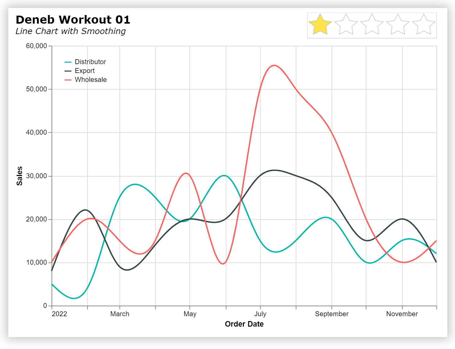
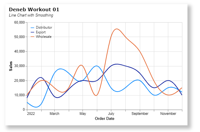
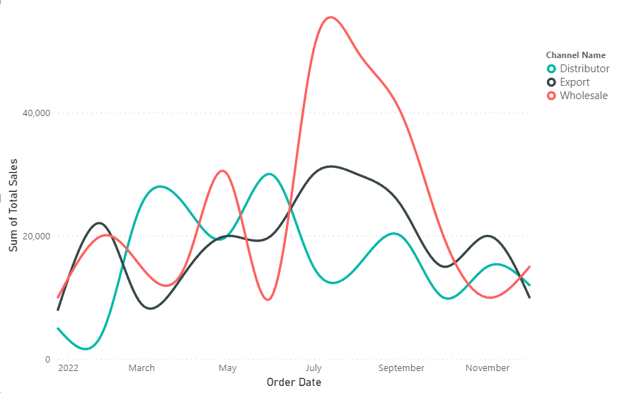
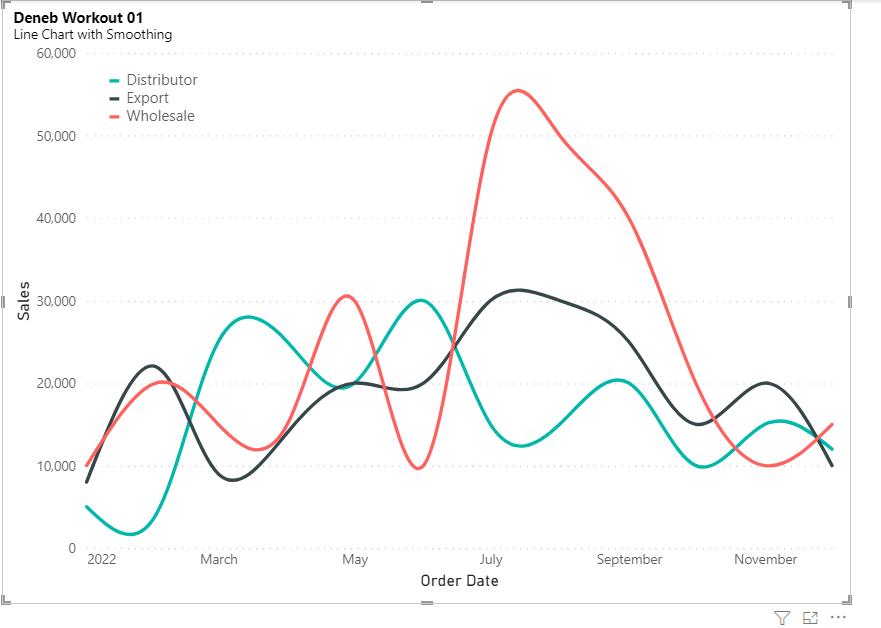
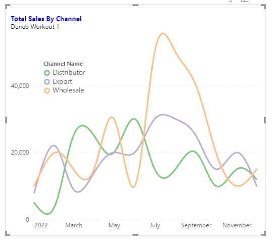
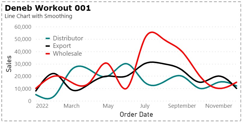
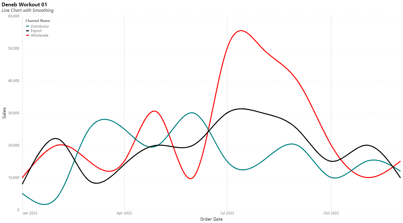
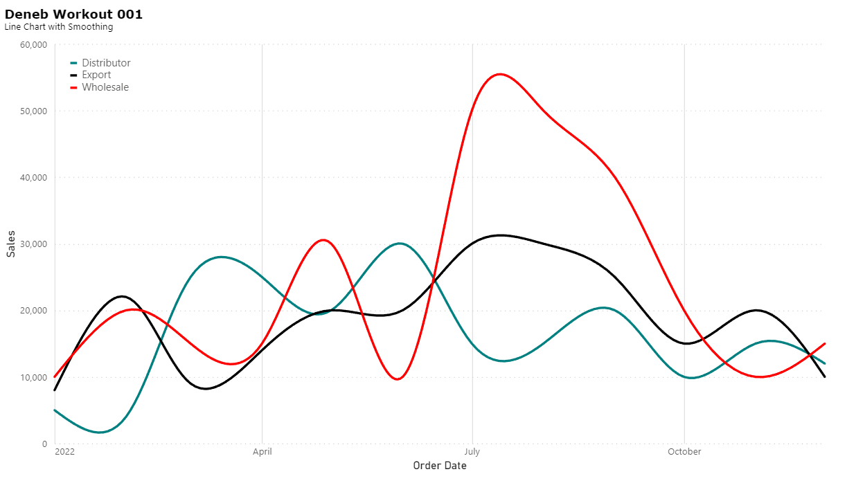
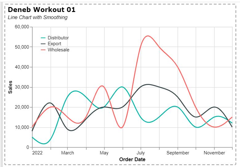
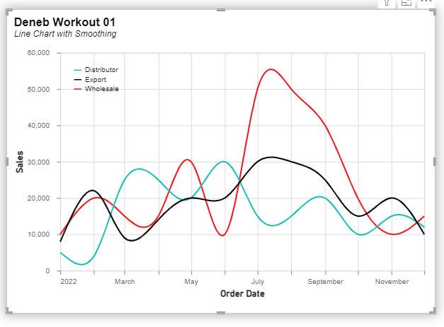
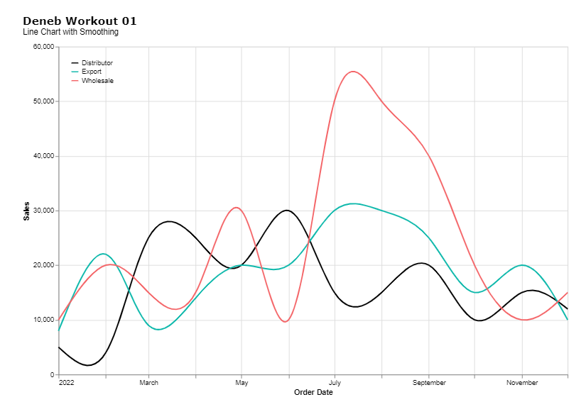
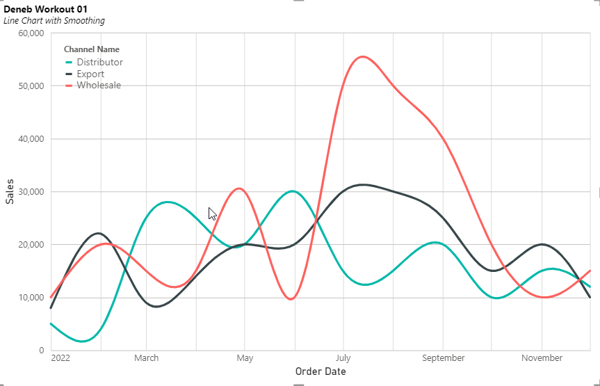
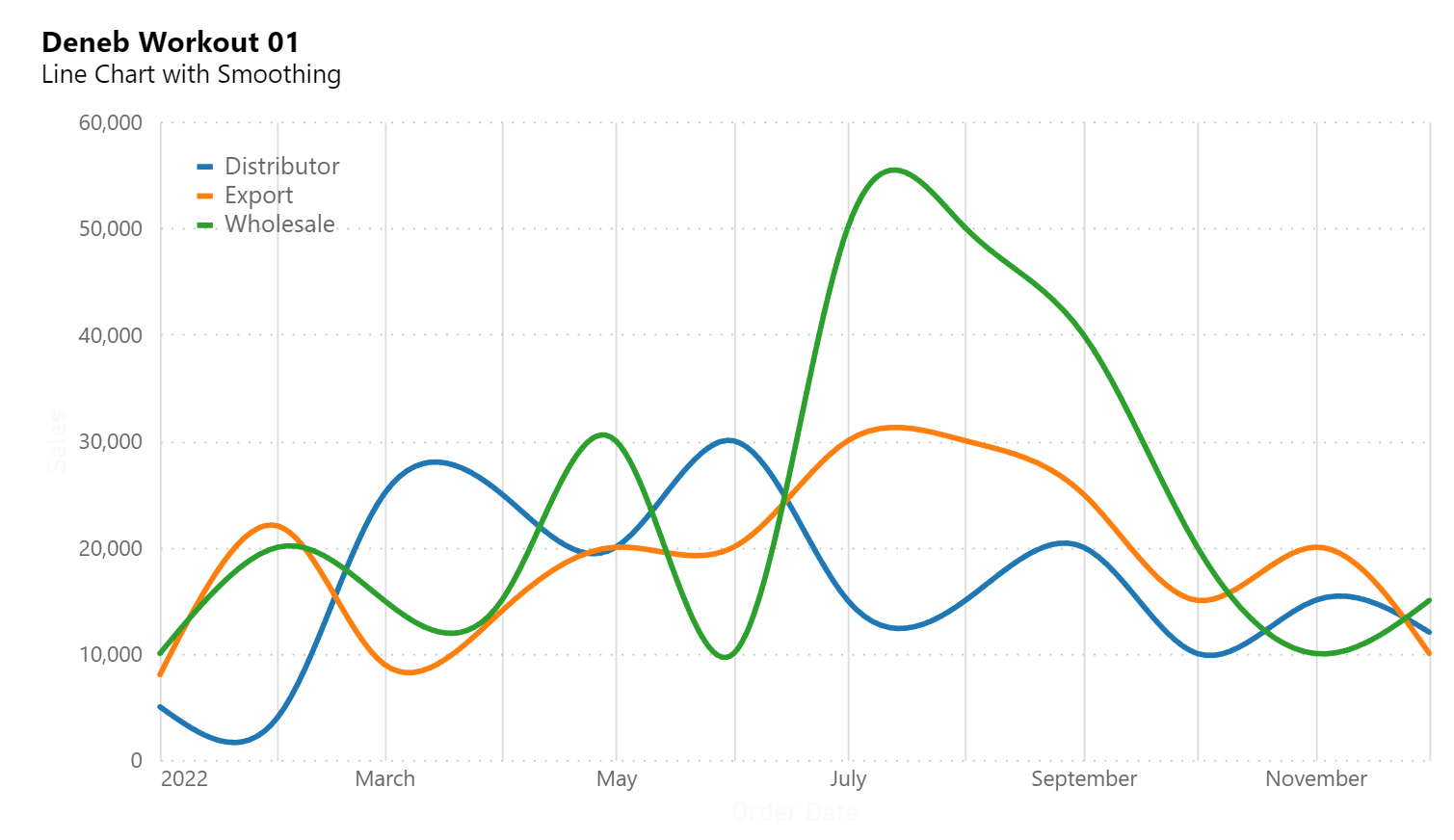
One of the features of a Line Chart created in Deneb in Power BI is that lines can be smoothed using various algorithms.

Goals

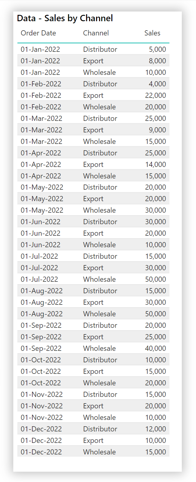
Using the simple supplied dataset, produce a Deneb visual in Power BI that:
• smooth the lines using the natural algorithm
• limit the number of entries on the Y-axis
• use the line colours defined in the current Power BI theme
• include a legend at top-left using lines as markers
• include a title and subtitle

Submission

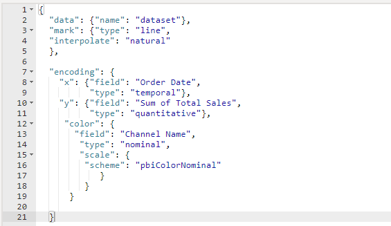
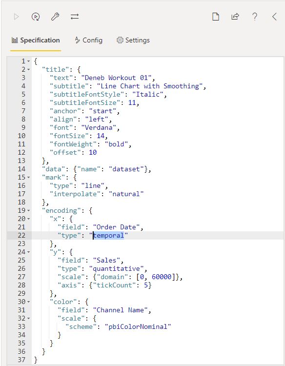
Load the supplied data file into a new Power BI file, create your solution, and reply to this post. Upload a screenshot of your solution along with the Deneb/Vega-Lite JSON code used. Please format your JSON code and blur it or place it in a hidden section.

Period

This workout will be released on Monday March 20, 2023, and the author’s solution will be posted on Sunday March 26, 2023.

Greg

Deneb Workout 01 - Data - Sales by Channel.xlsx (9.7 KB)

5 Likes

Hi Greg,
Thanks for the workout. I have only dabbled with Deneb and haven’t used it for a while so it was a great refresher.

My colors are different but everything else seems ok. Here is my solution:

image

{
“title”: {
“text”: “Deneb Workout 01”,
“subtitle”:“Line Chart with Smoothing”,
“anchor”: “start”,
“align”: “left”,
“font”: “Verdana”,
“fontSize”: 14,
“fontWeight”: “bold”,
“subtitleFontStyle”: “italic”,
“subtitleFontSize”: 11,
“offset”: 10
},

“data”: {“name”: “dataset”},
“mark”: {
“type”: “line”,
“interpolate”: “natural”
},
“encoding”: {
“x”: {
“field”: “Order Date”,
“type”: “temporal”

},
"y": {
  "field": "Sales",
  "type": "quantitative",
  "scale": {"domain": [0, 60000]},
  "axis": {"tickCount": 5}
},
"color": {
  "field": "Channel Name",
  "scale": {
    "scheme": "pbiColorNominal"
  },
  "legend": {
        "orient": "top-left",
        "direction": "vertical",
        "title": null,
        "offset": 10,
        "labelColor": "black",
        "labelFont": "Segoe UI",
        "labelFontSize": 10,
        "symbolSize": 100,
        "symbolType": "stroke"
      }
}

}
}

4 Likes

Looks great @KimC … the colours should align to the theme used in your PBIX file; try some different themes.
Greg

1 Like

@Greg Here is my submission.

image

Deneb Workout 001 - Line Smoothing Gerber.pbix (4.4 MB)

4 Likes

Hi,

Here is my Code: and immage of the visual

{
  "title": {
    "text": "Deneb Workout 01",
    "subtitle": "Line Chart with Smoothing",
    "anchor": "start",
    "align": "left"
  },
  "data": {"name": "dataset"},
  "mark": {
    "type": "line",

    "interpolate": "natural"
  },
  "encoding": {
    "x": {
      "field": "Order Date",
      "type": "temporal"
    },
    "y": {
      
      "field": "Sum of Total Sales",
      "type": "quantitative",
      "title": "Sales",
      "scale": {"domain": [0,60000]},
      "axis": {"tickCount": 5}
    },
    "color": {
      "title": null,
      "field": "Channel Name",
      "type": "nominal",
      "legend":{
        "orient": "top-left",
        "symbolType":"stroke"
      },
      "scale":{
        "scheme": "pbiColorNominal"
      }
    }
  }
}
4 Likes

Great first one for me. Mine is a bit of a copy of @Paul.Gerber and @jsodhi but was helpful to play around and modify a few things. So the intent wasn’t necessarily to make it look pretty.

JSON Code

{
“data”: {“name”: “dataset”},
“title”: {
“text”: “Total Sales By Channel”,
“subtitle”: “Deneb Workout 1”,
“align”: “left”,
“anchor”: “start”,
“color”: “blue”

},

“mark”:
{
“type”: “line”,
“interpolate”: “natural”
},
“encoding”: {
“x”: {
“field”: “Order Date”,
“type”: “temporal”,
“title”: null
},
“y”: {
“field”: “Total Sales Measure”,
“type”: “quantitative”,
“title”: null
},
“color”: {
“field”: “Channel Name”,
“type”: “nominal”,
“scale”: {
“scheme”: “accent”
},
“legend”: {
“direction”: “vertical”,
“orient”: “top-left”
}
}
}

}

Deneb Workout 1 picture

4 Likes

@tweinzapfel I should’ve put a title. Good addin

1 Like

Here is my solution to Deneb Workout 001
Deneb_Workout_001.pdf (451.9 KB)

1 Like

Can someone help on how to add gridline to the visualization? I have “grid:true” for the y-axis code, but the gridline is not appearing:

Vega-lite code

{
  "title": {
    "text": "Deneb Workout 001",
    "subtitle":"Line Chart with Smoothing",
    "anchor": "start",
    "align": "left",
    "font": "Verdana",
    "fontSize": 16,
    "fontWeight": "bold",
    "offset": 10
  },
  "data": {"name": "dataset"},
  "mark": {
    "type": "line",
    "interpolate": "natural"
  },
  "encoding":{
    "x":{"field": "Order Date", 
          "type": "temporal"},
     "y": {
      "field": "Sales",
      "type": "quantitative",
      "title": "Sales",
      "scale": {"domain": [0,60000]},
      "axis": { "grid": true,
                "tickCount": 5}
    },
    "color": {
      "title": null,
      "field": "Channel Name",
      "type": "nominal",
      "scale":{"range":["teal","black","red"]},
      "legend":{
        "orient": "top-left",
        "symbolType":"stroke"
      }
      }
    }
  }

Deneb_workout_submission.pbix (1.4 MB)

3 Likes

Hi @Nayeem. The standard template provided with Deneb has many configuration options/settings, including turning off the grid. You can just delete the code in the [Config] section and you’ll see both horizontal and vertical grid lines.
Greg

4 Likes

Summary

This text will be hidden

{
  "title": {
    "text": "Deneb Workout 01",
    "subtitle": "Line Chart with Smoothing",
    "anchor": "start",
    "align": "left",
    "fontSize": 16,
    "subtitleFontStyle": "italic",
    "subtitleFontSize": 14
  },
  "data": {"name": "dataset"},
  "mark": {
    "type": "line",
    "tooltip": true,
    "interpolate": "natural"
  },
  "encoding": {
    "x": {
      "field": "Order Date",
      "type": "temporal",
      "title": "Order Date",
      "timeUnit": "yearmonth",
      "axis": {
        "tickCount": 5,
        "grid": true
      }
    },
    "y": {
      "field": "Sum of Total Sales",
      "type": "quantitative",
      "title": "Sales",
      "scale": {"domain": [0,60000]},
      "axis": {
        "title": "Sales",
        "tickCount": 6,
        "grid": true
      }
    },
    "color": {
      "field": "Channel Name",
      "type": "nominal",
      "scale": {
        "domain": [
          "Distributor",
          "Export",
          "Wholesale"
        ],
        "range": [
          "teal",
          "black",
          "red"
        ]
      },
      "legend": {
        "orient": "top-left",
        "labelFontSize": 12,
        "offset": 10,
        "symbolType": "stroke"
      }
    }
  }
}
3 Likes

@Nayeem I see the gridline in this screenshot and in your pbix file. What are you trying to accomplish?

Paul

2 Likes

Hello Paul,
I see the gridline only for the x-axis, but not for the y-axis (vertical grid lines). I’m trying to figure out why the gridline for y-axis is not showing.

2 Likes

@Nayeem there wasn’t any coding for the x-axis. You had lines for the y-axis.

See below

“encoding”:{
“x”:{“field”: “Order Date”,
“type”: “temporal”,
“axis”: {
“grid”: true,
“tickCount”: 5
}
},
“y”: {
“field”: “Sales”,
“type”: “quantitative”,
“title”: “Sales”,
“scale”: {“domain”: [0,60000]},
“axis”: {
“grid”: true,
“tickCount”: 5
}
},

2 Likes

Got it. Thank you!

2 Likes

@Greg,

Thanks for this Deneb workout. Here’s my solution.

2 Likes

Hi, here is my solution:
image

Json File

{
“$schema”: “https://vega.github.io/schema/vega-lite/v5.json”,
“usermeta”: {
“deneb”: {
“build”: “1.4.0.0”,
“metaVersion”: 1,
“provider”: “vegaLite”,
“providerVersion”: “5.4.0”
},
“interactivity”: {
“tooltip”: true,
“contextMenu”: true,
“selection”: false,
“highlight”: false,
“dataPointLimit”: 50
},
“information”: {
“name”: “Line Chart Workout 01”,
“description”: “[No Description Provided]”,
“author”: “AAndrade”,
“uuid”: “d0b09845-becc-4185-9912-c6a3e7675c27”,
“generated”: “2023-03-23T15:45:37.756Z”
},
“dataset”: [
{
“key”: “0”,
“name”: “Channel Name”,
“description”: “”,
“type”: “text”,
“kind”: “column”
},
{
“key”: “1”,
“name”: “Order Date”,
“description”: “”,
“type”: “dateTime”,
“kind”: “column”
},
{
“key”: “2”,
“name”: “Sales”,
“description”: “”,
“type”: “numeric”,
“kind”: “measure”
}
]
},
“config”: {
“axis”: {
“ticks”: true,
“grid”: true,
“domain”: false,
“labelColor”: “#6C6966”,
“labelFontSize”: 10,
“titleFont”: “wf_standard-font, helvetica, arial, sans-serif”,
“titleColor”: “#131312”,
“titleFontSize”: 14,
“titleFontWeight”: “bold”
},
“axisX”: {“labelPadding”: 5},
“axisY”: {“labelPadding”: 10}
},
“title”: {
“text”: “Deneb Workout 01”,
“anchor”: “start”,
“fontWeight”: “bold”,
“fontSize”: 16,
“subtitle”: “Line Chart with Smoothing”,
“subtitleFontWeight”: “normal”,
“subtitleFontSize”: 12,
“subtitleFontStyle”: “italic”,
“offset”: 15
},
“width”: 500,
“height”: 300,
“data”: {“name”: “dataset”},
“layer”: [
{
“name”: “LINE”,
“mark”: {
“type”: “line”,
“interpolate”: “natural”,
“strokeWidth”: 2
},
“encoding”: {
“x”: {
“field”: “1”,
“type”: “temporal”
},
“y”: {
“field”: “2”,
“type”: “quantitative”,
“scale”: {
“domain”: [0, 60000]
},
“grid”: true
},
“color”: {
“field”: “0”,
“type”: “nominal”,
“scale”: {
“scheme”: “pbiColorNominal”
},
“legend”: {
“title”: null,
“orient”: “top-left”
}
}
}
}
]
}

3 Likes

Thanks for the workout Greg. Here is my submission.

{
  "$schema": "https://vega.github.io/schema/vega-lite/v5.json",
  "usermeta": {
    "deneb": {
      "build": "1.4.0.0",
      "metaVersion": 1,
      "provider": "vegaLite",
      "providerVersion": "5.4.0"
    },
    "interactivity": {
      "tooltip": true,
      "contextMenu": true,
      "selection": false,
      "highlight": false,
      "dataPointLimit": 50
    },
    "information": {
      "name": "Bramow-Deneb Workout 01",
      "description": "Enterprise DNA Deneb Workout 01",
      "author": "Jessica Bramow",
      "uuid": "e030a4b8-3e13-4ae6-85de-cfaaed892e80",
      "generated": "2023-03-24T15:18:52.838Z"
    },
    "dataset": [
      {
        "key": "__0__",
        "name": "Channel Name",
        "description": "",
        "type": "text",
        "kind": "column"
      },
      {
        "key": "__1__",
        "name": "Sales",
        "description": "",
        "type": "numeric",
        "kind": "column"
      },
      {
        "key": "__2__",
        "name": "Order Date",
        "description": "",
        "type": "dateTime",
        "kind": "column"
      }
    ]
  },
  "config": {
    "autosize": {
      "type": "fit",
      "contains": "padding"
    },
    "legend": {
      "title": null,
      "orient": "top-left",
      "symbolType": "stroke",
      "labelColor": "black",
      "symbolDirection": "vertical"
    }
  },
  "title": {
    "text": "Deneb Workout 01",
    "subtitle": "Line Chart with Smoothing",
    "anchor": "start",
    "align": "left",
    "font": "Verdana",
    "fontSize": 16,
    "fontWeight": "bold",
    "offset": 10
  },
  "data": {"name": "dataset"},
  "mark": {
    "type": "line",
    "interpolate": "natural"
  },
  "encoding": {
    "x": {
      "field": "__2__",
      "type": "temporal"
    },
    "y": {
      "field": "__1__",
      "type": "quantitative",
      "scale": {"domain": [0, 60000]},
      "axis": {"tickCount": 5}
    },
    "color": {
      "field": "__0__",
      "scale": {
        "range": [
          "#000000",
          "#0db8ab",
          "#f46568"
        ]
      }
    }
  }
}
1 Like

Thanks Greg!
This is my first deneb visual and I’m looking forward to the next workouts!

Is it possible to autosize the legend of a visual (for the visual it is possible to resize, the title and other text not, but maybe the legend is possible somehow?)

JSON
{
  "title": {
    "anchor": "start",
    "text": "Deneb Workout 01",
    "subtitle": "Line Chart with Smoothing",
    "subtitleFontStyle": "italic"
  },
  "data": {"name": "dataset"},
  "mark": {
    "type": "line",
    "interpolate": "natural"
  },
  "encoding": {
    "x": {
      "field": "Order Date",
      "type": "temporal",
      "axis": {
        "grid": true
      }
    },
    "y": {
      "field": "# Total Sales",
      "title": "Sales",
      "type": "quantitative",
      "scale": {"domain": [0,60000]},
      "axis": {
        "tickCount": 5,
        "gridDash": [0,0]
      }
    },
    "color": {
      "field": "Channel Name",
      "type": "nominal",
      "scale": {"scheme": "pbiColorNominal"},
      "legend": {
        "orient": "top-left",
        "direction": "vertical",
        "symbolType": "stroke"
      }
    }
  }
}

2 Likes

@Greg ,

Thanks – fantastic kickoff exercise! For some reason, I’m having trouble getting the Y axis title to show up, but otherwise happy with how this turned out.

Summary
{
  "data": {"name": "dataset"},
  "mark": {
    "type": "line",
    "interpolate": "natural",
    "tension": 0
  },
  "title": {
    "text": "Deneb Workout 01",
    "anchor": "start",
    "align": "left",
    "font": "Segoe UI",
    "fontSize": 16,
    "fontWeight": "bold",
    "subtitle": "Line Chart with Smoothing",
    "subtitleFontSize": 14,
    "offset": 12
  },
  "encoding": {
    "x": {
      "field": "Order Date",
      "type": "temporal"
    },
    "y": {
      "field": "Total Sales",
      "type": "quantitative",
      "title": "Sales",
      "scale": {"domain": [0, 60000]},
      "axis": {
        "tickCount": 5,
        "title": "Sales"
      }
    },
    "color": {
      "field": "Channel Name",
      "type": "nominal",
      "scale": {"scheme": "Category10"},
      "legend": {
        "title": null,
        "orient": "top-left",
        "symbolType": "stroke"
      }
    }
  }
}
1 Like