One of the great things about Deneb and Vega-Lite is how quickly you can customize existing visuals to suit your specific requirements. I had an idea this morning when thinking about a semi-circular gauge I’m seeing more-and-more frequently in media these days, and I wanted to see how easily it might be to customize an existing Deneb template to create such a Radial Gauge (I doubt this is the correct name, merely the one I gave it, but seeing as this is only a Deneb/Vega-Lite demonstration anyway …)
(While Power BI has a build-in radial chart visual, it doesn’t allow [AFAIK] adjustment of the start and end positions, nor the end radius.)
So, I started with the Donut KPI chart template that I posted a while ago, and within a 1/2 hour had something presentable (very minor changes to the marks; most of the time was spent getting the math right in the “transform” block):
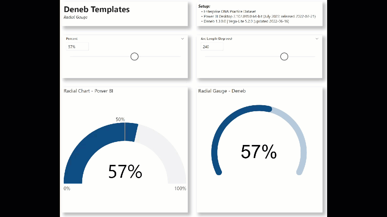
The customizations I made to the donut KPI chart template include:
- add transformations for the background arc start and end points (in radians) [using the selected “degrees”]
- add transformations for the foreground arc start and end points (in radians) [using the selected “percent”]
- change the location, colour, and font size of the percent “text” mark
- remove the category “text” mark
The intent of this template is not to provide a finished visual, but rather to serve as a starting point for further custom visual development.
Also included is the sample PBIX using the Enterprise DNA Practice Dataset as a demo.
NOTE: This template is provided as-is for information purposes only, and its use is solely at the discretion of the end user; no responsibility is assumed by the author.
Greg
deneb.radial_gauge.0.2.json (4.6 KB)
Deneb Templates - Radial Gauge.pbix (1.7 MB)