Hi Greg and Enterprise team,
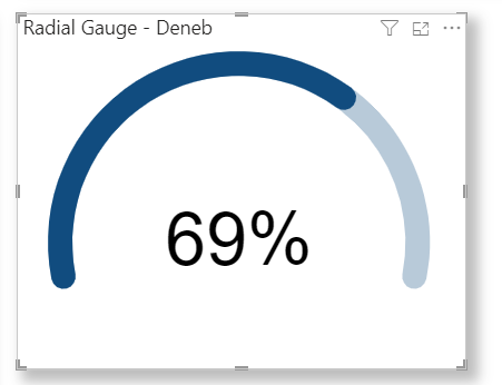
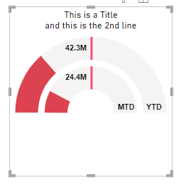
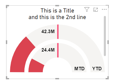
I’m just about completed my ARC chart customised from the ring chart in the deneb showcase.
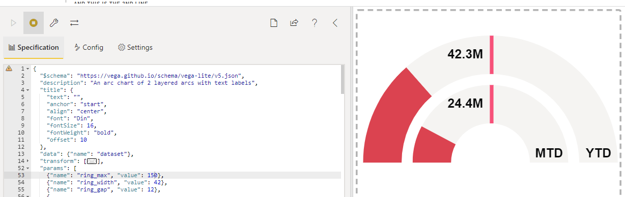
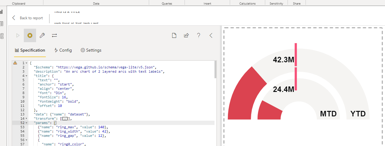
There’s quite a bit of white space on the bottom of the visual, is there a way of reducing it?
I checked the documentation and it says to change the width and height, i added width and height but altering them doesn’t impact anything:
“width” : 100 ,
“height” : 100 ,
I’ve also tried adjusting the “ring_max”, “ring_width” & “ring_gap”, this changes the size of the arcs but not the overall visual size.
I can adjust the size of the visual window but then I get the annoying scroll bar on the side.
Any assistance is appreciated.
my file & code:
Deneb Templates - Ring Chart (1).pbix (1.7 MB)
{
“$schema”: “https://vega.github.io/schema/vega-lite/v5.json”,
“description”: “An arc chart of 2 layered arcs with text labels”,
“width” : 100 ,
“height” : 100 ,
“title”: {
“text”: “”,
“anchor”: “start”,
“align”: “center”,
“font”: “Din”,
“fontSize”: 16,
“fontWeight”: “bold”,
“offset”: 10
},
“data”: {“name”: “dataset”},
“transform”: [
{
“calculate”: “((11.57datum[‘Ring1_Percent’])/100)-1.57”,
“as”: “Ring1_Theta2”
},
{
“calculate”: “((11.57datum[‘Ring2_Percent’])/100)-1.57”,
“as”: “Ring2_Theta2”
},
{
“calculate”: “((11.57datum[‘Ring3_Percent’])/100)-1.57”,
“as”: “Ring3_Theta2”
},
{
“calculate”: "datum[‘Wholesale_Sales’] ",
“as”: “Ring1_Percent_Label”
},
{
“calculate”: "datum[‘Distributor_Sales’] ",
“as”: “Ring2_Percent_Label”
},
{
“calculate”: “datum[‘Ring3_Percent’] + ‘%’”,
“as”: “Ring3_Percent_Label”
},
{
“calculate”: "datum[‘Var_Wholesale_Sales’] >= 0 ",
“as”: “Var_Wh_Sales”
},
{
“calculate”: "datum[‘Var_Distributor_Sales’] >= 0 ",
“as”: “Var_Dis_Sales”
},
{
“calculate”: “datum.label”,
“as”: “Chart_Label”
}
],
“params”: [
{“name”: “ring_max”, “value”: 150},
{“name”: “ring_width”, “value”: 42},
{“name”: “ring_gap”, “value”: 12},
{
“name”: “ring0_color”,
“value”: “#F3F3F2”
},
{
“name”: “ring_background_color”,
“value”: “#F3F2F0”
},
{
“name”: “ring1_color_good”,
“value”: “#52CF71”
},
{
“name”: “ring1_color_bad”,
“value”: “#DC414E”
},
{
“name”: “ring2_color”,
“value”: “#6086BC”
},
{
“name”: “label_color”,
“value”: “#08090A”
},
{
“name”: “target_color”,
“value”: “#F84F79”
},
{
“name”: “ring_background_opacity”,
“value”: 0.9
},
{
“name”: “ring0_percent”,
“value”: 100
},
{
“name”: “ring0_outer”,
“expr”: “ring_max+2”
},
{
“name”: “ring0_inner”,
“expr”: “ring_max+1”
},
{
“name”: “ring1_outer”,
“expr”: “ring0_inner-ring_gap”
},
{
“name”: “ring1_inner”,
“expr”: “ring1_outer-ring_width”
},
{
“name”: “ring1_middle”,
“expr”: “(ring1_outer+ring1_inner)/2”
},
{
“name”: “ring2_outer”,
“expr”: “ring1_inner-ring_gap”
},
{
“name”: “ring2_inner”,
“expr”: “ring2_outer-ring_width”
},
{
“name”: “ring2_middle”,
“expr”: “(ring2_outer+ring2_inner)/2”
},
{
“name”: “ring3_outer”,
“expr”: “ring2_inner-ring_gap”
},
{
“name”: “ring3_inner”,
“expr”: “ring3_outer-ring_width”
},
{
“name”: “ring3_middle”,
“expr”: “(ring3_outer+ring3_inner)/2”
},
{
“name”: “circle_size”,
“value”: 100
},
{
“name”: “x_label_gap”,
“value”: 10
},
{
“name”: “x_circle_1”,
“value”: -100
},
{
“name”: “x_circle_2”,
“value”: -20
},
{“name”: “x_circle_3”, “value”: 50},
{
“name”: “x_label_1”,
“expr”: “x_circle_1 + x_label_gap”
},
{
“name”: “x_label_2”,
“expr”: “x_circle_2 + x_label_gap”
},
{
“name”: “x_label_3”,
“expr”: “x_circle_3 + x_label_gap”
}
],
“vconcat”: [
{
“description”: “RINGS”,
“layer”: [
{
“layer”: [
{
“description”: “RING 1 (OUTER) BACKGROUND”,
“mark”: {
“type”: “arc”,
“radius”: {
“expr”: “ring1_outer”
},
“radius2”: {
“expr”: “ring1_inner”
},
“theta”: -1.57,
“theta2”: 1.57
},
“encoding”: {
“color”: {
“value”: {
“expr”: “ring_background_color”
}
},
“opacity”: {
“value”: {
“expr”: “ring_background_opacity”
}
}
}
},
{
“description”: “RING 1 (OUTER)”,
“mark”: {
“type”: “arc”,
“radius”: {
“expr”: “ring1_outer”
},
“radius2”: {
“expr”: “ring1_inner”
},
“theta”: -1.57,
“theta2”: {
“expr”: “datum.Ring1_Theta2”
},
“cornerRadius”: 0
},
“encoding”: {
“color”: {
“value”: {
“expr”: " datum[‘Var_Wh_Sales’] ? ring1_color_good : ring1_color_bad "
}
},
“tooltip”: [
{
“field”: “Ring1_Category”,
“type”: “nominal”,
“title”: “Channel”
},
{
“field”: “Ring1_Percent_Label”,
“type”: “nominal”,
“title”: “Percent of Total Sales”
}
]
}
},
{
“description”: “RING 1 (OUTER) LABEL”,
“mark”: {
“type”: “text”,
“align”: “right”,
“baseline”: “middle”,
“dx”: -8,
“dy”: {
“expr”: “-1ring1_middle"
},
“fontSize”: 14,
“fontWeight”: “bold”
},
“encoding”: {
“text”: {
“field”: “Ring1_Percent_Label”,
“type”: “nominal”,
“format”: “.3s”
},
“color”: {
“value”: {
“expr”: “label_color”
}
}
}
},
{
“description”: “RING 1 2nd (OUTER) LABEL”,
“mark”: {
“type”: “text”,
“align”: “right”,
“baseline”: “middle”,
“dx”: {
“expr” : "(ring_max/32+ring_width-ring_gap )”
},
“dy”: -10,
“fontSize”: 14,
“fontWeight”: “bold”
},
“encoding”: {
“text”: {
“value”: “YTD”,
“type”: “nominal”,
“format”: “.3s”
},
“color”: {
“value”: {
“expr”: “label_color”
}
}
}
},
{
“description”: “RING 1 (OUTER) TICK”,
“mark”: {
“type”: “rule”,
“strokeWidth”: 4
},
“encoding”: {
“x”: {
“value”:{
“expr” : “(ring0_outer/3)*2”
},
“axis”: null,
“scale”: {
“domain”: [0, 10]
}
},
“x2”: {
“value”:{
“expr” : “(ring0_outer/3)2"
}
},
“y”: {
“value”:{
“expr” : " 3 "
}
},
“y2”: {
“value”:{
“expr” : " -ring_max/3+ring_gap-1 "
}
},
“stroke”: {
“value”: {
“expr”: “target_color”
}
}
}
},
{
“description”: “DATA-DRIVEN TITLE”,
“data”: {
“name”: “dataset”
},
“mark”: {
“type”: “text”,
“align”: “center”,
“baseline”: “top”,
“x”: {
“expr”: “width / 2”
},
“y”: -60,
“font”: “Din”,
“fontSize”: 16,
“fontWeight”: “bold”
},
“encoding”: {
“text”: {
“field”: “”
}
}
}
]
},
{
“layer”: [
{
“description”: “RING 2 (MIDDLE) BACKGROUND”,
“mark”: {
“type”: “arc”,
“radius”: {
“expr”: “ring2_outer”
},
“radius2”: {
“expr”: “ring2_inner”
},
“theta”: -1.57,
“theta2”: 1.57
},
“encoding”: {
“color”: {
“value”: {
“expr”: “ring_background_color”
}
},
“opacity”: {
“value”: {
“expr”: “ring_background_opacity”
}
}
}
},
{
“description”: “RING 2 (MIDDLE)”,
“mark”: {
“type”: “arc”,
“radius”: {
“expr”: “ring2_outer”
},
“radius2”: {
“expr”: “ring2_inner”
},
“theta”: -1.57,
“theta2”: {
“expr”: “datum.Ring2_Theta2”
},
“cornerRadius”: 0
},
“encoding”: {
“color”: {
“value”: {
“expr”: " datum[‘Var_Dis_Sales’] ? ring1_color_good : ring1_color_bad "
}
},
“tooltip”: [
{
“field”: “Ring2_Category”,
“type”: “nominal”,
“title”: “Channel”
},
{
“field”: “Ring2_Percent_Label”,
“type”: “nominal”,
“title”: “Percent of Total Sales”
}
]
}
},
{
“description”: “RING 2 (MIDDLE) LABEL”,
“mark”: {
“type”: “text”,
“align”: “right”,
“baseline”: “middle”,
“dx”: -8,
“dy”: {
“expr”: "-1ring2_middle”
},
“fontSize”: 14,
“fontWeight”: “bold”
},
“encoding”: {
“text”: {
“field”: “Ring2_Percent_Label”,
“type”: “nominal”,
“format”: “.3s”
},
“color”: {
“value”: {
“expr”: “label_color”
}
}
}
},
{
“description”: “RING 2 2nd (OUTER) LABEL”,
“mark”: {
“type”: “text”,
“align”: “right”,
“baseline”: “middle”,
“dx”: {
“expr” : “(ring_max/3+ring_width-ring_gap )”
},
“dy”: -10,
“fontSize”: 14,
“fontWeight”: “bold”
},
“encoding”: {
“text”: {
“value”: “MTD”,
“type”: “nominal”,
“format”: “.3s”
},
“color”: {
“value”: {
“expr”: “label_color”
}
}
}
},
{
“description”: “RING 1 (OUTER) TICK”,
“mark”: {
“type”: “rule”,
“strokeWidth”: 4
},
“encoding”: {
“x”: {
“value”:{
“expr” : “(ring0_outer/3)*2”
}
},
“x2”: {
“value”:{
“expr” : “(ring0_outer/3)*2”
}
},
“y”:{
“value”:{
“expr” : "(ring_width+ring_gap+3) "
}
},
“y2”: {
“value”:{
“expr” : "(ring_gap+3) "
}
},
“stroke”: {
“value”: {
“expr”: “target_color”
}
}
}
}
]
}
]
}
],
“view”: {“stroke”: null}
}
Thanks,
Tim