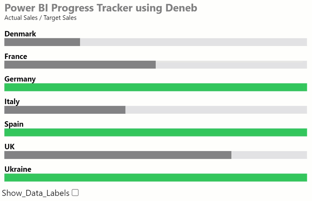
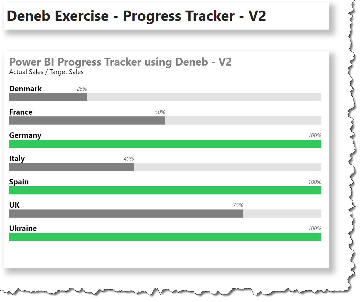
Many gauge visuals take-up a significant amount of screen real estate, and I wondered if Deneb/Vega-Lite could be used to minimize the required space. Here’s what I came up with:
This example uses a number of optional Deneb/Vega-Lite components, including:
a title block c/w subtitle
a transform block to extend the dataset
a layer block with 4 specifications as follows:
a bar mark for 100% width background (target)
a bar mark for progress
width = actual/target; percent) (actual)
color = green for 100%; dark grey for <100%
a text mark for country (zero-aligned; above bar)
a text mark for data label (progress-aligned; above bar; Deneb/Power BI percentage formatting)
a shared Y encoding outside the layer to allow/ensure data consistency
a Vega-Lite input widget (checkbox) to toggle data labels on and off
The intent of this exercise is not to provide a complete solution for finished visuals, but rather to serve as a starting point for further custom visual development.
Also included is a sample PBIX using a small made-up sample dataset as a demo.
NOTE: This exercise is provided as-is for information purposes only, and its use is solely at the discretion of the end user; no responsibility is assumed by the author.
Hi Greg. I really like what you have done with the progress tracker. I’m having difficulties figuring out how to eliminate “Show_Data_Labels” check box. I would like to have labels shown with no other option. Can you tell me what I should eliminate in the code? Best case would be to show both the progress as a percentage, along with Actual and Forecast values. Thank you so much for any help you can provide.
It is discouraged to add posts to solved threads. Many forum members do not review solved threads, so your issue may be unseen. Rather, start a new thread with your issue and link to the solved thread to maximize the visibility.