Deneb Data Label Position

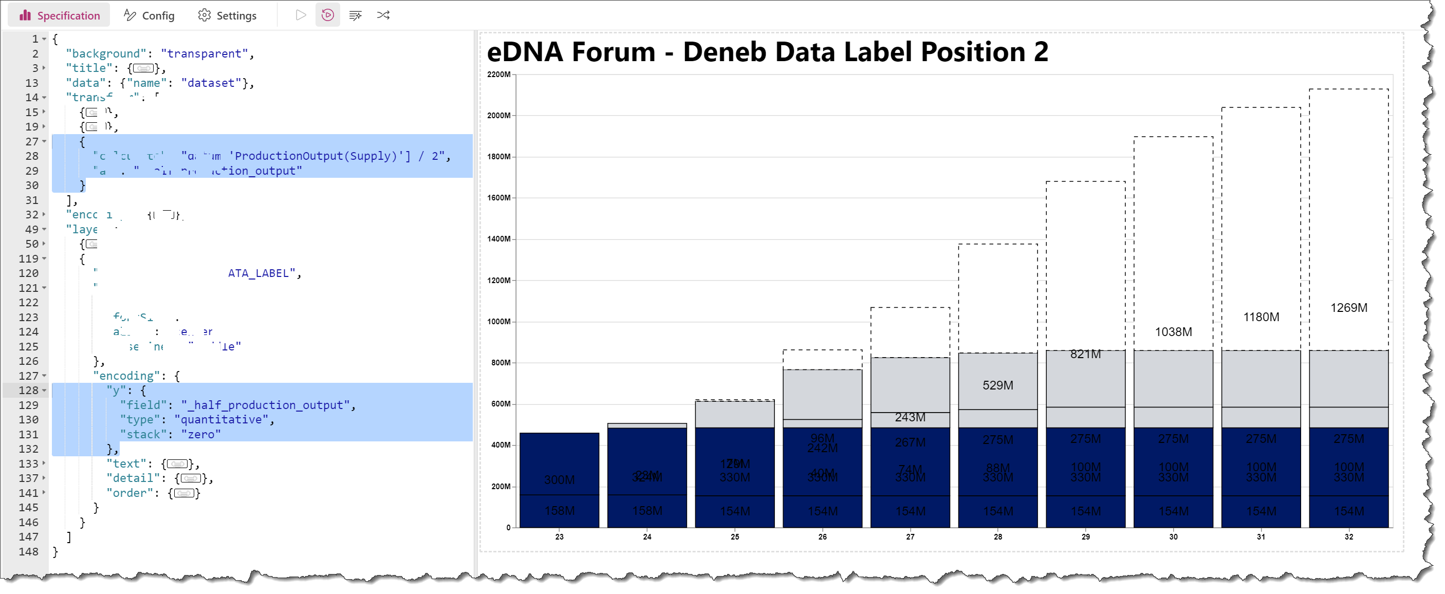
Hi - I am struggling quite a bit with getting my labels to be placed dynamically “inside base” - My current visual looks like this:

What I need is the text labels to be in the center of each block in the column. How do I do this? - My code is below:

{
  "data": {"name": "dataset"},
  "transform": [
    {
      "calculate": "datum['ProductionOutput(Supply)'] >= 1000000 ? format(datum['ProductionOutput(Supply)'] / 1000000, '') + 'M' : datum['ProductionOutput(Supply)'] >= 1000 ? format(datum['ProductionOutput(Supply)'] / 1000, '') + 'K' : format(datum['ProductionOutput(Supply)'], '')",
      "as": "formattedSupply"
    },
    {
      "lookup": "Legend",
      "from": {
        "data": {"name": "dataset"},
        "key": "Legend",
        "fields": ["Hex_color_code"]
      }
    }
  ],
  "layer": [
    {
      "mark": {
        "type": "bar",
        "stroke": "black",
        "strokeWidth": 1
      },
      "encoding": {
        "x": {
          "field": "Year_Short",
          "type": "ordinal",
          "sort": {
            "field": "Rank",
            "op": "sum",
            "order": "ascending"
          },
          "axis": {
            "labelAngle": 0,
            "labelFontWeight": "bold",
            "labelColor": "black",
            "title": null
          }
        },
        "y": {
          "field": "ProductionOutput(Supply)",
          "type": "quantitative",
          "stack": "zero",
          "axis": {
            "title": null,
            "labelExpr": "datum.value >= 1000000 ? format(datum.value / 1000000, '') + 'M' : datum.value >= 1000 ? format(datum.value / 1000, '') + 'K' : format(datum.value, '')",
            "tickCount": 10,
            "labelFontWeight": "bold",
            "labelColor": "black"
          }
        },
        "color": {
          "field": "Hex_color_code",
          "type": "nominal",
          "scale": null
        },
        "detail": {
          "field": "Legend",
          "type": "nominal"
        },
        "order": {
          "field": "Rank",
          "type": "quantitative"
        },
        "strokeDash": {
          "condition": {
            "test": "datum['Capacity_type'] == 'REQUIRED CAPACITY'",
            "value": [5, 5]
          },
          "value": [1, 0]
        },
        "tooltip": [
          {"field": "Year", "type": "ordinal", "title": "Year"},
          {"field": "Type_of_supply", "type": "nominal", "title":"Type of supply"},
          {"field": "Capacity_type", "type": "nominal", "title":"Capacity type"},
          {"field": "formattedSupply", "type": "nominal", "title": "Supply"},
          {"field": "Supply version", "type": "nominal", "title":"Supply version"}
        ]
      }
    },
    {
      "mark": {
        "type": "text",
        "fontSize": 6,
        "align": "center",
        "baseline": "middle"
      },
      "encoding": {
        "x": {"field": "Year_Short", "type": "ordinal"},
        "y": {"field": "ProductionOutput(Supply)", "type": "quantitative", "stack": "zero", "band": 0.5},
        "text": {"field": "formattedSupply", "type": "nominal"},
        "detail": {"field": "Legend", "type": "nominal"},
        "order": {
          "field": "Rank",
          "type": "quantitative"
        }
      }
    }
  ]
}

Please upload a PBIX (with sample data, if your data is not shareable) … I’ll then have a look later this morning.
Greg

Thanks Greg, much appreciated!

I have uploaded a sample of my data in this PBIX file.
data_sample.zip (1.5 MB)

Hi @CasperSeve.

Probably the easiest way to set the Y coordinate of the data label to half the production output is to add a calculate transform and then reference the new calculated field in your text mark.

This may or may not be what you’re looking for, as there are many data labels, and it is not immediately obvious which label goes with which bar. (I’ve increased the size of the text mark in my example to make the issue more visible.)

Hope this helps.
Greg
eDNA Forum - Deneb Data Label Position 2.pbix (1.5 MB)

Thanks @Greg!

It’s not entirely what I was seeking, but I see what you did here. It’ seems trivial, for such a simple feature that works out of the box from PBI to just put a value label for each block, but using Deneb it is quite complicated!

Hi @CasperSeve.

If you mock-up an example of exactly what you’re looking for, we can try to come closer to what you’re seeking.

While Power BI OOTB does what it thinks best, Vega-Lite rather does exactly what you tell it, so it’s incumbent upon you to be specific and exhaustive.

Greg

Good point, @Greg ! :slight_smile:

Attached I have tried to depict a mock-up of what I am trying to achieve. So essentially just the label values for each block centered in the middle. Preferably, with wrapping of the value and if the height of the block in the columns is too small to also have a label value, it does not show the value (rather the user then have to use the tooltip to get the information). Hope it makes sense - It’s essentially very “basic”, so how one normally would add labels in Excel or similar.

Hi @CasperSeve.

OK, I’ve been able to recreate your target with Deneb/Vega-Lite; here’s my solution.

I was able to leverage the new knowledge I gained yesterday on the pursuit of the internal dataset fields within Deneb/Vega-Lite on the forum: here’s the associated post.

Essentially, the addition of a simple transform block to the text mark that consisted of 2 parts did the trick:

  • access an internal D/V-L dataset to calculate the Y midpoint of the “bar”
  • filter: keep only values above a threshold

Here’s the JSON specification code.

{
  "title": {
    "anchor": "start",
    "align": "left",
    "orient": "top",
    "offset": 24,
    "text": "eDNA Forum - Deneb Data Label Position 3",
    "font": "Segoe UI",
    "fontSize": 24,
    "fontWeight": "bold",
    "fontStyle": "normal"
  },
  "data": {"name": "dataset"},
  "transform": [
    {
      "calculate": "datum['Category'] == 'A' ? 1 : datum['Category'] == 'B' ? 2 : 3",
      "as": "_category_order"
    }
  ],
  "encoding": {
    "y": {
      "field": "Amount",
      "type": "quantitative",
      "title": "Amount"
    },
    "order": {
      "field": "_category_order",
      "type": "ordinal"
    }
  },
  "layer": [
    {
      "name": "BAR_MARK",
      "mark": {
        "type": "bar",
        "stroke": "black",
        "strokeWidth": 1
      },
      "encoding": {
        "x": {
          "field": "Year",
          "type": "ordinal",
          "axis": {"labelAngle": 0}
        },
        "y": {
          "field": "Amount",
          "type": "quantitative"
        },
        "fill": {
          "field": "HEX Code Bar",
          "type": "nominal",
          "scale": null
        },
        "strokeDash": {
          "condition": {
            "test": "datum['Category'] == 'C'",
            "value": [5, 5]
          },
          "value": [1, 0]
        }
      }
    },
    {
      "name": "TEXT_MARK",
      "transform": [
        {
          "calculate": "( data('data_1')[datum['__row__']]['Amount_start'] + data('data_1')[datum['__row__']]['Amount_end'] ) / 2",
          "as": "_midpoint_y"
        },
        {
          "filter": "datum['Amount'] >= 1"
        }
      ],
      "mark": {"type": "text"},
      "encoding": {
        "text": {
          "field": "Amount",
          "type": "quantitative"
        },
        "x": {
          "field": "Year",
          "type": "ordinal"
        },
        "y": {
          "field": "_midpoint_y",
          "type": "quantitative"
        },
        "fill": {
          "field": "HEX Code Text",
          "type": "nominal",
          "scale": null
        }
      }
    }
  ]
}

Hope it helps.
Greg
eDNA Forum - Deneb Data Label Position 3.pbix (1.5 MB)
Sample - Year_Category_Amount.xlsx (9.4 KB)

Happy New Year, @Greg

That looks wonderful! Exactly what I was looking for :slight_smile: Question, what if I have a dataset that is kind of dynamic, so essentially could have multiple categories, how would you handle that?

In my example I only had 3 different categories, but in a moment when I am going to flip my data, so using a different “category” column, then there will suddenly be many dynamics rows of data.

As a fact, I actually also have a rank column depicting what you did with the category order already in my dataset (I didn’t put it in within my sample).

Lastly, how did you do the Amound_start and Amound_end columns?

Hi @CasperSeve.

1 - I can’t comment further on how to handle different numbers of categories without seeing the both the data and a mockup of the expected results.

2 - I don’t understand what you mean by, “flip my data”, so no comments.

3 - For details on how to access and use the Amount_start and Amount_end fields, see the thread referenced in my response (#8) above.
Greg

1 Like

Thanks @Greg !

I managed to solve it :slight_smile:

I have another minor thing, but I will create another post for that topic (unrelated to this one) :slight_smile:

@CasperSeve, are you going to share how you solved it?