I was able to figure out now. Thank you, Neba!
1 Like
Hi everyone! Great to see all of your submissions to the 4th Power BI Challenge.
Please send your entries to our email: powerbichallenge@enterprisedna.co
Thanks for your participation to this challenge!
I’ve posted my development up on youtube

I walk through how I went about the challenge.
Sam
10 Likes
Hi All,
I am new to Power BI and this group and already loving the level of creativity people are exhibiting in their reports.
I would like to thank Sam for reaching out to me and posting my challenge in non-members area as I couldn’t post by myself due to some technical issues. Frankly speaking, I thought that my work won’t be submitted but thanks to Sam and Enterprise DNA once again.
Looking forward to learn a lot from this group.
Congratulations to @alexbadiu!!! Your submission was 
Welcome to the forum! - great to have you here.
Thanks for your participation in the challenge. Can you please post the link to the nonmembers area and your submission? I haven’t seen that yet but would like to take a look.
- Brian
Thank you @BrianJ…
I looked at your reports and want to learn the type of statistical analysis you do… It’s just great.
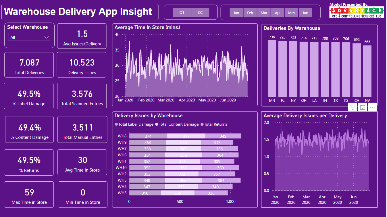
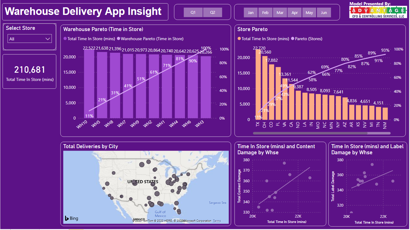
The report link is here: https://app.powerbi.com/groups/me/reports/d4da36cc-0035-4f4f-9b3a-8ba6f6a16ff9?ctid=2342efc5-e1b1-4fae-9a72-5a0432948e85
4 Likes
Wow - this is fantastic. There are techniques here , like adding clickable cards to the gauge visuals that I’ve never seen before, but absolutely love. Ticker, slicer panel and other innovative approaches that all fit beautifully within the structure of the report. Really well done.
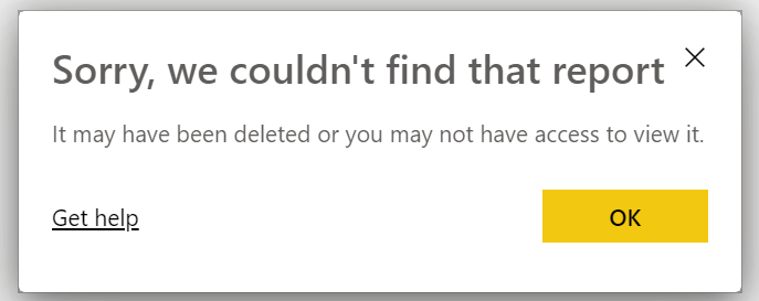
Would love to explore this more, but unfortunately get the following error when I click on the link:
In terms of incorporating the types of statistical analysis I use in my reports, there are two major components to learn:
-
how to run the actual statistical analyses and visuals. I’ve got a video on the eDNA TV YouTube channel (be sure to subscribe!) coming out next month entitled “R for non-R Users” on how to do this. For reasons I’ll discuss in the video, I think R is 10x easier to learn than DAX.
-
the more difficult (and far more important, IMO) component is to develop a solid foundational understanding of applied statistical analysis - distributions, hypothesis testing, selecting the correct test, interpreting and reporting the test results, etc.
What you want to achieve here is what I discuss in this video as the difference between familiarity and mastery. For example, in analyzing correlations, you don’t need to know the details of the Pearson vs. Spearman method (you can Google that easily). What you DO need to know is that you have to use different methods if your data are not distributed normally than if they are.
There are a ton of great resources on the internet for learning #2, but one that I particularly like is https://statisticsbyjim.com/ . Jim Frost is a professional statistician and writer, and has a very plain English, easy to understand style that is geared toward the non-statistician who wants to develop a solid understanding of the key concepts I listed above.
Anyway, I hope that is helpful and very much look forward to seeing more of your work in future challenges.
- Brian
1 Like
Thanks a lot Brian. It’s time dive into statistical analysis techniques now. I will start learning these techniques from today. Really appreciate your help!
Sorry for the error. Attaching the report here:
Challenge # 4 - Delivery APP.pbix (1.1 MB)
4 Likes
Wow Alex, Love the model and methodology around your model and report. (Power BI Newbie)
1 Like
This is amazing MudassirAli. I didn’t know about the scroller view, that’s interesting way to show data. and I like the approach of the i button. Sometimes user just don’t understand the purpose of the specific visual and it helps to explain it very well.
2 Likes
Well done on some fabulous aspect to your report. I like all the write ups and dynamic measures you’ve placed inside these.
Sam
1 Like
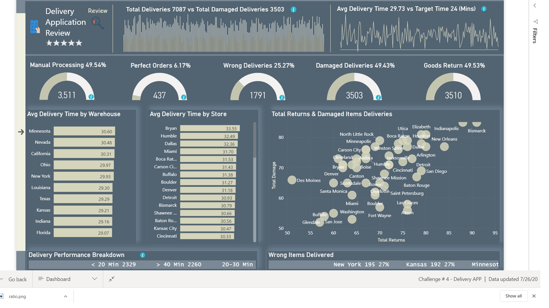
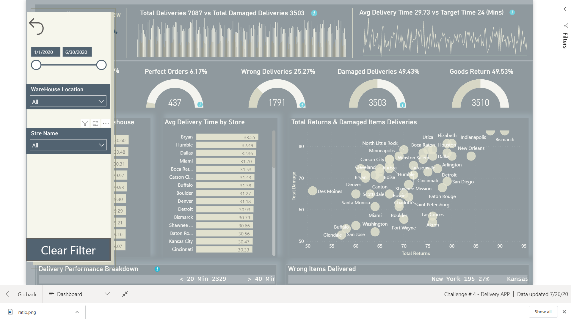
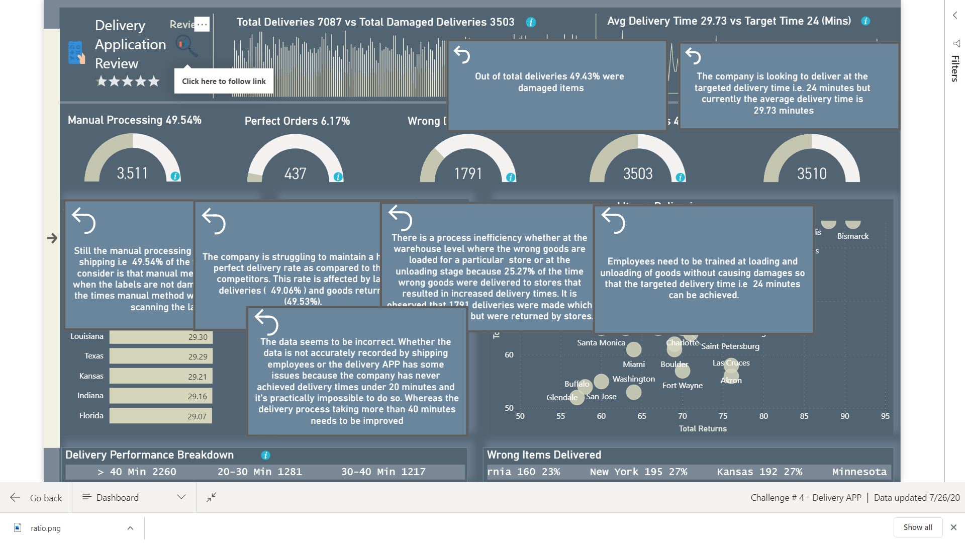
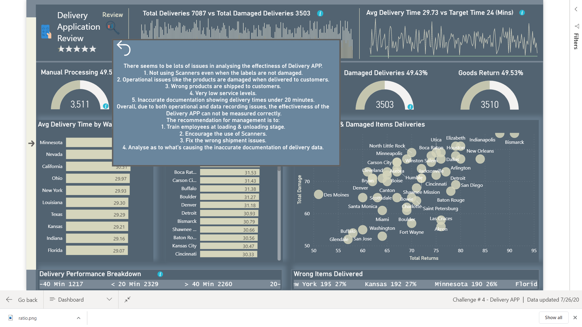
Thank you Sam. I didn’t have time for more analysis as I am currently busy with my company budgeting. My company’s management was asking a lot of questions about visuals that’s why I came up with placing info icons inside gauges and other visuals as they are accustomed to power point presentations rather than looking dynamically at data.
Frankly speaking, doing this challenge helped me to learn many new things and I am really curious to learn more from the experts.
Nice work!
1 Like
Hi @DianaB,
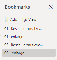
I am working with bookmarks today and have created a new ‘workflow’. I number my bookmarks in groups on a page. So on specific page, not matter what the page name, all bookmarks on that page start with the same number (say 01, or 02, 03 etc). I find this helps order them, find them and manage them. I hope this approach assists. See below for an example.
1 Like

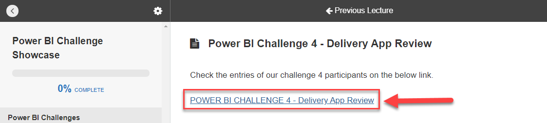
Hi @ambepat,
You can find all the entries to the challenges in the portal
Use the link on top to navigate to the files section where you can download the PBIX from anyone who participated in that specific challenge.
All the best.
1 Like