Data Visualization Workout 012 - Scatter chart - Quadrant highlighting

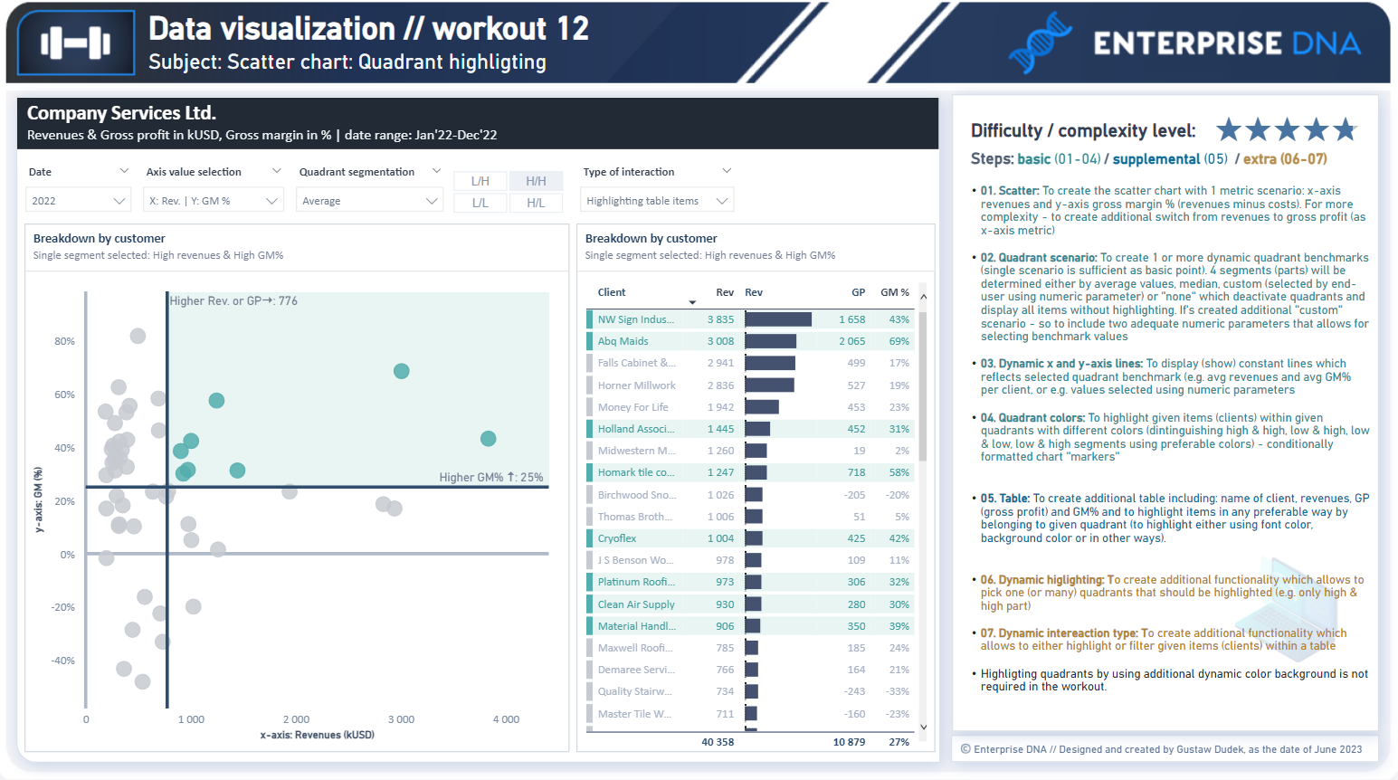
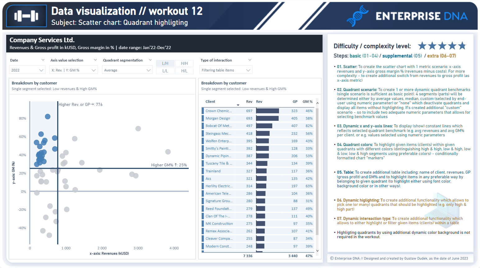
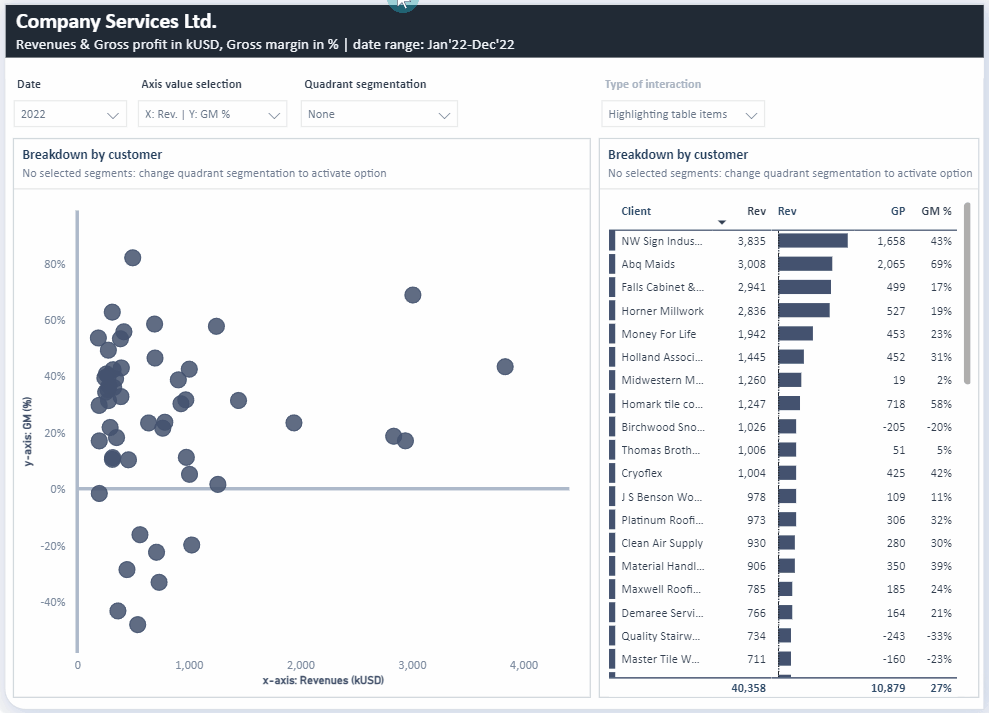
Workout 012 – Quadrant highlighting (Scatter chart, table)
Difficulty rating: 4.75 out of 5


Intro note
This workout combines various visualization techniques. The most important part of the workout is practice - entries does not have to include every element or functionality to be still considered as great . Please pay attention to the list of functionalities (provided in the screenshoot and in published-to-web report), which includes ‘basic’ elements (1st-4th point), supplemental (5th point) and extra (6th - 7th points). I would kindly recommend to review blue section before executing orange section to provide proper flow of your work.

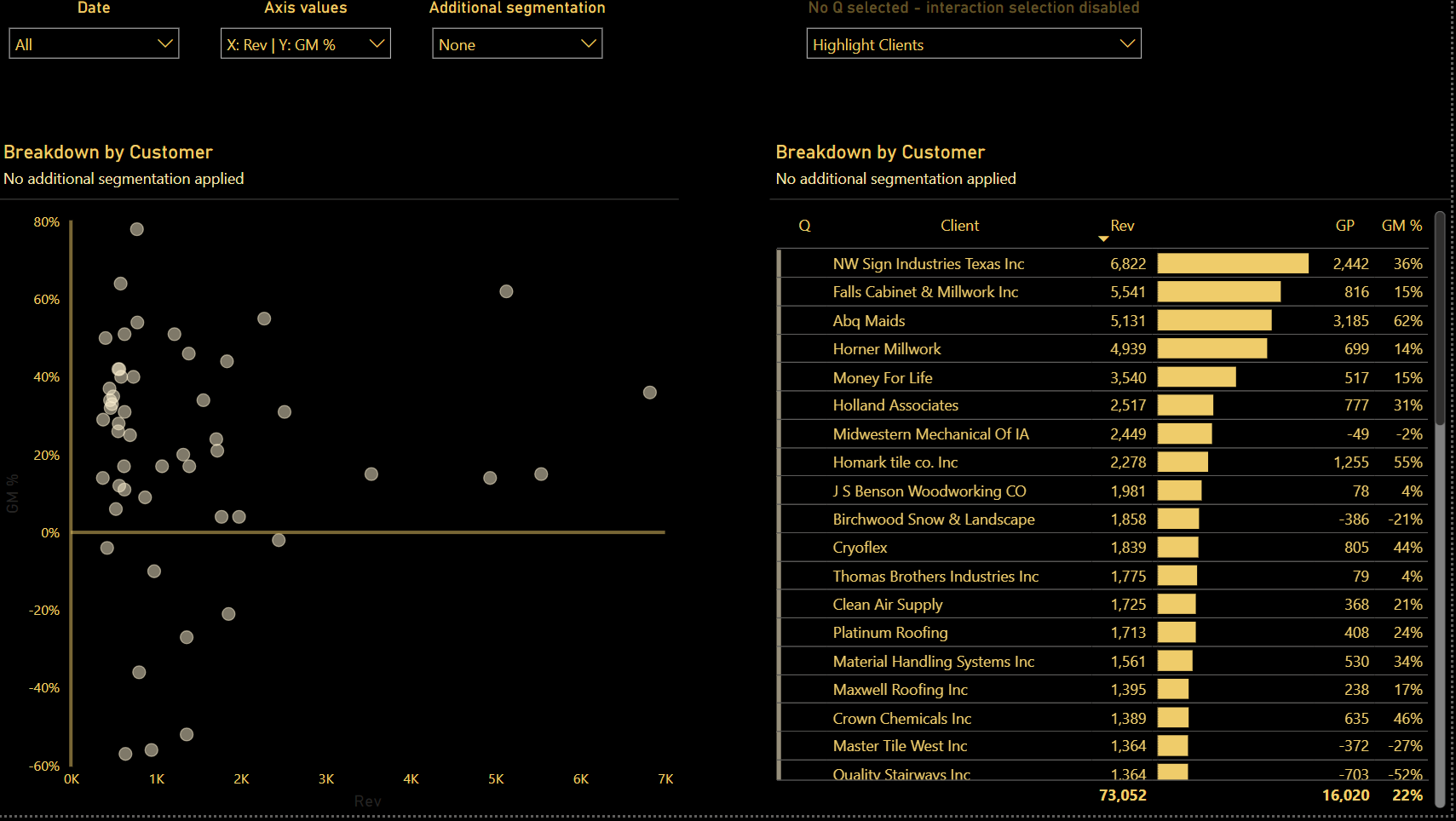
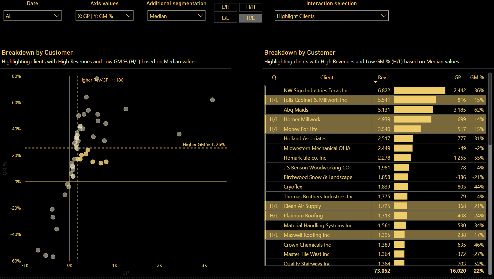
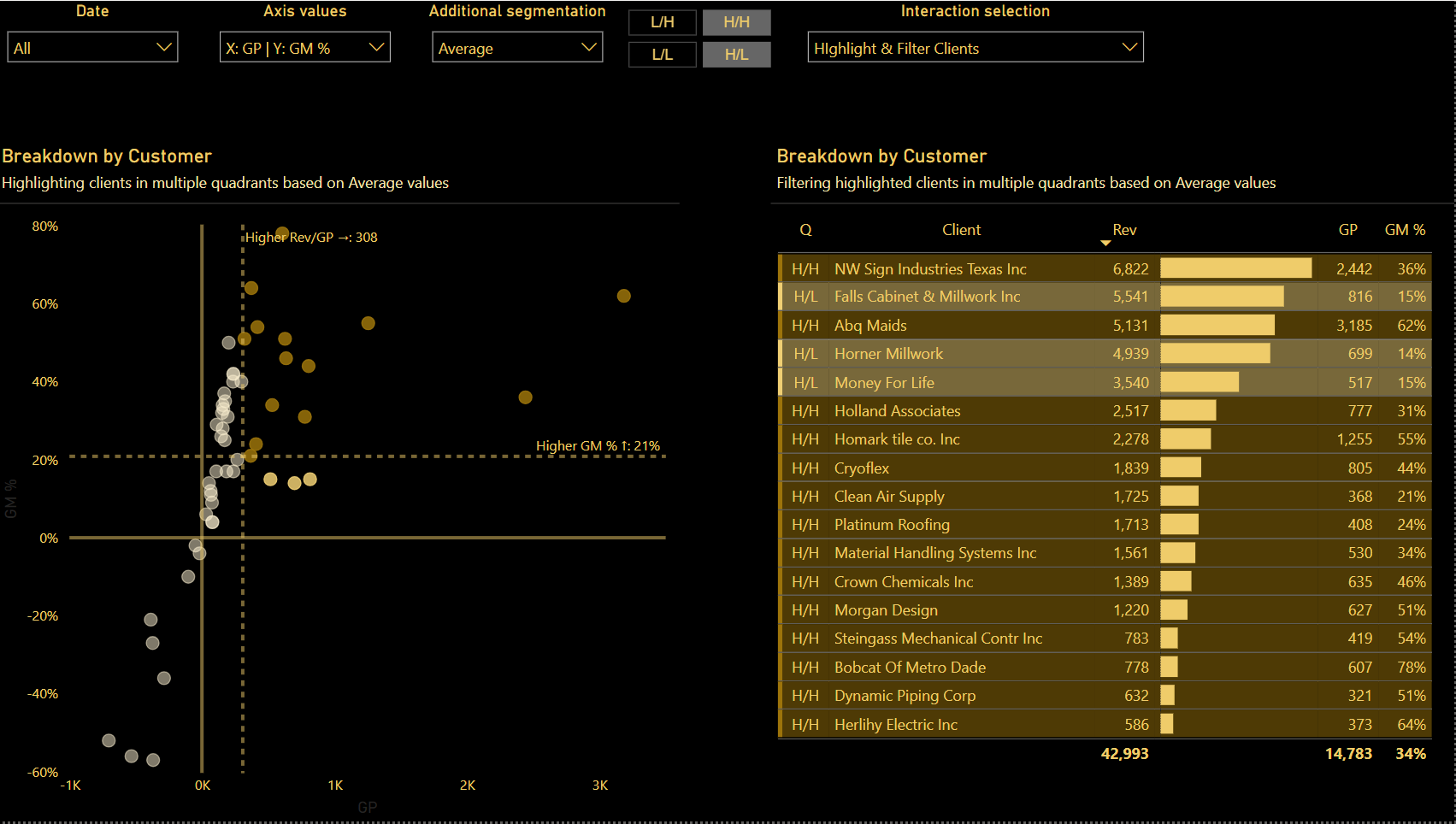
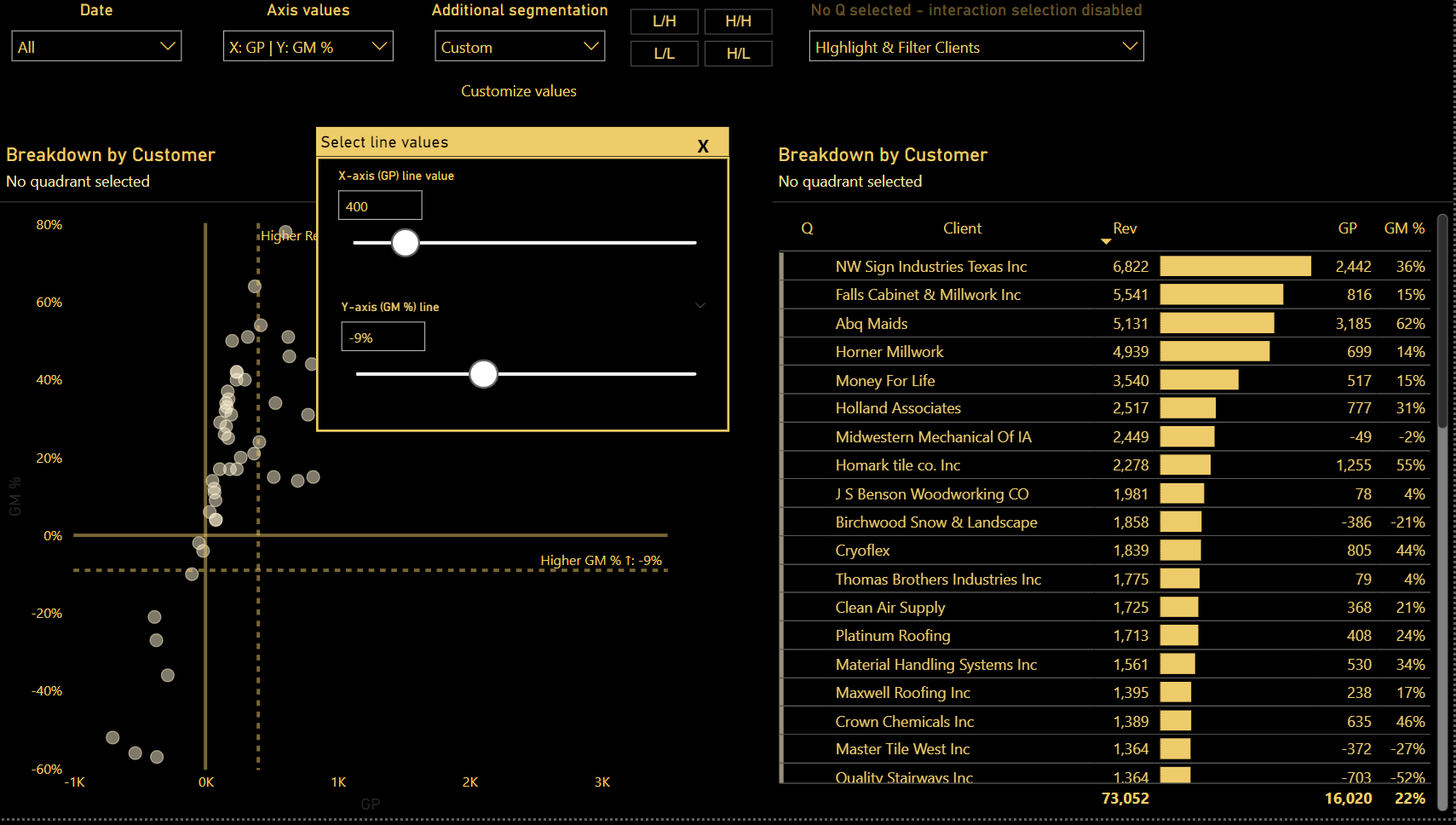
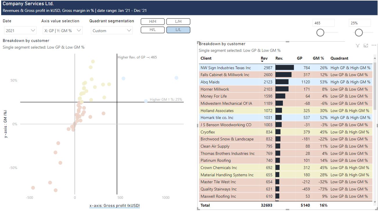
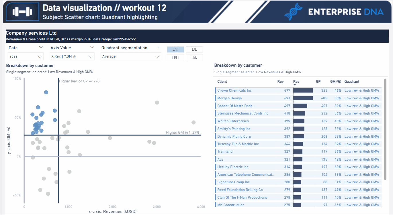
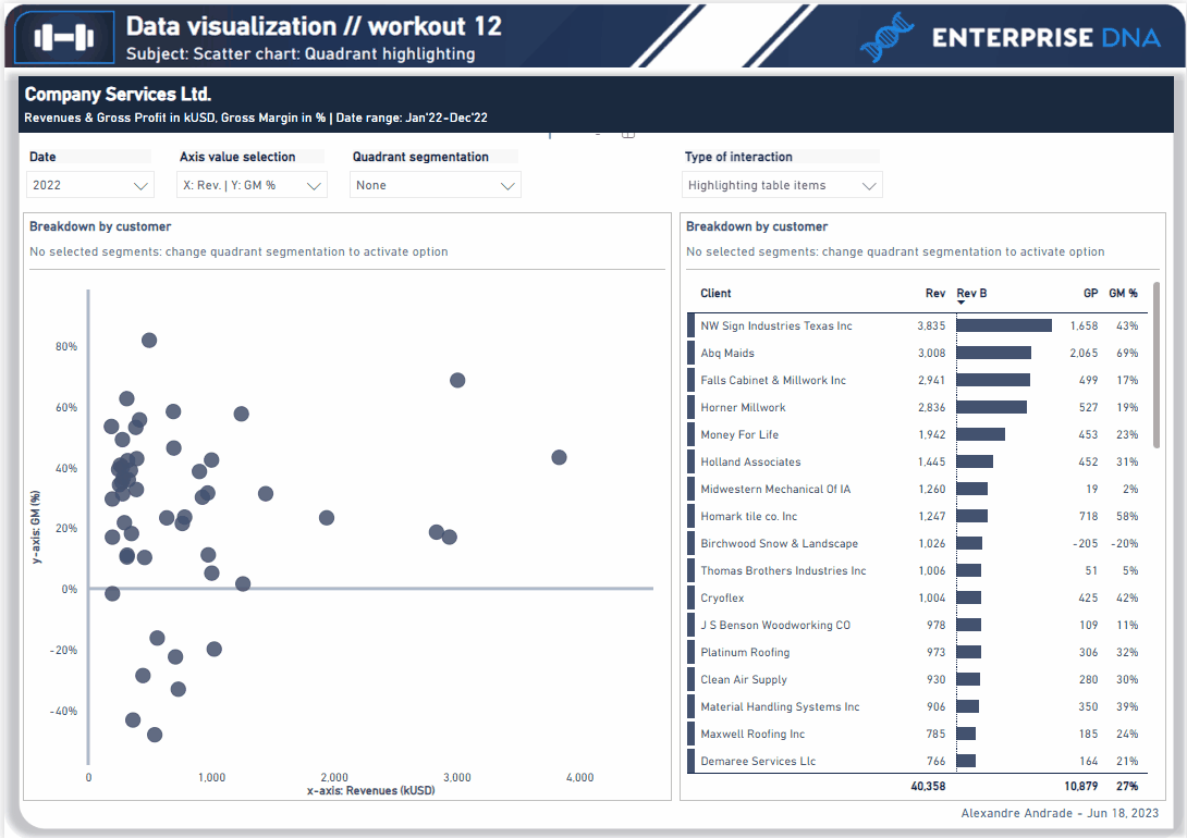
A good starting point is to implement basic points by creating a scatter chart with two fixed x-axis metrics (revenues and gross margin %), creating 1-2 benchmarks for determining the quadrants (4 separate parts that could be described as high & high, low & high, low & low, high & low segments, basing on given metrics and benchmarks). Realizing further points (blue and orange) will provide additional technical practice.

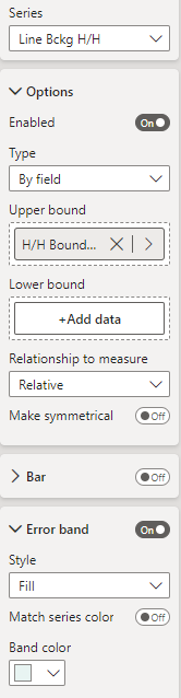
Presented images and gif present additional dynamic color background for selected quadrants, although it’s not required in the workout.

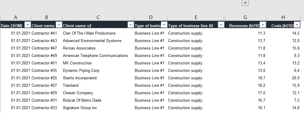
Following workout bases on the dataset that was provided during the workouts 002, 005, 006, 007 - . If you have participated in abovementioned workouts - you can still use your already imported and fransformed database. Not all columns provided in the dataset have to be used in that particular workout but feel free to use other additional columns / categories if you’ll find it useful.

**Also, feel free to use your entries as a part of your project portfolio, if it’s instrumental in realizing your goals.

Goals

In this workout, using the supplied dataset and reviewing the provided interactive report (link below) we are going to replicate the set of visualizations (scatter chart and slicer section and optionally a table). Also, please feel free to add any extra visual if you would like to (provided that core visualizations are included in the first place).

012 - Workout - Quadrant chart.xlsx (110.9 KB)

Core actions (practice) :

    • Creating dynamic metrics for x-axis or y-axis in scatter chart
    • Creating dynamic contant lines (average, median, custom selection)
    • Incorporating Dax to identify given quadrants in scatter chart (based on average / median / custom selection)
    • Using conditional formatting (highlighting given items)

Submission

Please load the supplied data (xls file) into a Power BI file, replicate visualizations (considerating list of points in the introductory report screenshot and the general design and functionality provided through interactive published-to-web report), and reply to this post including the screenshot (or a gif) of your solution along with the pbix file (please, include name or EDNA forum nick in the pbix name).

Period

This workout is released on Tuesday June 12, 2023, and the author’s solution will be posted on /Tuesday - Wednesday 20-21 June, 2023.

Additional materials

Link to the interactive dashboard:

1

Have a great fun!

Best regards!

5 Likes

That looks really cool. I am a bit scared of the star ranking :exploding_head: :upside_down_face:

4 Likes

I was thinking the same… but I am sure we will do it and learn something new :wink:

4 Likes

Epic Skills

3 Likes

Looks like the team is ready to tackle this. With our team, we’ll solve everything before the end of the week :slight_smile:

7 Likes

I was working on workout10 which I missed, but I’m going to stop and start with this new one, because it’s a great opportunity to do workouts 6 and 7 which I also missed.

This workout 12 seems very, very hard to solve. I’m thinking how hard the 5 star training will be…

1 Like

Great workout! My second workout on EDNA and already I’ve learned about a hundred tricks and now I feel overwhelmed and I don’t know how to keep track of everything I learned - if that makes sense. How do you guys do it?

Anyway, here are a few screenshots of my solution. Decided to go with a dark theme this time.

Also, just learned that some workouts share data - will definitely check out related past workouts since I feel that half of the job is already done! I may be wrong, though :wink:

6 Likes

4.75/5.00. :scream:

2 Likes

Hi all!
4.75 is mostly due to the greater number of small steps that has to be applied.
With the most basic approach (which is for example: fixed metrics for x and y-axis // single benchmark metric to set up the quadrants // fixed color segments without selecting specific parts) it will much more digestable.

If you decide to go with more complex approach (changeable x-axis metric, a few dynamic benchmarks, dynamic segments highlighting) I’m 100% sure you will go through this, but it’ll be more time consuming due to the amount of steps required.

Let me know if anything need more info.
Looking foward to see your as always incredible entries!

2 Likes

I may well get back on the horse for this one!

2 Likes
  • Steps 6 and 7 are still not done:( I hope to be able to get back on this over the weekend.
  • Also, some problems with the background. How is it possible that the formula which works on markers doesn’t work on the background :frowning:
  • to investigate - GM% works if I chose 1 month but if I chose a full year the difference is about 1-3% :frowning:

    Workout 012.pbix (213.8 KB)
2 Likes

Thank for an update Renata.
It already looks great, and you showed us the most important, core elements.

Regarding the orange points, I’m aware that it takes additional time and effort, but on the other hand, I’m 100% sure it will be easy for you (highlighting given segments actually requires only a small bit of additional dax, but not too much).

Regarding the dynamic background - it’s a substantial workaround, as the scatter chart itself does not provide such functionality. Please keep in mind that additional background higlighting is not required in this workout - as didn’t plan to put on you as much additional effort (but feel free to play around with that).

Would you mind tell us more about GM%? Which issue did you spot when selecting only 1 month?

Hello,
If we look at scater chart, GM % line for 2021 / Median you have 19% I have 17%. When I try to research and check one by one, January, February and March… of 2021 I have the same % every month. then it looks like rounding but 2 % in a year time is quite big difference.
For 2021 / average difference for full 2021 is 5 % (my 11% vs your 16%) and again if I check each month separatelly result is the same as yours in ever single month.
The only thing that comes to my mind is case with customers ( GM% for year vs GM % per client for year). I try to check it - maybe not correctly :frowning:

1 Like

If I understand that correctly, you currently use GM% as an Y-axis line - which gives you the same result for GM% (expressed on a line) as in the table in the total.

In my sample, I use average (or median) per client, so it changes result a bit, as it first check GM% per each client and then make average based upon already aggregated GM% per client.
Finally, as I believe, the result of used measure for GM% should reflect the same result that we would achieve by implementing native median or average line.

I hope it’s the reason behind the differences in our current visuals.
Let me know if I missed sth.

I use average or median too :
Switch Y-line =
if(
SELECTEDVALUE(‘QS Table’[Value])= “Average”,
[GM Avg2],
IF(SELECTEDVALUE(‘QS Table’[Value])= “Median”,
[GM med2],
IF(SELECTEDVALUE(‘QS Table’[Value])= “Custom”,
‘ParCustomer%’[ParCustomer% Value]
)
))

In formula above for average i try 2 posibility :
1.
GM Avg = AVERAGEx(FCT_table_Contractors,[GM %])
2. trying remove customers filters
GM Avg2 = CALCULATE(AVERAGEx(FCT_table_Contractors,[GM %]),REMOVEFILTERS(FCT_table_Contractors[Client name v2]))

where
GM % = DIVIDE([GP],[Revenues],0)

both give the same result

2 Likes

Almost there. Missing the table sorting and some last touches in the visualization.

2 Likes

Hi, glad to participate in this awesome workout. Lots of insights. Not all points matched yet. Cannot handle selection of multiple quadrant segments, only single selection. Quadrants background also in process :slight_smile:
Thank you for challenge.
Workout 012_EDNA_AngelinaMihejenkova.pbix (772.1 KB)

Workout 012_EDNA_AngelinaMihejenkova

5 Likes

Hi everyone,
For me, this exercise was a puzzle. There were many elements to build and some of them were very difficult to do. I had to work many hours during this weekend at night and early morning to get it done. But in the end the feeling of having made it was worth all the effort.
Here is my solution:

Data Viz Workout 012

If you want you check out the report, click on: https://app.powerbi.com/view?r=eyJrIjoiNjA1ZDFiZjEtODRmNy00NmI1LTk3MDQtNDMzOGE4NTIxMDE2IiwidCI6IjYzODA5NzRlLTJhODktNDMxMy05NDUzLTBlMTgzMDYxYmViMyIsImMiOjl9

5 Likes

Wow Alexandre!
Very good job !!!

I am still working on It and will not give up until Is done :wink:

Would you please give us a little suggestion (not too much spoiler) on background quadrant color change ?

2 Likes

@Roberto2 for background color I’m using error band.

2 Likes