Perfect Alex
1 Like
Of course @KimC , but I must say right away that the end result is much more beautiful and good looking than the organization of my ![]()
Workout 008_AA_Error Bars Final.pbix (579.5 KB)
If you have any doubt please let me know.
1 Like
Thank you for sharing @AlexandreAndrade , that is going to take me a little while to get my head around those measures ![]()
1 Like
My solution is probably more complicated than Dudek’s solution, but it’s working and I haven’t had much more time to improve it.
I’m sure you will understand the logic behind the measures, but if you need help, please let me know.
@Gustaw Thanks for your great workout.
However, even though I viewed your solution, there’re still some things I don’t know how to do or the reason behind.
Hope you can have a video talking about the solution or documents for “beginner” like me ^^
Hi,
thanks for your tremendous work.
I am struggling with the last point value to display.
You write: my measure = calculate(
lastdate(‘008: FCT_table: Financial KPIs’[Period]),
allselected(‘DIM: Date’)
)
This is ok , for each date, I obtain the same end date in your file.
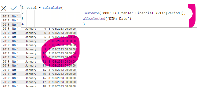
In my file, just transposed into my model ![]()
last point = CALCULATE(
LASTDATE(Data[Period]),
ALLSELECTED(Calendrier[Date])
)
I obtain a different date in each line of my table.
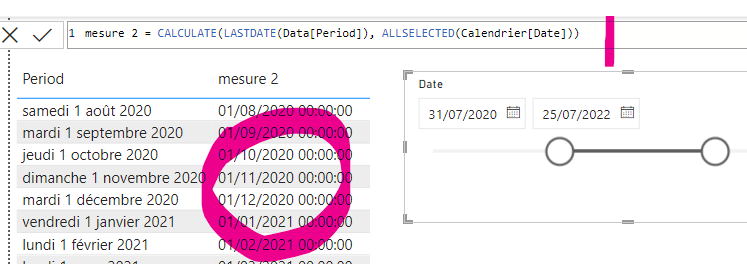
I don’t know where I am wrong… thank for any clue.
I checked the model, i don’t what is different.
Thanks,
Céline
1 Like
Hi Celine, would you mind to share your pbix file?
Hi Gustaw,
Here is my second pbix file. The issue can be seen in page 2.
Thanks for your help,
Céline
008 2eme.pbix (253.0 KB)
Hi Celine,
In that particular case, I referred to the entire calendar table vs reference to a single column.
Please find pbix below.
008 2eme.pbix (256.5 KB)
Hi to Everybody ,
Please have a look into my solution , a big thanks to @AlexandreAndrade , I follow his footsteps to showcase growth/decline message in line chart
here is the some glimpse of my solution
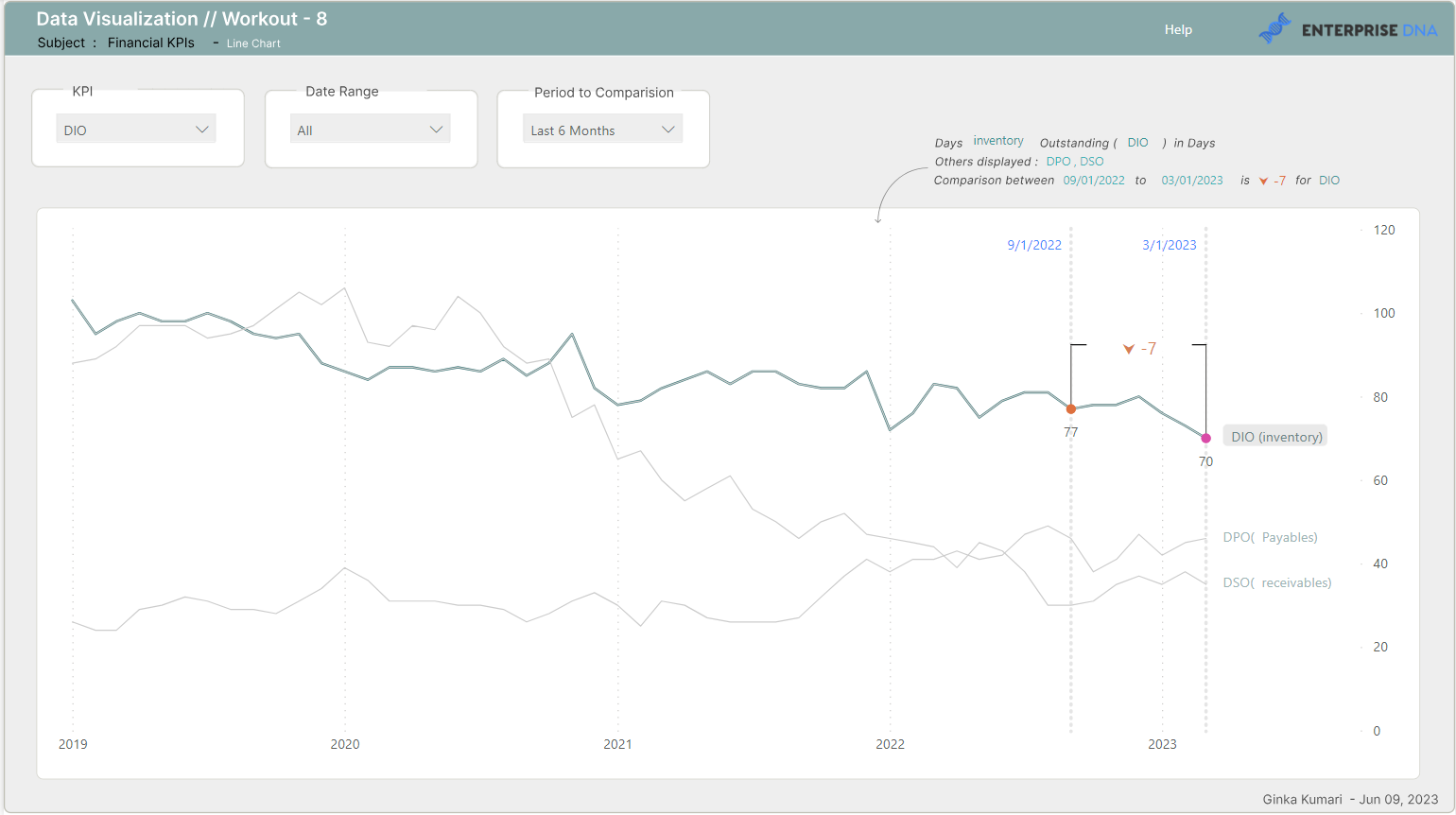
here is the guidance page
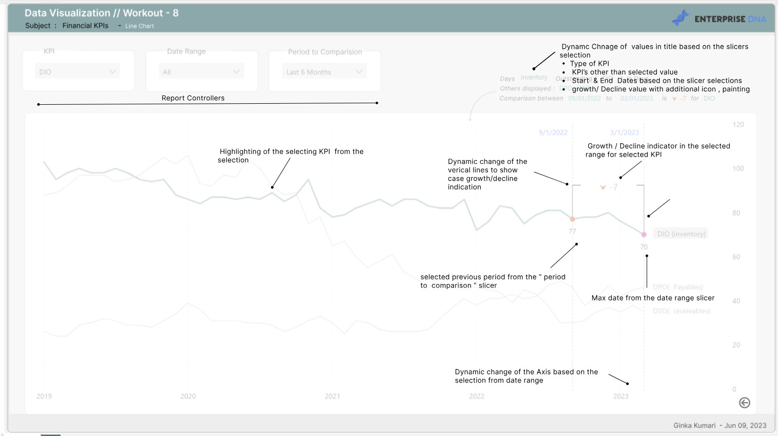
and the detailed report explanation
Thank you for reading this post …!!!
2 Likes
Thank you, I thought I checked everything and became mad last evening. ![]()
And now, I just succeeded in displaying only the two data points values. I don’t really understand why ALLSELECTED(DimDate) is working better than ALLSELECTED(DimDate[Date]). I will test other things. ![]()
1 Like
Thank you for your mention. Your explanatory notes are very helpful. It’s awesome
1 Like
Tried several ways on highlighting series labels, but have to keep that out😕
1 Like
Hi guys,
Here’s my submission for EDNA Workout 8. I’m so happy; it’s the first time ever I’ve ticked off all the questions. Thank you, Gustaw!
EDNA Workout 8.pbix (263.9 KB)
Power BI link: Click Here
1 Like