hi,
Sorry but could someone help me with this formatting please.
thank you
Rémi
hi,
Sorry but could someone help me with this formatting please.
thank you
Rémi
Hi @Remi10
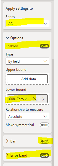
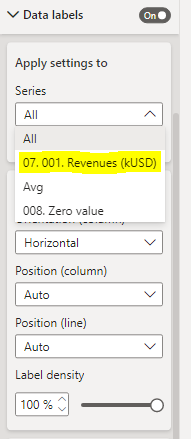
The formula works fine, but it has to be applied for given measure (now it’s applied to “all”). Please see the screen below:
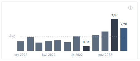
Hope it’ll help.
Best regards!
thank you very much for your help
No problem Remi : )
One last question please I also want this blue but i can’t get it.
Would you know why?
Thank you in advance
Remi
007 Workout - Remi Martinato.pbix (346.6 KB)
very good, thanks again
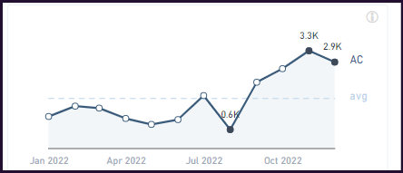
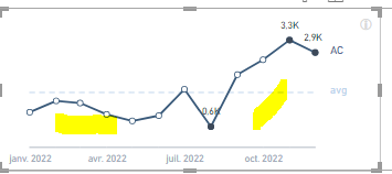
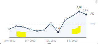
In this, you have MIN , MAX and Last data label with marker in a blue dark color. Can you please tell me how to make this?
Yes It is related to Workout 007
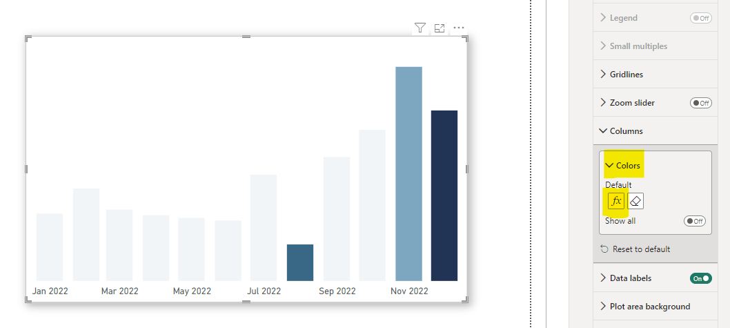
There’s a couple of ways to go about that. I used a measure to conditionally color dots based on whether they represented the min, max, or last value then used that measure in the conditional color fx. There’s a trick to it, though, because conditional color fx is unavailable for area chart.
Start with a clustered column chart and set your color fx in that visualization then switch the visual type to an area chart. Conditional colors persist.
I used a measure that conditionally assigns colors when displaying a clustered column chart:
.
.
.
SWITCH(
    TRUE()
    , __max = __curRev, "#7AA6C2"
    , __min = __curRev, "#346888"
    , __last = __curRevDate , "#203457"
    , "#F2F5F8"
    )
.
.
.
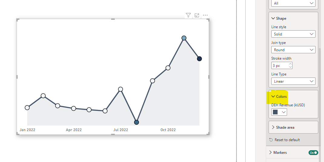
Then switched to an area chart:
You’ll see that there’s no option to conditionally format the marks. Still, the conditional coloring that was set in the cluster bar chart persists.
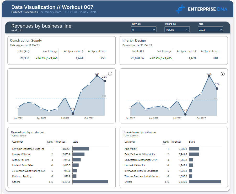
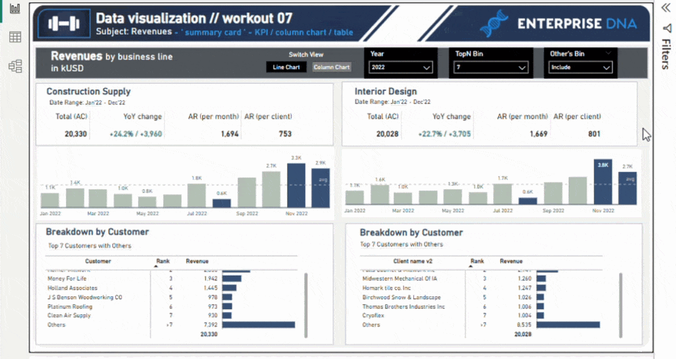
Hi everyone, here’s my submission.
This challenge was tough, but I learned a lot. Chandeep’s video (https://www.youtube.com/watch?v=yGFcCbXn_g0&t=1113s) helped me tackle the TopN and Others table, though I’m still working on getting the totals right. Will update soon.
Thanks, Gustaw!